By: Siddharth Mehta | Comments (2) | Related: 1 | 2 | 3 | 4 | 5 | > Reporting Services KPI
Problem
Key Performance Indicators are typically displayed in a scorecard with stop light indicators, which are either red, amber or green light icons. The limitation for these kind of indicators is that you can see the actual and target values in two different fields as well as see the status of the KPI in red, amber or green color. If the user wants to figure out the thresholds associated with the KPI, these values are generally not visible. Further, representing the threshold values in the scorecard itself defeats the purpose of the scorecard. The scorecard should display the KPI's status in the most summarized form and use a minimal amount of space on the dashboard. In this tip we would look at how to address this issue.
Solution
Before we start addressing the issue, it would be helpful to take a view of what we are trying to address. The image below shows a typical PerformancePoint scorecard. Here the user can easily see the actual and target values, but not thresholds associated with it. If the thresholds are displayed in the form of additional fields, this would consume more space on the dashboard. Another option is to display the values in tooltips, which is not an efficient solution and it might not be even acceptable to the users.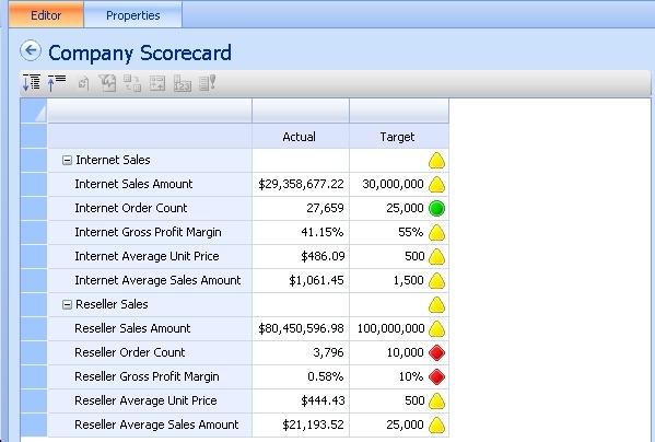
The solution to this problem is to use bullet graphs, which is a linear gauge representation of the data available in SSRS 2008 R2. Let's follow the steps below to create a sample bullet graph, and once it is generated, compare it with the above scorecard to evaluate how bullet graphs solve the problem as opposed to stop light indicators.
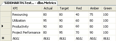
Step 1: Create a sample dataset as shown in the screenshot below. KPIs generally have actual and target values as well as thresholds associated with them which are divided into red, amber and green status. This dataset is a typical example of a few KPIs that are tracked for project management purposes.
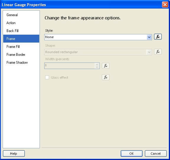
Step 2: Create a new SSRS report, and configure it to use the above data in a dataset. Right-click on the report area, select Insert -> Gauge -> Bullet Graph (from the Linear section). Right-click on the gauge, select gauge properties and set it's Frame style to "None" as shown in the screen shot below, so that we can fit the gauge in other containers smoothly.
Step 3: Select this gauge, and set it's DataSetName property to the dataset created in Step 2.
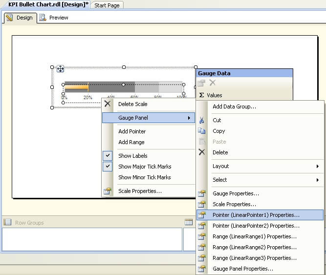
Step 4: Right-click on the gauge and you would be able to see the GaugePanel properties as shown in the screen shot below. One fundamental thing to keep in mind before configuring this gauge is that there are two pointers (actual and target) and three scale (red, amber and green) by default. The first linear pointer, which is a horizontal bar, is usually used for the actual value and second linear pointer, which is a vertical bar, is usually used for the target values. Linear Range 1, 2, and 3 can be mapped to red, amber and green thresholds respectively.
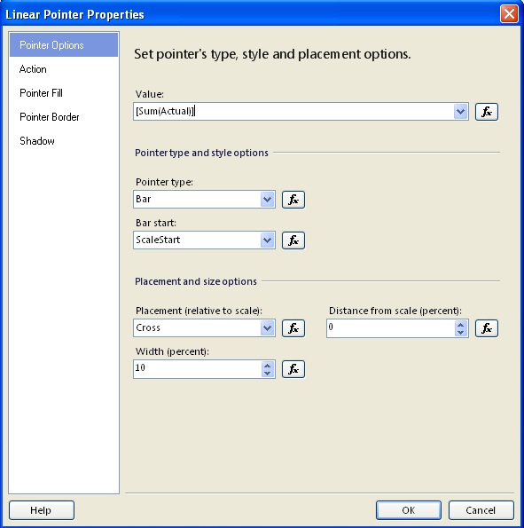
Step 5: Select LinearPointer1 properties and set it to the value of the sum of the actual as shown in the below screenshot. Do not get confused with the Sum function, this will get clearer when we place the gauge in a container. Set the pointer fill color to Solid style and Black color. Repeat the same steps for LinearPointer2 and set the value to Target instead of Actual, Color style to Solid and Color to Red.
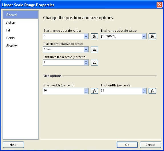
Step 6: Select LinearRange1 properties and set the "End range at scale value" property to sum of Red as shown in the screen shot below. This means that the first scale range would start with zero and end with the value of the Red field. Change the Fill style to Solid and color to Tomato Red. Accordingly change the start and end ranges, as well as respective colors for LinearRange2 and LinearRange3.
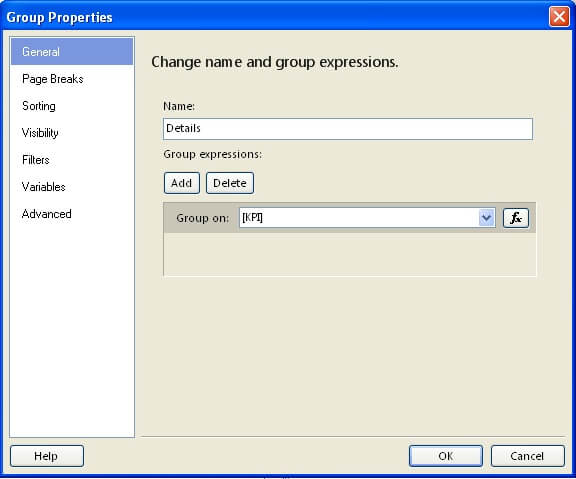
Step 7: Add a table to the report, and delete the third column. Right-click the detail row in the table, and add a group based on the KPI field as shown in the figure below. The reason for this is so that we would add the gauge to the detail area and the gauge in each row would have access to values of a single KPI as we are grouping by the same. Add KPI field to the first column and the gauge to the second column.
Step 8: After you are done , preview / execute the report and you should find a result similar to the screen shot below. Your font, color, border size, etc. may be a bit smaller or bigger than the screen shot below. Try tuning different UI related properties and you should be able to adjust your result similar to the one shown below.
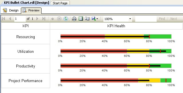
Compare the result with the values we have in the dataset, then compare this result with the scorecard with the stop light indicators. You would be able to see how the user can determine the actual, target, and threshold values in the same graph. In general, dashboards do not require exact KPI values, but every piece of information in the dashboard needs to be as concise as possible. In my opinion, bullet graphs solves the problem in question and fits smoothly into the theme of a dashboard.
Next Steps
- Experiment adding more scales and pointers to these graphs.
- Tune different UI properties so that the gauge smoothly fits into the table, giving it a scorecard flavor.
- Check out these related tips:


About the author
 Siddharth Mehta is an Associate Manager with Accenture in the Avanade Division focusing on Business Intelligence.
This author pledges the content of this article is based on professional experience and not AI generated.
View all my tips
