By: Dattatrey Sindol | Comments (11) | Related: > Reporting Services Charts
Problem
I recently started working with Charts in Reporting Services and while choosing the colors for charts, I see that there is a limited set of pre-defined color palettes available, and they do not meet end user needs many of the times. I wanted to know what are the different ways to apply custom colors to charts and what are the pros and cons of each of the approaches.
Solution
In SQL Server Reporting Services (SSRS), there are 12 different pre-defined Color Palettes available. However, in many scenarios, these pre-defined palettes do not meet user's requirements, and hence we need to be able to define and apply our own colors.
In this tip we will see 4 different approaches for using custom colors and highlights (pros and cons) of each approach, which will give you some initial thoughts on which approach will be suitable for your scenario and would help you to choose a better approach.
Note: This tip assumes that you have prior knowledge of working with SQL Server Reporting Services (SSRS) and are familiar with Developing a Pie Chart. If you are not familiar with SSRS, refer to the SSRS Tutorial. The demonstration in this tip is based on SQL Server 2012. However, the steps are pretty much same for previous version of SSRS also.
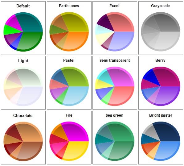
Before we start looking at different approaches, here is a quick look at the pre-defined color palettes, just to get a feel of how they look like.
Let us first build a sample data set from AdventureWorksDW sample database using the below query. The AdventureWorks sample database(s) can be downloaded from the CodePlex site.
Building the Sample Dataset
SELECT
    DG.CountryRegionCode AS CountryCode
    , DG.EnglishCountryRegionName AS CountryName
    , FIS.SalesAmount
FROM
    dbo.FactInternetSales AS FIS
    INNER JOIN dbo.DimCustomer AS DC
        ON FIS.CustomerKey = DC.CustomerKey
    INNER JOIN dbo.DimGeography AS DG
        ON DC.GeographyKey = DG.GeographyKey
Let's create a Pie Chart using the above dataset by following these steps:
- Open SQL Server Data Tools (SSDT) or Business Intelligence Development Studio (BIDS) if you are working with previous version of SSRS.
- Create a Report Server Project.
- Create a Data Source (You can either create a Report Data Source directly or create a Shared Data Source first and then use this to create a Report Data Source).
- Create a dataset using the above query.
- Add a new Pie Chart (Basic "Pie" Chart) to the Report Design surface.
- Set the Chart Values to "SalesAmount" and leave "Aggregate Function" defaulted to "Sum".
- Set the Category Group to "CountryCode", Category Group Label to "CountryName" and Sort by property to "CountryName" (Which is in Ascending Order "A to Z" by default).
- Click on Pie, go to Properties Window (Chart Series Properties) >> CustomAttributes and set "PieDrawingStyle" to "Concave".
- Right click on the Pie Chart and set "Show Data Labels" property.
- Right Click on a Data Label, select "Series Label Properties", and set "Label data" to "#PERCENT" (If you get a warning "This property will not have effect unless UseValueAsLabel is set to False. Do you want to set the UseValueAsLabel to False?", select "Yes").
- With a little bit of
formatting around Fonts, Dimensions etc., the completed Pie Chart should
look as shown below (Note that, the Legend Layout has been set to "Tall Table"
intentionally in the below chart, so that we can clearly see the sequence of
colors in the subsequent approaches which we are going to discuss).
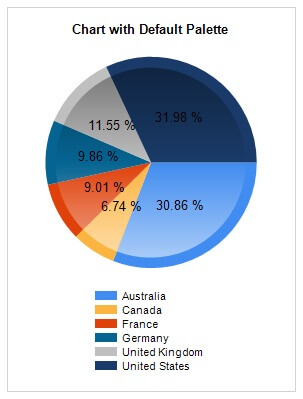
We will start applying different approaches on top of this report. Let us refer to the above report as the "Initial Report" for the rest of this tip. Now let us start looking at different approaches for applying custom colors.
Approach 1: Using Custom Palette
In this approach, we will define our own Custom Palette with colors of our choice. Follow the below mentioned steps and modify the above report.
- Select the report, go to Chart Properties, set the "Palette" property under
"Chart" property category to "Custom" as shown below.
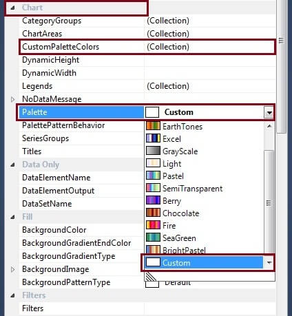
- Go to "CustomPaletteColors" property and click on the ellipsis button next to "(Collection)". This will open up the "ChartColor Collection Editor".
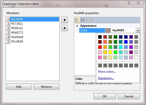
- In the ChartColor Collection Editor window, click on Add on the left bottom corner. This will add a member named "Color". With this member being selected (This is selected by default when you add it), Click on the "Color" drop-down, go to "Expression..." and set it to "#AC9494" (without double-quotes). Note: You need to remove the equal sign from the "Expression" window before putting this html code in it.
- Similarly add five more members and set them to "#37392C", "#939C41", "#6B8272",
"#D29B48", and "#3C4848" in the same sequence. Once you have set the six colors,
your "ChartColor Collection Editor" window should look as shown below.
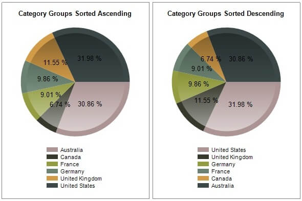
- Now preview your report and notice that the colors are applied in the same sequence in which they appear in the ChartColor Collection Editor and based on the Sorting Order of the Chart Grouping (Which is set to Ascending Order "A to Z" by "CountryName").
- Go to "CountryCode" Category Group properties and set the sorting to Descending Order ("Z to A") by "CountryName".
- Now again preview your report and notice that the colors are applied to
the chart in the reverse order since ordering on CountryName has been reversed.
The chart with CountryName set to Ascending and Descending Order will look as
shown below.
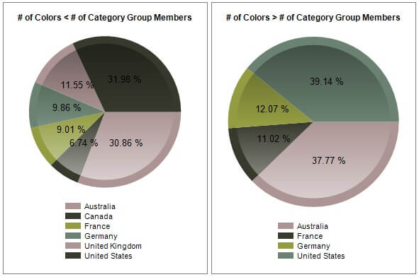
- Next, remove the last two colors from the ChartColor Collection Window,
keep only the first four colors, and render the report. Notice that since the
number of colors is less than the number of categories, colors are repeating.
When the number of colors is more than the number of categories, only the required
number of colors are used based on the sequence as explained above. With this
variation, the charts look as shown below.
So that is how the Custom Palettes work with Charts in Reporting Services. Here are some of the highlights of this approach:
- This custom palette needs to be defined for individual charts and cannot be shared across charts.
- On the similar lines as previous pointer, this custom palette cannot be shared across reports.
- Adding a large number of colors can be a tedious job.
- Once colors are set for all the charts/reports, even if one color needs to be changed, it should be manually updated in each of the charts/reports.
- We can control which color is applied to which category group member by using expression for "Color" property in the "ChartColor Collection Editor" window.
- Sequence in which colors are applied depends on the sequence in which colors are added in the "ChartColor Collection Editor" window and sort order of the Category Group.
- List of colors defined in the "ChartColor Collection Editor" window is the primary and only source of colors. When number of category group members exceeds the number of colors, then the colors from the same set are repeated.
Approach 2: Using Expressions
In this approach, we will see how we can set custom colors to chart categories using expressions. Let us apply the following changes on top of our initial chart.
- Right Click on the Pie and select "Series Properties..." from the context menu. This will open the Series Properties Window.
- Go to "Fill" option in the left navigation menu, leave the "Fill style"
to "Solid" (default), and click on "fx" button next to "Color" property,
which will open up the "Expression" editor window.
=SWITCH(
   Fields!CountryName.Value = "Australia", "#AC9494"
   , Fields!CountryName.Value = "Canada", "#37392C"
   , Fields!CountryName.Value = "France", "#939C41"
   , Fields!CountryName.Value = "Germany", "#6B8272"
   , Fields!CountryName.Value = "United Kingdom", "#D29B48"
   , Fields!CountryName.Value = "United States", "#3C4848"
)
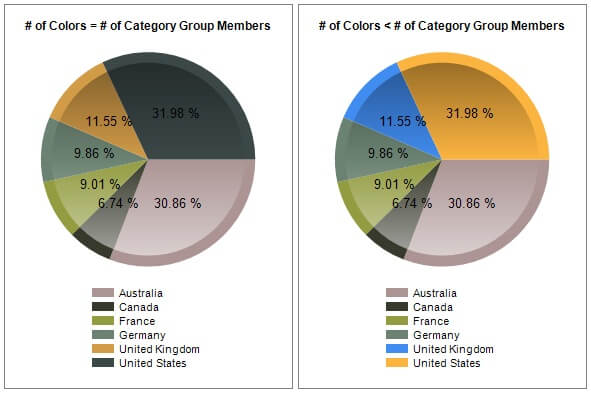
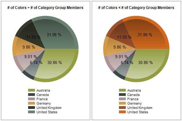
- The completed chart looks as shown in the chart on the left below.
- Next remove the last two colors/conditions for "United Kingdom" and "United States" from the above SWITCH Expression.
- Now render the report and notice that, since the number of colors is less
than the number of category group members, colors for first four members "Australia",
"Canada", "France", and "Germany" are applied from the expression, and the colors
for the remaining two members "United Kingdom" and "United States" are applied
from the underlying color palette set for the Chart ("Bright pastel" in our
case). The completed chart looks as shown in the right chart below.
So that is how Expressions work with Charts in Reporting Services. Here are some of the highlights of this approach:
- Expressions need to be set for individual charts and cannot be shared across charts.
- On the similar lines as previous pointer, these expressions cannot be shared across reports.
- Adding a large number of colors can be a tedious job.
- Once colors are set for all the charts/reports, even if one color needs to be changed, it should be manually updated in each of the charts/reports.
- We can control which color is applied to which category group member since we are using conditional colors/expressions.
- Colors that are applied to each category group member are fixed and do not change irrespective of sort order of the members.
- List of colors defined in the Expression editor serves as the primary source of colors. When the number of category group members exceeds the number of colors, then the colors are applied for the remaining category group members from the underlying color palette set for the Chart ("Bright pastel" in our case), serving as a secondary source of colors.
Approach 3: Using Custom Code
In this approach, we will see how we can set custom colors to chart categories using Custom Code. Let us apply the following changes on top of our initial chart.
- Go to "Chart Properties" and set the "Color palette" property to "Chocolate". This is only for demonstrating how this approach behaves when number of colors defined is less than number of category group members.
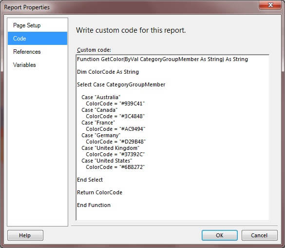
- Go to "Report" option on toolbar and select "Report Properties..." from
the drop-down, which will open the "Report Properties" window. Click on "Code"
in the left navigation pane and paste the following VB code into it.
Function GetColor(ByVal CategoryGroupMember As String) As String Dim ColorCode As String Select Case CategoryGroupMember Case "Australia" ColorCode = "#AC9494" Case "Canada" ColorCode = "#37392C" Case "France" ColorCode = "#939C41" Case "Germany" ColorCode = "#6B8272" Case "United Kingdom" ColorCode = "#D29B48" Case "United States" ColorCode = "#3C4848" End Select Return ColorCode End Function - Your code window should look as shown below. Notice that the same colors
are used as that of previous approach but are shuffled for demonstration purpose.
- Right Click on the Pie and select "Series Properties..." from the context menu. This will open the Series Properties Window.
- Go to "Fill" option in the left navigation menu, leave the "Fill style" to "Solid" (default), and click on "fx" button next to "Color" property, which will open up the "Expression" editor window.
- Enter the following expression in the "Expression" editor window.
=Code.GetColor(Fields!CountryName.Value)
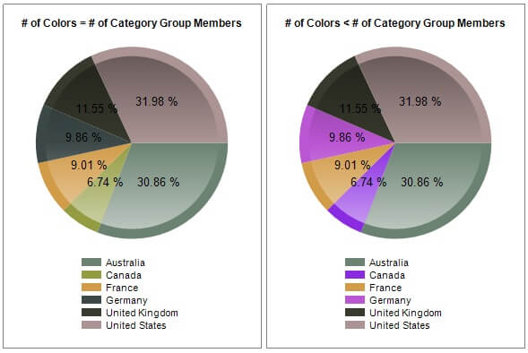
- The completed chart looks as shown in the left chart below.
- Next remove the last two colors/conditions for "United Kingdom" and "United States" from Case Statement in the above VB function.
- Now render the report and notice that, since the number of colors is less
than the number of category group members, colors for first four members "Australia",
"Canada", "France", and "Germany" are applied from the VB function. And the
colors for the remaining two members "United Kingdom" and "United States" are
applied from the underlying color palette set for the Chart ("Chocolate" in
our case). The completed chart looks as shown in the right chart below.
In this approach we have embedded the code within the report. However, we can also use .NET Framework Custom Assembly, which will make the same function accessible across multiple reports.
So that is how the Custom Code works in Reporting Services. Here are some of the highlights of this approach:
- Function is defined at the report level and hence can be shared across multiple charts within the report.
- By using .NET Framework Custom Assembly, instead of embedded code within in the report, the logic/function can be used across multiple reports.
- Adding a large number of colors can be a tedious job.
- Once colors are set for all the charts/reports, changing the color for any of the category group members/countries is pretty simple and simply changing the function will update the colors across different charts/reports (depending upon whether embedded code or custom assembly is used).
- We can control which color is applied to which category group member since we are using conditional colors (CASE Statement).
- Colors that are applied to each category group member is fixed and does not change irrespective of sort order of the members.
- List of colors defined in the function serves as the primary source of colors. When number of category group members exceeds the number of colors, then the colors are applied for the remaining category group members from the underlying color palette set for the Chart ("Chocolate" in our case), serving as a secondary source of colors.
Approach 4: Using Colors from Database
In this approach, we will see how we can set custom colors to chart categories using colors from database table. Let us apply the following changes on top of our initial chart.
Let us first create a table and load the color codes into it. This table will hold the mapping of category group members and color codes.
IF OBJECT_ID('dbo.CategoryColorCodeMapping') IS NOT NULL
   DROP TABLE dbo.CategoryColorCodeMapping
GO
SELECT CountryCode, CountryName, ColorCode INTO dbo.CategoryColorCodeMapping
FROM
(
   VALUES
      ('US','United States','#AC9494')
      , ('GB','United Kingdom','#37392C')
      , ('CA','Canada','#939C41')
      , ('AU','Australia','#6B8272')
      , ('FR','France','#D29B48')
      , ('DE','Germany','#3C4848')
) AS CountryColorMapping (CountryCode, CountryName, ColorCode)
GO
Notice that the same colors are used as that of previous approach but are shuffled for demonstration purpose. Now update the report dataset which we created initially with the below query.
SELECT
   DG.CountryRegionCode AS CountryCode
   , DG.EnglishCountryRegionName AS CountryName
   , CCM.ColorCode
   , FIS.SalesAmount
FROM
   dbo.FactInternetSales AS FIS
   INNER JOIN dbo.DimCustomer AS DC
      ON FIS.CustomerKey = DC.CustomerKey
   INNER JOIN dbo.DimGeography AS DG
      ON DC.GeographyKey = DG.GeographyKey
   LEFT JOIN dbo.CategoryColorCodeMapping AS CCM
      ON DG.CountryRegionCode = CCM.CountryCode
Now let us apply the following changes on top of our initial chart.
- Go to "Chart Properties" and set the "Color palette" property to "Berry". This is only for demonstrating how this approach behaves when number of colors defined is less than number of category group members.
- Right Click on the Pie and select "Series Properties..." from the context menu. This will open the Series Properties Window.
- Go to "Fill" option in the left navigation menu, leave the "Fill style" to "Solid" (default), and click on "fx" button next to "Color" property, which will open up the "Expression" editor window.
- Enter the following expression in the "Expression" editor window.
=Fields!ColorCode.Value
- The completed chart looks as shown in the left chart below.
- Next run the following query to set the color code for "Canada" and "Germany"
to NULL.
ALTER TABLE dbo.CategoryColorCodeMapping ALTER COLUMN ColorCode VARCHAR(7) NULL GO UPDATE dbo.CategoryColorCodeMapping SET ColorCode = NULL WHERE CountryName IN ('Canada','Germany') GO - Now render the report and notice that, since the number of colors is less
than the number of category group members, colors for four members "Australia",
"France", "United States", and "United Kingdom" are applied from the database
table. And the colors for the remaining two members "Canada" and "Germany" are
applied from the underlying color palette set for the Chart ("Berry" in our
case). The completed chart looks as shown in the right chart below.
So that is how we can apply colors from a database table in Reporting Services. Here are some of the highlights of this approach:
- Category Group Members and Color Codes mapping is stored at the database level and hence can be shared across multiple charts/reports.
- Adding a large number of colors is a much simpler job (simply inserting some data into the table) compared to the previous approaches. Hence this is a scalable approach.
- Once colors are set for all category group members, changing the color for any of the category group members/countries is a lot simpler compared to above approaches and requires only a simple update statement as shown above.
- We can control which color is applied to which category group member since the color vs. country/category group member mapping is stored in the table.
- Colors that are applied to each category group member is fixed and does not change irrespective of sort order of the members.
- List of colors defined in the database serves as the primary source of colors. When number of category group members exceeds the number of colors, then the colors are applied for the remaining category group members from the underlying color palette set for the Chart ("Berry" in our case), serving as a secondary source of colors.
As we can see from the above demonstration, there are many different ways in which we can apply custom colors to charts in reporting services. We can choose from various different options based on our scenarios considering the flexibility, scalability, etc...
Next Steps
- Check out the SQL Server Reporting Services tutorial
- Check out the SQL Server Report Builder 3.0 Tutorial
- Check out the Business Intelligence Development Studio (BIDS) Tutorial
- Check out the other Tips in Reporting Services category


About the author
 Dattatrey Sindol has 8+ years of experience working with SQL Server BI, Power BI, Microsoft Azure, Azure HDInsight and more.
This author pledges the content of this article is based on professional experience and not AI generated.
View all my tips
