By: Koen Verbeeck | Comments (4) | Related: > Reporting Services Charts
Problem
I have a data set about durations that I want to plot in a graph. I need to display the minimum, maximum, average and other statistical information in a convenient way. How can I do this using SQL Server Reporting Services (SSRS)?
Solution
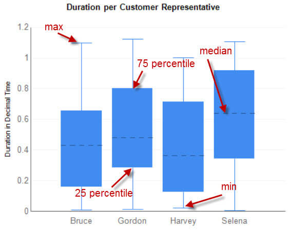
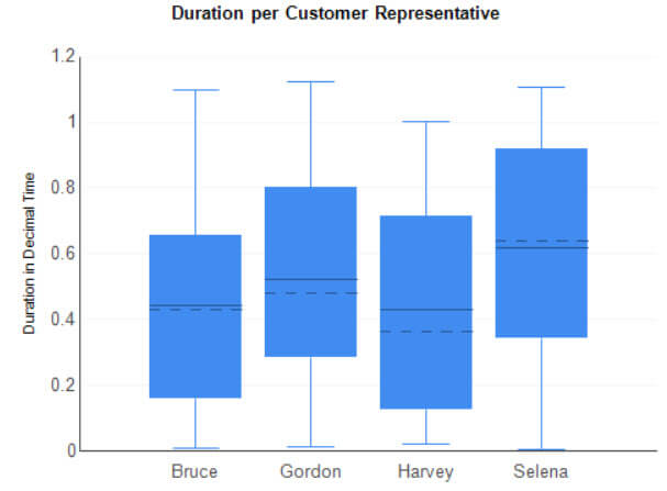
An efficient way to display different statistical properties is a box plot. It allows us to display the following statistical information in a condensed representation:
- Maximum value
- Minimum value
- Average
- Median (which is the 50th percentile)
- Percentiles (typically 25th, the bottom of the box and 75th, the top of the box)
- Possible outliers
Using a box plot, you can quickly find out if there are outliers, if the data is tightly grouped or if it is rather skewed.
An example:
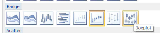
In Reporting Services, there are different graph types available that allow us to create this type of graph. The two most important ones are the candlestick and the boxplot itself of course. Both can be found in the Range category.
The tip Distribution Analysis using a SQL Server Reporting Services Box Plot Chart explains in great detail how to make a box plot using the candlestick graph and shows some customization tricks, such as adding outliers to the graph. This tip will focus on the box plot type, which was used to build the example above.
Set-up a Box Plot in SSRS
We will use the same data as in the tip about formatting durations in SSAS, which was about tracking durations for several customer representatives and the handling of service tickets. For your convenience, here’s the entire script to set-up the test data.
CREATE TABLE dbo.DimRepresentative(
  SK_Representative INT NOT NULL
 ,Name    VARCHAR(50) NOT NULL
 CONSTRAINT [PK_DimRepresentative] PRIMARY KEY CLUSTERED
 (
  SK_Representative ASC
 )
);
GO

INSERT INTO dbo.DimRepresentative(SK_Representative,Name)
VALUES  (1,'Bruce')
  ,(2,'Selena')
  ,(3,'Gordon')
  ,(4,'Harvey');

CREATE TABLE dbo.FactCustomerService
 (SK_CustomerServiceFact INT IDENTITY(1,1) NOT NULL
 ,SK_Representative  INT NULL
 ,TicketNumber   UNIQUEIDENTIFIER NOT NULL DEFAULT NEWID() -- degenerate dimension
 ,TicketTimestamp  DATETIME2(3) NOT NULL
 ,Duration    INT NOT NULL);

INSERT INTO dbo.FactCustomerService(SK_Representative,TicketTimestamp,Duration)
SELECT
  SK_Representative = FLOOR(RAND()*4) + 1 -- random assign a duration to a customer representative
 ,TicketTimestamp = DATEADD(DAY,RAND()*100,'2014-01-01')
 ,Duration   = RAND()*100000;
GO 100

CREATE VIEW dbo.CustomerServiceFact_Cube
AS
(
 SELECT
   SK_CustomerServiceFact
  ,SK_Representative
  ,TicketNumber
  ,TicketTimestamp
  ,TicketMonth = CONCAT('2014, ',DATENAME(MONTH,TicketTimestamp)) -- concat is SQL 2012+ only
  ,MonthOrder  = MONTH(TicketTimestamp) -- used for sorting in the report/cube
  ,Duration  = Duration / 86400.0
 FROM dbo.FactCustomerService
);
GO
Creating the Box Plot Graph in Visual Studio
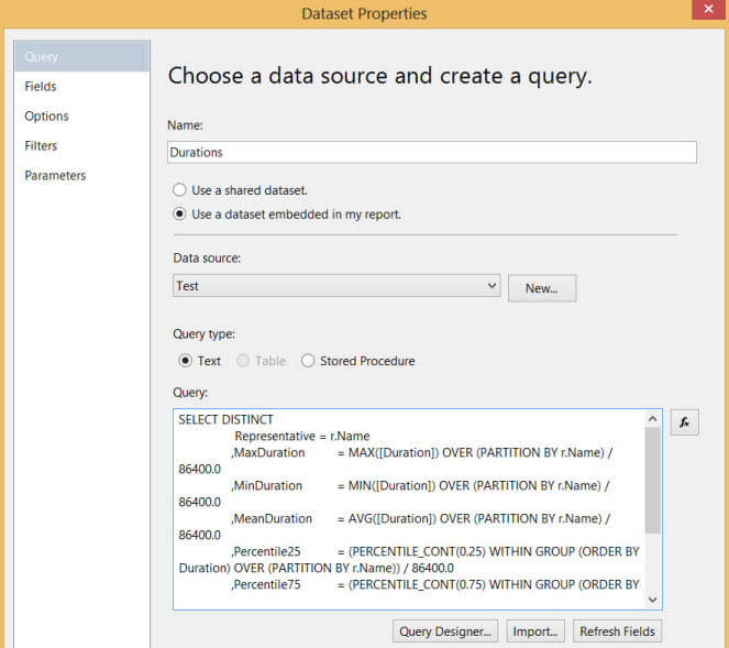
Open up a new report in Visual Studio. Add a connection to the database holding the test data and create a new dataset. The following query is used to retrieve all the statistical information from the database:
SELECT DISTINCT
  Representative = r.Name
 ,MaxDuration = MAX([Duration]) OVER (PARTITION BY r.Name) / 86400.0
 ,MinDuration = MIN([Duration]) OVER (PARTITION BY r.Name) / 86400.0
 ,MeanDuration = AVG([Duration]) OVER (PARTITION BY r.Name) / 86400.0
 ,Percentile25 = (PERCENTILE_CONT(0.25) WITHIN GROUP (ORDER BY Duration) OVER (PARTITION BY r.Name)) / 86400.0
 ,Percentile75 = (PERCENTILE_CONT(0.75) WITHIN GROUP (ORDER BY Duration) OVER (PARTITION BY r.Name)) / 86400.0
 ,MedianDuration = (PERCENTILE_CONT(0.50) WITHIN GROUP (ORDER BY Duration) OVER (PARTITION BY r.Name)) / 86400.0
FROM [dbo].[FactCustomerService] c
JOIN [dbo].DimRepresentative  r ON c.SK_Representative = r.SK_Representative;
Note that this query will only work using SQL Server 2012 or above, because it uses the analytical windowing function PERCENTILE_CONT introduced in SQL Server 2012 to calculate the percentiles and the median. The query returns the results in decimal time. The maximum, minimum and average can be calculated starting from SQL Server 2005, because those are not actual windowing functions using windows (defined by RANGE or ROWS); they are normal aggregates using the OVER clause. The difference is described in this blog post.
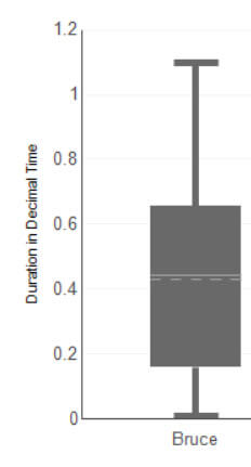
The dataset looks like this:
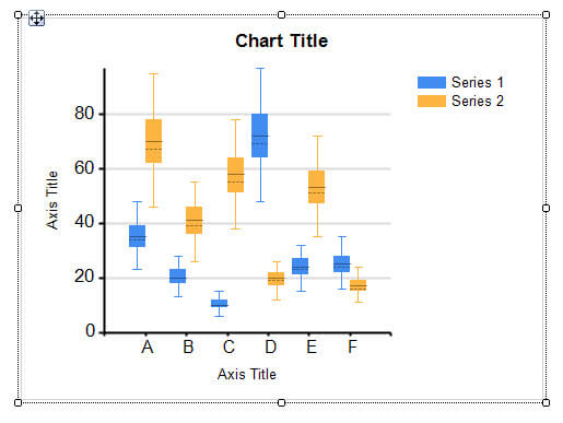
Add a new graph to the reporting canvas and select the boxplot graph type.
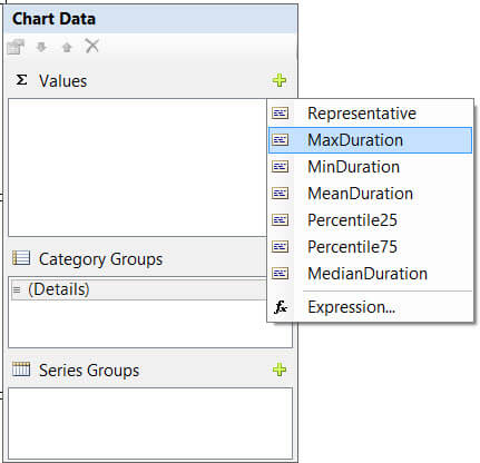
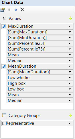
Click somewhere in the chart area so that the Chart Data form pops up. Click on the green plus icon next to Values and choose MaxDuration.
This will insert a new series called MaxDuration. If you want, you can change the name in the properties window.
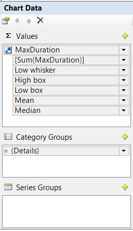
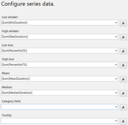
Right-click on the series and choose Series Properties... There you can see MaxDuration has been configured as the high whisker. Now we can setup all the other properties of the box plot using the other measures. Leave category and tooltip empty.
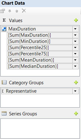
Now add the Representative column as a category group to the chart.
Finally we need to clean up the layout a bit: give the chart and the y-axis proper titles, drop the legend and the x-axis title and perhaps make the axis and gridlines less prominent. When we preview the report, we have a box plot like this one:
Customizing the Box Plot in Reporting Services
Unfortunately, there aren’t many options to customize this box plot. You can change the color of the box and the thickness of the lines, but that’s about it. Luckily SSRS is smart enough to change the color of the median and mean lines depending on the color of the box. For example, they turn white/grey against a darker box color.
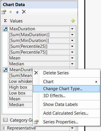
But suppose I want to choose the color of those lines myself. Or that I want to change the thickness of that line. In that case we have to use a small work around. Remove the median and the mean from the series and click the plus icon in the Chart Data window again to add a new series. Choose MeanDuration from the list. This will add a new series with MeanDuration configured as the high whisker.
Right-click the series and change the chart type to Candlestick.
Right-click the series again and go to the properties. Set the open and close value to MeanDuration and leave low and high empty. Change the color in the Fill pane and the border thickness in the Border pane to your liking.
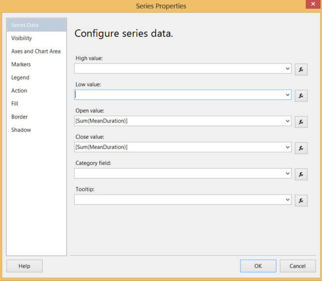
Repeat the same process for MedianDuration. When the report is run, the box plot looks like this:
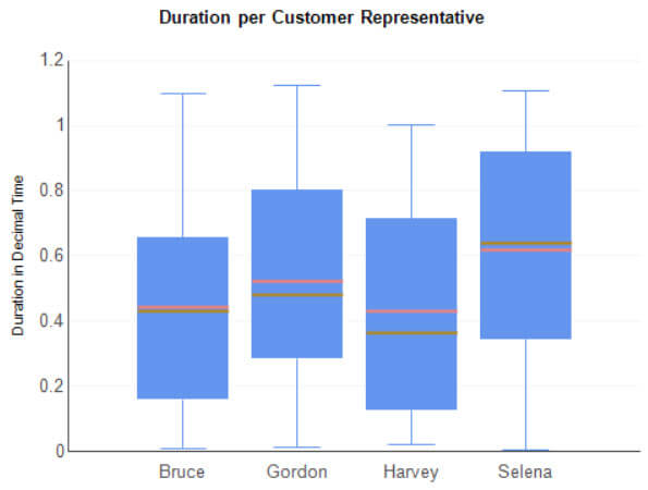
Because the open and close values for the candlestick series are populated with the same values, they are reduced to single lines. Due to this trick, we can change color and line weight of the median and mean lines in the box plot.
Next Steps
- If you want to take a deeper look at the report, you can download the .rdl file here.
- Extra reading material:
- Distribution Analysis using a SQL Server Reporting Services Box Plot Chart
- Mike Davis builds a box plot graph using Candlestick series and customized markers in his blog post How to Make a Box Plot Chart in SQL Reporting Services 2008 SSRS.
- An overview of Reporting Services Charts Tips


About the author
 Koen Verbeeck is a seasoned business intelligence consultant at AE. He has over a decade of experience with the Microsoft Data Platform in numerous industries. He holds several certifications and is a prolific writer contributing content about SSIS, ADF, SSAS, SSRS, MDS, Power BI, Snowflake and Azure services. He has spoken at PASS, SQLBits, dataMinds Connect and delivers webinars on MSSQLTips.com. Koen has been awarded the Microsoft MVP data platform award for many years.
This author pledges the content of this article is based on professional experience and not AI generated.
View all my tips
