By: Scott Murray | Comments (2) | Related: > Reporting Services Charts
Problem
As report designers working with SQL Server Reporting Services (SSRS) charts, what are some tidbits that will help solve common charting situations with pie charts, working with data outliers and rendering reports on my mobile phone?
Solution
Creating an eye pleasing, accurate, and clearly relevant chart requires using all the visual aids tricks available in SQL Server Reporting Services (SSRS). As with any tool, there are always work-arounds and hard to find properties and enhancements to help get your job done. In this tip, we will discuss:
- embedding pie charts
- using scale breaks
- best rendering methodology for sending reports to a mobile device
We will use the AdventureWorks database as the sample data for the report examples. As of the writing of the tip, a SQL Server 2014 version of the AdventureWorksDW sample database was not available; thus, I just upgraded the SQL Server 2012 version. The database is available on Codeplex at http://msftdbprodsamples.codeplex.com/releases/view/55330. Once you download and install the SQL Server database, we will subsequently use SQL Server Data Tools (SSDT-BI) for Visual Studio 2013 to develop our examples.
Embedding Pie Chart in SQL Server Reporting Services
Pie charts are a great way to display the proportion of a total for a specific set of data points. However, report developers are often asked to display more than a single pie chart, especially in a dashboard situation. The initial thought is that you would have to create a pie chart for each category and series that was requested. From a report development and maintenance standpoint, we can see that although that process is doable, it is a significant amount of work to create and maintain that many charts.
To visualize an example, let us create a pie chart for each income group (down the rows) and year (across the columns) in the AdventureWorks sales amount dataset; further, the pie slices should be broken out by the amount sold in each region. If the dataset has 4 years of data and 3 income groups, we would need to create 12 charts. Moreover, if we want a total column and / or total row pie chart (or both), we potentially are looking at 20 charts to create. The result would look something similar to the report part illustrated below.
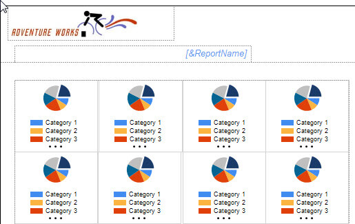
You can quickly see that creating such a grouping of pies could easily become a mammoth task to complete and ultimately keep up with as changes are requested. Furthermore, each chart would need its own header to distinguish what values are included. Fortunately, there is a better way. We can easily embed a pie chart (and most any other chart) within the data area of a tablix as shown below.
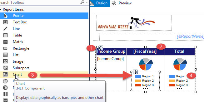
To create the embedded pie chart, first we add a tablix to our report. Next, as shown in Step 1 above, we add IncomeGroup from our AdventureWorks dataset as a row group, and in Step 2, we add Fiscal Year as a column group. Step 3, we drag the Chart Control onto the data area of the tablix and then run through the Chart Wizard.
The Chart Wizard allows us to select a pie chart and then to add Amount (from the dataset) as the data item and for our example, Region is added for our category. One other item to note; you normally need to adjust the size of the cell containing the chart. Finally in Step 4, we add a Total column and copy the chart from the details column to the total column.
Two or three charts are much easier to maintain as compared to twenty. Note that once you drop the chart into the data field, that field only contains the chart object and not the text box object (and related properties). The end result is displayed next.
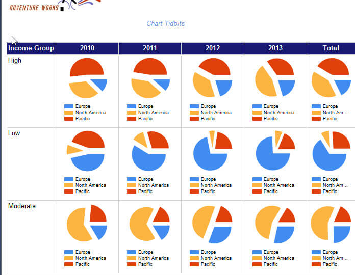
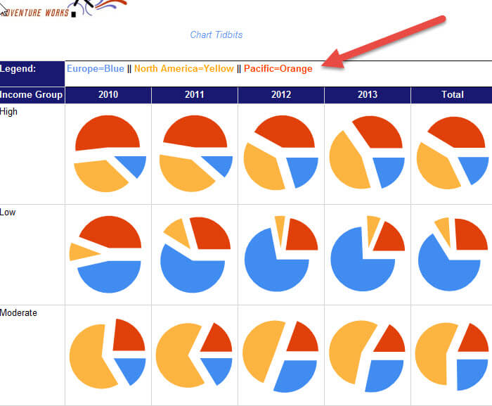
One last adjustment you could make would be to add a Legend header row and then remove the duplicate legends as illustrated below. Of course, you have to have a set number of categories to produce these results and know how many slices will be displayed.
Using Scale Breaks to handle outliers on a SSRS Chart
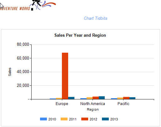
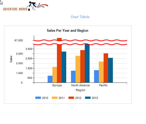
Often times when dealing with data that is viewed on a line or bar chart, one category or series will contain an outlier value. On regular charts, similar to the one in the below illustration, large outlier values, such as Europe for 2012 shown below, cause havoc when attempting to discern the non-outlier values. We know they are all less than 20,000, but not much else.
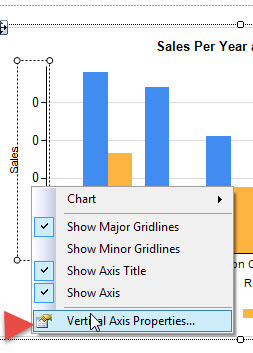
Fortunately, SSRS contains a property called a scale break. To enable a basic scale break, first right mouse click on the vertical axis, the vertical one in our example, and then select Vertical Axis Properties. To enable a scale break, you simply click the Enable Scale Break check box.
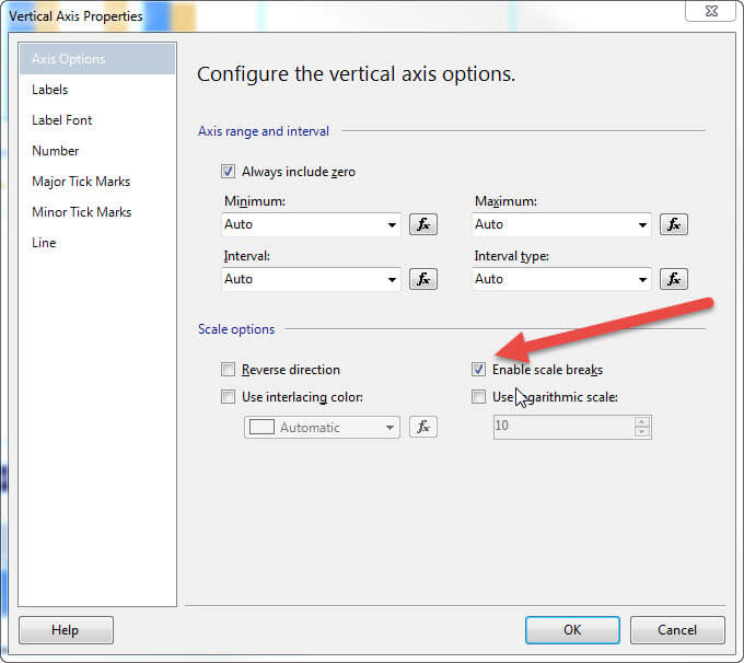
To get the full effect for the scale break, we need to adjust some additional ScaleBreakStyle Properties which are displayed in the next illustration. The properties are as follows:
- BorderColor, BorderStyle, BorderWidth - The first three properties control the scale break's border color, line style, and line width.
- BreakLineType - one of four values: ragged, wave, straight, or none that defines which line break will be displayed.
- CollapseSpaceThreshold - this value is a percentage value (i.e. you enter 50 which signifies 50%) and controls the minimum percentage that can be collapsed by the break.
- Enabled - Enables the Scale break (on / off switch).
- IncludeZero - Determines if scale should start at zero or not.
- MaxNumberofBreaks - Multiple breaks can actually be used and this property determines the maximum that can be included.
- Spacing - Controls the spacing of the scale break which is the spacing between the two scale break lines; higher values equate to larger scale break spacing. This value can help to delineate or emphasize the break.
For our example, I changed the border color to red and increased the line spacing to 8. As shown in the next figure, we can easily see the outlier value while also being able to clearly see where the rest of the values fall.
We can easily utilize scale breaks on other chart types such as a line chart, as shown next.
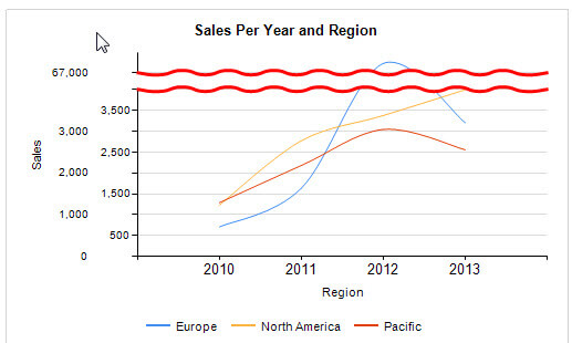
Scale breaks make easy work of outlier values.
Send a SQL Server Reporting Services Report to a Mobile Device
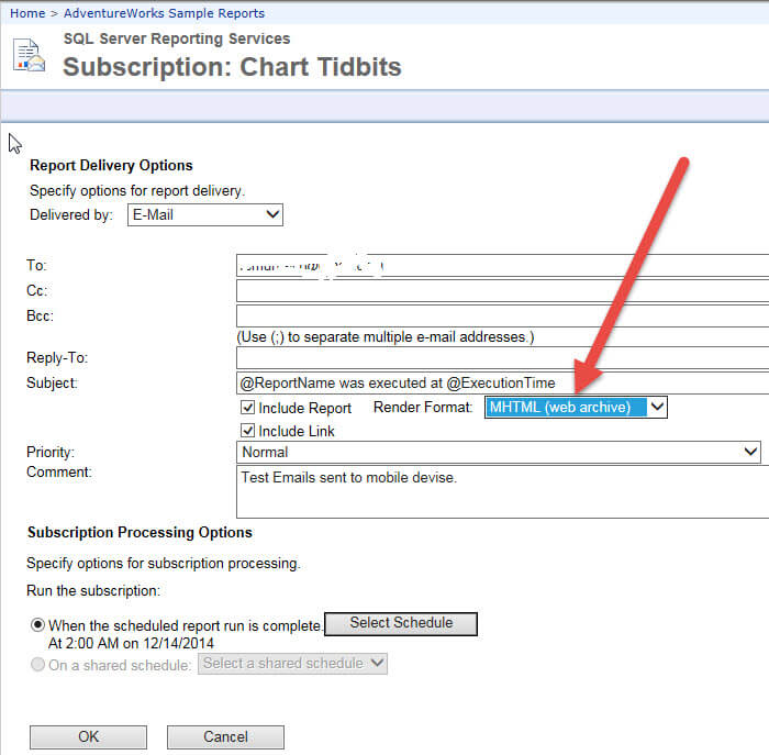
Our last tidbit for this tip pertains to sending reports to mobile devises. Certainly we could send the data in an attachment, and it would be formatted for that attachment. However, most folks who receive a report in email often would rather see the report in the email itself. A SSRS subscription includes a great avenue for completing this particular task; you can select a render format of "MHTML". MHTML stands for Mime HTML and is considered a web archive standard format. Basically the subscription sends the email in HTML format with the report embedded within the email, again all in HTML format. To enable this functionality, simply select the Render Format of MHTML (web archive) as shown in the subscription setup below.
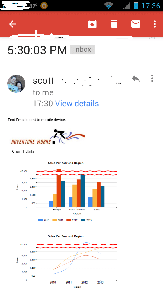
Now, when the user receives the email on their mobile device, the report is right there within the email. As noted on the below screen print from my android phone, those charts we have been using in the prior example display very nicely on the mobile device.
Of course, the one big caveat using this sort of embedded email is that you need to make sure the data is not confidential!
Conclusion
In this SSRS Charting tidbit, we covered three items which on their own were not enough for a single tip, but by combining them together, we can cover three very helpful hints.
First, embedding a chart within a tablix, provides report developers with an easy way to produce a large group of charts with a single tablix. The embedded chart actually takes the place of the data value within a tablix and is broken out according the individual row and column groups.
Next, we covered using chart scale breaks to provide report developers an easy way to show outlier values while also showing the appropriate detail scale for the remaining "normal" values in a set. By using a scale break, we can convey all dataset values in a compact chart.
Finally, we discussed using the MTHML render format to display a report on a mobile device. Most email apps on a phone or tablet, handle displaying MHTML emails without an issue and within the email itself.
Next Steps
- Test out these three new SSRS Charting options for yourself.
- Check out these additional resources:
- Creating a Chart in SSRS
- SSRS Charts Tips on MSSQLTips.com
- All Business Intelligence Tips on MSSQLTips.com


About the author
 Scott Murray has a passion for crafting BI Solutions with SharePoint, SSAS, OLAP and SSRS.
This author pledges the content of this article is based on professional experience and not AI generated.
View all my tips
