By: Scott Murray | Comments (9) | Related: > Reporting Services Charts
Problem
I have been using pie charts for SSRS, but they are hard to read and don't really give a good picture of the data. What options are there to make pie charts more visually appealing as well as more useful?
Solution
Plain old pie charts, similar to the one below, often get a bad rap in the data visualization world. Many folks discount their use in dashboards and explain they are poor for comparing datasets and can be used to "cover up" negative data points. These points are valid, but when used correctly, pie charts offer report developers with another tool in their visualization arsenal. In this tip we will cover ways to make a pie chart stand out as being both visually appealing and appropriately proportioned.
We will use the Adventure Works databases as the basis for our SSRS report development. The 2014 versions of the regular and data warehouse databases are available on Codeplex: https://msftdbprodsamples.codeplex.com/releases/view/125550. Once you download and install the SQL Server databases, we will subsequently use SQL Server Data Tools for Business Intelligence (SSDT-BI) for Visual Studio 2013 to develop reports. You can download SSDT-BI from: http://www.microsoft.com/en-us/download/details.aspx?id=42313.
Pie Chart Pizazz
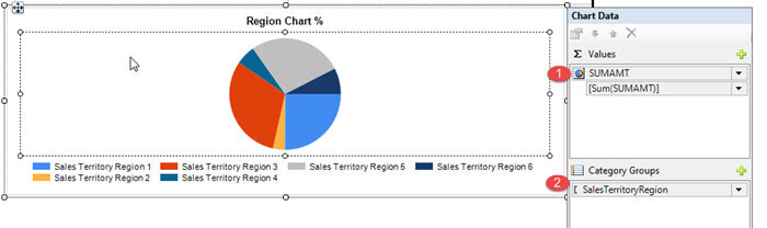
Creating your first pie chart is rather easy. From the toolbox, you will drag the chart object onto your design panel, and select pie chart as the chart type. Finally, you specify the value data point and the category group, SUMAMT and SalesTerritory, respectively in the below screen print. Note you can add multiple category groups and even add series groups, but each combination of multiple categories or category / series combinations are just considered another pie slice.
Shown next, the resulting pie chart is, rightly so, really not terribly informative or clear. These situations, of course, are what give pie charts a bad name.
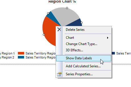
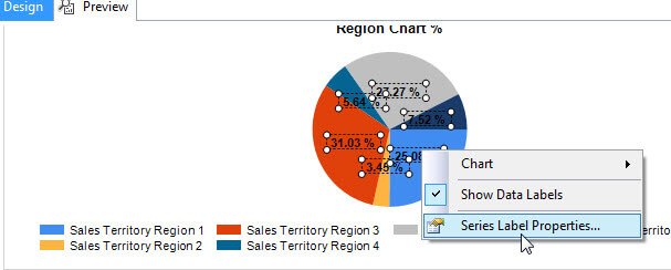
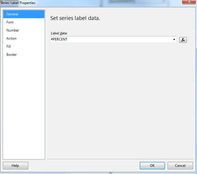
So what can we do to make the pie chart clearer? First, we should show data labels and second, we need to show the percent of the pie total for each category group. To turn on Show Data Labels, simply right click on the chart, and then click on Show Data Labels. Next, to show the percent of total instead of the raw number of each slice, we again right mouse click on the labels, select Series Label Properties. In the Label Data Field, we add the #PERCENT preset, which tells SSRS to show the percent of the total pie for each label.
These changes result in a better, but definitely not a perfect pie chart. The labels help to more equally compare each of the regions; however we can make it better.
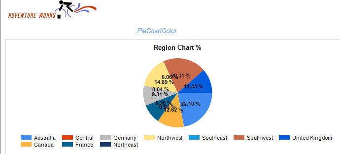
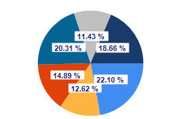
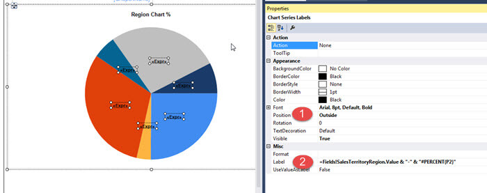
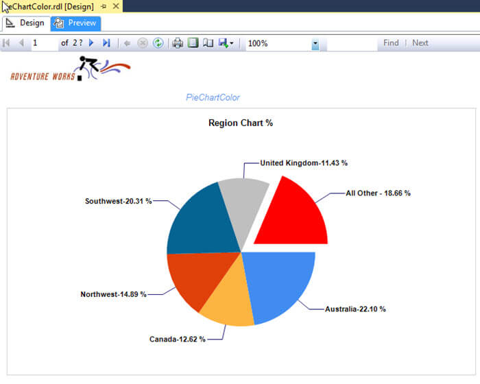
To make this pie chart better, we can begin to utilize some of the pie chart custom properties. First, as shown next, we click on the data label, and go to properties and change the position to Outside. This change puts the labels outside the pie slices. Next, we adjust the label expression to show both the category, shown in step 2 below, plus the percent. This expression looks like: =Fields!SalesTerritoryRegion.Value & "-" & "#PERCENT{P2}"; notice how we still use the #PERCENT data label, but put it within double quotes. We also tell SSRS to format it for P2, or percent with two decimal places.
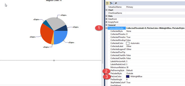
Finally, we click on the pie chart itself, go to properties, and then CustomAttributes. We adjust the PieLabelStyle to Outside and select a PieLineColor which defines the color going from the pie slice to the label.
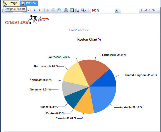
We now have a much better looking pie chart, illustrated below, which addresses many of the issues with a basic pie chart.
The final result of our pie chart is displayed next.
Make a Pie Chart Even Better
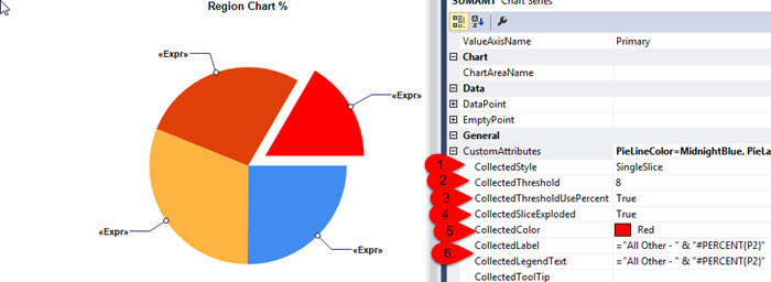
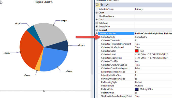
Wow, what an improvement, but we can make it even better. Notice how the Northeast, Central, and Southeast regions are all less than 1%. It would be beneficial to combine these under one "slice of pie". To complete this process, we need to adjust some additional CustomAttributes properties for the pie chart as follows:
- CollectStyle needs to be set to SingleSlice
- CollectedThreshold is the value below which all the slices will be combined
- CollectedThresholdUsePercent determines whether the value comparison is a raw number or percentage
- CollectedThresholdExploded tells SSRS to exploded out the rollup slice (see red slice in below screen print)
- CollectedColor sets the color of our rollup slice
- CollectedLabel and CollectedLegendText sets the text which will be shown for the collected slice for the label and legend
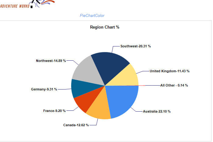
You can see in the first screen print below that we collect all the values less than 8% under the All Other pie slice. To see the CollectedStyle better, in the second illustration, the threshold is set to less than 10%).
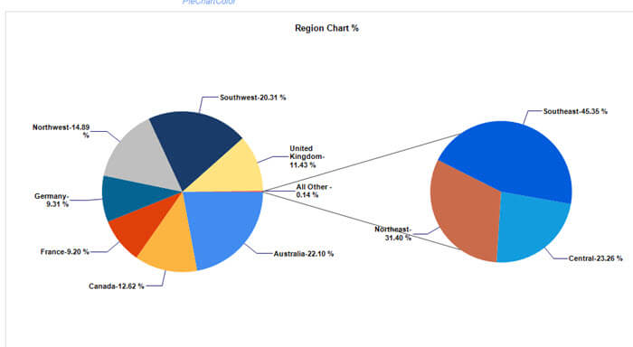
We round out the CollectedThreshold features by adjusting the CollectedStyle to CollectedPie. This change will create what I call the double pie effect which allows for drilling into the "All Other" data point.
The CollectedPie property results in the below screen
prints which gives us both the high level details and drills into the values that make up the All Other category.
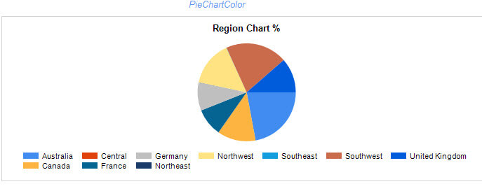
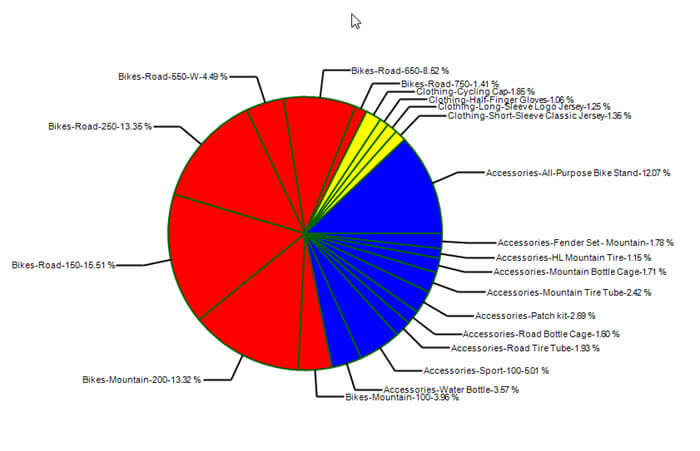
One other way we can use colors and multiple
categories, is to use the same slice color to reference the main
category group while at the same time still breaking up the slices. To
help
clarify this situation, please review the below screen print. You will
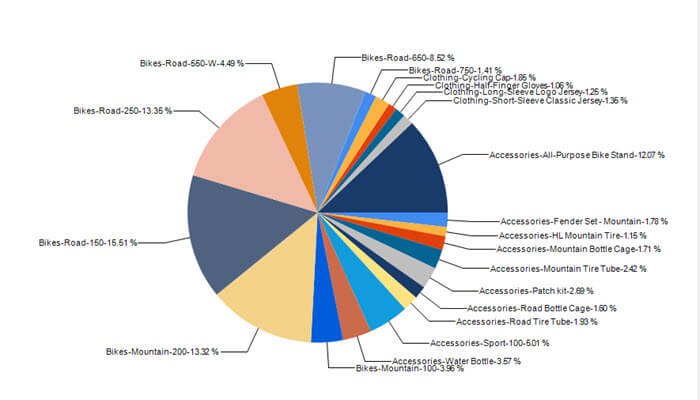
notice there are a large number of slices broken out by the major
categories of Bikes, Clothing, and Accessories; notice how the slices
are ordered so all the main product category slices are together. These
categories are
further refined by the product models. This chart is a little busy with
all the colors. As opposed to using the above technique of creating an
"All Other" category, we will instead use some color techniques to
achieve beneficial results.
Our first step is to select the pie chart, as
shown below, and then edit the Color Property. This property sets the
color of the pie slice.
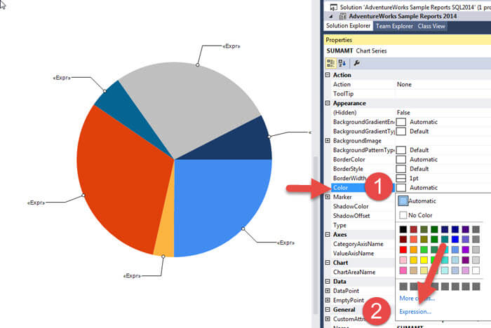
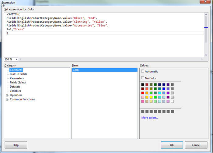
Subsequently, we "hard" code the color property
of the pie slices based on the Major Product Category, as shown below.
To assist with this color coding in large data sets, you could actually
have a color table which join with your query.
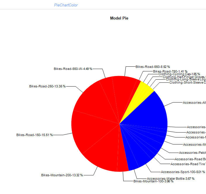
This results in pie slices being all the
same color, as illustrated next; now we need to add a prominent border between
slices to distinguish between slices
Adding a border color of Dark Green is shown next.
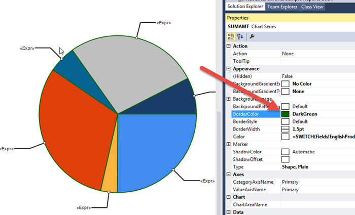
This change results in a much more
defined pie chart (barring my poor color selections!!) when you want to
display many values as shown next.
One item that is beyond the
scope of this particular tip is to code the slice color palette to
adjust the shade of a color based on the percentage within the pie
chart as described in this MSDN article: http://blogs.msdn.com/b/davidlean/archive/2009/02/17/sql-reporting-how-to-conditional-color-3-4-tint-shade-functions.aspx.
Conclusion
In this tip we covered some of the various ways to liven up a pie chart to enhance its clarity and effectiveness. Two particularly helpful enhancements utilize the CollectedStyle attribute to either rollup small values into a "single slice" or to rollup a group of values into a "secondary pie" chart. Furthermore using clear labels and the #PERCENT function provide additional precision to your pie charts.
Next Steps
- Review all the SSRS Charting MSSQLTips - https://www.mssqltips.com/sql-server-tip-category/175/reporting-services-charts/
- Create Custom Colors for SSRS Charts - https://www.mssqltips.com/sqlservertip/2797/different-ways-to-create-custom-colors-for-charts-in-sql-server-reporting-services/


About the author
 Scott Murray has a passion for crafting BI Solutions with SharePoint, SSAS, OLAP and SSRS.
This author pledges the content of this article is based on professional experience and not AI generated.
View all my tips
