By: Siddharth Mehta | Comments (3) | Related: 1 | 2 | 3 | 4 | 5 | > Reporting Services Charts
Problem
Factual data is generally analyzed from a lot of different dimensions. Because of this Grid based reporting is not an ideal reporting format to support analytical needs. Visual data representation like charts, graphs, and gauges are one of the best ways to report data that require comparison analysis. The challenge with this form of data representation is that every visualization has a modest limit to contain data points, after which the visual representation becomes uninterruptable to the human eye. Therefore the need is to have a scalable information visualization design that can report quantitative multi-dimensional data while still preserving its analytical value.
Solution
The more attributes you try to contain within a chart/graph, the more data points there are in a single chart which distorts the scale as well as size of the data points in the graph. So the solution is to separate different attributes / groups on a different axis and add only required data points into the visualization. This might sound completely confusing without an example, so let's try to understand the problem as well as the solution with an example.
Step 1:
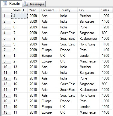
Create a dataset as shown in the below screenshot. This dataset is of Sales, having Year, Continent, Country and City as its attributes. There are 18 records in this dataset.
Step 2:
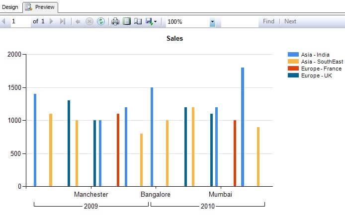
Suppose we want to contain this data in a bar chart. Without grouping the data there would be 18 bars on the graph, and if you have the most granular level attribute to report in the chart i.e. City in this dataset, you would always end up with 18 bars on the chart. Generally a dataset like this in real life would be much larger. Try to analyze the data from the below representation.
Step 3:
Reporting data using small graphical representation in pivotal form is known at lattice charts and a trellis chart is a form of this. We will report from our dataset in this form. To report this data and make it analyzable, with all the related attributes, we need to separate the attribute being reported on the chart and limit the chart to represent only actual data i.e. Sales and most granular attribute i.e. City.
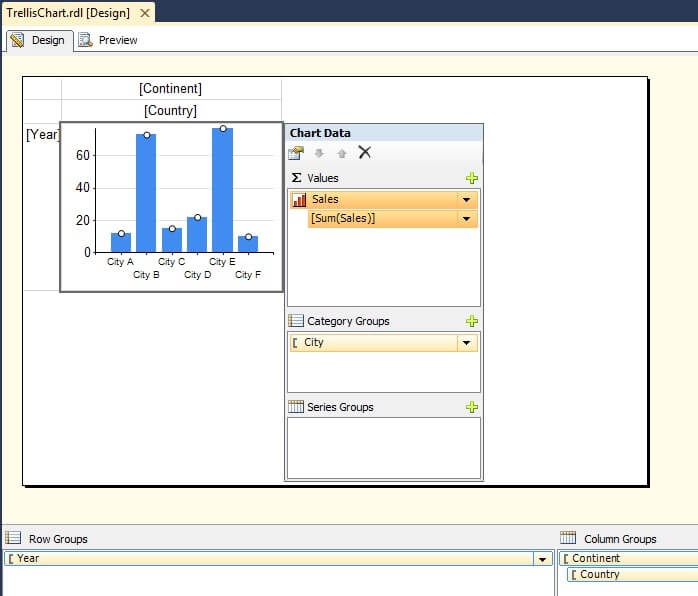
Create a new SSRS report. Add a matrix control to the report, then add grouping by Year on the rows axis and grouping by Continent -> County on the columns axis. Add a chart on the Data area and configure it to contain Sales and City fields on Values and Category area respectively. After this is done, your configuration should look exactly like the below screenshot.
Step 4:
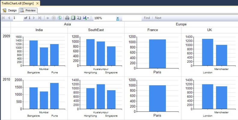
Execute and preview the report and you should find the output as shown in the below screenshot. If you analyze carefully, the data is analyzable using any attribute with every possible combination. This technique of information visualization design is very scalable. Even if more attributes get added like Product Category, Orders etc, the same can be put across the desired axis and the report would still remain analyzable. If that same volume of data was represented on a single bar chart, the reported data would become completely unintelligible.
Next Steps
- Scale of the chart is auto scale. Try to configure a fixed scale of the chart, so all charts have a uniform scale.
- Try to use a different chart in place of the bar chart for a different form of analysis.


About the author
 Siddharth Mehta is an Associate Manager with Accenture in the Avanade Division focusing on Business Intelligence.
This author pledges the content of this article is based on professional experience and not AI generated.
View all my tips
