By: Knox Cameron | Comments | Related: > Sharepoint Design
Problem
You want to quickly implement SharePoint 2010 as an Intranet solution. You don't need to turn it into a fully customized web site. You don't want to take the time to build and test custom master pages, and you don't want to hire in development resources. But it does need to look like it belongs in your organization, with a corporate color scheme and banner.
Solution
SharePoint provides some basic branding capabilities that don't require developers and don't involve customizing master pages. Even if you intend going down that track in future, these capabilities provide a quick and easy starting point.
We're going to look at three levels of basic branding that can be achieved without custom master pages.
Themes are a great way to package up a color scheme and apply it to a site. A site owner or designer can select colors in an easy-to-use interface and apply them to the site without touching underlying technical components like CSS files and master pages. And developers can build master pages and CSS files which are not tied to a particular color scheme.
The next step is to add a custom logo and title to your site. Again, this can easily be achieved through the web user interface.
The final level is to change the banner background through the use of an "Alternate CSS" file. You can also use this where required to make other adjustments to suit your branding.
Of course, if you need to add new content onto all pages, like a footer with copyright information, or you need to make significant changes to page layout, you will need to create custom master pages. But if you can avoid that, then you greatly reduce the risk of causing issues with SharePoint functionality, and therefore reduce the need for extensive testing.
In this tip, we will examine how the colors in a theme are used in SharePoint, and go through the steps to create and apply a theme. We will then look at how to create a custom logo and title and apply it to a site. Finally, we will look at how to use Alternate CSS to apply a custom banner background, and if required modify the appearance of other page elements to suit.
Note that themes and the custom site logo and title are available as part of SharePoint Foundation. However, alternate CSS is only available with SharePoint Server.
Themes
Themes in SharePoint 2010 work differently from 2007, and there is no migration path. They do less (for example, they can no longer apply a custom background image or custom CSS styles), but are much easier to build. In 2010, they focus purely on color, and the idea is that they allow you to manage color independent of page layout.
Themes in SharePoint 2010 are linked to themes in Microsoft Office on the desktop. Until Office 2003, each of the main components of the Office suite managed colors in different ways, but from Office 2007 onwards they have standardized on the color model that originated in PowerPoint.
Any Excel developer will tell you that this represents a "dumbing down" from previous versions! In particular, you can only specify a very limited range of colors in the theme. Office will then generate additional shades based on an internal algorithm over which you have no control. If you have corporate design standards that specify particular approved shades, there is no way to provide these in the interface or prevent a user selecting non-approved shades.
But from a SharePoint perspective, the system works pretty well, and by creating custom style sheets you can get more control under the covers than you can get on the desktop.
Here, we will look at how the appearance of a SharePoint is changed when you apply a theme, which is poorly documented in general. We will then look at how you can create a theme using PowerPoint and apply it to SharePoint.
- Note that, although themes are available in SharePoint Foundation, they are not applied for anonymous users. As a partial workaround, you can use a content editor web part to manually put in a reference to the theme stylesheet. See Customizing the blog - part 1 for more details.
What is in a theme?
A theme consists of 12 colors and two fonts, as you can see in the Site theme page in site settings (the "Customize Theme" section is displayed by SharePoint Server when you are at the top level site in a site collection):
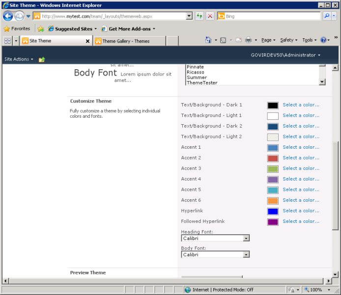
The colors are:
- text/background dark 1 and 2, and light 1 and 2;
- accents 1 to 6;
- hyperlink and followed hyperlink.
The fonts are a heading font and a body font.
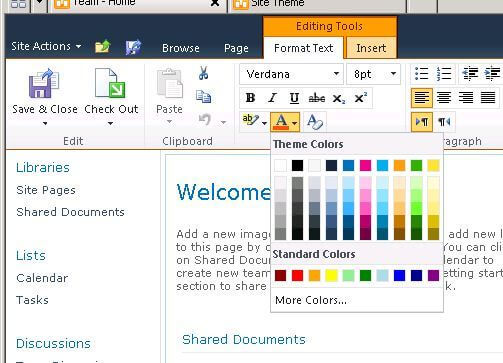
Office generates an additional 5 shades of each color (Lightest, Lighter, Medium, Darker, Darkest) which are shown in the themes user interface. When you edit text, the color selector shows the 10 base colors (excluding the hyperlink ones) plus the additional 5 shades of each, as well as some standard (non-theme) colors.
Where are these colors and fonts used?
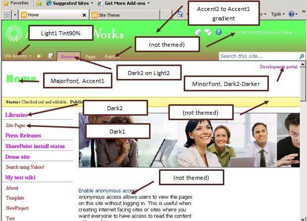
To find out, I created a truly horrible theme with garish colors, so I could see where they were used. Here is the theme, with annotations on how the colors are used on that page:
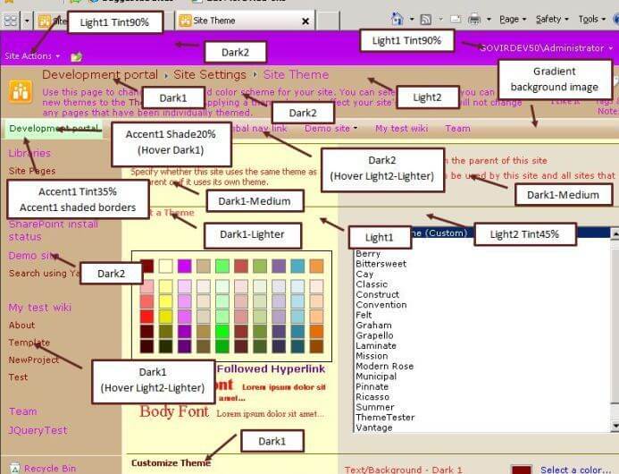
Having created a further 48 shades based on the 12 you specified in the theme, Microsoft goes on to create even more shades on the fly using the 'shade' function to darken or the 'tint' function to lighten one of the 12 base colors. They also recolor images to create gradients.
Contrary to what you might expect, 'shade 20%' darkens a lot whereas 'shade 80%' only darkens a little. Similarly 'tint 20%' lightens a lot and 'tint 80%' lightens a little. Effectively, the percentage indicates closeness to the original color.
It quickly becomes obvious that the color shading is too subtle to pick up visually. I used the Internet Explorer developer tools to identify the CSS classes being applied to the content, and a cross checked those with the various style sheets installed by SharePoint.
In these screen shots, I am only calling out the main examples of color usage. There are dozens of other places in the user interface where theme colors are used - far too many to attempt to list them all here. Many of them are subtle details, such as top, left, right and bottom borders of a selected menu item.
We could summarize the overall effect as:
- Lightened Light1 on Dark2 for the very top bar
- Dark1 and Dark2 on Light2 for the ribbon bar and left navigation area
- Accent1 for the selected item in the global navigation
- Shades of Dark1 on Light1 for the main body
If we look at the home page of a team site, it's generally the same, although with some Dark2 in the body, and some use of the other accents and shading.
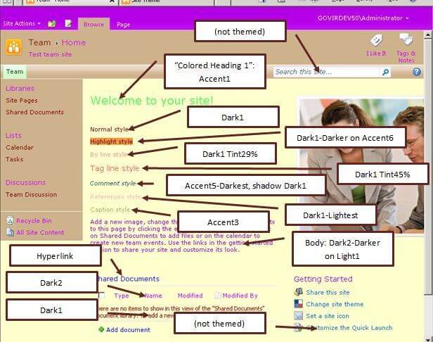
A few things to note here:
- The default heading in the page content uses the rich text editor "Colored Heading 1" style, even though that style is not available in the editor when you edit the page - if you edited the page and deleted the heading, I don't know how you would ever get it back!
- The other listed styles are the ones available from the Styles drop-down in the rich text editor. If you don't select a style, you get the default body style, which is different from "Normal".
- A couple of elements on the page (the search box and some default content) seem to have hard-coded color values that aren't linked to the theme.
- No use is made of the fonts incorporated in the theme.
Now let's look at a publishing site, which is using the "nightandday.master" master page.
Here, for the first time, the fonts from the theme are being used. The heading font is used for the page heading (h1 style) and the body font is the default font for text in the body of the page.
However there are even more elements not themed, including the background color of the main page body (white), the default text color (very dark grey) and the font of the default content. There is probably an assumption that if you are building a publishing site, you are more likely to invest in detailed customization, including custom master pages and style sheets, rather than simply applying a theme. In fact, unless your company is called "AdventureWorks", you are going to need to at least replace the logo image in the site.
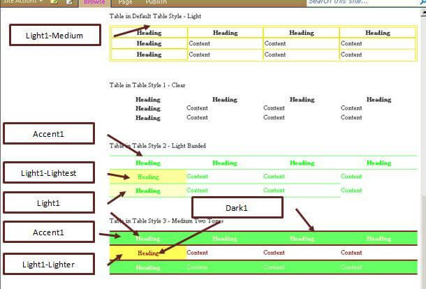
As you edit content on a publishing page, you will come across more use of theme colors in the rich text editor. There are four table styles which use Light1, Accent1 and Dark1.
There is also an additional set of styles called "Markup Styles" that provide two sets of heading styles, 4 callout styles, horizontal rule and a paragraph style.
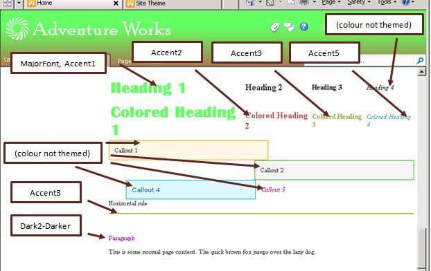
Heading level 1 is the only style that uses the heading font from the theme. The 'colored heading' styles use various accent colors. However, the four 'callout' styles use fixed colors.
Color and font usage summary
When you are selecting colors and fonts for a theme, you need to be aware of how SharePoint generally uses them:
- Dark1, Dark2, Hyperlink and Followed Hyperlink are used for most text, including some shaded variations
- Light1 and Light2 are used for most backgrounds, including some shaded variations
- Accent1 is used frequently for highlighting, both as a text color and as a background
- Accents 2 to 6 are used very little
- The heading font is only used for level 1 headings in publishing pages
- The body font is used for body content on publishing pages, but most other text remains in a system font
Creating a theme
You can create a theme using Word, Excel or PowerPoint, 2007 or 2010. The process is:
- From the Design tab in PowerPoint (or the Page Layout tab in Word or Excel), use the Colors drop down in the Themes group to select one of the existing color schemes that is similar to what you want
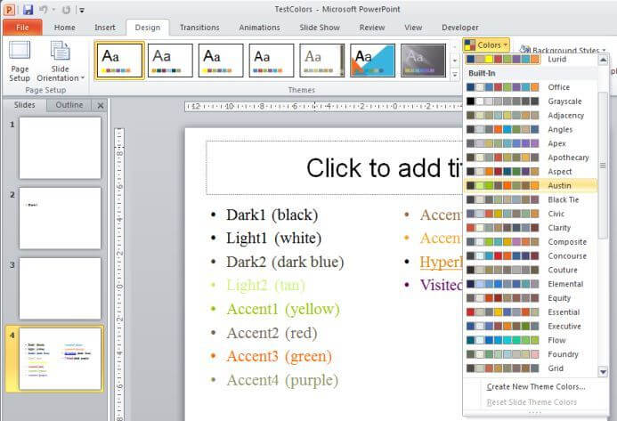
- Select "Create New Theme Colors..." from the bottom of the same drop down. This will show you the currently selected colors and allow you to select any of them for editing.
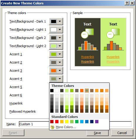
- You can use the "More Colors..." option to specify an exact value for a color in RGB
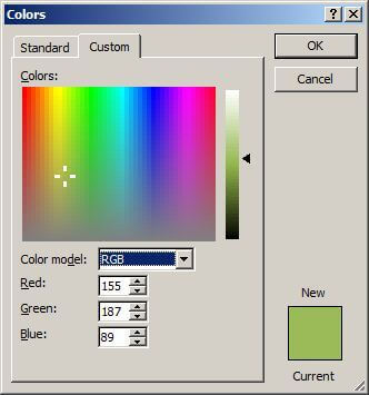
- One issue you may encounter is that Office uses decimal values between 0 and 255 for each of the red, green and blue components of the color. If you have been given color values to use on a web site, they will typically be in hexadecimal format, something like "#FA9A00" for an orange, which is how they would be specified in a CSS stylesheet. Fortunately, the calculator in Windows 7 can do hex conversions. To convert this code to decimal for Office, you would:
- Open Windows calculator, and select Programmer from the View menu
- Select the Hex radio button on the left
- Enter the first two digits after the #, which is the value for red in hex notation; in this case FA
- Select the Dec radio button on the left to see what this value is in decimal, in this case 250. Select 250 as the value for red in PowerPoint.
- Repeat this process for 9A to find that the value for green should be 154. Hopefully, it is obvious that the value for blue should be 0!
- Alternatively, a search engine will find you many pages on the net that will do RGB hexadecimal to decimal conversions. These will be much faster to use if you have more than one or two conversions to do, as you can convert all three values in one go.
- Once you have the colors right, give your color scheme a name at the bottom of the dialog, and press save. Note that this has only saved your colors - you haven't yet created a theme.
- If you need to go back and edit your colors, you can right click the scheme in the Colors drop-down in PowerPoint, Word or Excel, and select "Edit...".
- You also need to select the heading and body fonts for your theme. To do this, follow a similar process using the Fonts drop-down, immediately below the Colors drop-down.
- Once you have the colors and fonts right for your theme, you can save it as a .thmx file. To do this, click the "More" down arrow at the right of the theme gallery in PowerPoint (or just open the theme gallery in Word or Excel).
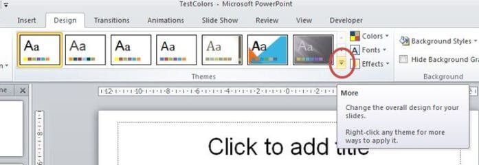
- At the bottom of the expanded theme gallery, select Save Current Theme...
- By default, it will save into C:\Users\{your user name}\AppData\Roaming\Microsoft\Templates\Document Themes. That is where the theme should go if you want to be able to use it in Office on your desktop, but you can also browse to a location where you will be able to find it more easily for uploading to SharePoint.
Applying the theme to SharePoint
You can upload the theme into SharePoint through the site administration web pages. To do this:
- Go to the top-level site in your site collection
- Themes are stored in a gallery there for the whole site collection
- Select Site Actions > Site Settings
- Under Galleries, select Themes
- Select the Documents tab in the ribbon, then select Upload Document
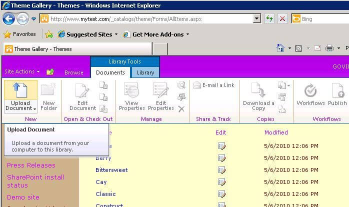
- Upload the .thmx file you saved from PowerPoint
- Once the file is uploaded, go to Site Actions > Site Settings and select Site Theme under Look and Feel
- Your new theme will appear in the list so you can select it and apply it to the current site (and optionally sub-sites as well)
Site logo and title
Having used themes to apply a color scheme to your site, the next step is to add your corporate logo and title to the banner.
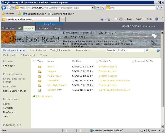
In a publishing site, a good starting point might be to grab the Adventure Works logo and title, to use as a template. That way, you know the size will work well in SharePoint. Open the Style Library in the top level site and navigate into the Images folder. There you will see a number of images used by the nightandday master page, all named with nd_.
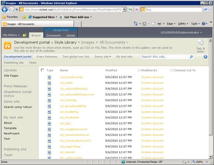
From the context menu for nd_logo, select Send To > Download a Copy and save a copy on your local machine.
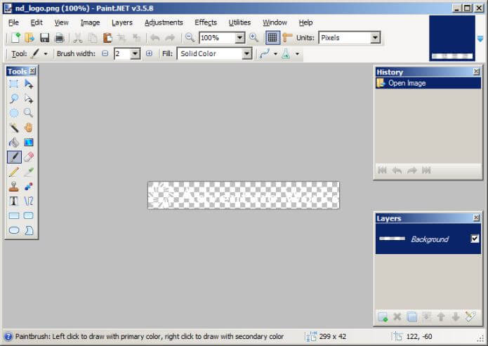
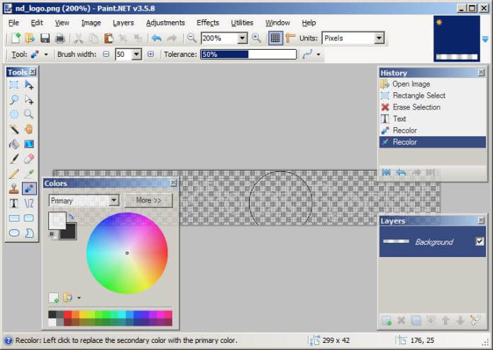
If you open this file with Paint, you will just see a blank image, because the logo is white on a transparent background. You need to use a program that understands transparency, such as the (free) Paint.NET. With this, you will see the Adventure Works logo in all its white glory.
On a non publishing site, where this logo is not available to copy, create a new image about 300 X 40 pixels in size.
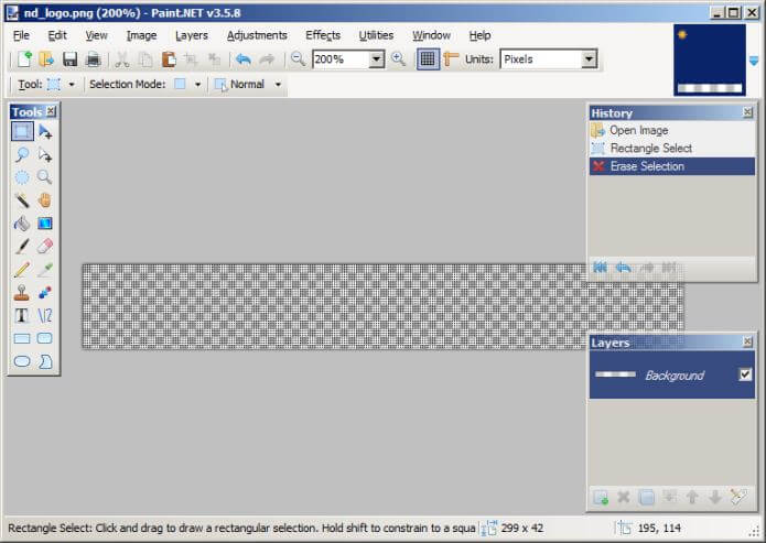
Replace this with your own logo and title in a similar style. First, zoom in to 200% or 400% (using the drop down in the middle of the toolbar), then use the rectangular select tool (the first one in the tool palette on the left) to select the whole picture, then press the delete key to erase Adventure Works.
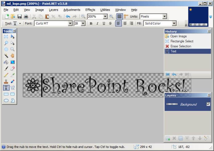
Next, select the text tool, and experiment with typing the site title until you find a font you like in a size that neatly fits the space. Also copy in your corporate logo. Here, I used an atom symbol from the Segoe font as a logo at the start (pasted in from the Character Map system tool in Windows).
If you want to make the logo white like Adventure Works was, select the recolor tool, make white the primary color and black the secondary color in the color palette, increase the brush width to 50, and drag across the image to change the black into white.
However, SharePoint tends to show the logo on light backgrounds, so a white logo appears rather washed out. I therefore made the text black and the logo orange.
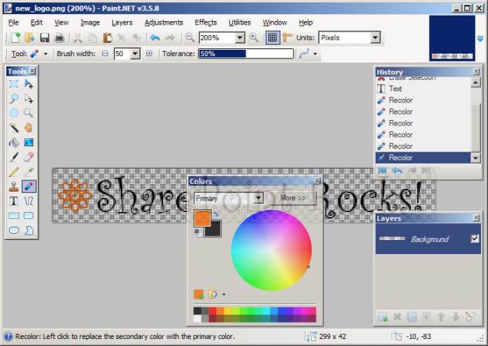
Save your new logo to your computer using the name new_logo.png, then upload it to the images folder in the Style Library.
Now we need to tell SharePoint to use this as the site logo. To do this, go into Site Actions > Site Settings, then select "Title, description, and icon" in the Look and Feel section.
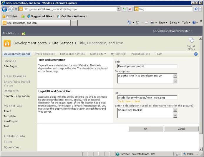
For the URL, enter the path to the new logo file in the style library. You can use the link provided to test that the path is correct. If you left the logo as white on a transparent background, the preview test page will appear blank, but as long as you don't see an error message presumably the path is correct. Press OK, and voilà! Our custom logo has replaced the standard little orange icon in the banner.
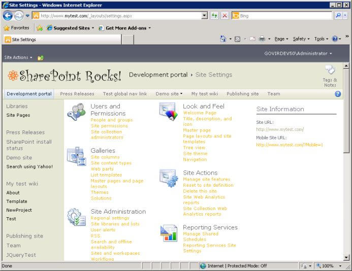
On the site home page, our custom logo has also replaced Adventure Works.
Banner background
For the final stage of customization, you will replace the background image in the banner. To do this, you will create a simple custom CSS file. You will then use the Alternate CSS feature of SharePoint Server to attach it to the site.
- Unfortunately, this feature is not available in SharePoint Foundation, so you would need to customize the master page to reference a custom CSS file. That is beyond the scope of this article.
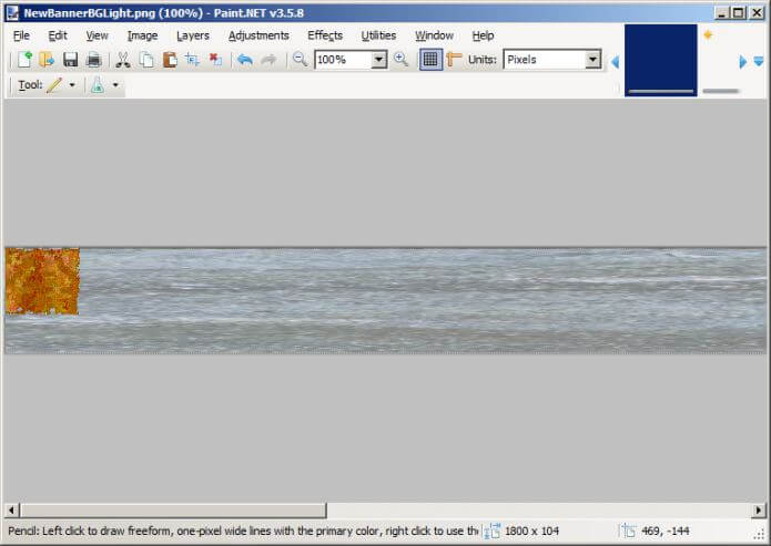
First you need a banner background image. For this example, I combined some elements from images in the library in Microsoft Office online. The image is not designed to repeat, so I edited and stretched it using Paint.NET to be 104 pixels high and 1800 pixels wide (to fill the screen width even for a large monitor). I kept the graphic on the left within the top 80 pixels, as that is the area typically visible and clear of other UI elements like navigation buttons.
- For simplicity, we will just use an image as-is. It is possible to tell SharePoint to recolor an image to match the theme.
- In this example, I have saved the image as a PNG. However, that is not a good format for this kind of image. By default, it ended up being 360KB in size, which creates too much overhead on the site. Saving it in JPEG format yielded an image that is just 36KB in size.
Upload your banner image to the images folder in the style library in your site. Here is a link to mine if you want to use it as a test example.
You need to create the CSS file to reference your banner. CSS files are just plain text, so open NotePad and copy in the following:
.ribbonbackground, .s4-title {
background:url('/Style%20Library/Images/NewBannerBGLight.jpg') no-repeat 0 0 !important;
}
This applies the background image to page elements tagged with styles "ribbonbackground" and "s4-title". These are the banner areas in the nightandday and v4 master pages respectively. The "!important" seems to be required to override the style in nightandday, because it has its own stylesheet which otherwise takes priority over the site's alternate CSS. Edit the URL of the background image as required if you called your background image something different.
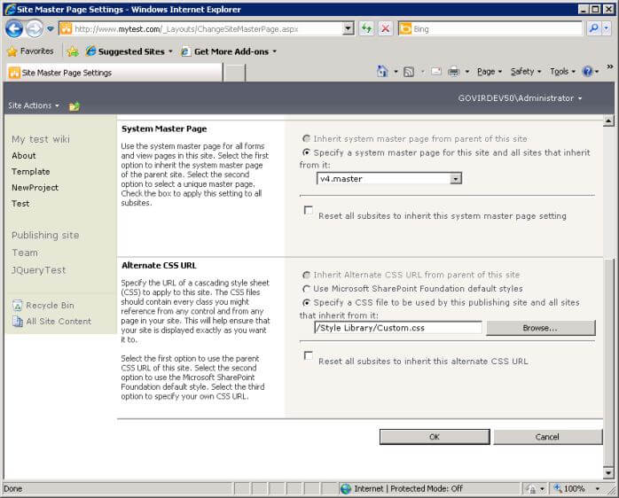
Save this file as "Custom.css" on your computer, then upload it to the top level of your style library. Then go to Site Settings and select Master page in the Look and Feel section. At the bottom you will find the option to enter a URL for an alternate CSS for the site. You can use the Browse... button to locate the CSS file you uploaded to the style library.
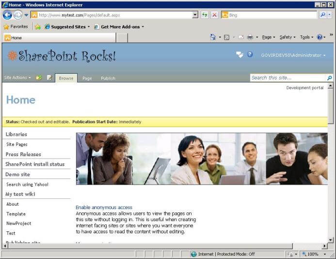
Select OK and your new banner will appear on system and list view pages:
And on publishing pages:
An issue you may encounter, particularly since we did not attempt to re-color the image using the theme, is text disappearing into the background image in the banner. You can particularly see this with the grey "Site Settings" link on the system page above.
The solution is to identify the style being used, and override it in your custom CSS. You can use the Internet Explorer developer toolbar (F12) to identify the style, then add the necessary commands to override them to the CSS. Here are commands you can add to the end of your Custom.css that will change most of the text in the banner in non-publishing pages to black:
.s4-title h1, .s4-title h1 a, .ms-socialNotif-text {
/* [ReplaceColor(themeColor:"Dark1")] */
color:Black;
}
.s4-title h2, .s4-title h2 a, .ms-ltviewselectormenuheader .ms-viewselector A {
/* [ReplaceColor(themeColor:"Dark1")] */
color:Black;
}
.s4-title .s4-pagedescription {
/* [ReplaceColor(themeColor:"Dark1")] */
color:Black;
}
.s4-titlesep {
/* [ReplaceColor(themeColor:"Dark1")] */
color:Black;
}
- I have included the commands to replace the color black with the theme color 'Dark 1', so you can see what they look like. However, these will not take effect unless you save the stylesheet to a folder called "Themable", which I have not done in this example.
Once you save the updated CSS into the style library, this will change the banner text to black:
Next Steps
- Build a color scheme and apply it to your site.
- Put together a logo and background and apply those to your site.
- If you want to package a theme, master page and CSS for deployment using Visual Studio, see Applying custom branding to cloud hosted SharePoint 2010 site | Yaroslav Pentsarskyy on SharePoint Development. This shows how to build a package that can be deployed as a sandboxed solution.
- See SharePoint MySite Branding for the steps to build a feature to apply custom branding to My Sites
- If you want to know more about customizing SharePoint's look and feel, including details on using style sheets to re-color images and building custom master pages, Wiley Publishing's SharePoint 2010 Branding and User Interface Design is an excellent reference.
- Check the article on Creating SharePoint Web Part Pages


About the author
 Knox Cameron
This author pledges the content of this article is based on professional experience and not AI generated.
View all my tips
