By: Scott Murray | Comments | Related: > Power BI Charts
Problem
What is a Power BI Ribbon Chart? How do I build a Power BI Ribbon Chart? Can you provide any examples of Power BI Ribbon Charts?
Solution
The breath and variety of charts and graphics available in Power BI continues an upward spiral. One recent addition is the Ribbon chart. This chart is really a combination or amalgamation of several other charts, specifically a stacked bar or column chart along with a line chart. The neat part is that the ribbon actually shows you the change in the rank as the ribbons, like a line chart, can and do cross each other’s path to show differences in rank and size. The key for the chart is showing the rank change over time with the highest rank value being on the top of the ribbon. Furthermore, unlike a stacked bar or column chart (or area chart) where all the categories are ordered the same on each chart, the ribbon chart “moves” the placement category measure based on the rank of measure value for a category.
Ribbon Chart
To get started you will need to download Power BI Desktop from https://powerbi.microsoft.com/en-us/desktop/. Power BI Desktop is the client application that is available for you to design Power BI Dashboards and Reports on a local desktop. Once Power BI Desktop is installed, we can go ahead and start developing a Ribbon chart. We are going to make use of the Wide World Importers databases for our sample data. You can download the Wide World Importers database from https://github.com/Microsoft/sql-server-samples/tree/master/samples/databases/wide-world-importers.
In order to develop the ribbon chart, three main data components are needed:
- Measure – Value of the data, generally this item would be something like quantity sold or sales amount.
- Category – Category is the field by which you want to see the ranking, this item would normally be items such as sales persons, sales promotion group, or maybe a state or province.
- Series – Series field defines the x axis that should be used on the ribbon report, most often this field would be a date or time field as you are wanting to see the ranking and changes over a period of time.
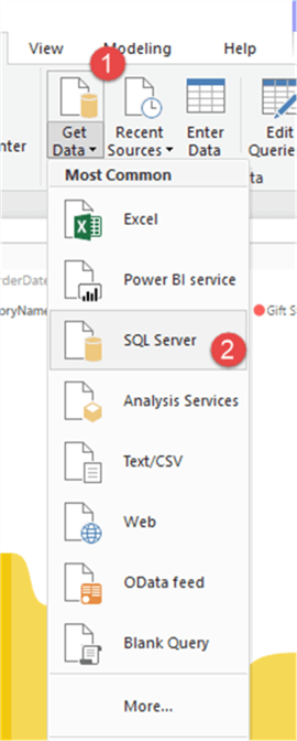
For this tip, we will use Sales Data in the Wide World Importers DB. Specifically, the measure value will be the Quantity in the Sales Order Lines table, the series will come from the Order Date field in the Sales Orders table, and finally the Customer Category Name will come from the Sales Customer Category table. We will initiate the data retrieval process using the Get Data button and selecting SQL Server as the source.
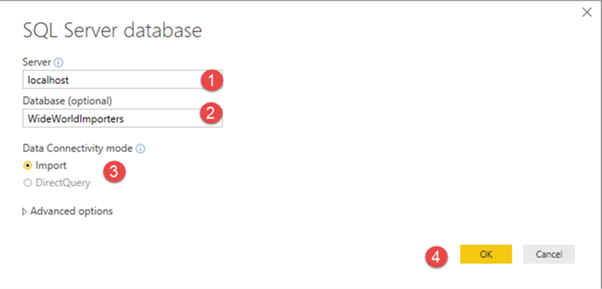
Subsequently, we indicate the server and database name as illustrated below.
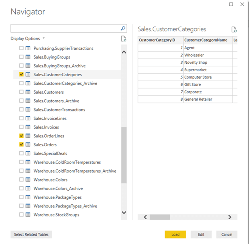
Next, we pick the needed tables from the data source and select load.
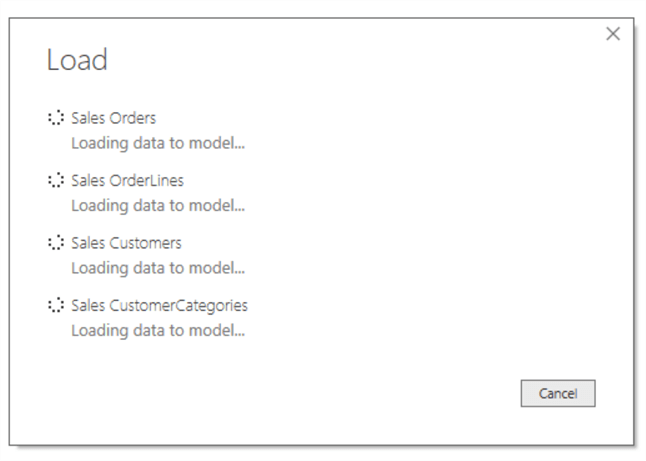
Power BI will formerly load the data and return the table / field list to the main Power BI screen which in turn allows us to work with the data.
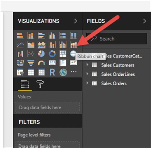
Next, the Ribbon Chart is selected from the visualization list which places it on the design grid.
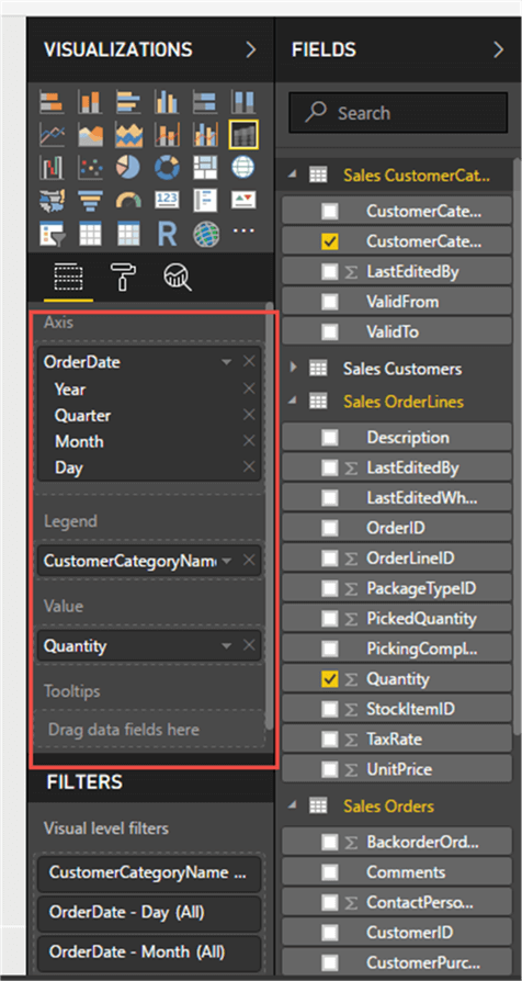
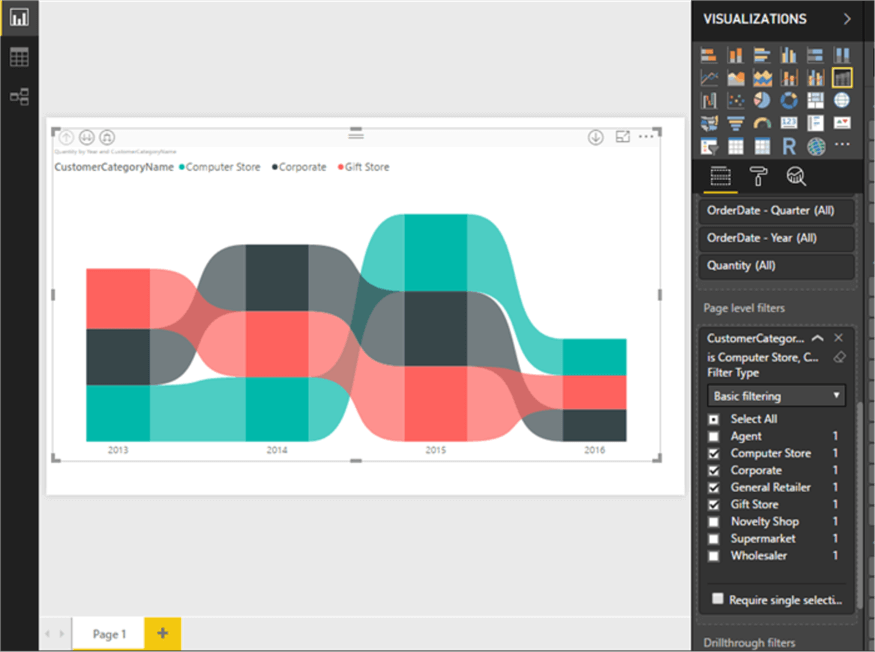
The succeeding step is to add the fields to the appropriate property: OrderDate to Axis, CustomerCategoryName to Legend (aka category) and Quantity to Value (aka measure).
In just a few steps we created a handy Ribbon chart showing the ranking of Customer Categories. Specifically, as shown below, we can see the yellow area which relates to the Novelty Shop category that has the highest sales quantity per year while, for instance, the Gift Store category fluctuates from 3rd highest in 2013 to 2nd lowest in 2014 to lowest in 2015 and back to 2nd highest in 2016. Furthermore, because of the stacking effect, we can likewise see its portion of the total quality sold.
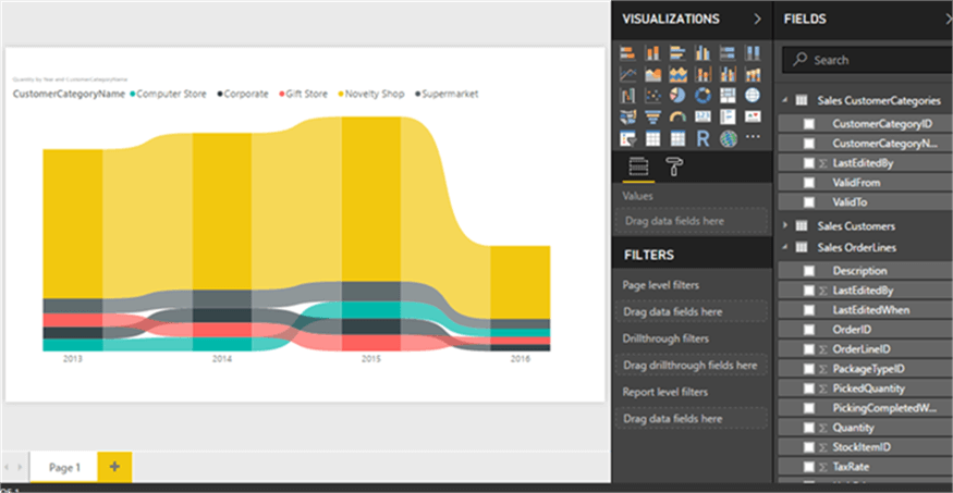
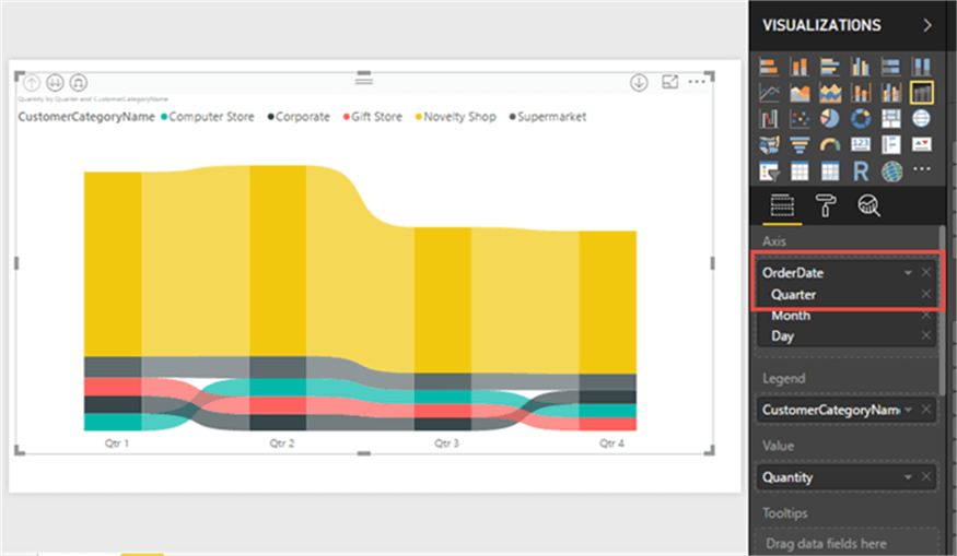
As an alternative, the year field could be removed in the order date hierarchy, and the chart simply flips to a quarterly view (all years are included).
A page filter can be added to the visual to restrict the categories being displayed; however, the chart automatically adjusts for the applied filter.
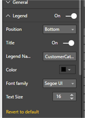
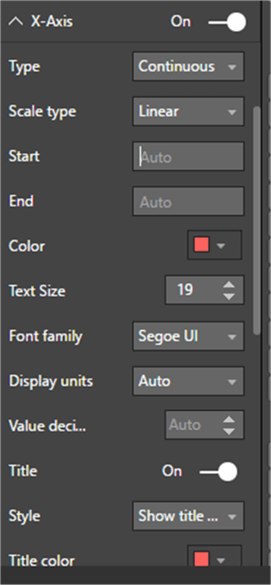
For the X axis and the Legend, various formatting changes can be applied to the visual. For the below example, the legend position is moved to the bottom, the font color for the Axis is changed to a reddish color, and a title is added to the axis.
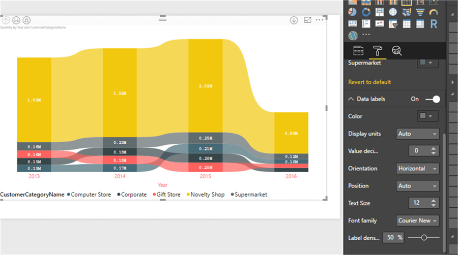
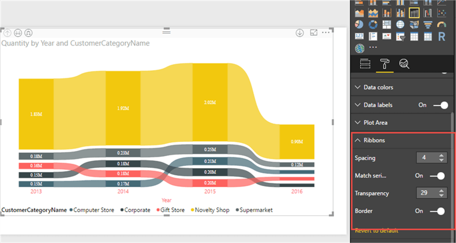
Adding data labels helps to show the values used to come up with each ribbon.
Four Ribbon specific formatting options can be utilized to adjust the following:
- Spacing – This property controls the amount of spacing between the different category layers.
- Match Series – This property determines if the color of the ribbon (the part between the calendar series) will match the color of the series (the area between the years).
- Transparency – This property controls the transparency of each of these layers.
- Border – This property controls whether an outside border is added to each ribbon.
Implementing several of these changes is illustrated below.
The new Ribbon Chart visualization available in Power BI is a welcome addition to the standard visuals in Power BI. Its ability to not only show customer results, but also rank, provides a clear advantage over a normal stacked column or bar charts.
Next Steps
- Explore many of the Power BI Custom Visualizations: https://store.office.com/en-us/appshome.aspx?productgroup=PowerBI&ui=en-US&rs=en-US&ad=US
- Check out all of the Power BI tips.
Learn more about Power BI in this 3 hour training course.


About the author
 Scott Murray has a passion for crafting BI Solutions with SharePoint, SSAS, OLAP and SSRS.
This author pledges the content of this article is based on professional experience and not AI generated.
View all my tips
