By: Esat Erkec | Comments (2) | Related: > Power BI Charts
Problem
How do apply the Locally Weighted Scatterplot Smoothing (Lowess) method and find out the trend of a data series in Power BI?
Solution
In some cases, linear regression cannot clarify relationships between variables and cannot detect the trend of a data series. For this reason, we can apply other regression methods in statistics. Locally Weighted Scatterplot Smoothing also known as the Lowess method is the most popular regression approach for these cases. In this tip, we will define some essential statistics terms about Lowess and demonstrate in Power BI, but we will not go deep into details and formulas.
What is Regression?
Regression analysis defines a mathematical function which finds a relation between one dependent variable and one or more variables. This obtained function is called the regression equation.
What is Smoothing?
The smoothing technique is to group variables that are expected to have similar expectations and fit a suitable curve or line. Smoothing techniques provide a means to decrease the volatility in the data series. Thus, the trend of the data series can be observed more clearly. As an example, moving average is one of the simplest smoothing techniques.
What is Lowess?
The simplest definition of Locally Weighted Scatterplot Smoothing (LOWESS) is that it is a method of regression analysis which creates a smooth line through a scatterplot. This line provides a means to figure out relationships between variables. At the same time this line helps us understand trends of variables. This method has advantages and disadvantages.
Advantages:
- Illustrates data in very flexible approach.
- Easy to use.
- Can show data trends.
Disadvantages:
- Complex calculations.
- Less understanding than parametric smoothers.
- Difficulty in explaining the results obtained.
Before analyzing the Lowess calculation logic, I want to add some notes about Power BI. Power BI is one of the most powerful business intelligence tools in the market. At the same time Power BI supports R (R is a language and environment for statistical computing and graphics). In this tip we will take advantage of R support. But in the first step, we need to enable R scripts in Power BI. You can review this tip (Getting started with R scripts and R visuals in Power BI Desktop) to complete this step. After completing this step, we need a sample dataset. We will download the cars dataset in the R console and we will use this dataset in Power BI for this Lowess demonstration.
- Open R console
- You can find the cars data set here.
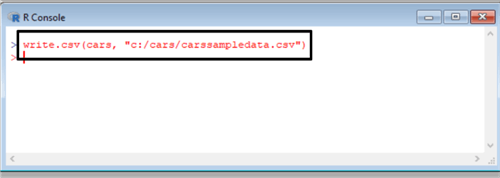
- Or you can write the following command in the R console and export the cars dataset to specified file path on your computer.
write.csv(cars, "c:/cars/carssampledata.csv")
Now our dataset is ready to load into Power BI. For this demonstration we will use Power BI Desktop edition. After installation is compete you can find Power BI Desktop edition in your start up menu.
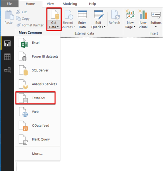
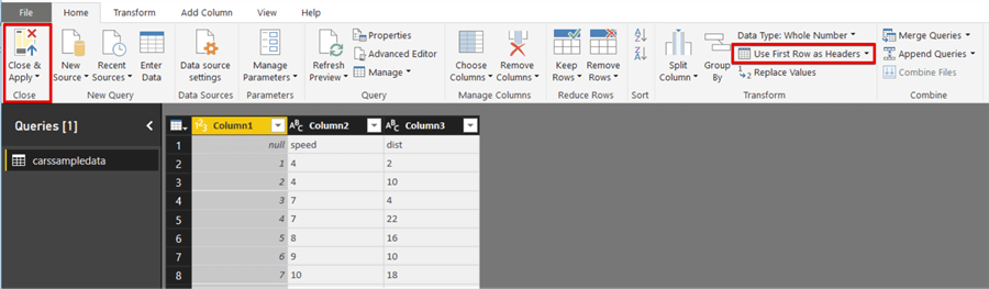
Click Get Data and select Text/CSV and select carssampledata.csv file.
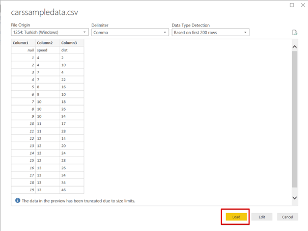
Click Load and import data into Power BI.
Click edit queries and then click Use First Row as Headers and then click Close & Apply.
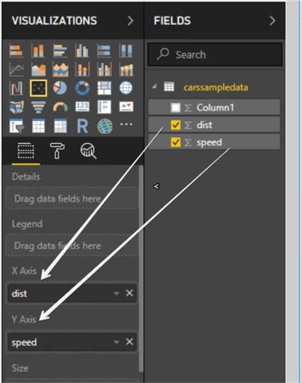
Drag and drop the cars dataset columns to the scatter plot X axis field and Y axis field. Drag and drop dist column to the X axis and the speed column to the Y axis.
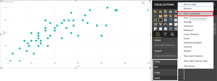
Right click X axis and Y axis and then check the Don’t summarize option.
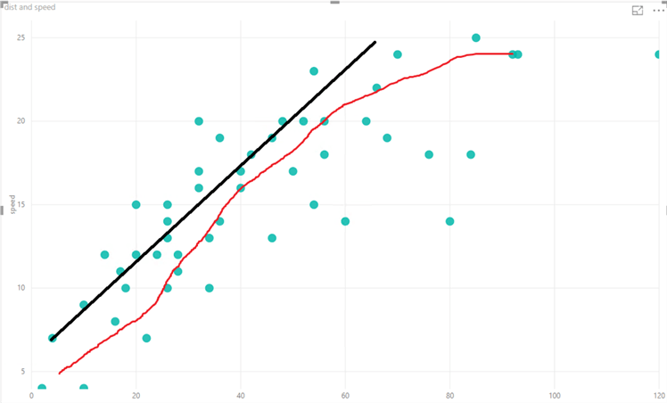
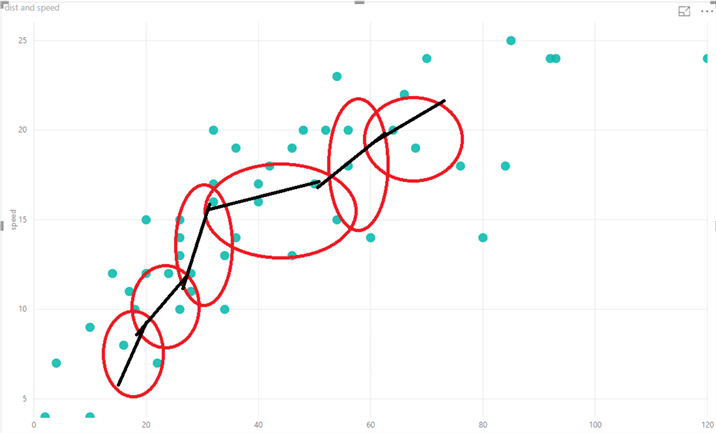
Now we will analyze this scatter plot. This chart tells us that there is a positive relationship between distance and speed variables. But this relation cannot define a strong linear line. This relation is much nearest to the curve. In the below image the red line illustrates this curve.
Lowess have very complex algorithm and statistics calculations, but we can illustrate this algorithm in the following image as simple as possible.
- Divide data into smaller parts.
- Calculate fit lines for these smaller parts with statistics calculations.
- Try to create a fit curve.
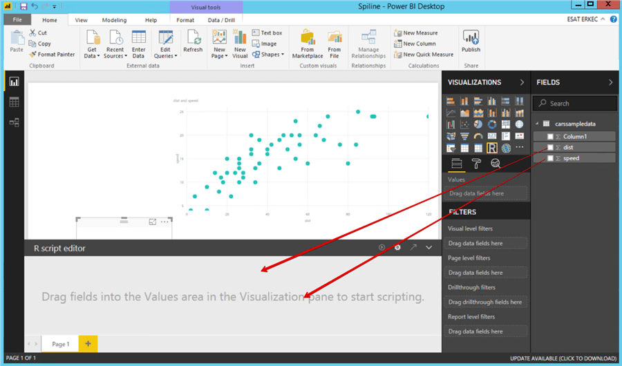
Now we will add R script visual and write a little R script code.
Drag and drop dist and speed fields over the R script visual.
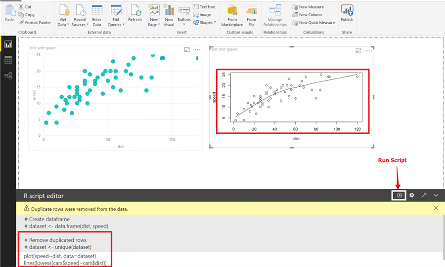
The following R scripts first line of code will create a simple scatter plot and set the speed field in the Y axis and set the dist field in the X axis. The second line of code applies the Lowess function to this scatter plot and draws the curve line.
plot(speed~dist, data=dataset)
lines(lowess(cars$speed~cars$dist))
Run the R script.
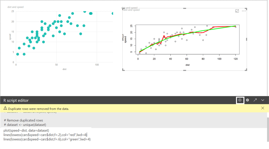
For the Lowess function in R, there is a significant parameter which is the smoother span. This gives the ratio of points in the plot which effect the smoothness at each value. Larger values give more smoothness. Now we will change the f parameter in the Lowess function with the following script. This script adds two different curves to the scatter plot which have different smoother spans. The “f” sign indicates this parameter and “col” parameter can change the color of this curve. The “lwd” parameter defines the line width.
plot(speed~dist, data=dataset)
lines(lowess(cars$speed~cars$dist,f=.2),col="red",lwd=4)
lines(lowess(cars$speed~cars$dist,f=.6),col="green",lwd=4)
Next Steps
- You can learn more about the Loess method which is the advanced form of Lowess.
- For more information check out Lowess, loess and other smoothers.
- This tip can help about figure out the moving average methodology SQL Server T-SQL Code to Calculate a Moving Average.
- Check out all of the Power BI Tips.
Learn more about Power BI in this 3 hour training course.


About the author
 Esat Erkec is a Microsoft certified SQL Server Database Administrator that has been working with SQL Server since 2004.
This author pledges the content of this article is based on professional experience and not AI generated.
View all my tips
