By: Esat Erkec | Comments (2) | Related: > Power BI Charts
Problem
Can you describe a Rolling Average (also known as Moving Average) and how can I create a simple rolling average in Power BI without using DAX (Data Analysis Expressions)?
Solution
What is Rolling Average?
A rolling average also known as moving average is a statistical method that calculates the average of a data series for a given period. Rolling average has a wide usage. Especially in financial markets where traders or investors use this method to estimate stock prices. Also, rolling average assists to determine or estimate direction of trends and so it increases the right decision probability. The main idea of this method is to determine trends and track the trend. Thus, it takes an advantage of avoiding daily changes and allows analysis of long term trends. Assuming that your data series has fluctuations, if you want to clarify these data series you can use a rolling average. Because it will provide smoothing of a data series and filtering noise data. After all these details we can dip into the calculation methodology for a rolling average.
Calculating a Simple Rolling Average
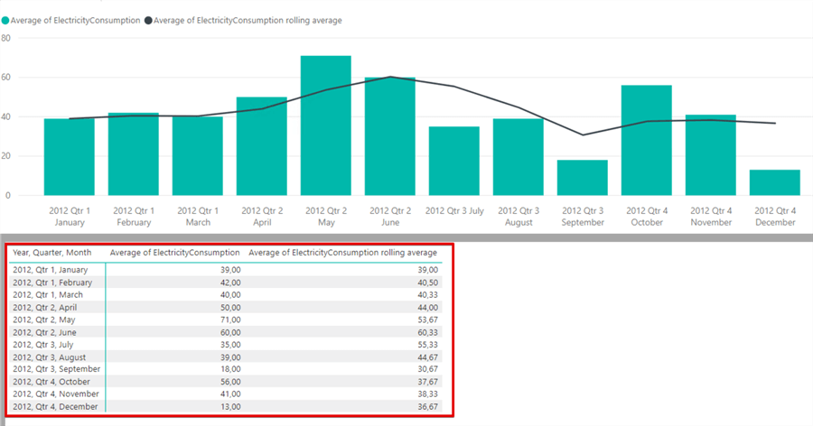
The below image illustrates the monthly consumption of electricity with a rolling average calculation. For this dataset we will calculate a three-month simple moving average.
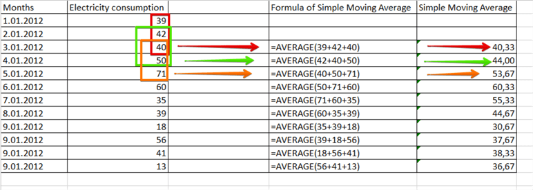
The formula is very simple. Add the total values through the period and divide into number of periods.
- Simple rolling average = (P1 + P2 + P3 + P4 + ... + Pn) / n
Simple rolling average point one calculation is like this
- Sma1 = (39+42+40)/3
- Sma1 = 40.33
- Simple rolling average point two calculation is like this
- Sma2 = (42+40+50)/3
- Sma2 = 44
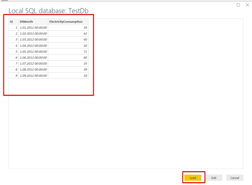
Now we will create a demonstration in Power BI with this data series. The below T-SQL code will create the sample data series in SQL Server.
DROP TABLE IF EXISTS TestRollingAvg
CREATE TABLE TestRollingAvg
(Id INT PRIMARY KEY IDENTITY(1,1),DtMonth DATE, ElectricityConsumption INT )

INSERT INTO TestRollingAvg VALUES('20120101',39)
INSERT INTO TestRollingAvg VALUES('20120201',42)
INSERT INTO TestRollingAvg VALUES('20120301',40)
INSERT INTO TestRollingAvg VALUES('20120401',50)
INSERT INTO TestRollingAvg VALUES('20120501',71)
INSERT INTO TestRollingAvg VALUES('20120601',60)
INSERT INTO TestRollingAvg VALUES('20120701',35)
INSERT INTO TestRollingAvg VALUES('20120801',39)
INSERT INTO TestRollingAvg VALUES('20120901',18)
INSERT INTO TestRollingAvg VALUES('20121001',56)
INSERT INTO TestRollingAvg VALUES('20121101',41)
INSERT INTO TestRollingAvg VALUES('20121201',13)
Now our data is ready for use. After this step we will connect SQL Server with Power BI. For this demonstration we can use Power BI Desktop edition. After installation we can find Power BI in the start-up menu.
Launch Power BI Desktop edition.
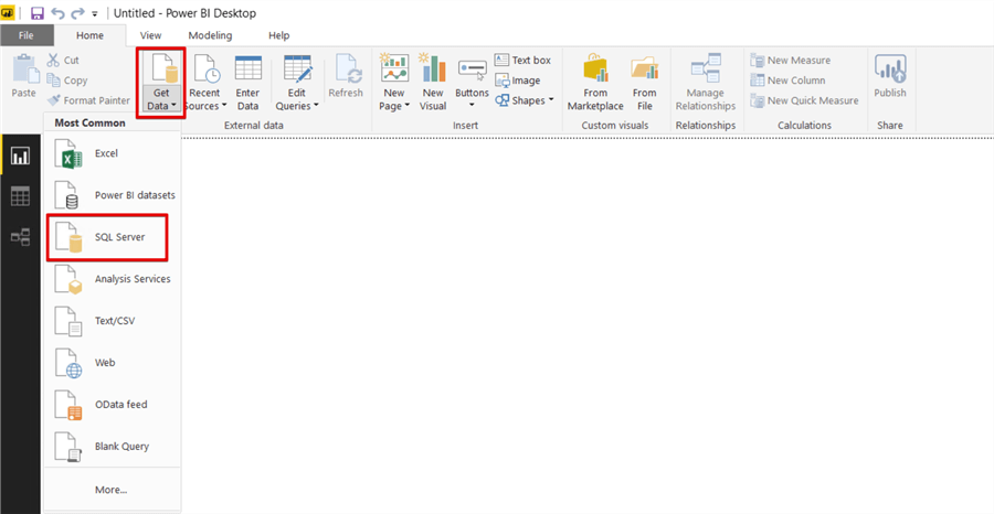
Click Get Data and select SQL Server.
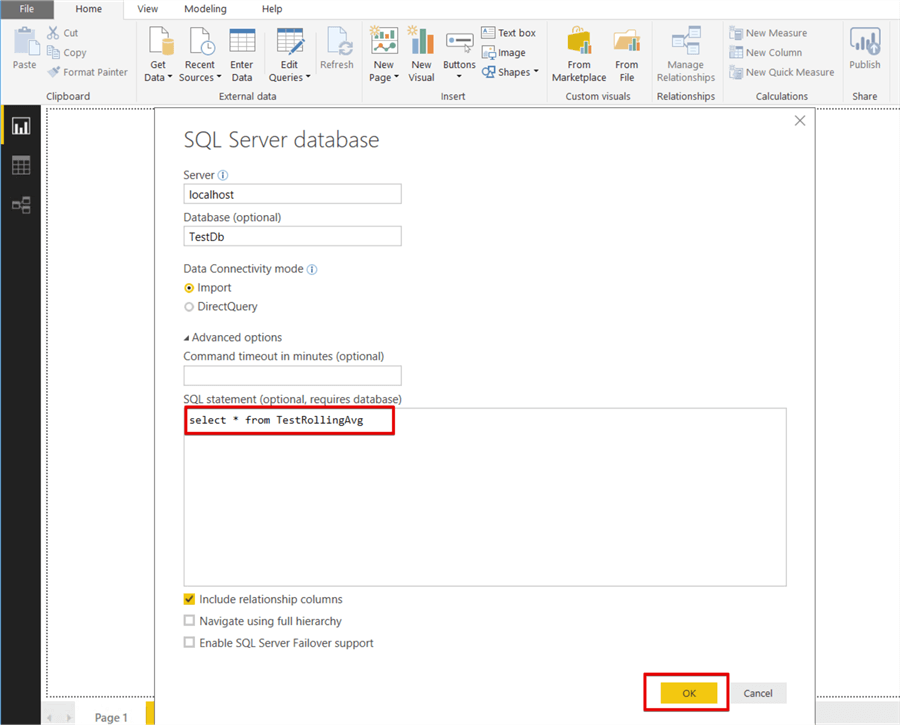
Complete the connection string details and click Advanced options.
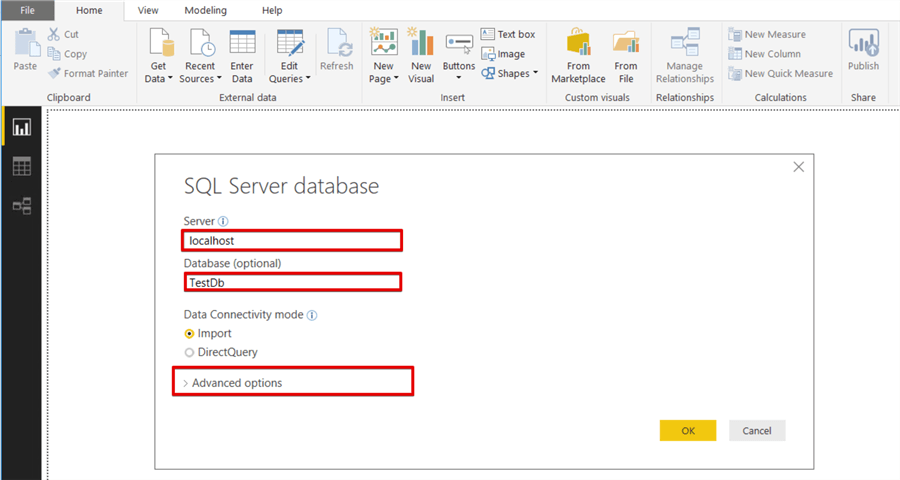
Write the following T-SQL code in the SQL Statement text box and click OK.
select * from TestRollingAvg
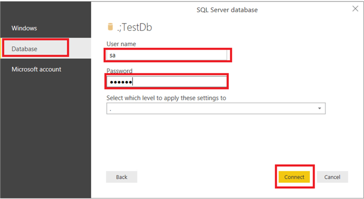
Select and fill security settings. If you use SQL Server authentication, you can select Database tab and fill database User name and password.
Click the Load button.
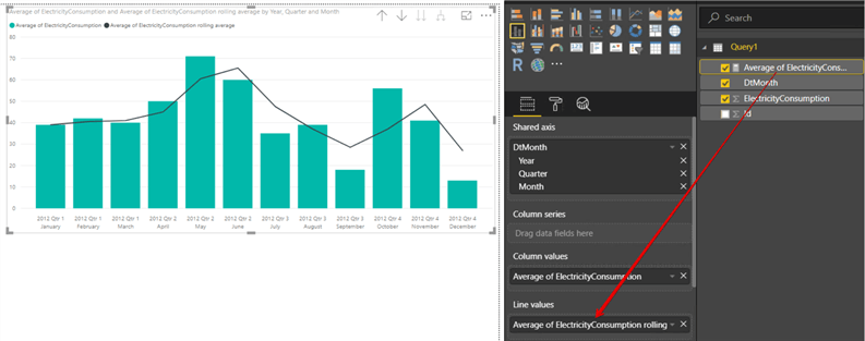
Drag and drop the Line and Stacked column chart into the Power BI design panel.
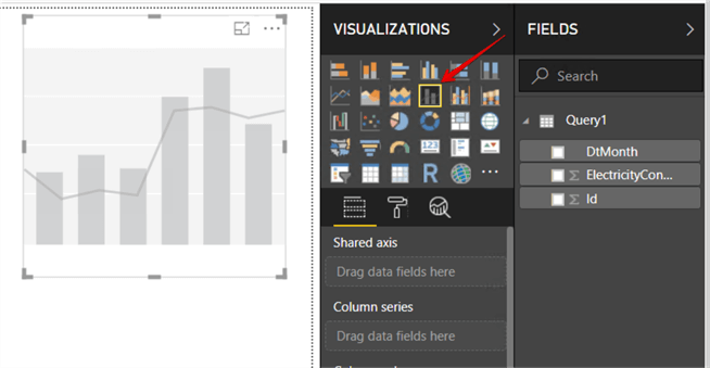
Drag and drop the DtMonth measure to the Shared axis and drag and drop the ElectricityConsumption measure to the Column values.
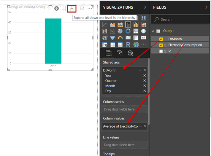
Click Expand down one level in the hierarchy button 3 or 4 times and the Line and stacked column chart will start to look like this. This option allows us to illustrate all levels of the date hierarchy values.
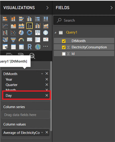
Remove the Day hierarchy because we don’t need this date hierarchy.
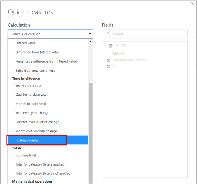
Right click over the DtMonth measure and select New quick measure.
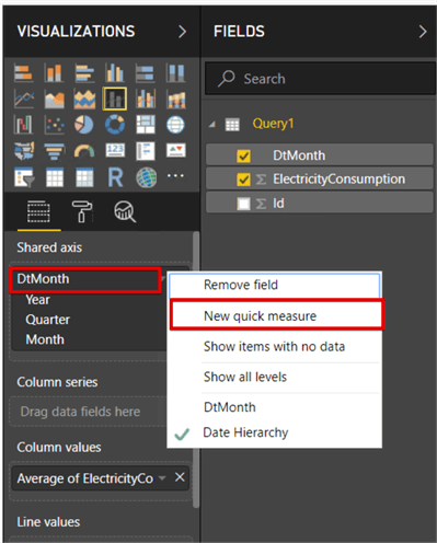
Select Rolling average under the Time intelligence title.
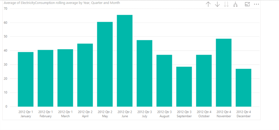
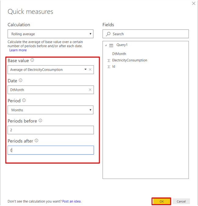
Complete the Quick Measures window as shown below. Because we want to add the previous value and current value in the data set and find the average. For this reason, we set periods before value 2 and our period is based monthly so we select the period as month.
Drag and drop Average of ElectricityConsumption rolling average measure to the Line values.
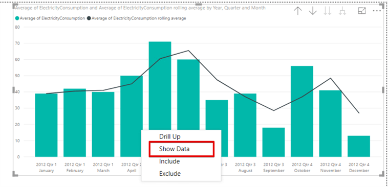
Right click in the chart and click show data. This option allows us to show values on the chart.
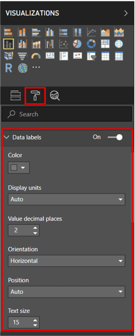
Change the graphic appearance in the format tab of graph.
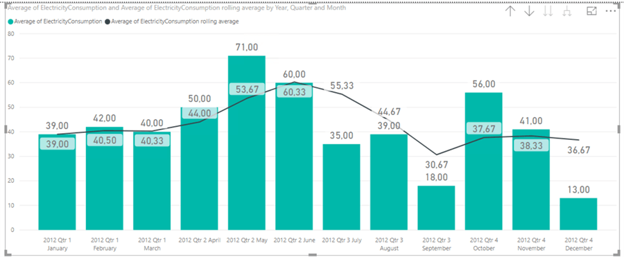
Finally, the line and stacked column will look like the below image.
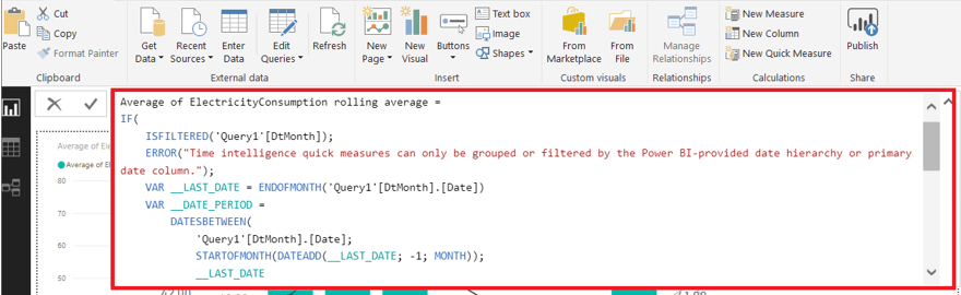
If you look at the calculation background, Power BI automatically creates custom DAX code for this rolling average measure. When we click the Average of ElectricityConsumption rolling average measure, we can find the DAX code.
Conclusion
In this tip, we explored the logic of rolling average and how to create a rolling average in Power BI. Rolling average has several types (Exponential Moving Average (EMA), Smoothed Moving Average (SMMA), and Linear Weighted Moving Average) which differ from a simple rolling average and it has wide usage especially in financial analyses. In this tip we created a rolling average in Power BI in the easiest method since we didn't have to use DAX.
Next Steps
- Follow the steps in the tip and create your own report
- Check out this tip to learn about moving average
- Review this related information
- Check out the Power BI tips.
Learn more about Power BI in this 3 hour training course.


About the author
 Esat Erkec is a Microsoft certified SQL Server Database Administrator that has been working with SQL Server since 2004.
This author pledges the content of this article is based on professional experience and not AI generated.
View all my tips
