By: Siddharth Mehta | Comments | Related: > SQL Server 2017
Problem
Graph analysis can be divided into two parts – Graph Rendering and Graph Querying. In the first part of this tip we saw how to create a graph with different aesthetic customizations to represent the graphical nature of the data in a visually interpretable manner. Generating a graph is just the first part of the graph analysis process. The other part of the analysis is querying the graph and rendering the results of the query in the graph visualization. In this tip we will learn how to query graph data and render each step of the analysis in the graph visualization.
Solution
DiagrammeR package has a variety of functions to query and customize different graph attributes, which can be used to display the query results on a graph visualization.
1) As this tip is part 2 of the previous tip on the same subject, its assumed that the required R packages explained in the previous tip are installed correctly.
2) To demonstrate the query process, first we need to create a sample dataset that can be used for querying. If you already have a sample graph data, you can use it and fit it in the way explained below. Alternatively, you can use a sample dataset that is explained in the DiagrammeR package documentation, which is also explained in the steps below.
3) Let’s say that we have a scenario where people are consuming food items like vegetables, fruits and nuts. So, we have four diverse types of entities here – person, fruits, vegetables and nuts. A node data frame can be created using the create_node_df function from DiagrammeR package as shown below. Here we are specifying the type as the type of entity, label as the name of some actual entities like person name, fruit name, etc.
nodes <- create_node_df(14, nodes = 1:14,
    type = c("person", "person", "person", "person", "person",
             "fruit", "fruit", "fruit",
             "veg", "veg", "veg",
             "nut", "nut", "nut"),
    label = c("Annie", "Donna", "Justine", "Ed", "Graham",
              "pineapple", "apple", "apricot",
              "cucumber", "celery", "endive",
              "hazelnut", "almond", "chestnut")
           )
4) People may like as well as dislike some of these items, and some may even be allergic to some of these items. These creates our edges where the relation is likes, dislikes and allergic. An edge data frame can be created using the create_edge_df function from the DiagrammeR package as shown below. In the below code, in the from section we are creating a series of 1 to 5 for 5 times. The intention is to create edges from nodes 1 to 5 which are all the person nodes that can be seen in the above code. In the To section we are creating random 5 edges for 5 times, to associate 5 food items with each person. Finally, in the label section we are giving a random type to each edge. You can also use rel keyword instead of label to add it as a relation attribute of the edge instead of a label attribute.
edges <- create_edge_df(
    from = sort(as.vector(replicate(5, 1:5))),
    to = as.vector(replicate(5, sample(6:14, 5))),
    label = as.vector(replicate(5, sample(c("likes", "dislikes","allergic_to"), 5,TRUE,c(0.5, 0.25, 0.25)))))
5) Now that we understand how nodes, edges and relations are created, it’s time to create the actual graph. Execute the below code to create the graph. We have used few formatting options while creating the nodes and edges, so that the graph looks intuitive. After creating the graph object with the create_graph function, we are exporting it to a png image using the export graph function.
EXECUTE sp_execute_external_script @language = N'R', @script = N'

library(DiagrammeR)
library(magrittr)
library(DiagrammeRsvg)

set.seed(20)

nodes <- create_node_df(14, nodes = 1:14,
    type = c("person", "person", "person", "person", "person",
             "fruit", "fruit", "fruit",
             "veg", "veg", "veg",
             "nut", "nut", "nut"),
    label = c("Annie", "Donna", "Justine", "Ed", "Graham",
              "pineapple", "apple", "apricot",
              "cucumber", "celery", "endive",
              "hazelnut", "almond", "chestnut"),
    fontname = "Helvetica",
    fontsize = "6",
    fillcolor = "yellowgreen",
    color = "red"
    )

edges <- create_edge_df(
    from = sort(as.vector(replicate(5, 1:5))),
    to = as.vector(replicate(5, sample(6:14, 5))),
    label = as.vector(replicate(5, sample(c("likes", "dislikes","allergic_to"), 5,TRUE,c(0.5, 0.25, 0.25)))),
    fontname = "Helvetica",
    fontsize = "7",
    fontcolor = "blue",
    color = "grey"
    )

graph <- create_graph(nodes_df = nodes, edges_df = edges, directed="true")

export_graph(graph, file_name = "C:\\temp\\Graph1.png", file_type = "png", width=1800, height=800)
'
6) Once the above code executes successfully, the file should get created in the provided location. Open the file and the visualization would look as shown below.
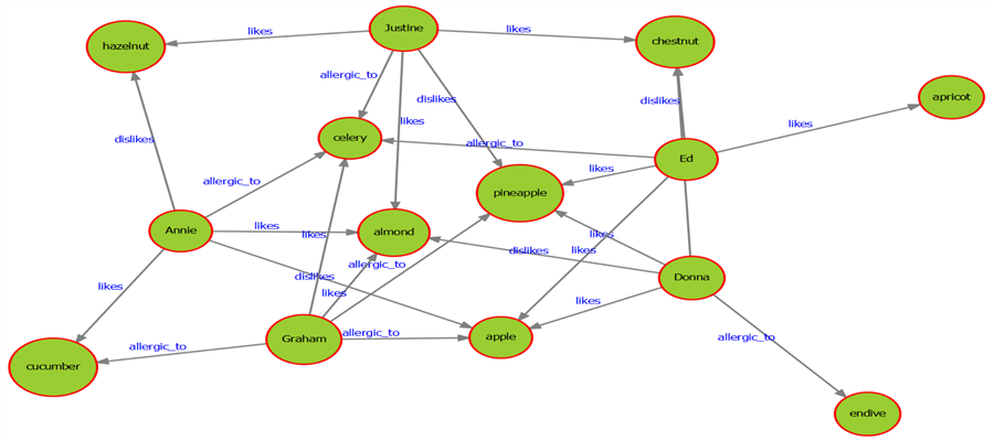
7) Now that the graph has been created, we are able to first visually understand how the entities are related, and then form a query criterion to query the graph. Let’s start the query criteria with a simple condition which can be matched with just one step. For example, let’s say we want to find all the nodes of type person in a graph. The above graph is a small dataset, but in real life scenarios, there can be millions of nodes and edges even in modest size graph datasets. Although we can visually identify all the person nodes in the above graph, the programmatic way to identify is by querying the attributes of the graph. You can find the entire language and function reference of DiagrammeR package here.
8) The below code can be used to query the graph and highlight the nodes of type person. After creating the graph, we are creating a new graph object and selecting the nodes of type person by using the select_nodes function. In the next step we are extracting the nodes that we selected in the previous step and changing the fillcolor attribute value to pink to highlight the results in the graph. After completing this step, we are finally exporting the data to a png file.
EXECUTE sp_execute_external_script @language = N'R', @script = N'

library(DiagrammeR)
library(magrittr)
library(DiagrammeRsvg)

set.seed(20)

nodes <- create_node_df(14, nodes = 1:14,
    type = c("person", "person", "person", "person", "person",
             "fruit", "fruit", "fruit",
             "veg", "veg", "veg",
             "nut", "nut", "nut"),
    label = c("Annie", "Donna", "Justine", "Ed", "Graham",
              "pineapple", "apple", "apricot",
              "cucumber", "celery", "endive",
              "hazelnut", "almond", "chestnut"),
    fontname = "Helvetica",
    fontsize = "6",
    fillcolor = "yellowgreen",
    color = "red"
    )

edges <- create_edge_df(
    from = sort(as.vector(replicate(5, 1:5))),
    to = as.vector(replicate(5, sample(6:14, 5))),
    label = as.vector(replicate(5, sample(c("likes", "dislikes","allergic_to"), 5,TRUE,c(0.5, 0.25, 0.25)))),
    fontname = "Helvetica",
    fontsize = "7",
    fontcolor = "blue",
    color = "grey"
    )

graph <- create_graph(nodes_df = nodes, edges_df = edges, directed="true")

querynodes <- graph %>% select_nodes(conditions = "type == \"person\"")

graph <- graph %>% set_node_attrs(node_attr = "fillcolor", values = "pink", nodes = get_selection(querynodes))

export_graph(graph, file_name = "C:\\temp\\Graph2.png", file_type = "png", width=1800, height=800)
'
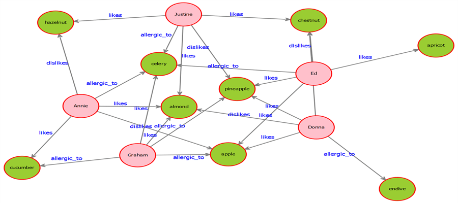
9) Once you execute the code successfully, your exported graph image should look as shown below. This result clearly shows the person type nodes in the overall graph.
10) Let's increase the complexity of the query to a criterion which requires multiple query steps. For example, let’s say we intend to find out all the allergic foods in the graph. There are diverse ways to get the results of this query. One way is to first find all the person nodes, then determine the edges which have a label or relation of allergic_to, and then find the target nodes of those edges. Once target nodes are found, the last step is highlighting the results and exporting the graph to an output file.
11) Execute the below code to query the data based on the criterion explained in Step 10. After creating the graph, we are first selecting the nodes of type person and inverting the selection i.e. selecting all nodes that are not of type person, which means selecting all the food nodes. We can execute this step even without inverting the selection, but we are doing it to make the navigation more complex for demonstration purpose. In the next step we are moving the selection to all the edges that have the label allergic_to using the trav_in_edge function. Then we are using the trav_in_node function and selecting the target nodes of the selected edges and highlighting the node color by changing the fillcolor attribute of the target nodes to pink. Once the results are ready, the graph is exported to a png image.
EXECUTE sp_execute_external_script @language = N'R', @script = N'

library(DiagrammeR)
library(magrittr)
library(DiagrammeRsvg)

set.seed(20)

nodes <- create_node_df(14, nodes = 1:14,
    type = c("person", "person", "person", "person", "person",
             "fruit", "fruit", "fruit",
             "veg", "veg", "veg",
             "nut", "nut", "nut"),
    label = c("Annie", "Donna", "Justine", "Ed", "Graham",
              "pineapple", "apple", "apricot",
              "cucumber", "celery", "endive",
              "hazelnut", "almond", "chestnut"),
    fontname = "Helvetica",
    fontsize = "6",
    fillcolor = "yellowgreen",
    color = "red"
    )

edges <- create_edge_df(
    from = sort(as.vector(replicate(5, 1:5))),
    to = as.vector(replicate(5, sample(6:14, 5))),
    label = as.vector(replicate(5, sample(c("likes", "dislikes","allergic_to"), 5,TRUE,c(0.5, 0.25, 0.25)))),
    fontname = "Helvetica",
    fontsize = "7",
    fontcolor = "blue",
    color = "grey"
    )

graph <- create_graph(nodes_df = nodes, edges_df = edges, directed="true")

graph_allergies <- graph %>% select_nodes(conditions = "type == \"person\"") %>% invert_selection

graph_allergies <- graph_allergies %>% trav_in_edge(conditions = "label == \"allergic_to\"")

graph_allergies <- graph_allergies %>% set_node_attrs(node_attr = "fillcolor", values = "pink", nodes = get_selection(trav_in_node(graph_allergies)))

export_graph(graph_allergies, file_name = "C:\\temp\\Graph3.png", file_type = "png", width=1800, height=800)
'
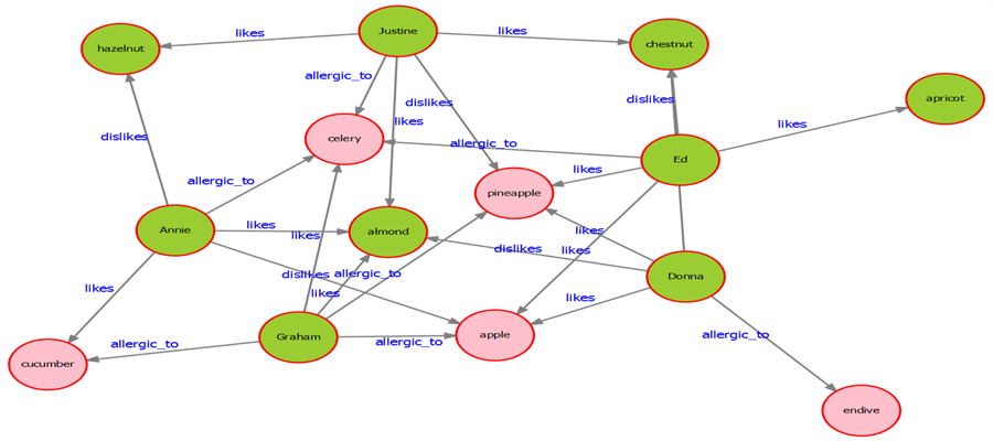
12) Once you execute the above code successfully, your exported graph would look as shown below with allergic food highlighted in pink color.
In this way, we can query a graph and intuitively represent the data on a visualization to show the query results explicitly. Visualizing graph data is not easy as visualizing tabular data on a grid. So this method of querying can be extremely valuable in cases of large complex graphs. The key here is the logic of graph traversal which requires analyzing the graph, determining the shortest path to the results, and changing the key attribute of the graph to implement the desired change in the graph.
Next Steps
- Consider exploring distinct functions available in the DiagrammeR package for querying, traversing and modifying graph attributes and testing the same to implement complex query criteria.
- Check out part 1 of this tip.


About the author
 Siddharth Mehta is an Associate Manager with Accenture in the Avanade Division focusing on Business Intelligence.
This author pledges the content of this article is based on professional experience and not AI generated.
View all my tips
