By: Nai Biao Zhou | Comments | Related: > SQL Server 2017
Problem
Sarka [1] pointed out that, in a real-life data science project, professionals spend about 70% of time on data overview and data preparation. SQL Server professionals have already known how to query, transform and cleanse data. They are able to work on data science projects after having mastered some statistical techniques. Furthermore, SQL Server 2017 Machine Learning Services (SQL MLS) allow them to write SQL stored procedures containing R codes, thus they can use a wide variety of statistical and graphical techniques provided by R. The powerful graphics capabilities in R fascinate many users [2]. Those professionals who have extensive knowledge in SQL server hope to quickly pick up new skills through an exercise.
Solution
We are going to create a demographic dashboard to give a comprehensive overview of customers. The ability to know customers can bring a significant competitive advantage to a business. These demographic characteristics, for example, educational experience level, occupation and total purchase amount, help the business to develop effective marketing strategies.
In this exercise, we will construct a frequency bar graph to display the number of customers in each occupation. Then, we will introduce the concepts of relative frequency and cumulative relative frequency. We will construct a less-than cumulative relative frequency diagram of customer educational experience level. After an introduction of the concept of percentile, we will use a boxplot to show positions of outliers and a five-number summary of the individual customer total purchases in year 2013. Finally, we will group the total purchase amount into classes and construct a histogram to represent the frequency distribution of each individual customer's total purchases in year 2013.
We are going to use data from the AdventureWorks sample database "AdventureWorks2017.bak" [3]. We will use "R Tools for Visual Studio (RTVS)", introduced in my other tip "Getting Started with Data Analysis on the Microsoft Platform — Examining Data".
The solution was tested with SQL Server Management Studio V17.4, Microsoft Visual Studio Community 2017, Microsoft R Client 3.4.3, and Microsoft ML Server 9.3 on Windows 10 Home 10.0 <X64>. The DBMS is Microsoft SQL Server 2017 Enterprise Edition (64-bit).
1 – Comparing Nominal, Ordinal, Interval and Ratio Variables
When we use a dashboard to exhibit customer demographic data, we face different types of measurement. Educational experience level and purchase amount, for example, are different scales. Stevens' classification of scales of measurement [4] has been widely used to define the four types of variables in statistics: nominal, ordinal, interval, and ratio.
A nominal variable, is also called categorical variable, represents data by name. Customer occupation, for instance, is a nominal variable having a small number of discrete values. We can determine if two values are equal; but, they cannot be ordered. Sometimes, we may use numeric values to represent categories. For example, we use the numeric values 0 and 1 to represent two genders, female and male, respectively. These numeric values are used as labels only; we cannot order them from lowest to highest.
An ordinal variable, preserves rank-ordering in data, but the difference between each ranking is not defined. The five levels of educational experience in the AdventureWorks, for example, are ordered as partial high school, high school, partial college, bachelors and graduate degree. The category high school means more educational experience than the category partial high school; and the category graduate degree means more educational experience than the category bachelors. But the difference between high school and partial high school is not the same as the difference between graduate degree and bachelors.
An interval variable, is quantitative in nature. The difference between two values is meaningful. A typical example is the measure of temperature. Equal intervals of temperature are corresponded to equal mercury volumes of expansion. For example, the temperature in three rooms A, B and C is 12 degrees, 14 degrees and 16 degrees, respectively. The temperature difference between rooms B and A is as same as the difference between rooms C and B. But the zero value of an interval variable doesn't mean: doesn't exist. Zero degree on the Celsius scale, for example, doesn't mean there is no temperature in a room. In addition, it may not make sense to apply the mathematical operations of multiplication and division to interval variables. For instance, the statement that 30 degrees is twice as warm as 15 degrees is not accurate.
A ratio variable, has all characteristics of an interval variable, except that it has meaning of an absolute zero value. A zero-income customer, for example, means that the customer doesn't have income. Therefore, we can construct a meaningful fraction (or ratio) with a ratio variable. An example of a ratio variable is weight. If box A weighs 5 pounds and box B weighs 10 pounds, we can say box B is twice as heavy as box A.
It is important to know how these four types of variables differ because statistical and graphical techniques used in analysis differ depending on the type of variables. For example, it would not make sense to compute an average of customer occupations. Table 1 presents a simplified version of Stevens' classification table [4]. The value "Yes" in the table denotes that we can apply the corresponding statistical technique to the variable, and the value "No" indicates that we cannot.
| Statistical Technique | Nominal | Ordinal | Interval | Ratio |
|---|---|---|---|---|
| Frequency Distribution | Yes | Yes | Yes | Yes |
| Mode | Yes | Yes | Yes | Yes |
| Contingency Correlation | Yes | Yes | Yes | Yes |
| Median | No | Yes | Yes | Yes |
| Percentiles | No | Yes | Yes | Yes |
| Mean | No | No | Yes | Yes |
| Standard Deviation | No | No | Yes | Yes |
| Rank-order Correlation | No | No | Yes | Yes |
| Product-moment Correlation | No | No | Yes | Yes |
| Coefficient or Variation | No | No | No | Yes |
Table 1 -The difference among nominal, ordinal, interval and ratio variables [4]
Variables in statistics also can be broadly classified into two types: qualitative and quantitative. The nominal and ordinal variables are two sub-classifications for the qualitative variable. The interval and ratio variables are two sub-classifications for the quantitative variable.
2 – Analyzing a Nominal Variable
With the knowledge of customer occupations, a business can promote additional products or services to existing customers, namely cross-selling. Five occupations have been identified in the AdventureWorks system: clerical, management, manual, professional, and skilled manual. These values are taken by the occupation variable. Each value represents a category called class. Then, we can answer a business's question by using class frequency, which is the number of observations in the data set falling in a class [5].
2.1 Construct a Frequency Distribution for a Nominal Variable
Let's randomly pick up 20 customer's occupations from the database, as shown in Table 2.
| 1 | Manual | 6 | Manual | 11 | Skilled Manual | 16 | Management |
| 2 | Professional | 7 | Clerical | 12 | Clerical | 17 | Skilled Manual |
| 3 | Management | 8 | Management | 13 | Professional | 18 | Management |
| 4 | Clerical | 9 | Professional | 14 | Professional | 19 | Skilled Manual |
| 5 | Professional | 10 | Skilled Manual | 15 | Manual | 20 | Professional |
Table 2 -Occupation data on 20 customers
We count the occurrences of each occupation. The number we have counted represents the class frequencies for the 5 classes. For comparison, the class frequency can be expressed as a fraction of the total number of observations. These fractions constitute a relative frequency distribution [6]. Table 3 shows two ways we summarized a nominal variable: the class frequency and the class relative frequency. We can easily identify that the value "Professional" appears 6 times in the sample data set. This value represents the mode of the data set, which is a statistical measure.
| Class | Frequency | Relative Frequency |
|---|---|---|
| Clerical | 3 | 0.15 |
| Management | 4 | 0.20 |
| Manual | 3 | 0.15 |
| Professional | 6 | 0.30 |
| Skilled Manual | 4 | 0.20 |
Table 3 - Frequency table for occupation data on 20 customers
The summary table reveals that 30% of customer occupations are professional, 15% are clerical and another 15% are manual. This may remind the business to add more products or services that these professionals are more likely to buy. This table also suggests that the business should carry out some market activities to attract customers whose occupations are clerical or manual.
2.2 Construct a Frequency Distribution through SQL MLS
Since there are 18,508 individual customers in the AdventureWorks database, it is inefficient for us to manually count the occurrences of each customer occupation. R provides a function, "table()",for creating a frequency table. We are going to run R codes within a SQL stored procedure to obtain the frequency table. We will use "R Tools for Visual Studio sample projects" as a starting point. This sample project from Microsoft provides an in-depth introduction to R through the extensive comments in two source files [7]. If you are the first time user of RTVS, my other tip "Getting Started with Data Analysis on the Microsoft Platform — Examining Data" provides a step-by-step procedure to create a stored procedure containing R codes.
2.2.1 Create a New Stored Procedure "sp_analyze_nominal_variable"
Add a new stored procedure to the sample project. As shown in Figure 1, three files were added into the project. We are going to write R codes in the R file, write a database query in the query file, and modify the template file to integrate R codes and the query into a stored procedure.
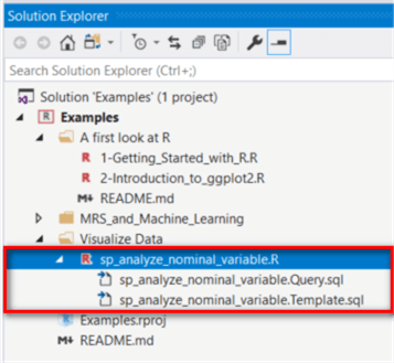
Figure 1 -Add a new stored procedure in the project through RTVS
2.2.2 Write a SQL Query to Retrieve Customer Occupations
Open the file "sp_analyze_nominal_variable.Query.sql" and place the following SQL codes into the file. The query retrieves every individual customer occupation from the database.
SELECT p.Occupation
 FROM [Sales].[vIndividualCustomer] c inner join [Sales].[vPersonDemographics] p
            ON c.BusinessEntityID = p.BusinessEntityID
2.2.3 Create a Frequency Table in R
Open the R script file "sp_analyze_nominal_variable.R"; use the following R codes to replace the existing codes. It is noteworthy that we un-comment test codes so that we can test these R codes through RTVS. We must comment these test codes before publishing the stored procedure.
# @InputDataSet: input data frame, result of SQL query execution
# @OutputDataSet: data frame to pass back to SQL

# Test code
library(RODBC)
channel <- odbcDriverConnect(dbConnection)
InputDataSet <- sqlQuery(channel, iconv(paste(readLines('your work folder/visualize data/sp_analyze_nominal_variable.query.sql', encoding = 'UTF-8', warn = FALSE), collapse = '\n'), from = 'UTF-8', to = 'ASCII', sub = ''))
odbcClose(channel)

# Create one-way contingency table from one categorial variable
freq_table <- table(InputDataSet$Occupation)

# Convert a table with counts to a table with proportions
relative_freq_table <- prop.table(freq_table)

# Get the category names in the contengency table
category_name <- names(freq_table)

# Convert a table data to a vector
vector_freq_table <- as.vector(freq_table)

# Convert a table data to a vector
vector_relative_freq_table <- as.vector(relative_freq_table)

# Construct a data-frame as the output data set
OutputDataSet <- data.frame("Occupation" = category_name, "Frequency" = vector_freq_table, "Relative Frequency" = vector_relative_freq_table)
Add a database connection to the project, and this step creates a R file "Settings.R". For convenience, we add another variable "dbConnection" to the source codes, as shown in the follows:
# Application settings file.
# File content was generated on 2018-11-16 9:09:31 PM.
settings <- as.environment(list())
# [Category] SQL
# [Description] Database connection string
# [Editor] ConnectionStringEditor
settings$dbConnection <- 'Driver={SQL Server};Server=(local);Database=AdventureWorks2017;Trusted_Connection=yes'
dbConnection <- 'Driver={SQL Server};Server=(local);Database=AdventureWorks2017;Trusted_Connection=yes'
We should run the Settings.R file to assign the connection string to the variable "dbConnection". Then, we can test the R codes in the file "sp_analyze_nominal_variable.R". After running these R codes, we obtain the value of the variable "OutputDataSet" in the R interactive window, as shown in Figure 2.
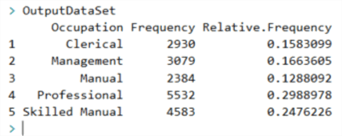
Figure 2 -Output in the R Interactive window
2.2.3 Modify the Stored Procedure Template
Open the template file "sp_analyze_nominal_variable.Template.sql", use the following script to replace the existing codes.
CREATE PROCEDURE [sp_analyze_nominal_variable]
AS
BEGIN
EXEC sp_execute_external_script@language = N'R'
    , @script = N'_RCODE_'
    , @input_data_1 = N'_INPUT_QUERY_'
--- Edit this line to handle the output data frame.
    WITH RESULT SETS
   ((
      Occupation         nvarchar(50),
      Frequency          int,
      Relative_Frequency decimal(12,10)
   ));
END;
2.2.4 Publish the Stored Procedure to the Database
Before publishing the stored procedure, we should comment testing codes in the R file, as shown in Figure 3. Then, we use the "Publish Stored Procedure" menu command from the menu "R Tools -> Data" to publish the stored procedure.
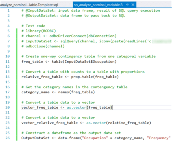
Figure 3 - Comment the testing codes before publishing
2.2.5 Run the Stored Procedure
Run the stored procedure through SSMS. The result should look like Figure 4. The result reveals that the occupation of most customers is professional, and the least is manual.
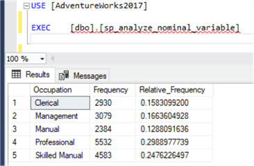
Figure 4 - Run the stored procedure through SSMS
2.3 Create a Frequency Distribution Bar Chart
Although the result, shown in Figure 4, adequately describes the customer occupations in the database, business users may prefer to a graphical presentation. One of the most widely used graphical methods for describing qualitative data is bar graph [5]. We can use the plot function in the base installation to construct an occupation frequency bar chart.
Run R function "ls()" in the interactive window to ensure the variable "InputDataSet" still exists. Then, Run the following R codes in the R interactive window. We obtain a bar chart as shown in Figure 5. Through the bar chart, it is obvious that the number of professionals is the highest, and the number of manuals is the lowest.
plot(InputDataSet$Occupation, main = "Occupation",
     xlab = "Occupation",
     ylab = "Number of Customers",
     col = "blue")
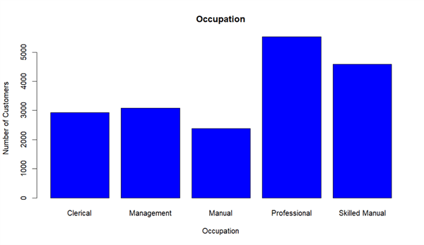
Figure 5 - A bar chart for customer occupation frequency distribution
3 – Analyzing an Ordinal Variable
In the AdventureWorks system exists a list of educational experience levels, from lowest to highest: partial high school, high school, partial college, bachelors and graduate degree. In addition to ask the number of customers at each level, the business users also ask, for example, how many customers are below a level. The solution is to look at the cumulative frequency distribution, which shows a running total of the frequency in the distribution. The running total of the relative frequency is called a cumulative relative frequency distribution [6].
3.1 Construct a Cumulative Frequency Distribution for Ordinal Variable
Let's randomly select 20 customer educational experience levels from the AdventureWorks database. Since the order of levels is meaningful, we can organize the raw data in ascending order, as shown in Table 4. Through the array, we can immediately read out some summary statistics. The lowest level is high school, and the highest level is graduate degree. The median, the value at halfway point, is bachelors. The mode, the most frequently occurring value, is bachelors. Usually, we do not compute the mean of an ordinal variable.
| 1 | High School | 6 | Partial College | 11 | Bachelors | 16 | Bachelors |
| 2 | High School | 7 | Partial College | 12 | Bachelors | 17 | Bachelors |
| 3 | High School | 8 | Partial College | 13 | Bachelors | 18 | Graduate Degree |
| 4 | Partial College | 9 | Partial College | 14 | Bachelors | 19 | Graduate Degree |
| 5 | Partial College | 10 | Bachelors | 15 | Bachelors | 20 | Graduate Degree |
Table 4 - Educational levels of 20 customers
To obtain the cumulative distribution, we compute the running total of the class frequency. The cumulative relative frequency is obtained by dividing the running total by the total number of observations in the data set, as shown in Table 5.
| Class | Frequency | Cumulative Frequency | Cumulative Relative Frequency |
| High School | 3 | 3 | 0.15 |
| Partial College | 6 | 9 | 0.45 |
| Bachelors | 8 | 17 | 0.85 |
| Graduate Degree | 3 | 20 | 1.00 |
Table 5 - Cumulative frequency table for educational experience levels of 20 customers
3.2 Construct a Cumulative Frequency Distribution through R
The function "cumsum()" in R is used to compute cumulative sum. Let's add a new script file "compute_cumulative_frequency_distribution.R" to the project. We replace the content of the file with the following R codes:
library(RODBC)
channel <- odbcDriverConnect(dbConnection)
InputDataSet <- sqlQuery(channel,
                         "
      SELECT rtrim(ltrim(p.Education)) AS Education
      FROM [Sales].[vIndividualCustomer] c inner join [Sales].[vPersonDemographics] p
           ON c.BusinessEntityID = p.BusinessEntityID
                         ")

odbcClose(channel)

# R sorts strings in the alphabet order by default.
# I use the factor() function to inform R about the correct order
Education_Level = factor(InputDataSet$Education, order = TRUE,
                   levels = c("Partial High School", "High School", "Partial College", "Bachelors", "Graduate Degree"))

# Create one-way contingency table from one categorial variable
freq_table <- table(Education_Level)

# Get cumulative frequencies
cumulative_freq <- cumsum(freq_table)

# Get cumulative relative frequencies
cumulative_relative_freq <- cumulative_freq / nrow(InputDataSet)

# Get the category names in the contingency table
category_name <- names(freq_table)

# Convert a table data to a vector
vector_cumulative_freq <- as.vector(cumulative_freq)

# Convert a table data to a vector
vector_cumulative_relative_freq <- as.vector(cumulative_relative_freq)

# Construct a dataframe as the output data set
OutputDataSet <- data.frame("Education" = category_name,
                            "Cumulative Frequency" = vector_cumulative_freq,
                            "Cumulative Relative Frequency" = vector_cumulative_relative_freq)
print(OutputDataSet)
The output in the R interactive window should look like Figure 6. More than half of customers do not own a bachelor's degree.
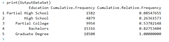
Figure 6 - Output in the R interactive window
3.3 Create a Cumulative Relative Frequency Diagram
Although the output, shown in Figure 6, can reveal the summary of customer educational experience levels in the database, business users may prefer to a graphical presentation. We can construct a less-than cumulative relative frequency graph by plotting the less-than cumulative relative frequency against the upper-class limit [6].
To demonstrate the less-than cumulative frequencies, I re-organized the data in Figure 6 into the less-than cumulative frequencies as shown in Table 6. Note that the less-than cumulative frequencies reflect the number of customers below the particular educational experience level. For example, 54% of customers have not obtained a bachelor's degree.
| Educational Experience | Frequency | Less-than Cumulative Frequency | Less-than Cumulative Relative Frequency |
|---|---|---|---|
| No educational experience to less than Partial High School | 0 | 0 | 0.00 |
| Partial High School to less than High School | 1582 | 1582 | 0.09 |
| High School to less than Partial College | 3297 | 4879 | 0.26 |
| Partial College to less than Bachelors | 5075 | 9954 | 0.54 |
| Bachelors to less than Graduate Degree | 5362 | 15316 | 0.83 |
| Graduate Degree to less than the Next Higher Degree | 3192 | 18508 | 1.00 |
Table 6 - Less-than cumulative frequencies and less-than cumulative relative frequencies
Run the following R codes in the R interactive window. We obtain a diagram as shown in Figure 7. The x-axis tick values, from 1 to 6, correspond to the upper limits in Table 6. Through the less-than cumulative relative frequency diagram, we can easily find the percentage of customers whose educational experience level is under a chosen educational level. For example, 83% of customers do not have a graduate degree.
education_level <- seq(1, length(category_name))
plot(education_level, vector_cumulative_relative_freq,
                    main = "Less-than Cumulative Relative Frequency Diagram",
                    xlab = "Educational Experience Level",
                    ylab = "Cumulative Relative Frequency")
lines(education_level, vector_cumulative_relative_freq)
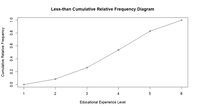
Figure 7 - Less-than cumulative relative frequency diagram of educational experience levels
4 – Analyzing a Ratio Variable
Business users want to analyze individual customer historical purchases to get an insight about customer buying behavior. Thus, the total purchase amount of each individual customer in the past year is of interest to them. In this case, the total purchase amount is the variable of interest, which is numerical in nature. If the total purchase amount of a customer is zero, this indicates that the customer had not purchased anything from AdventureWorks last year. Thus, the total purchase amount in last year is a ratio variable. A ratio variable has all characteristics of an interval variable. Therefore, the statistical techniques used in this section can apply to both the interval variable and the ratio variable.
4.1 Percentiles
Business users like to identify most profitable customers, and design marketing efforts to keep these customers happy. Customer profitability is defined as the difference between revenues and costs. In this exercise, we are going to look at the customer total purchase amount. We would like to compare the total purchase amount of one customer in 2013 to other customers' purchase amount in the same year.
We assume the total purchase amount of a customer is $3084 in year 2013. To find
the percentage of customers whose total purchase amount in 2013 is less than $3084,
we can use a positional measure method, percentile, in statistics. There is no universal
definition for percentile; we are going to use the definition introduced in [6].
Percentiles are values that divide a data set into 100 equal parts. The value of
a percentile is denoted as
 .
In the given example, if
.
In the given example, if
 ,
we can say that roughly 85% of customers spent less than this value, $3084, and
15% of customers spent larger than this value.
,
we can say that roughly 85% of customers spent less than this value, $3084, and
15% of customers spent larger than this value.
We can compute percentiles for ordinal, interval, or ratio variables. The first step is to arrange raw data into an ascending array, then use the following equation to compute the position number of a percentile in the array [6]:

where
denotes the value at the xth
percentile; x denotes the number of the desired percentile, N denotes the total
number of observations in the data set. The last step is to find the value at that
position.
After introduction of percentiles, we can use a five-number summary, including
the minimum value,
 ,
median (
,
median ( ),
),
 and the maximum value, to describe a set of data. We will compute a five-number
summary of customer total purchase amount in 2013.
and the maximum value, to describe a set of data. We will compute a five-number
summary of customer total purchase amount in 2013.
I used the following SQL script to randomly pick up 56 records from the AdventureWorks database. The query results are presented in Table 7.
DECLARE @purchase_totals TABLE
(
  purchase_total money
)

INSERT INTO @purchase_totals
SELECT sum([SubTotal]) AS Total_Purachase_2013
FROM [Sales].[SalesOrderHeader] o INNER JOIN [Sales].[Customer] c
                                  ON o.CustomerID = c.CustomerID
WHERE c.PersonID is not null
      and year([OrderDate])= 2013
Group by c.PersonID

SELECT top 0.5 percent purchase_total
FROM @purchase_totals
ORDER BY NEWID()
| 2457.33 | 2983.34 | 564.99 | 132.97 | 69.97 | 751.34 | 23.78 | 34.98 |
| 37.27 | 162689.36 | 2458.92 | 3121.30 | 4.99 | 2369.97 | 2492.32 | 1779.47 |
| 96.46 | 103.48 | 69.99 | 24.99 | 33.98 | 39.98 | 86.45 | 83.95 |
| 2334.97 | 23.78 | 828.47 | 782.99 | 4217.30 | 1249.84 | 4.99 | 34.47 |
| 3084.02 | 553.97 | 63.97 | 123.21 | 3360.42 | 68243.95 | 135970.05 | 2294.99 |
| 101.45 | 139462.79 | 106.95 | 23.78 | 68.49 | 42.28 | 2365.94 | 49.97 |
| 1700.99 | 726.27 | 1382.97 | 2466.32 | 2479.94 | 2511.32 | 323.99 | 34.99 |
Table 7 - Randomly pick up 56 customer total purchase amount in 2013
To summarize the row data in Table 7, a simple method is to organize these data into an array, in which values are in ascending or descending order of magnitude [6]. By using Excel to sort these values, we have obtained the sorted values shown in Table 8. We also find the mean of the data set, i.e. 9991.63.
| 4.99 | 34.47 | 63.97 | 101.45 | 564.99 | 1700.99 | 2458.92 | 3121.3 |
| 4.99 | 34.98 | 68.49 | 103.48 | 726.27 | 1779.47 | 2466.32 | 3360.42 |
| 23.78 | 34.99 | 69.97 | 106.95 | 751.34 | 2294.99 | 2479.94 | 4217.30 |
| 23.78 | 37.27 | 69.99 | 123.21 | 782.99 | 2334.97 | 2492.32 | 68243.95 |
| 23.78 | 39.98 | 83.95 | 132.97 | 828.47 | 2365.94 | 2511.32 | 135970.05 |
| 24.99 | 42.28 | 86.45 | 323.99 | 1249.84 | 2369.97 | 2983.34 | 139462.79 |
| 33.98 | 49.97 | 96.46 | 553.97 | 1382.97 | 2457.33 | 3084.02 | 162689.36 |
Table 8 - Sorted total purchase amount in 2013
The Table
8 reveals that the lowest value is 4.99 and the highest value is 162689.36
in the data set. The range, which is the difference between two extreme values,
is 162268.37. The value at the halfway point, the median or
,
is between 553.97 and 564.99. The median can be assumed to be the average of two
middle positions, thus the median of this data set is (553.97 + 564.99)/2 = 559.48.
The 25th percentile is also
called the first quartile, denoted as
 ,
can be computed in two steps:
,
can be computed in two steps:
The first step is to find the position number of the percentile:

The second step is to find the value at the position:
The 14th position in the array is 49.97 and the 15th position is 63.97, thus:

The 75th percentile is also
called the third quartile, denoted as
 ,
which can be computed in the same way as we compute
:
,
which can be computed in the same way as we compute
:

The 42th position in the array is 2457.33 and the 43th position is 2458.92, thus:

Here is the five-number summary of the sample data set:
- the minimum value: 4.99
-
:
53.47
- median: 559.49
-
:
2458.52
- the maximum value: 162689.36
It is worth noting that two functions in R, summary() and fivenum(), can compute
the five-number summary. Since R uses a different algorithm to estimate underlying
distribution, the
and
will be different from the results we have computed by hand.
When a distribution has extremely high and low values, like the sample data set, it is more useful to focus on data in the range covered by the middle 50% of the observed values. The range where the middle 50% of the values lie is called interquartile range (IQR), which can be computed by:
The interquartile range for the sample data is 2458.52 - 53.47 = 2405.05, which is much less than the range of the data set, 162268.37.
4.2 Create a Boxplot
We have computed the five-number summary of the sample data by hand. A boxplot, as shown in Figure 8, is used to visualize this summary. In addition, a boxplot can identify outliers, which are abnormally different from other values in the data set.

Figure 8 - boxplot components
4.2.1 Construct a Boxplot
Statistical tools, like R and SAS, can plot a boxplot from a data set. Unlike a line graph or a bar graph, the information represented by a boxplot is not obvious to a first-time user. In an attempt to know how to read and construct a boxplot, let's create a boxplot from the data in Table 8 by hand.
Step 1: Compute Q1, Median, Q3, and IQR
We have already known:
- Q1 = 53.47
- Median = 559.49
- Q3 = 2458.52
- IQR = 2405.05
Step 2: Compute Lower Inner Fence, Upper Inner Fence, Lower Outer Fence and Upper Outer Fence
- Lower Inner Fence = Q1 - 1.5 * IQR = -3554.11
- Upper Inner Fence = Q3 + 1.5 * IQR = 6066.10
- Lower Outer Fence = Q1 - 3.0 * IQR = -7161.68
- Upper Outer Fence = Q3 + 3.0 * IQR = 7268.62
Step 3: Identify the positions of Lower Whisker and Upper Whisker
- Lower Whisker is drawn to the most extreme point that is greater than or equal to the Lower Inner Fence, i.e. -3554.11. Since Table 8 was sorted, the first value 4.99, the least value in the data set, is greater than the Lower Inner Fence. Thus, we have obtained the value of Lower Whisker (= 4.99).
- Upper Whisker is drawn to the most extreme point that is less than or equal to the Upper Inner Fence, i.e. 6066.10. The value at the 52rd position, 4217.30, is the greatest value that is less than the Upper Inner Fence. Thus, we have obtained the value of Upper Whisker (= 4217.30).
Step 4: Identify the extreme outliers
All values locate the outside of the outer fences are extreme outliers, marked by *. The data set in Table 8 has 4 extreme outliers: 68243.95, 135970.05, 139462.79 and 162689.36.
Step 5: Identify the mild outliers
All points beyond the inner fences but inside the outer fences are mild outliers. No mild outliers are found in the data set.
Step 6: Draw a boxplot
All the components in Figure 8 have been identified; and we can use the model presented in this figure as a template to sketch a boxplot.
It is worth noting that we should treat outliers carefully. Outliers don't always mean bad data. They may contain some valuable information that is worthy of further investigations. After a careful investigation, I have found the SQL codes I used to randomly select data from the database are not correct. Some values of total purchase amount, returned from the SQL codes, were made by stores rather than individual customers. This kind of outliers should be eliminated in any further analysis.
4.2.2 Plot a Boxplot in R
The R function "boxplot" in the base installation can be used to plot a boxplot. The following R codes are used to retrieve a data set from the database, then construct a boxplot, as shown in Figure 9. We have noticed that the boxplot produced R is slightly different the plot shown in Figure 8.
library(RODBC)
channel <- odbcDriverConnect(dbConnection)
InputDataSet <- sqlQuery(channel,
                         "
                            SELECT sum([SubTotal]) AS Total_Purachase_2013
                            FROM [Sales].[SalesOrderHeader] o INNER JOIN [Sales].[Customer] c
                                        ON o.CustomerID = c.CustomerID
                            WHERE c.PersonID is not null and c.StoreID is null
                                  and year([OrderDate]) = 2013
                            Group by c.PersonID
                         ")

odbcClose(channel)

# Plot a Boxplot
boxplot(InputDataSet$Total_Purachase_2013,
        horizontal = TRUE,
        main = "Box plot",
        xlab="Total Purchase of Each Customer in 2013")

# Print the statistics used to build the graph
boxplot.stats(InputDataSet$Total_Purachase_2013)
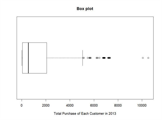
Figure 9 - A boxplot of total purchase of each customer in 2013
Two extreme outliers have been identified in the boxplot. The R function "boxplot.stats" tell that the data set has 53 outliers out of 10,541 observations. Before considering trimming out these outliers, we should investigate whether they are valid values or not; and whether the similar values will continue to enter to the system.
4.3 Construct a Frequency Distribution for a Ratio Variable
We have respectively constructed frequency distributions for a nominal variable and an ordinal variable; these two kinds of variables can only take on a small number of discrete values. Since an interval variable or a ratio variable usually has many distinct values, we will apply a different approach to construct the frequency distribution.
Firstly, 4 outliers in Table 8 were eliminated because they came from the SQL query error. All valid values are presented in Table 9.
| 4.99 | 34.47 | 63.97 | 101.45 | 564.99 | 1700.99 | 2458.92 | 3121.3 |
| 4.99 | 34.98 | 68.49 | 103.48 | 726.27 | 1779.47 | 2466.32 | 3360.42 |
| 23.78 | 34.99 | 69.97 | 106.95 | 751.34 | 2294.99 | 2479.94 | 4217.30 |
| 23.78 | 37.27 | 69.99 | 123.21 | 782.99 | 2334.97 | 2492.32 | - |
| 23.78 | 39.98 | 83.95 | 132.97 | 828.47 | 2365.94 | 2511.32 | - |
| 24.99 | 42.28 | 86.45 | 323.99 | 1249.84 | 2369.97 | 2983.34 | - |
| 33.98 | 49.97 | 96.46 | 553.97 | 1382.97 | 2457.33 | 3084.02 | - |
Table 9 - Sample data of customer total purchase amount in 2013
Then, we define a class with a lower limit and upper limit. The difference between the lower limit and the upper limit is called class width. We can group values into different classes by comparing values to these limits. We are going to follow procedure in [6] to construct a frequency distribution for a ratio variable. This procedure can apply to continuous variables that take on any values in a range.
Step 1: Determine the number of classes and the width of the class intervals.
It is recommended that the number of classes should be between 6 and 15. Since we only have 52 values in the data set, we should keep the number of classes low [6]. The range of the values in Table 9 is 4217.30 – 4.99 = 4212.31. If we define 6 classes, the class width should be 4212.31/6= 702.05. Thus, a class width of 500 is a rational. Since 4212.31/500=8.42, the number of classes will be 9.
Step 2: Construct classes
Since the least value is 4.99, we can select 0 as the first lower limit. Then, the lower limits of other classes will be 500, 1000, 1500, 2000, 2500, 3000, 3500, 4000 and 4500.
Step 3: Count the class frequencies
The class frequency is the number of observations in the data set falling in a class interval. By counting the occurrence of observations in each class, we have obtained a frequency table as shown in Table 10.
| Class Interval | Class Frequencies |
|---|---|
| 0 to under 500 | 27 |
| 500 to under 1000 | 6 |
| 1000 to under 1500 | 2 |
| 1500 to under 2000 | 2 |
| 2000 to under 2500 | 9 |
| 2500 to under 3000 | 2 |
| 3000 to under 3500 | 3 |
| 3500 to under 4000 | 0 |
| 4000 to under 4500 | 1 |
Table 10 - Frequency distribution of sample data
4.4 Create a Frequency Distribution Histogram in R
A histogram is constructed directly from a frequency distribution. The histogram is a vertical bar graph that the width of the bar represents class width and the height of each bar represents the frequency or relative frequency of the class. One important feature of the histogram is that all bars should touch adjacent bars.
R provides a function "hist" to plot a histogram from a data set. The number of bar in the histogram is determined by the "breaks" parameter. The following R codes will load a data set from the database then plot a histogram:
library(RODBC)
channel <- odbcDriverConnect(dbConnection)
InputDataSet <- sqlQuery(channel,
                         "
                            SELECT sum([SubTotal]) AS Total_Purachase_2013
                            FROM [Sales].[SalesOrderHeader] o INNER JOIN [Sales].[Customer] c
                                        ON o.CustomerID = c.CustomerID
                            WHERE c.PersonID is not null and c.StoreID is null
                                  and year([OrderDate]) = 2013
                            Group by c.PersonID
                         ")
odbcClose(channel)
# Plot a histogram
hist(InputDataSet$Total_Purachase_2013,
        breaks = 9,
        col= "blue",
        main = "Frequency Distribution Histogram",
        xlab = "Total Purchase 2013")
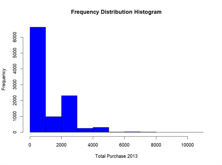
Figure 10 - A frequency distribution histogram for customer total purchase in 2013
The boxplot shown in Figure 9 gives an overview of the data distribution. The histogram illustrated in Figure 10 gives more detail information. Firstly, the distribution is not symmetric. Most customers spent less than $1,000 on AdventureWorks products or services in 2013; only a few customers spent more than $5,000. We can also compare customer groups, for example, the number of customers whose total purchase amount in the range [2000, 3000] is twice as large as the number of customers whose total purchase amount in the range [1000, 2000].
5 - Pass Multiple Datasets to the Stored Procedure: SP_EXECUTE_EXTERNAL_SCRIPT
One objective of this exercise to construct a dashboard with 4 graphs that we have created in the previous sections. The data used for these 4 graphs came from two different data sets. According to [8], we can pass only one input dataset to the stored procedure "sp_execute_external_script". [8] implies that we can use R codes to connect the SQL server to retrieve an additional dataset. I do not think this is a preferable solution because we need to specify a database connection string in R codes. I prefer to a neat solution whereby we serialize a dataset first then pass this serialized dataset as a stored procedure parameter. To use this method, we need three stored procedures to construct the dashboard.
5.1 Create a Stored Procedure "sp_customer_demographics"
We create this stored procedure to retrieve customer demographics data from the database, and then define the serialized dataset as output parameter of this stored procedure. Since we use the RTVS tool, one stored procedure consists of three source files.
5.1.1 sp_customer_demographics.Query.sql
-- Place SQL query retrieving data for the R stored procedure here

SELECT p.Occupation,rtrim(ltrim(p.Education)) AS Education
FROM [Sales].[vIndividualCustomer] c inner join  [Sales].[vPersonDemographics]  p
                                     ON c.BusinessEntityID = p.BusinessEntityID
5.1.2 sp_customer_demographics.R
# @InputDataSet: input data frame, result of SQL query execution
# @OutputDataSet: data frame to pass back to SQL

# Test code
# library(RODBC)
# channel <- odbcDriverConnect(dbConnection)
# InputDataSet <- sqlQuery(channel, )
# odbcClose(channel)

# Serialize dataset
output_serialized_r <- serialize(InputDataSet, NULL)
5.1.3 sp_customer_demographics.Template.sql
CREATE PROCEDURE [sp_customer_demographics]
   @demographics_data_sql VARBINARY(MAX) output
AS
BEGIN
EXEC sp_execute_external_script@language = N'R'
    , @script = N'_RCODE_'
    , @input_data_1 = N'_INPUT_QUERY_'
   , @params = N'@output_serialized_r VARBINARY(MAX) OUTPUT'
   , @output_serialized_r = @demographics_data_sql OUT
--- Edit this line to handle the output data frame.
    WITH RESULT SETS NONE;
END;
This template file presented how a variable in R codes passed a value to a SQL variable.
5.2 Create a Stored Procedure "sp_customer_total_purachase_2013"
We create this stored procedure to retrieve customer total purchase amount from sales data in the database and, then, define the serialized dataset as an output parameter of this stored procedure.
5.2.1 sp_customer_total_purachase_2013.Query.sql
-- Place SQL query retrieving data for the R stored procedure here
SELECT sum([SubTotal]) AS Total_Purachase_2013
    FROM [Sales].[SalesOrderHeader] o INNER JOIN [Sales].[Customer] c
            ON o.CustomerID = c.CustomerID
WHERE c.PersonID is not null and c.StoreID is null and year([OrderDate]) = 2013
Group by c.PersonID
5.2.2 sp_customer_total_purachase_2013.R
# @InputDataSet: input data frame, result of SQL query execution
# @OutputDataSet: data frame to pass back to SQL

# Test code
# library(RODBC)
# channel <- odbcDriverConnect(dbConnection)
# InputDataSet <- sqlQuery(channel, )
# odbcClose(channel)

# Serialize dataset
output_serialized_r <- serialize(InputDataSet, NULL)
5.2.3 sp_customer_total_purachase_2013.Template.sql
CREATE PROCEDURE [sp_customer_total_purachase_2013]
   @total_purachase_data_sql VARBINARY( MAX ) output
AS
BEGIN
EXEC sp_execute_external_script@language = N'R'
    , @script = N'_RCODE_'
    , @input_data_1 = N'_INPUT_QUERY_'
   , @params = N'@output_serialized_r VARBINARY( MAX ) OUTPUT'
   , @output_serialized_r = @total_purachase_data_sql OUT
--- Edit this line to handle the output data frame.
    WITH RESULT SETS NONE;
END;
5.3 Create a Stored Procedure "sp_plot_customer_dashboard"
Each of the two stored procedures "sp_customer_demographics" and "sp_customer_total_purachase_2013" has an output parameter, which contains a serialized data set retrieved from the database. We will create a new stored procedure "sp_plot_customer_dashboard" to read values in these two parameters and un-serialize them. The new stored procedure also plots 4 graphs and arrange them into one page. Since we obtain data from other two stored procedures, there is no SQL query in the Query.sql file. We only need to edit the R code file and the template file.
5.3.1 sp_plot_customer_dashboard.R
# @InputDataSet: input data frame, result of SQL query execution
# @OutputDataSet: data frame to pass back to SQL

# Test code
# library(RODBC)
# channel <- odbcDriverConnect(dbConnection)
# InputDataSet <- sqlQuery(channel, )
# odbcClose(channel)

# Un-serialize dataset
demographics_data <- unserialize(demographics_data_r)
purchase_data <-unserialize(purchase_data_r)

# Save the graph to a pdf file
pdf(paste("C:\\Development\\workfolder\\", as.character(Sys.Date()), "dashboard.pdf"))

# Determine the layout of the dashboard
op <- par(mfrow = c(2, 2), # 2 x 2 pictures on one plot
          pty ="m") # generates the maximal plotting region.

# Plot occupation bar graph
plot(demographics_data$Occupation, main ="Occupation Frequency Distribution",
     ylab ="Number of Customers",
     las = 2,
     cex.names = 0.8,
     col ="blue")

# Plot Total Purchase Boxplot
boxplot(purchase_data$Total_Purachase_2013,
        horizontal =TRUE,
        main ="Customer Total Purchases Distribution",
        xlab ="Total Purchases of Each Customer in 2013")

## Compute Cumulative Relative Frequency of Customer Educational Level

# R sorts strings in the alphabet order by default.
# I use the factor() function to inform R about the correct order
Education_Level = factor(demographics_data$Education, order = TRUE,
                  levels = c("Partial High School", "High School", "Partial College", "Bachelors", "Graduate Degree"))

# Create one-way contingency table from one categorial variable
freq_table <- table(Education_Level)

# Get cumulative frequencies
cumulative_freq <- cumsum(freq_table)

# Get cumulative relative frequencies
cumulative_relative_freq <- cumulative_freq / nrow(demographics_data)

# Get the category names in the contingency table
category_name <- names(freq_table)

# Convert a table data to a vector
vector_cumulative_freq <- as.vector(cumulative_freq)

# Convert a table data to a vector
vector_cumulative_relative_freq <- as.vector(cumulative_relative_freq)

# Plot less-than cumulative relative frequencies against the upper class limit
# Thus, we add a "Next Higher Degree" level, which is higher than "Graduate Degree"
# Construct x-axis
Educational_experience_level <- seq(1, length(category_name)+1)
Less_than_cumulative_relative_freq <- c(0, vector_cumulative_relative_freq)

# Plot less-than cumulative relative frequencies
plot(Educational_experience_level, Less_than_cumulative_relative_freq,
main = paste("Less-than Cumulative Relative ", "\nFrequency Diagram"),
xlab ="Educational Experience Level",
ylab ="Cumulative Relative Frequency")
lines(Educational_experience_level, Less_than_cumulative_relative_freq)
legend("topleft", legend = c("1: Partial High School",
                             "2: High School",
                             "3: Partial College",
                             "4: Bachelors",
                             "5: Graduate Degree"),
                , cex = 0.6, title ="Levels", bg ="lightblue")

# Plot Frequency Distribution Histogram
hist(purchase_data$Total_Purachase_2013,
     breaks = 9,
     col ="blue",
     main = paste("Frequency Distribution Histogram", "\nfor Customer Total Purchases"),
     xlab ="Total Purchases in 2013")

# shut down the current device
dev.off()
5.3.2 sp_plot_customer_dashboard.Template.sql
CREATE PROCEDURE [sp_plot_customer_dashboard]
AS
BEGIN
Declare @demographics_data_sql VARBINARY(MAX), @purchase_data_sql VARBINARY(MAX)

EXEC [dbo].[sp_customer_demographics]@demographics_data_sql OUTPUT
EXEC [dbo].[sp_customer_total_purachase_2013]@purchase_data_sql OUTPUT

EXEC sp_execute_external_script@language = N'R'
    , @script = N'_RCODE_'
   , @params = N'@demographics_data_r VARBINARY(MAX), @purchase_data_r VARBINARY(MAX)'
   , @demographics_data_r = @demographics_data_sql
   , @purchase_data_r = @purchase_data_sql
--- Edit this line to handle the output data frame.
    WITH RESULT SETS NONE;
END;
This template file demonstrated how we passed a value of a SQL variable to a variable in R codes.
6 - Put It All Together
We have created three stored procedures through RTVS in the previous section. Next, we publish all these stored procedures to a database and, finally, we run the stored procedure in SSMS. A PDF file will be generated in the folder "C:\Development\workfolder". The content in the file should look like Figure 11.
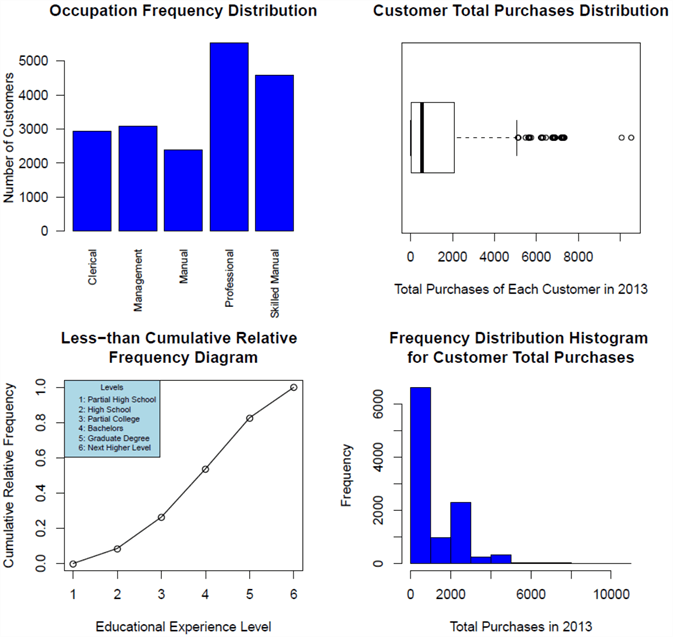
Figure 11 - The customer demographic dashboard
This dashboard reveals a big picture of AdventureWorks customers. AdventureWorks serves a broad diversity of customers across different occupations and educational experience levels. More than half of customers are technical people whose occupations are professional or skilled manual. Roughly half of customers do not have bachelor's degree. We can also find that most customers spent less than $1000 in 2013; only a few customers spent more than $5000; and two customers spent more than $8000.
Summary
We have compared 4 types of variables: nominal, ordinal, interval and ratio. We have used Stevens' classification table [4] to list permissible statistics for each type of variables. We have placed a focus on analyzing single variable of the customer demographic data in the AdventureWorks database. We, initially, analyzed the occupation variable and, subsequently, the educational experience level variable. Finally, we studied the customer total purchase amount in 2013. We have combined the frequency distribution bar graph, the less-than cumulative relative frequency diagram, the boxplot and the frequency distribution histogram into the dashboard that can provide valuable insight to business users.
References
[1] Sarka, D. (2018). Data Science with SQL Server Quick Start Guide. Birmingham, UK: Packt Publishing.
[2] Kabacoff, R. (2015). R in Action, Second Edition: Data analysis and graphics with R. Shelter Island, NY: Manning Publications.
[3] Kess, B. (2017, December 12). AdventureWorks sample databases. Retrieved from https://github.com/Microsoft/sql-server-samples/releases/tag/adventureworks.
[4] Stevens, S. S. (1946). On the Theory of Scale of Measurement. Science, 103(2684), 677-680. http://www.jstor.org/stable/1671815
[5] William, M., & Sincich, T. (2012). A Second Course in Statistics: Regression Analysis (7th Edition). Boston, MA: Prentice Hall.
[6] Hummelbrunner, S. A., Rak, L. J., Fortura, P., & Taylor, P. (2003). Contemporary Business Statistics with Canadian Applications (3rd Edition). Toronto, ON: Prentice Hall.
[7] Brockschmidt, K., Hogenson, G., Warren, G., McGee, M., Jones, M., & Robertson, C. (2017, December 12). R Tools for Visual Studio sample projects. Retrieved from https://docs.microsoft.com/en-us/visualstudio/rtvs/getting-started-samples?view=vs-2017.
[8] Takaki, J., Steen, H., Rabeler, C., Mike, B., Kess, B., Hamilton, B, Roth, J. & Guyer, C. (2018, July 14). Quickstart: Handle inputs and outputs using R in SQL Server. Retrieved from https://docs.microsoft.com/en-us/sql/advanced-analytics/tutorials/rtsql-working-with-inputs-and-outputs?view=sql-server-2017.
Next Steps
- I have used a term "single variable" for easy understanding of the statistical techniques and graphics techniques. A statistics textbook may prefer a term, such as, univariate analysis. You can use the key word "univariate analysis" to search in your available resources to find more materials about performing univariate analysis. I also recommend Sarka's book, Data Science with SQL Server Quick Start Guide, which is intended for SQL Server professionals and data scientist who would like to start using SQL Server in their data science projects [1].
- Check out these related tips:
- Getting Started with Data Analysis on the Microsoft Platform — Examining Data
- Data Science for SQL Server Professionals
- SQL Server sp_execute_external_script Stored Procedure Examples
- SQL Server 2016 Regular Expressions with the R Language
- Generate charts rapidly with SQL Server using R and T-SQL
- Visual SQL Server Performance Data Comparison with R
- Analyze Categorical Data with a Mosaic Plot in SQL Server with R
- SQL Server Data Access Using R – Part 1
- SQL Server Data Access Using R – Part 2
- SQL Server Data Access Using R – Part 3


About the author
 Nai Biao Zhou is a Senior Software Developer with 20+ years of experience in software development, specializing in Data Warehousing, Business Intelligence, Data Mining and solution architecture design.
This author pledges the content of this article is based on professional experience and not AI generated.
View all my tips
