By: Gauri Mahajan | Comments (6) | Related: > Power BI Charts
Problem
In any business process, analytical reporting plays a vital role to make data-driven decisions based on analytics and evaluation of a business strategy. Reporting and scorecards, with their drill-down abilities, go side-by-side in determining how a business is doing overall. Scorecards are commonly used by top management to assess performance and summary of business statistics. Sometimes, when there is a requirement to deal with large datasets, with too much detailed information that needs to be presented, it is always a good practice to show visualizations with details as precisely as possible in the overview display. If we show graphs, charts, tables, etc. in the same scorecard to have a one-page overview of business improvement goals, the screen space is not efficiently used in this case and can get crowded. We want something that would provide a compact view that is able to give immediate details about the overall structure. The expectation is to have visualizations with summary and details of the big dataset in one grid with a simple implementation. Let's see how can we address this problem.
Solution
VitaraCharts-MicroChart is one of the best approaches for analytical reporting especially required by executive management. With MicroCharts, we can quickly build scorecards and dashboards. It supports a comprehensive technique that is easy to use and works with more than one metric in a compact grid design. We will show compact visual representation of metrics in different chart formats available with MicroCharts.
In order to get started, we need to ensure we have Power BI Desktop installed. It is free to download from here.
Let's move forward and see how this custom visual can be used.
Importing Custom Visuals - Vitaracharts - Microchart in Power BI Desktop
To import this visual in Power BI Desktop, we will have to download it first. You can download it from here.
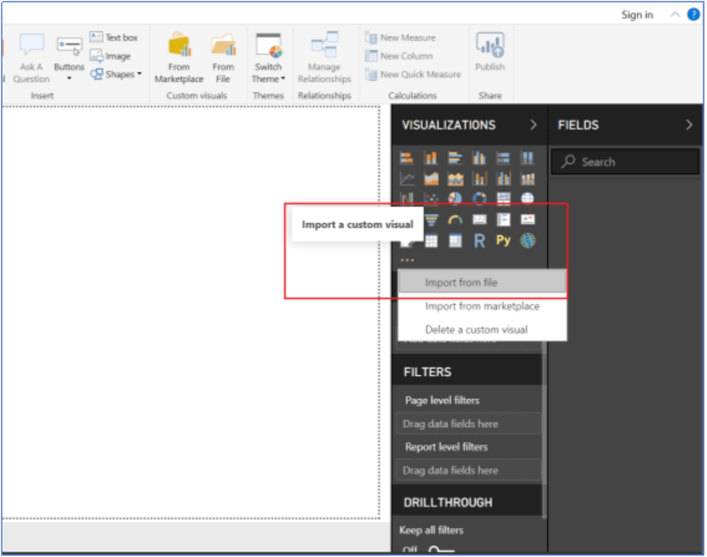
Once it is downloaded, open Power BI Desktop and click the ellipses from the bottom of the Visualizations pane. Select Import from file as shown below.
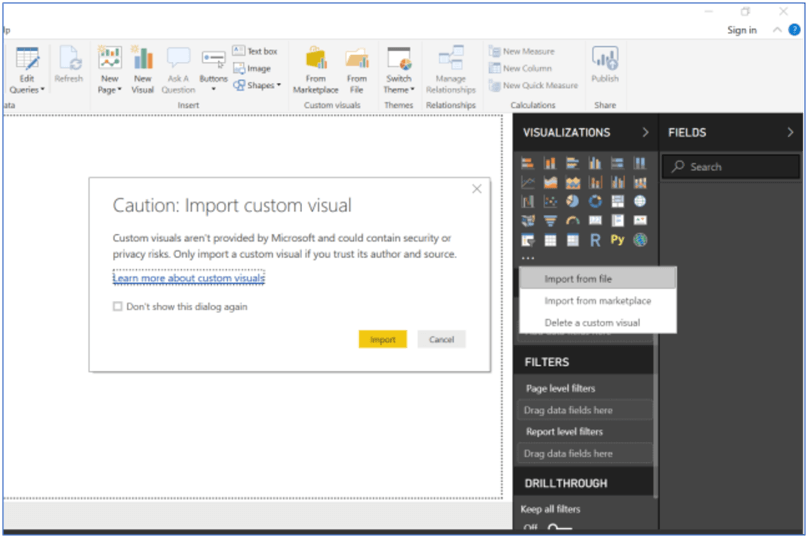
You will get this screen then click the Import button.
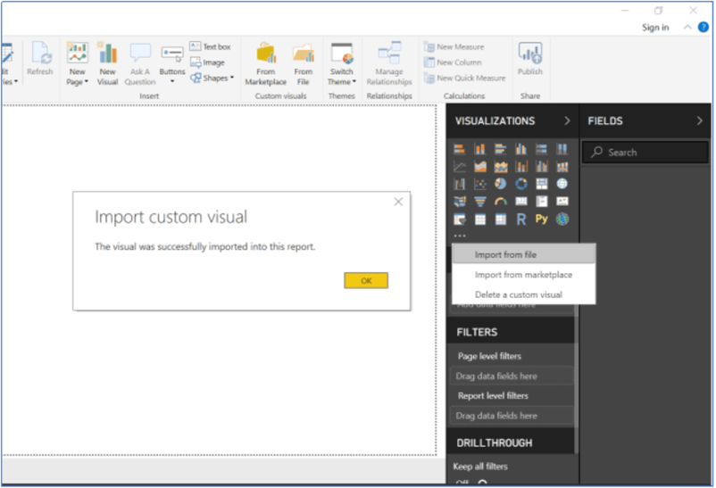
Navigate to newly downloaded custom visual file vitaracharts-microchart.1.0.2.0.pbiviz and click Open. You will see the below screen after opening the file.
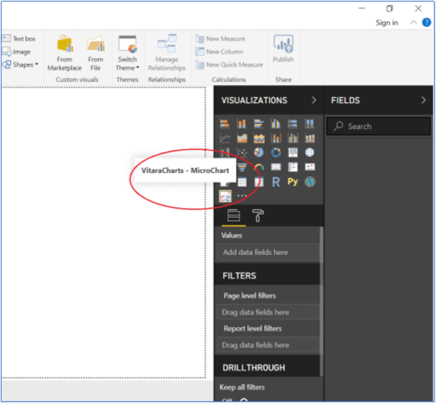
Once you click OK, the visual VitaraCharts – MicroChart is imported successfully in the report and a custom visual icon is added on the bottom of the visualizations pane. Hover over this icon and you can see the tooltip VitaraCharts – MicroChart.
Getting Sample Data to Work with MicroCharts and Power BI
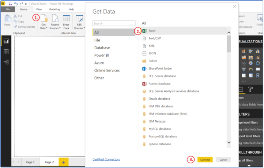
Click Get Data on the Home ribbon, select Excel and press the Connect button.
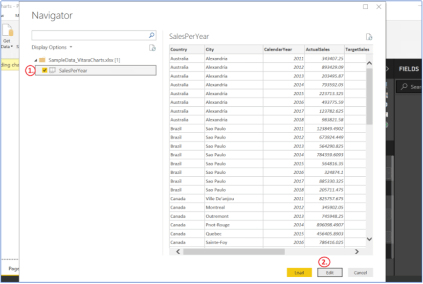
We will navigate to a sample Excel file that we created to demonstrate the functionality of VitaraCharts in this tip. You can download this Excel file from here. Click on the SalesPerYear file and select Edit button. You can see the preview of this spreadsheet on the right side of this navigator screen.
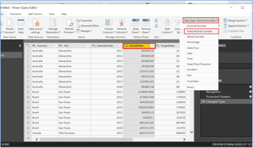
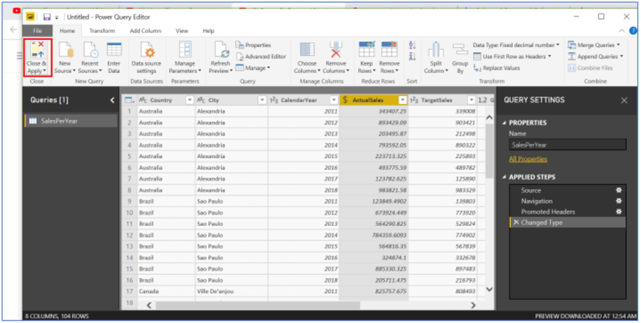
This will open the Power Query Editor window, click the ActualSales column and specify Fixed decimal number as the data type in the Data Type drop down in the top of the query editor. Basically, we intend to select Decimal(19,4) as the data type of this column to avoid rounding of its values.
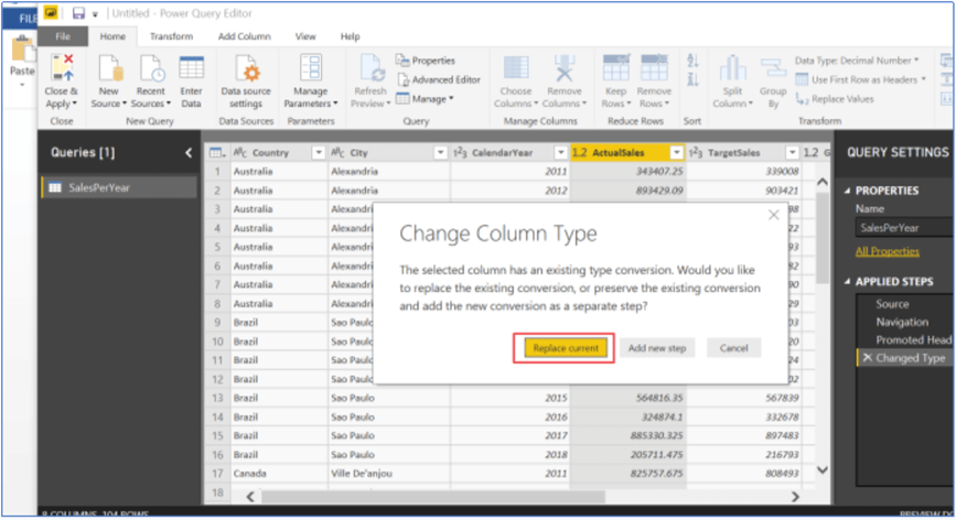
Click on the Replace current button to implement this data conversion.
Click on Close & Apply on the left top corner of Power Query Editor to import these changes into the Power BI report.
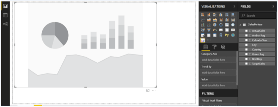
Once these changes are saved, data in the Excel file is loaded in the Fields pane. In order to work with MicroCharts, let's bring this visual into the report. To do so, simply click on this custom visual icon on the bottom of the visualization pane, right next to the ellipses. You can expand or resize the chart by grabbing its bottom right corner and dragging towards the right in the report.
Working Example using MicroCharts in Power BI Desktop
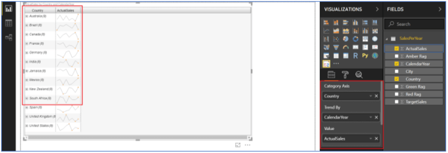
MicroCharts allows the use of one field as Category Axis and one field for trending. Select Microchart on the report and drag and drop the attribute Country on the Category Axis and attribute Calendar Year on Trend By on the Visualizations pane. Next, we will bring column ActualSales to the Value section. Once, this ActualSales column is added, the sales trend for all countries is seen in the report.
Line Chart in MicroCharts with Power BI
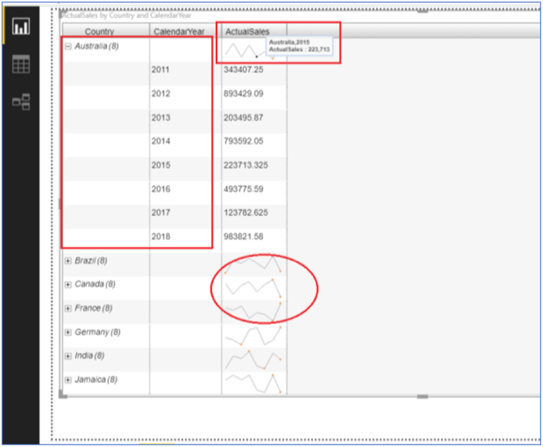
Expand the Country to see Sales per year from 2011 through 2018 for the country. By default, a Line Chart is shown as the trendline Charts and you can hover over this chart to look at the details.
Basically, MicroCharts supports three Trendline Charts (Line, Bar and Bullet Chart) and many more formatting options are available with each type of these charts. Hover over the header column ActualSales and click on the three lines icon next to it. Choose Trendline Charts and hit More Options… as shown below.
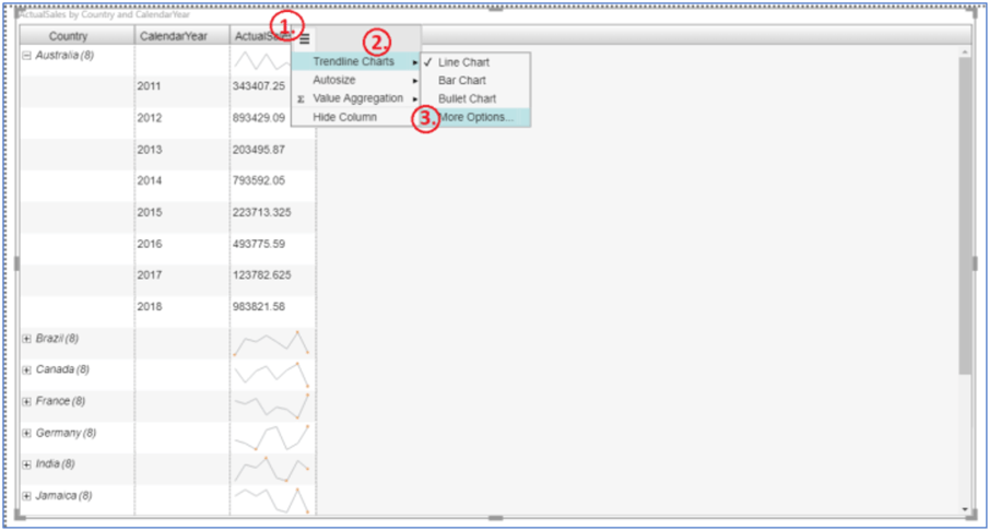
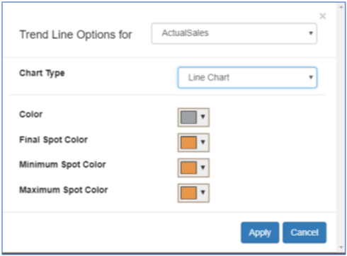
We can format Line Chart Trend for the given field and for different color combinations like line color and colors for different spots.
Bar Chart in MicroCharts in Power BI
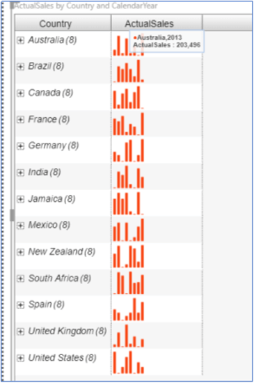
We can also select Bar Chart as Trendline Charts and choose color options to show it on the report. One such example is shown below.
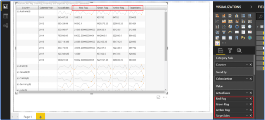
Now coming back to the data that we imported into the Power BI designer, we have a few more fields like TargetSales, Green Rag, Yellow Rag and Red Rag in the table. We intend to show a scorecard type of report here that compares a country's actual sales (ActualSales) against projected sales (TargetSales) using simple visualizations. Also, we would like to evaluate how a country is doing over a period of time using RAGs (Red, Amber and Green). We are using arbitrary values in the RAG columns for the sake of simplicity, generally they are calculated based on several key performance indicators and vary from project to project.
Bullet Chart in MicroCharts in Power BI
It's time to introduce a Bullet Chart to the report and see how it is implemented with the data we have on hand. Let's quickly bring in columns (TargetSales, Green Rag, Amber Rag and Red Rag) into the report by checking them on the Fields pane.
We want to measure a country's sales performance against TargetSales with different RAG information and will be displaying it using a Bullet Chart visualization. If you notice, if we drag and drop ActualSales a second time in the Value section, MicroCharts will not allow us to use this column more than once in the chart, so we will have to add one new column (named ActualSalesPerformance) to create a Bullet Chart. This new column will have the save value as ActualSales. Right click on the table name under the Fields list and choose New column.
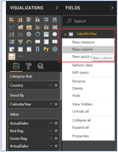
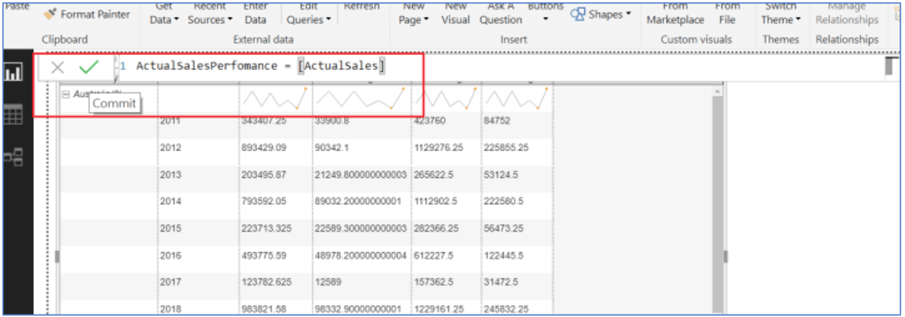
Provide ActualSalesPerformance as the name for this new column and assign the value as ActualSales. Click the tick mark icon that will commit these new column changes into the table.
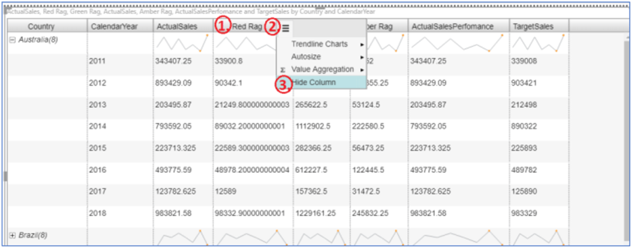
Once, this new column is added, it can be seen under the Fields list. Let's drag and drop it into the Value section to see this on the report as well. Since, we don't need RAGs columns as separate column headers in the report and we are going to use them in the Bullet Chart, we will go ahead and hide them. To do so, hover over the Red Rag column header, click on three black lines next to the column header name, and select Hide Column option. We will do this for all the three RAGs columns.
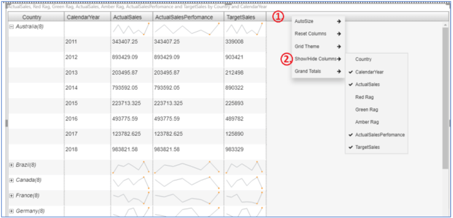
In case you want to bring the column back to the report or you accidently hid the column and want to show it again, there is a way to do so. Right click on the main column header section, select Show/Hide Columns and you can see the list of all the columns that are shown or hidden on the report. Select the column(s) that you want to display in the report.
Let's switch to creating a Bullet Chart visual now. Go to ActualSalesPerformance column header and click the three lines on the right side of the column and choose Trendline Charts and select Bullet Chart.
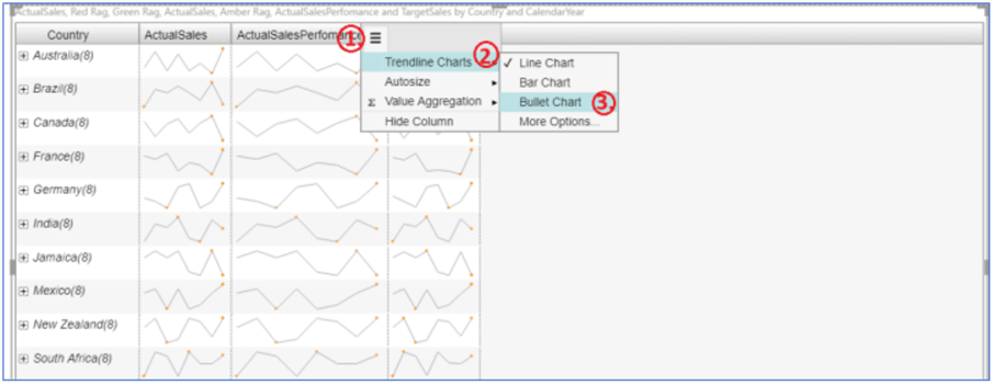
On selecting the Bullet Chart option, it will make this column ActualSalesPerformance as Bullet Chart as shown below. As of now, it is showing the Bullet Chart visual based on the default/random values. Let's go ahead and design this chart more suitably.
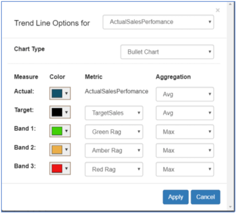
In order to configure the Bullet Chart appropriately, hit three lines on the top right corner of the column header once again, choose Trendline Charts and select More options… and a small configuration screen popped up with numerous options to select column name, Chart Type, set color pattern, metric name and aggregate values.
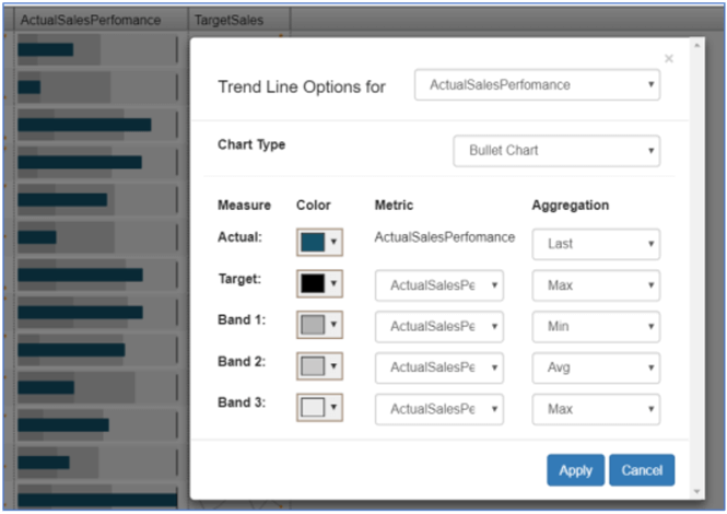
We will assign TargetSales as the Target measure and associate Green Rag, Amber Rag, Red Rag with Band 1, 2 and 3 respectively. Also, we will adjust the colors for the Bands and aggregations as shown below. Feel free to alter the configurations and see how the outcome of the chart varies.
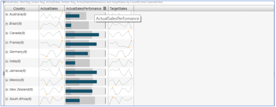
When pressing the Apply button, you can see the changes made to the Bullet Chart in the background. Close the pop-up to get back to the report. The report looks like the example below with Line Chart visual on ActualSales & TargetSales and Bullet Chart for the ActualSalesPerformance attribute.
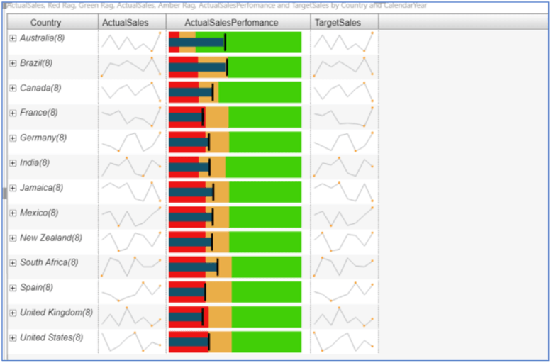
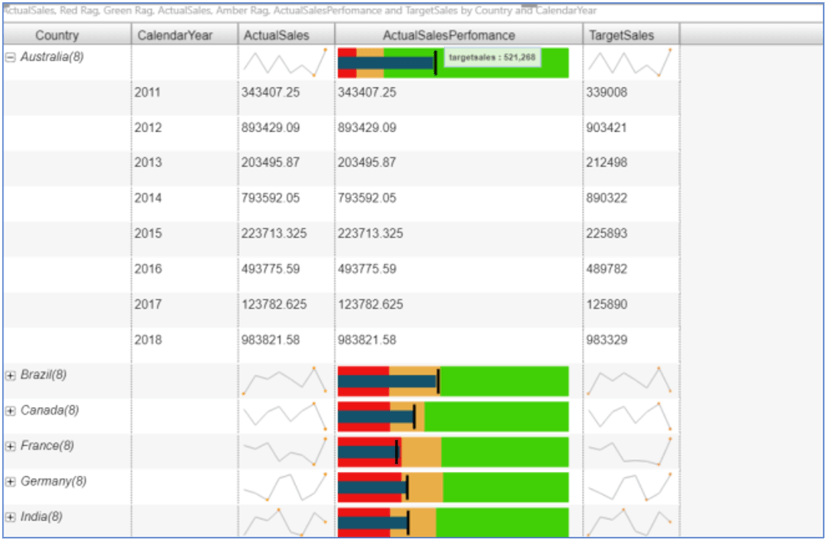
Click on the + sign next to Australia to see the detail view of the report as shown below. You can also hover over the Chart to see the values.
Aggregated Value Columns in the MicroCharts in Power BI
Let's say we want to show TargetSales as a single value instead of displaying as a Line Chart. This can be done very quickly by the pressing the three lines next to the column header TargetSales and selecting Value Aggregation. We are selecting Max as the aggregate number here.
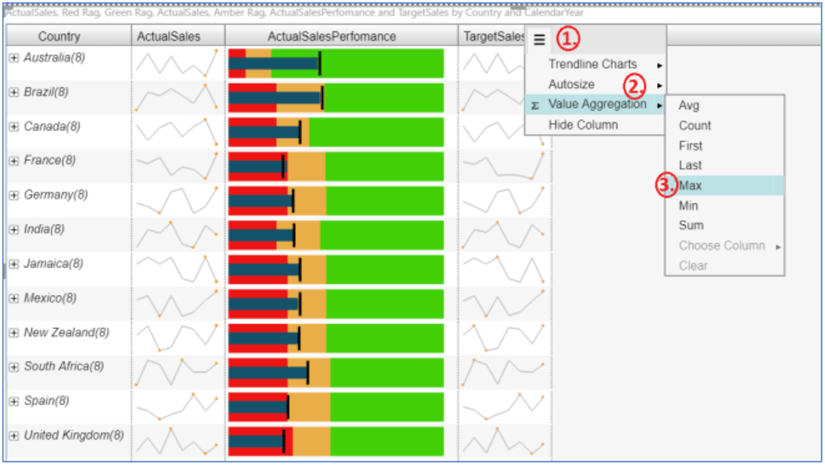
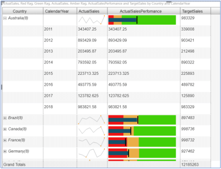
We can see a single value (Max) calculated at individual levels by drilling down on each country.
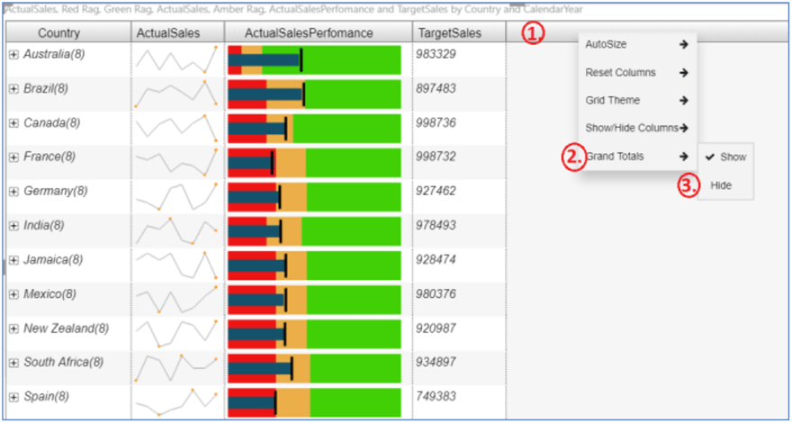
Grand Totals, AutoSize and Grid Theme in MicroCharts with Power BI
With this, we come to the last leg of this tip. Once any kind of value aggregation is implemented on a column, MicroCharts provides Grand Totals by default at the bottom of the report. You can choose not to show the Grand Totals by right clicking the main column header section and selecting the Hide option under Grand Totals.
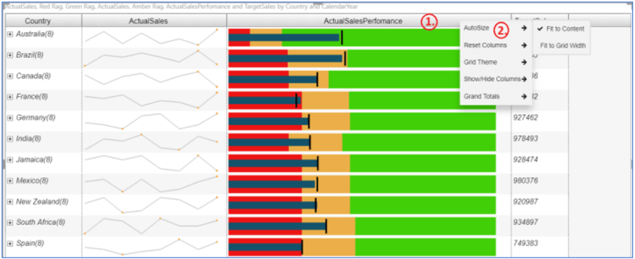
MicroCharts also allows us to auto size the scope and dimensions of the chart. We can determine from two given options, Fit to Content and Fit to Grid Width. With size adjusting to content, it will resize the chart based on the content we have in the columns and with size adjusting to grid width, it will expand it to all the way to the size of the grid.
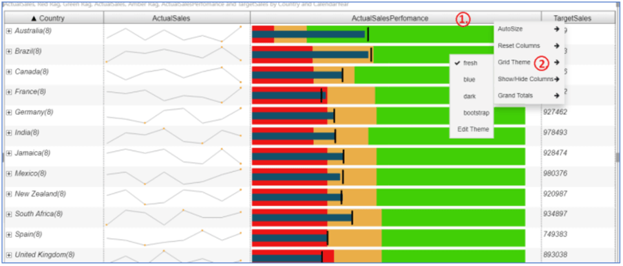
Additionally, these charts provide users an option to change the Grid Theme. You can set a theme of your choice by right clicking the main header section and selecting the Grid Theme option and selecting themes from the given list. You can also customize a theme by using the Edit Theme choice.
Summary
This tip demonstrated a compact grid visualization to provide basic knowledge of essentially how VitaraCharts work in Power BI Desktop. Also, we observed how each attribute in the Microchart can be presented as a different visual like Line, Bar and Bullet Charts with various formats and aggregation selections.
Next Steps
- Try importing the VitaraCharts-MicroCharts visual in Power BI Desktop and implement visualizations on various metrics on the report.
- For more information on Power BI, refer to these other Power BI Tips.
Learn more about Power BI in this 3 hour training course.


About the author
 Gauri Mahajan is very passionate about SQL Server Reporting Services, R, Python, Power BI, the Database engine, etc. and enjoys writing.
This author pledges the content of this article is based on professional experience and not AI generated.
View all my tips
