By: Gauri Mahajan | Comments (4) | Related: > Power BI Charts
Problem
Any data analytics process involves statistical inspection of data and transforming raw data into useful information to support executive management in decision making. Finding patterns, relationships and behavior of data are a fundamental part of assessing large data sets. Statistical analysis helps in making observations and interpretation of data. At times, an outlier turns out to be an observation that shows a behavior or pattern different from the rest of the data set. Generally speaking, outliers have a significant effect on a number of statistical derivations and if left ignored can cause serious problems for data professionals to analyze data correctly. There are a variety of visualization for outlier analysis. In this tip, we will learn one of the innovative yet effective visualizations to detect and visualize outliers in Power BI Desktop.
Solution
A funnel plot is a variation of the scatter plot that aids in assessing and visualizing surveillance data by identifying outliers. These plots are used in many industries like medical health analysis, comparing organization performance, etc. Outliers in the funnel plot are basically dots outside the funnel.
One important thing to note here is a funnel 'plot' is different from funnel 'chart' in a way that a funnel chart is broadly a visualization representation with no statistical interpretations whereas a funnel plot helps to compare samples with a graphical visualization and finds true outliers based on statistical analysis.
Importing Custom Visual into Power BI Desktop
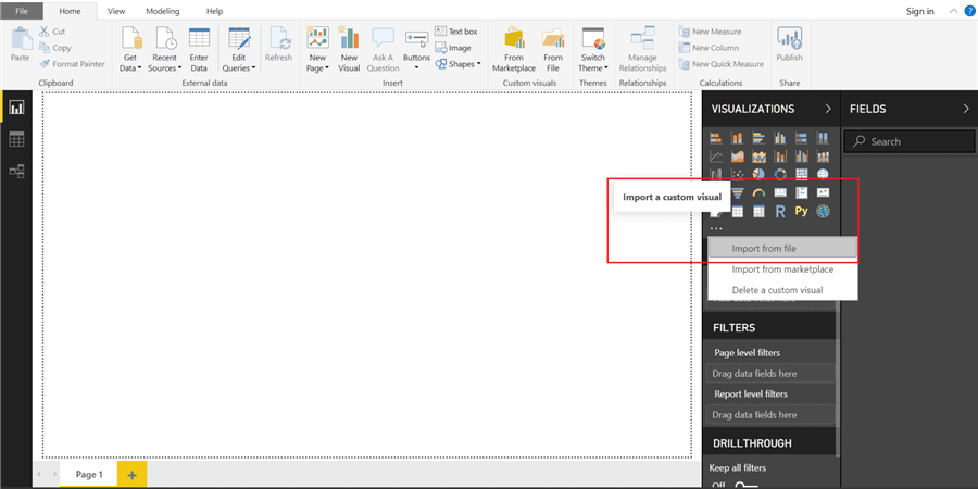
A funnel plot is a custom visual that can be added to the Power BI Desktop for its varied visualizations. In order to import this visual in Power BI Desktop, we will have to download it first. You can refer to this site to download it. After it is downloaded, open the Power BI Desktop application and click on ellipses in the bottom of the visualizations as shown below.
You are presented with the screen below, press the Import button.

This will open a dialog box to select the downloaded visualization file in order to add it in Power BI Desktop. Select the downloaded visualization file and the below pop-up is displayed on the screen.
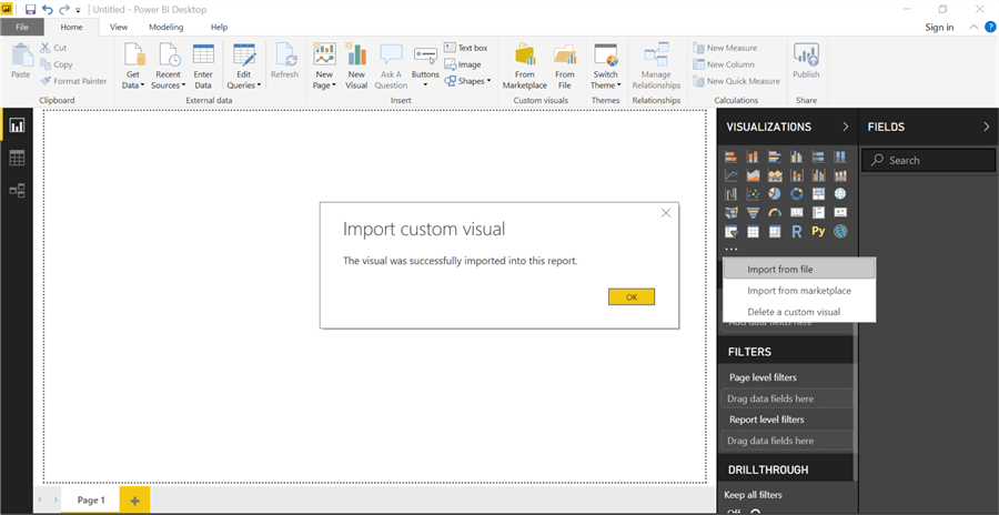
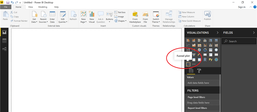
Click OK and the custom visualization shows up in the visualization's gallery. Hover over this newly added icon to see the tooltip as shown below.
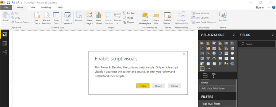
Let's bring this visual into the report. On clicking this icon in the visualizations pane, a message asking to "Enable script visuals" appears as shown in the screenshot below. These custom visuals reference several R packages - scales, reshape, ggplot2, plotly, htmlwidgets, XML, etc. When you enable script visuals this control will try to install the required R packages on the R installation referenced by Power BI Desktop. In case, due to any reason these packages are not installed, then you will need to import these additional R packages in Power BI Desktop when the visual is loaded for the first time. To incorporate this, make sure the local R installation of the system is specified correctly in the R scripting section of the Options dialog box under the Options and settings submenu in Power BI Desktop.
You will receive a prompt as shown below. Click Enable.
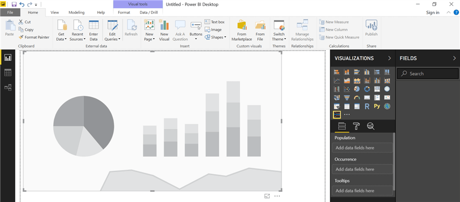
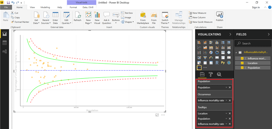
Once enabled, the funnel plot is added to the reports layout in Power BI Desktop. Expand it by dragging it all the way to the right to occupy the report canvas space. If you notice, right below the Funnel plot visual icon in the visualizations pane, three roles are defined in the input fields section for this visual which are - Population, Occurrence and Tooltips. We will learn about these shortly.
Getting Sample Data in Power BI Desktop
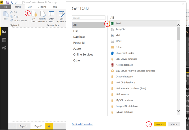
Now that we have the visualization in place, let's go ahead and populate some sample data in Power BI Desktop. Click Get Data on the Home ribbon, select Excel and click the Connect button as shown below.
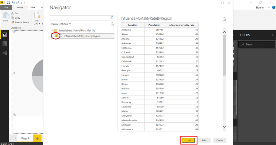
Navigate and open an Excel file that you need to import in Power BI Desktop. You can also download the sample here. Data in this Excel file illustrates a hypothetical influenza casualty cases dataset for the given location and population under 2,000,000 in the United States in 2017. Select sheet InfluenzaMortalityRateByRegion and you will be able to preview the data on the right side of the navigator screen as shown below. Select this sheet and click the Load button to populate data in Power BI Desktop.
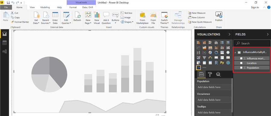
After loading the data, the data model looks like below.
Funnel Plot in Power BI Desktop
Funnel plot allows using the X-axis as Population and Y-axis as Occurrence in the visual. These two fields are mandatory fields. Select this visual on the report page and drag & drop Population on Population and Influenza mortality rate on Occurrence from the table to the Fields pane. It supports one optional field named Tooltips as well to make these plots more effective. Once a column is added to it, that field is shown in tooltips when hovering over the funnel plot. Also, it permits adding more than one attribute to it. We are adding all the three fields of the table to the Tooltips area in the Fields section. As an impact of these changes, one interesting funnel plot is created in the report page and can be seen below.
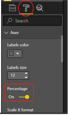
Let's move forward and try to understand how a funnel plot actually works. Here, in this visualization, the X-axis represents the population under 2,000,000 and is plotted against influenza mortality rate on the vertical axis (the Y-axis). You may select the Y-axis to be presented in percentage or ratio by selecting the paint roller icon to display the Format pane and setting Percentage option to On / Off as shown below.
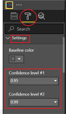
Fundamentally, these plots are formed by confidence limits, a couple of clusters (group of dots) and outliers. A horizontal blue line in the plot is referred to as a baseline. By default, solid green lines represent a confidence level of 0.95 and red dotted lines represent a confidence level of 0.99. Basically, these limits represent the probability that data point will fall within the interval outlined by these lines. We have constructed the funnel plot using default limits on confidence levels in this tip. Depending upon what do you wish to apply, you can easily alter these limits by selecting settings in the Format pane and setting values in confidence level #1 and #2 as displayed below.
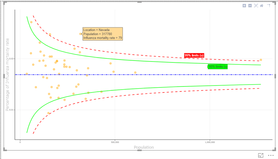
Now, coming to the data points plotted in the funnel plot, hover over any dot to see Location, Population and Influenza Mortality Rate for the given input parameters. If you notice carefully, Nevada has an influenza mortality rate of 79 which is categorized as an outlier considering the size of the population and is plotted outside the funnel. This asymmetry helps users research and investigate more on this division.
An enlarged view of the funnel plot with several data points (discussed above) is shown below for more clarity.
Formatting a Funnel Plot Visualization
Funnel plot supports a gamut of formatting options to the visual in Power BI Desktop. To get started with formatting, click on the paint roller icon to design and modify the visual attributes in the plot. These numerous formatting controls help in enhancing the visual appearance of the plot.
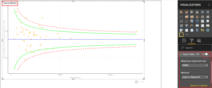
Export Data from Funnel Plot
We can use the export data option in the format pane to export the outcome of the clustering from a visual to a CSV file. Once this option is set to ON, you will be able to see the copy to clipboard button on the top left corner of the funnel plot. Click this to copy data to a csv format. You can also revert to the default settings by clicking Revert to default as shown below.
Data Point Changes in Funnel Plot
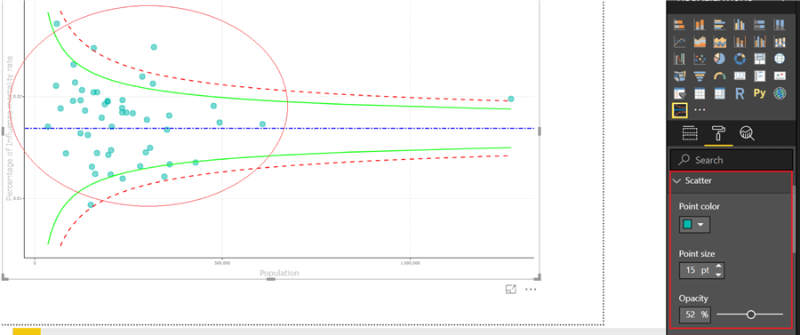
We can change the way data points look in the funnel plot by modifying color, size, etc. of the scatter dot in Power BI Desktop. To do so, click Scatter in format pane and select color and size that suits your needs. One such example is shown below.
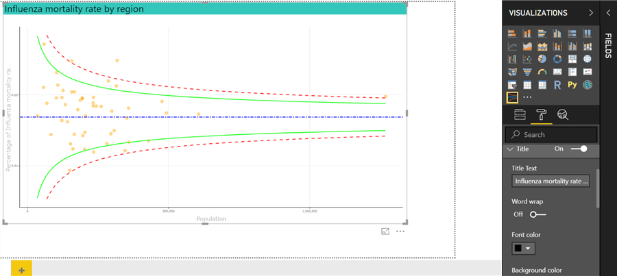
Set Title in Funnel Plot
Funnel plots also allow you to add Titles to the plots in order to make them more interactive and clearer. Set the Title option in the format pane to ON and provide Title text to be shown on the funnel plot. Additionally, you can select other attributes like font color, size, alignment, background color of the title, etc. on the funnel plot. Here is an example of these settings.
There are certainly many more formatting choices that you can introduce to your funnel plot. We have highlighted the significant ones here, feel free to explore and dig in more on this front.
Caveat When Using Funnel Plot
As they say, some bad comes with the good, there are some problems associated with Funnel plots. It may give the wrong impression about metadata if confidence levels are wrongly used. Also, the look of the funnel plot changes drastically depending on the scale chosen on the Y-axis. There can be either too many or too few outliers impacting data interpretation and research analysis. So, a thorough analysis and interpretation of data should be exercised before tossing Funnel plots to end-users.
Next Steps
- Try importing a funnel plot visual in Power BI Desktop. Create visualizations to understand distribution of data and to assess outliers.
- You can also test the range of formatting options that come with funnel plots.
- To learn more about Power BI, refer to these Power BI tips.
Learn more about Power BI in this 3 hour training course.


About the author
 Gauri Mahajan is very passionate about SQL Server Reporting Services, R, Python, Power BI, the Database engine, etc. and enjoys writing.
This author pledges the content of this article is based on professional experience and not AI generated.
View all my tips
