By: Rahul Mehta | Comments (1) | Related: > Power BI Formatting
Problem
As Power BI is widely used for data visualization and analytics, one bottleneck with analytics is the lack of highlighting essential data and data points in charts and reports. In this tip we will look at how to use conditional formatting in a Power BI chart to address this need.
Solution
Power BI recently introduced a dynamic and color saturated support for "Conditional Formatting" with the majority of charts. This feature allows you to configure the color bifurcation not only for a table or matrix, but also on a variety of charts as well. It could now be used in three different modes to highlight the essential data points on charts:
- By Color Scales: This is a way to define a range of low to high scale on which the color will differentiate. For instance, if you have a Low range identified with a Red color and a High range with a Blue color, the color saturation will be Low (Red) > Medium (Green) > High (Blue).
- By Color Rules: This is when you want to define a custom range and put different highlights for a range according to business logic. For this article, we will be demonstrating this rule.
- By Field Values: This is a way to target specific metadata and focus your highlighting on a single column rather than different data points.
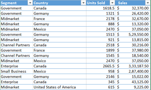
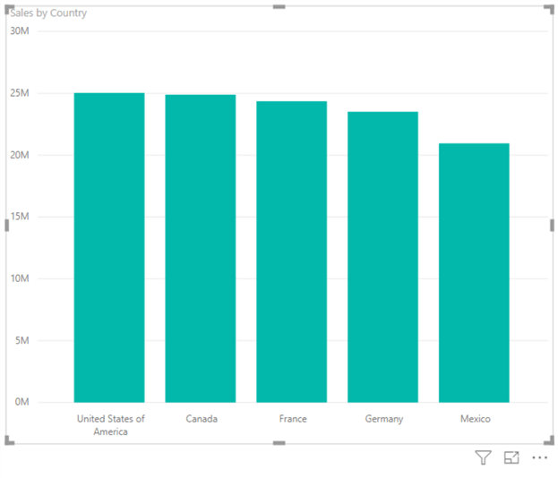
To further explain, let me give you an example. I have a financial sheet where the product information is stored by segment and country. It has also captures units sold and sales information as shown below.
We will be performing the below activities to demonstrate conditional formatting:
- Add/Configure a chart to show the sales by Country
- Formatting chart by color rules
So, let's get started with all the steps.
Add/Configure a Power BI Chart
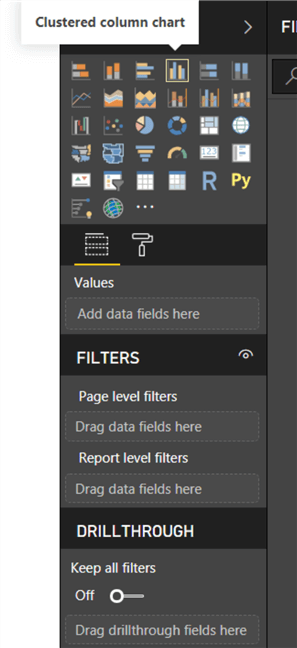
We will be using a Clustered Column Chart to show sales by country.
From the visualization pane, select "Clustered Column Chart".
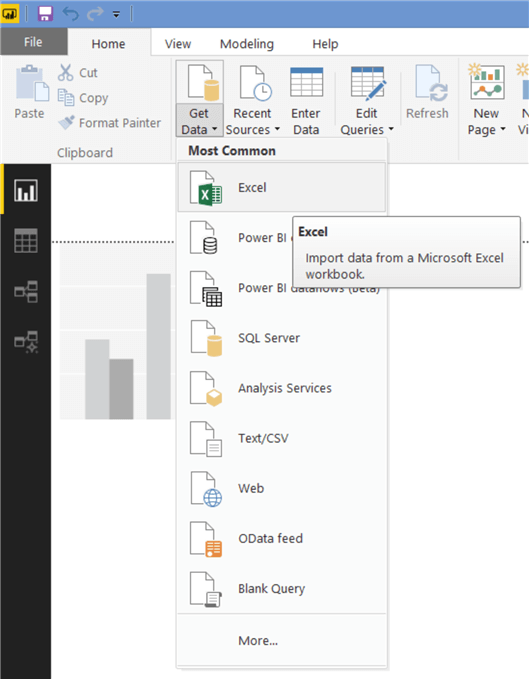
Now let's add a data source. In our case, we will be using an Excel file. To access the Excel file, click on "Get Data" in the ribbon and select "Excel".
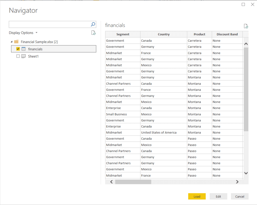
A window will appear to select an Excel file. Select the file and select the data range/sheet to load the data.
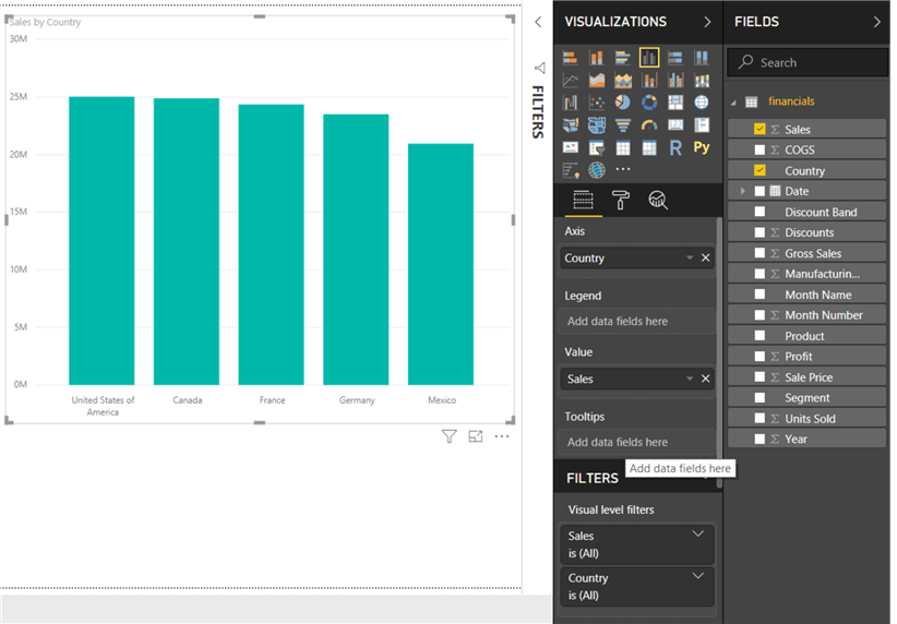
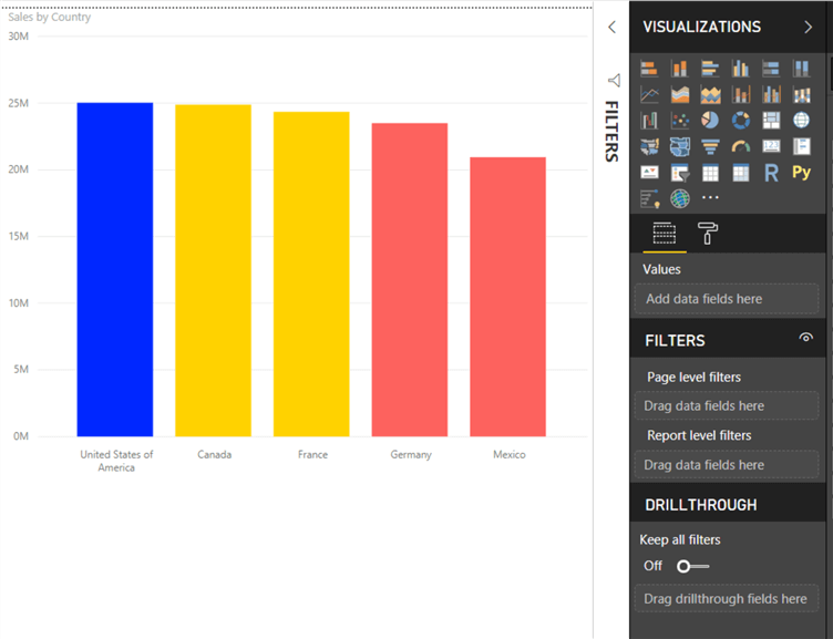
Once the data is loaded, the next step is to select the fields in our chart to show the data. To do so, select the chart and drag the "Country" field to "Axis" and "Sales" field to "Values". Once done, it should look something like the below image
Formatting Chart by Color Rules with Power BI
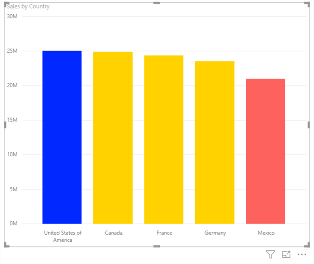
As we have now completed the first step, let's start highlighting and bifurcating the "On-target" and "Off-target" sales. For which we are going to follow the below business rules:
- Anything between 25 - 50 million in sales is on target and will be highlighted in blue.
- Anything between 23 - 25 million in sales is near-to target in amber.
- Anything below 23 million in sales will be consider as off-target and will be shown in red.
To apply the above rules, perform the below steps:
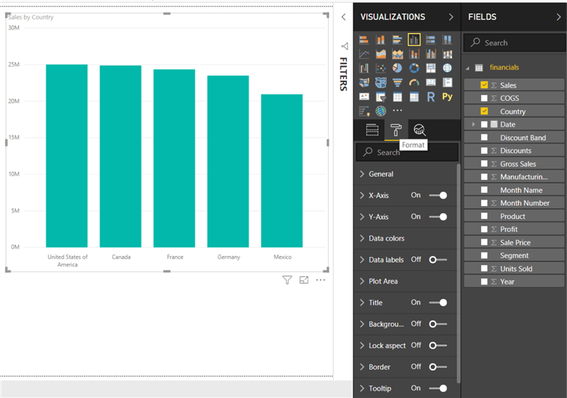
Select the chart and select the "Format" icon in "Visualizations" pane.
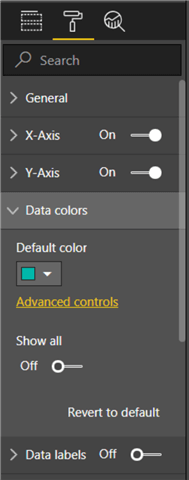
Expand the "Data Colors" section and click on "Advanced controls"
A window to define "Data Colors" will appear. By default, the "Color scale" will be selected in "Format by". We will change it to "Rules" as we are going to define custom business logic rules.
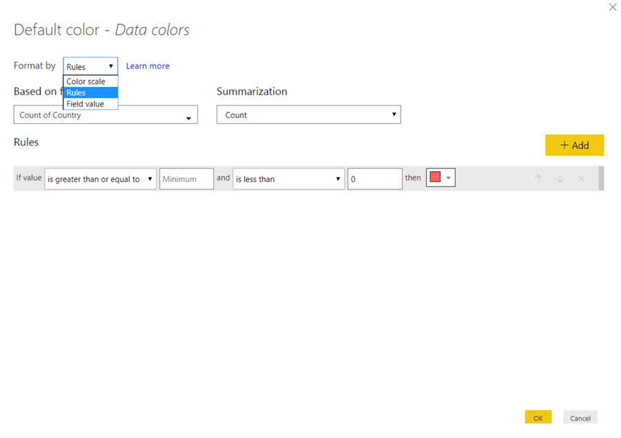
As we want to bifurcate the country according to the sales, we should select "Sales" in the "Format by" dropdown and "Sum" in the "Summarization" dropdown. Basically, this matches the rules against the total sales of each country.
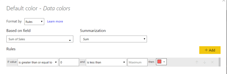
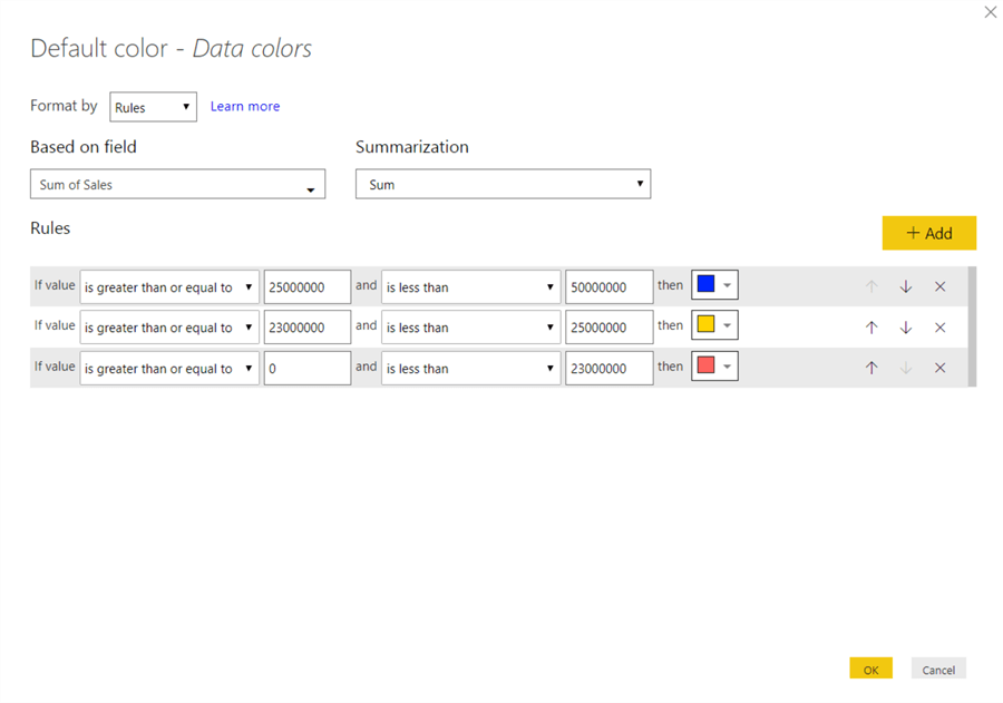
To define a rule, we will configure the below field rules:
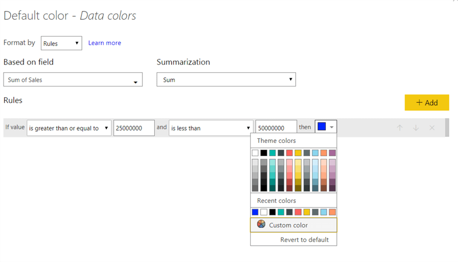
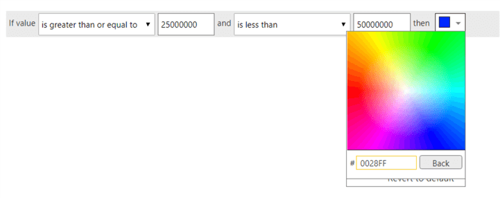
Rule 1 should have a minimum of 25,000,000 million and maximum of 50,000,000 million. Also, select the color as blue. To select the color, open the theme color box next to "Then". Select the custom color at the bottom and select a "Blue" color.
Use the "+ Add" button, to add 2 more making a total of 3 rules.
Rule 2 should have a minimum of 23,000,000 million and maximum of 25,000,000 million. Also, select the color to amber.
Rule 3 should have a minimum of 0 million and maximum of 23,000,000 million. Also, select the color to red.
Once configured correctly, it should look like below:
Ensure the configuration including rules, selection of fields, amount configuration and selection of colors are correct or otherwise the chart won't be able to reflect the changes.
Once correctly configured, click on OK and you will be able to see something similar to the second image below. The first image shows the data without the color coding.
A few things to note in the above image:
- The chart shows three different ranges of sales.
- USA has sales over 25 million and thus in blue, however the following three countries (Canada, France, Germany) are above 23 million in sales, but not above 25 million.
- And lastly, Mexico has sales less than 23 million.
Further, in case you want to specifically change or highlight any individual area, Power BI also allows you to do so. For instance, in our case I want to highlight "Germany" to red as their sales are considerably less compared to the other countries. To do so, let's perform below steps:
Expand the "Data colors" section under "Format" section in the Visualizations pane. An option of "Show all" will be available. We will need to toggle this "On".
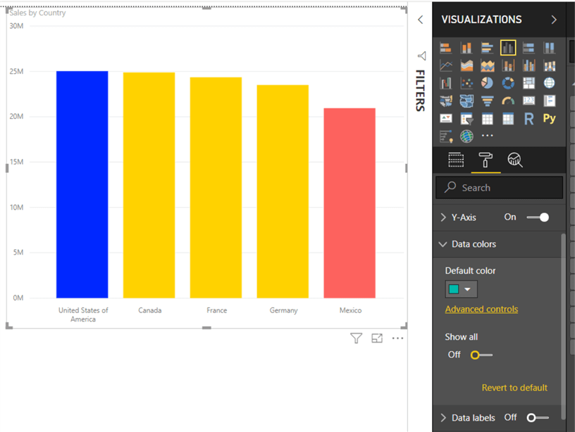
Once toggled, all the options of the X-axis will be shown with the colors. Change the color of "Germany" from amber to "Red".
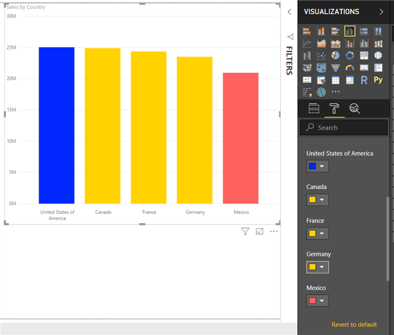
As soon as you change the color, it will directly be reflected in the chart.
In this way, conditional formatting could be used to highlight, isolate and bifurcate the data to enhance the experience of data analytics using Power BI.
Next Steps
- Try to use the conditional formatting by scale and by fields.
- Try to use the formatting for column/bar charts, funnel chart, scatter chart and others.
- Try to embed different reports to tooltips report page.
- Check out all of the Power BI tips.
Learn more about Power BI in this 3 hour training course.


About the author
 Rahul Mehta is a Project Architect/Lead working at Tata Consultancy Services focusing on ECM.
This author pledges the content of this article is based on professional experience and not AI generated.
View all my tips
