By: Scott Murray | Comments (8) | Related: > Power BI Formatting
Problem
What is new with Power BI conditional formatting?
Solution
Conditional formatting choices have been a much-requested option in Power BI. In several early versions of Power BI, the ability to apply conditional formatting was lacking in several feature categories. Fortunately, that has changed significantly as Power BI has continued to evolve over the past few years with many options now available including rule based, dynamic formatting. Additionally, the four main ways to conditionally format is to either change the background color, change the font color, add an icon, or add a colored data bar. Within each of these areas, you have the ability to control the various color options such as color gradients and upper and lower thresholds, all of which will be covered in several examples within this tip.
Before we get into the examples, be sure to download the latest version of Power BI desktop from here. Additionally, we will be using the WideWorldImportersDW database as a basis for our data sources; this database can be downloaded from GitHub. If you need a refresher on bringing data into Power BI please see this tip.
Sample Power BI Project
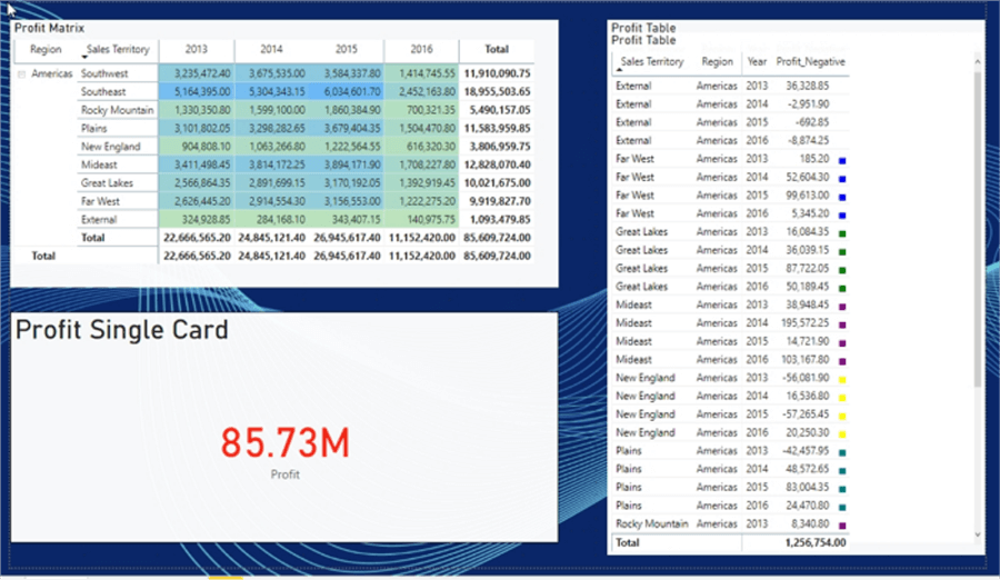
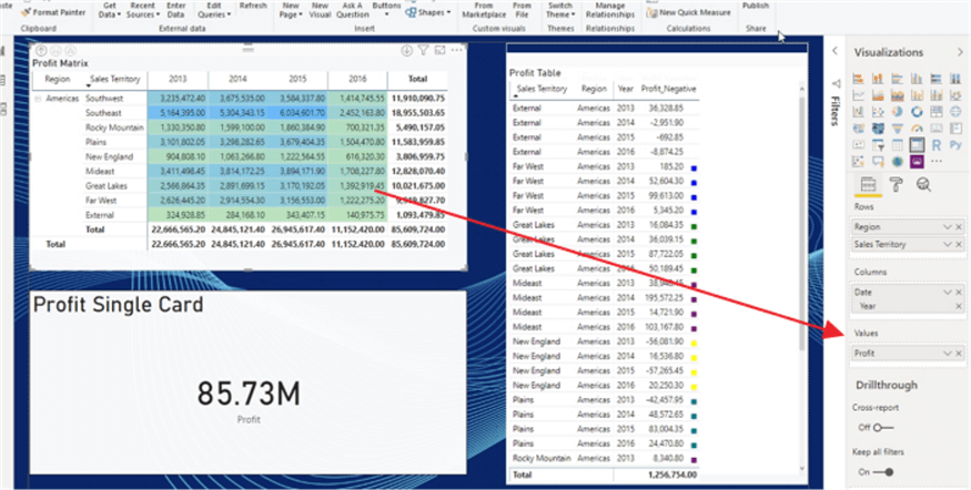
To help get us started, I created a simple Power BI report PBIX file and added a tab to the report. The tab contains a table, a card, and a matrix, as illustrated in the next screen print.
Configure Conditional Formatting in Power BI
We will first start with the table and matrix visuals as they have similar methods that can be used to apply conditional formatting with two big exceptions. Conditional formatting can be applied to any field in a table, but only to the values or measures fields in a matrix (for the table visual all fields are values). Second, conditional formatting does not apply to subtotal or total rows / columns. You can potentially get around the issue in a matrix by placing a field in the value well, but that uses an aggregate function for non-numeric fields (First or Last) to evaluate the expression conditional formatting.
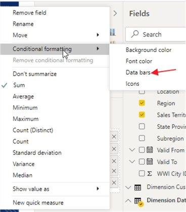
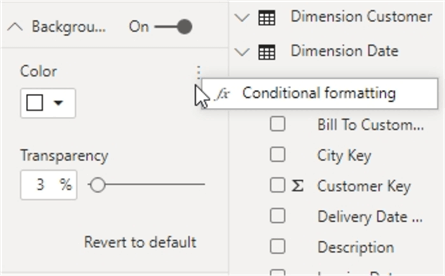
Starting with the table visual, there are two main ways to get to the conditional formatting options. First, as shown next, you can click the down arrow next to the field name in the values area.
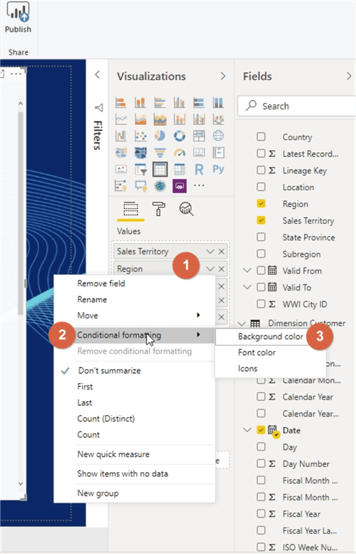
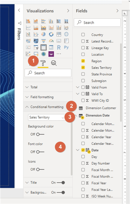
Alternatively, conditional formatting can be added or changed by going to the Format tab (paint brush) and then scrolling to and expanding the conditional formatting property. Within the conditional formatting properties, you can select the field and then the type of formatting to be applied, such as background color, font color, and icons.
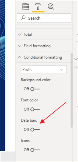
You should note that if the field you select from the list is non-numeric (not a measure), the data bar option will not be shown. However, as displayed below, this option is shown for fields that are considered a measure (numeric values).
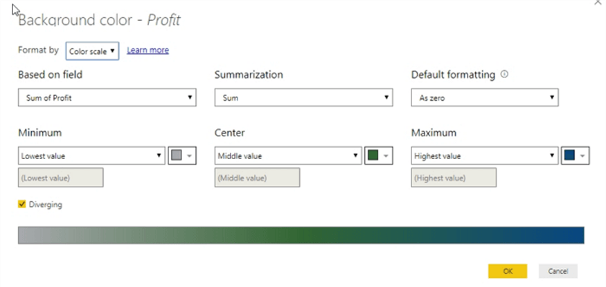
Power BI Color Scale Conditional Formatting
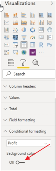
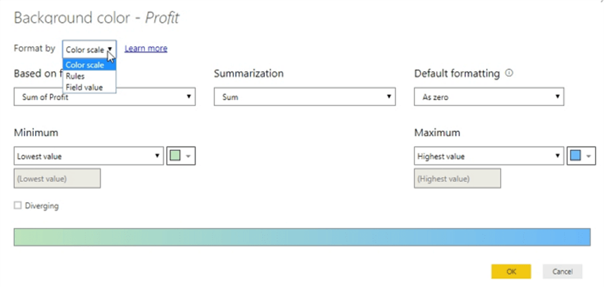
Let us start with changing the background color for the profit measure. To do so, select the arrow to the right of Profit from the visual well. Next, select conditional formatting and background color. Upon opening the conditional formatting screen, the box in the upper left shows the three methods that the format rules can be applied: 1) Color Scale 2) Rules 3) Field Value. The color scale options provide a continuous range of colors over a minimum to maximum (lowest to highest) set of values. A low value color and a high value color are selected with all the color variations fitting between the selected colors.
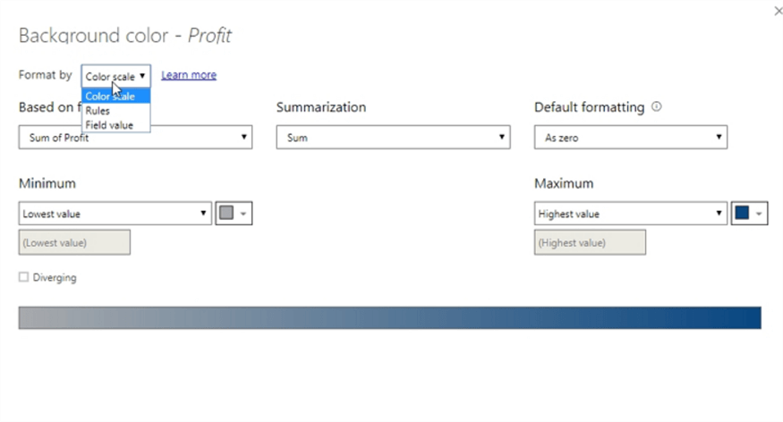
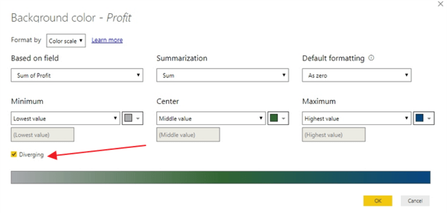
Checking the Diverging option provides a third color option for the center or middle set of values.
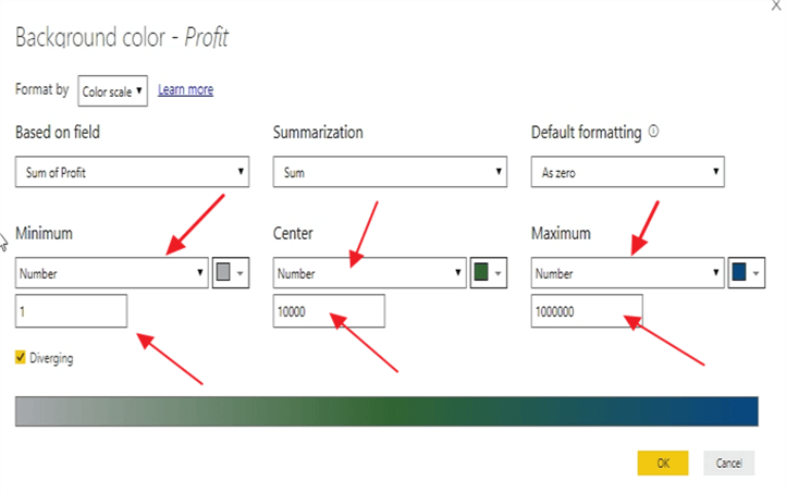
An actual minimum and maximum value (and center for the diverging option) can be specified as opposed to letting Power BI set the minimum and maximum figures. Numbers outside the range will have the background color nearest the value (on the high or low side).
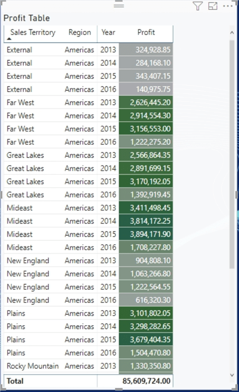
By setting up the color scale with the gray to green to blue color scale, the background colors will then move from gray at the lowest to blue at the highest.
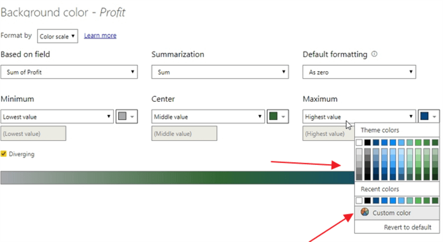
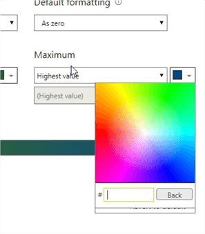
Colors can be selected from the pick list of colors or custom colors can be selected or a color’s HEX code can be entered (you can look up HEX codes here).
The final result of the conditional formatting selections is shown below. Note due to the dark nature of the background, the font color had to be changed to white to display the Profit measure values.
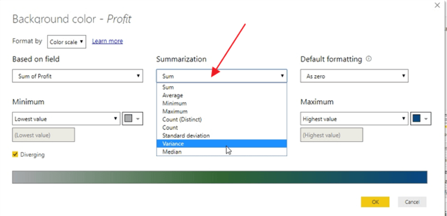
Other options that are available to adjust include changing the summarization calculation, as shown below, to include such items as variation, standard deviation, and average.
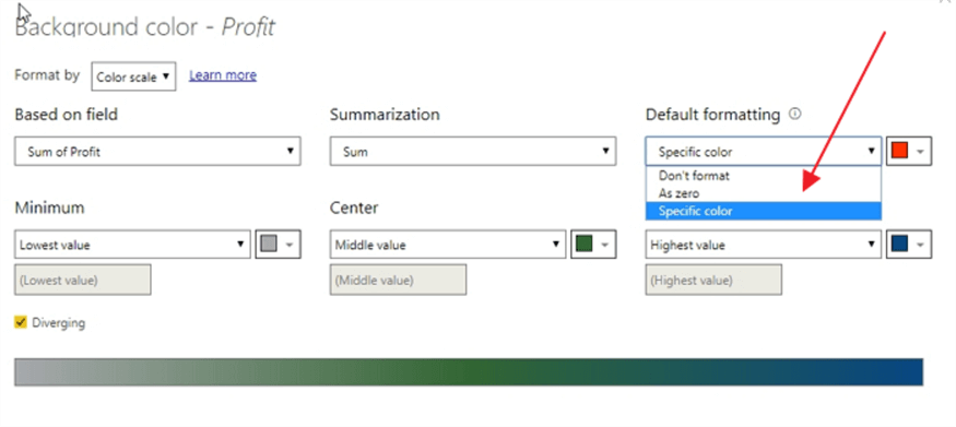
Finally, the default formatting option shows what coloring should be applied when a value is blank or NULL. This field can be defined as no color formatting, use the same coloring as 0, or finally use a specific color.
Power BI Rules Based Conditional Formatting
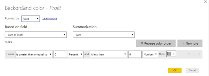
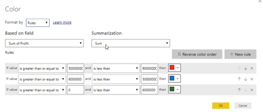
Now, we can move on to using the second Format by option, which is Rules based. While the color scale option allows you to quickly create a set of color formatting, rules-based formatting allows you to customize the color formatting to a much more granular level.
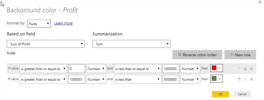
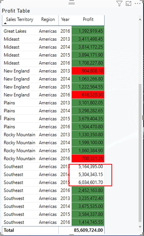
Using the same table, the below setup shows using a rules-based setup to define which background colors to draw. Thus, in this example, values between 0 and 1,000,000 will receive a background of red while colors between 1,000,001 and 5,000,000 will show a background of light green.
In the subsequent illustration, you can see the colored background is applied as prescribed by the rule. However, notice how several of the Southeast’ profit values show no background color as the rules that were input do not apply to values over 5,000,000. Thus, no formatting is employed; care must be taken to be sure to allocate for those outlier situations if coloring is needed for all values. In this example, a very large “less than” value could be input (200 million for instance). The same issue would apply if aggregated values existed below the lowest threshold (0 in the above example). You should also take notice that this functionality of “outside values” works differently between color scale and rule-based formatting.
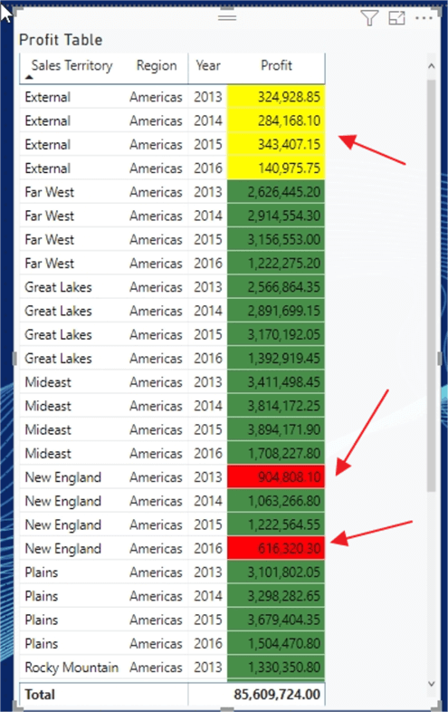
A second item to note is that if an aggregated value is within the bounds of two of the rules, the last rule will apply. Notice in the below example that a third rule line was added to display a background of yellow when values are between 0 and 500,000.
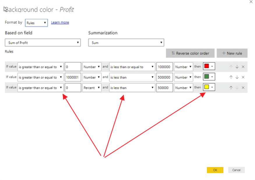
Thus, the values between 0 and 500,000 will display a background color of yellow, as shown below, as it is the last rule that applies.
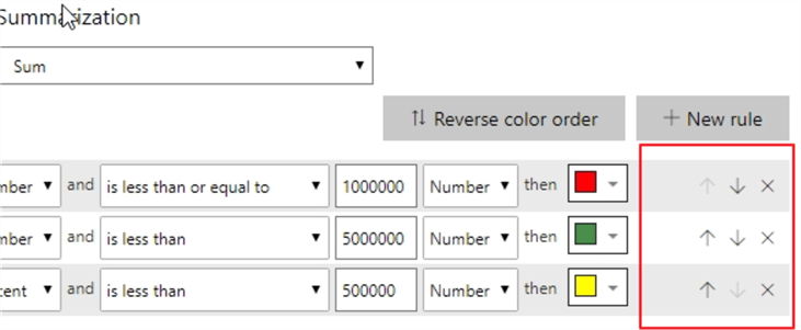
In order to change the order of application, the arrows next to the rules allow the report designer to move the rules higher and lower on the rule list. Additionally, clicking on the X will delete that particular rule.
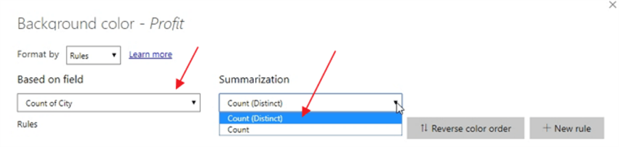
If for instance, you would rather use text value to determine the color, that can be accomplished by changing the Based on field; however, the summarization options will then only be Count and County (Distinct).
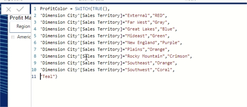
Moving to the last of the Format by options which is to use a Field value. This process does require some pre work to put into practice, but also provides the ability to use DAX or M to define the color spectrum to be used. A new column needs to be added to the dataset to reflect the desired color which will be utilized (or you could have the color column defined in your database query!); thus in the below illustration, a new column called ProfitColor is created which is populated with a value of the color (a valid HTML color) based on the what Sales Territory is related to that Profit figure. For example, profits related to the New England sales territory will show a background of purple. To achieve this result, we use the SWITCH and TRUE functions as opposed to an embedded set of IF statements.
Power BI Field Value Conditional Formatting
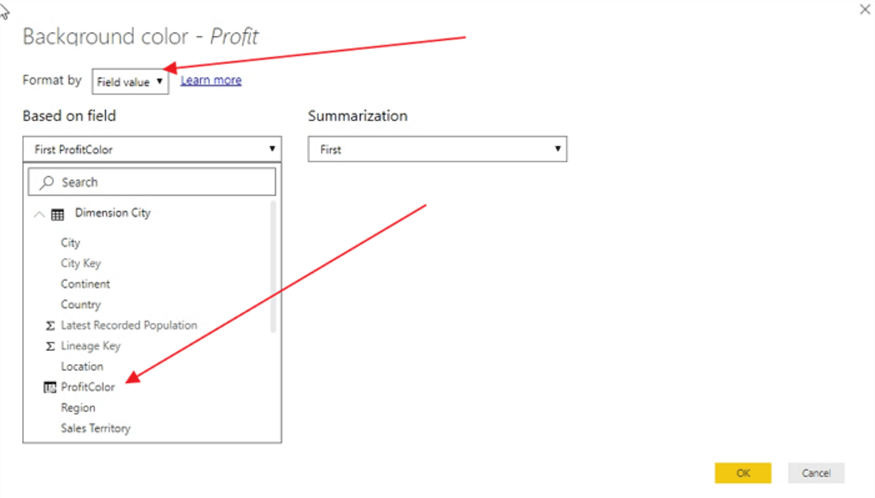
Now that the color column is defined, we can setup the Format by option to use a Field value. Using the Based on field option, the newly created column, called ProfitColor, is selected as the basis for the background color. The summarization property allows for the selection of first or last value.
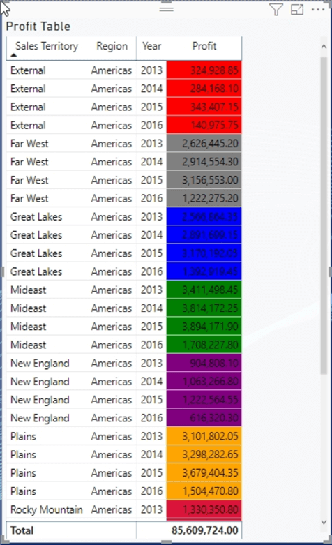
The resulting table shows the “rainbow” of colors, now based on the sales territory column in our dataset.
Remove Conditional Formatting in Power BI
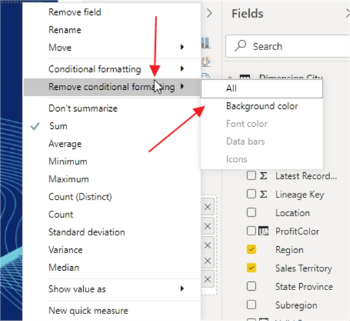
At any juncture we can remove the conditional formatting that was applied by either turning the switch to off in the Visualization formatting pane or by going to Values well and selecting the down arrow next to our field and selecting Remove Conditional formatting.
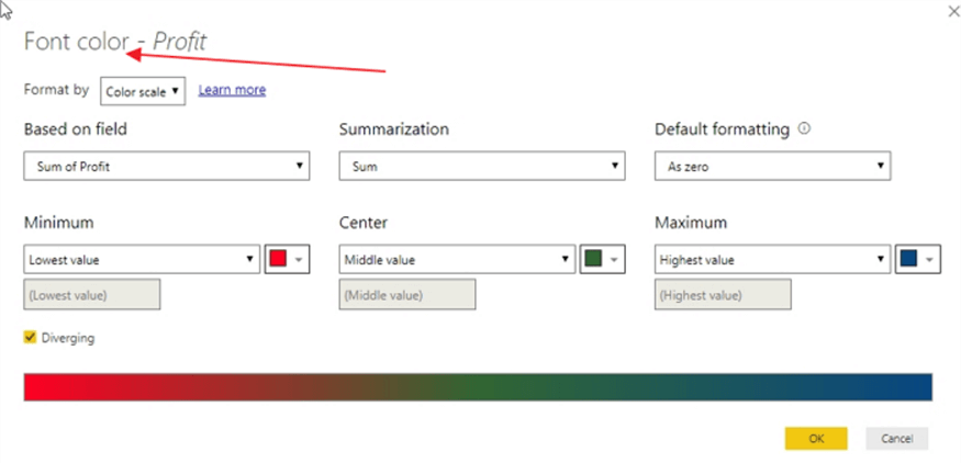
Power BI Conditional Formatting for Font Color
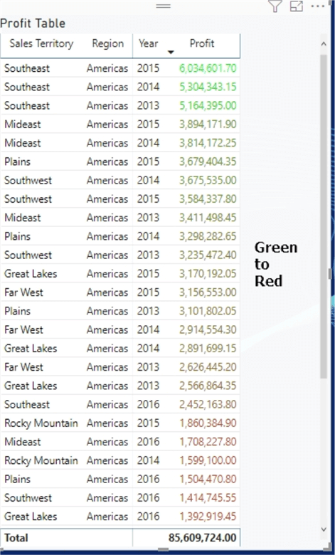
Up to this point the focus has been on the background color, but we can apply these same processes to conditionally changing the font color. Each of the format by functions work exactly the same with font color based conditional formatting, so we will not review each of those examples. Instead, the below example shows a single sample with a color scale of green to red.
For the resulting table, notice the total row remains unchanged as conditional formatting does not apply to total rows or columns.
Data Bars Conditional Formatting in Power BI
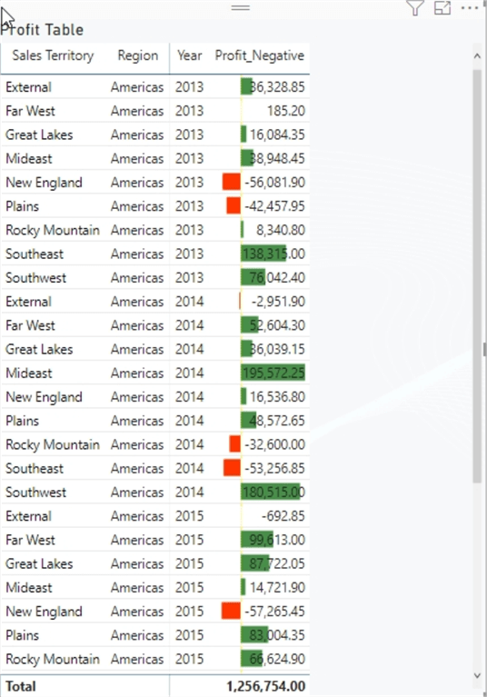
Switching to data bars conditional formatting, it contains just a single method to define the data bars to be shown. An additional caveat is data bars can ONLY be shown on measure fields; therefore, the profit value in our example is a measure, so that works fine. Yet, the sales territory, region and date are not measures and as such, do not allow data bars. As shown below, the positive data bars will show as green while the axis will show as yellow and the negative data bars will show red (note I had to create a new profit column to generate some negative profit values).
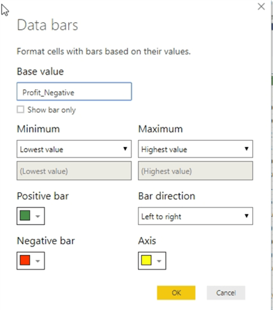
The results are quite profound in that they quickly show how each sales territory compares to the other territories and also proficiently shows which regions are negative. Additional options that could be helpful with data bars include showing the data bars only, with no figures, and also the ability to switch from left to right to right to left, similar to a funnel chart. Finally, the minimum and maximum values can be changed to use raw values and not the highest and lowest value; nonetheless, I would not recommend changing these options, as you can easily create a situation where no data bars would be displayed, since the base value is outside the specific range input.
Icon Based Conditional Formatting in Power BI
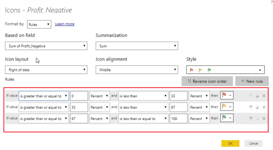
The last conditional formatting method we will discuss in this tip relates to the use of icons. For icon conditional formatting two Format by options are available, one by Rules (similar to the rules-based method shown in the background color section) and one by field. Starting with the Rules based method, a similar selection of summarization options is available such as average, standard deviation, and variation. Also, the placement of the icon in relation to the measure value can be set to be left or right of the measure value, or icon only option can be selected which will not show the measure value at all. The icon alignment defines if the icon is placed vertically in the top, middle, or bottom of the box where the value resides (especially important when text wrapping occurs).
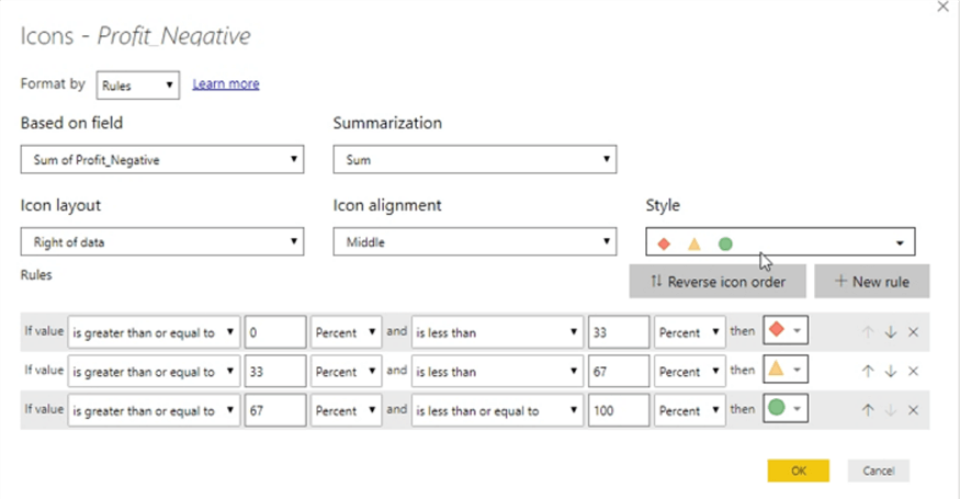
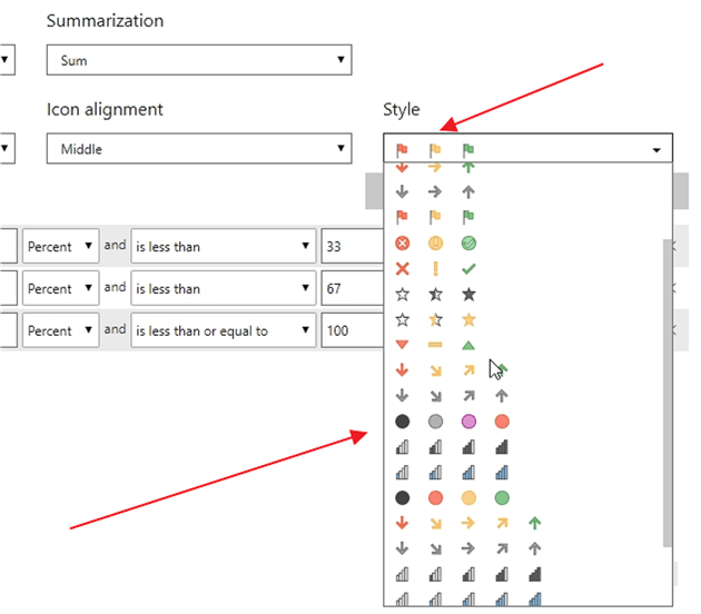
The Style option provides a variety of prefilled icon sets that can be handy to rapidly get a set of 3 distinct icon values.
Moving on to the actual rules, the default options create a set of 3 rules based on a percentage of the total. The percentage automatically calculates based on the measures values (Profit_Negative in our example). The percent option allows for the summarization values to fluctuate without the report designer having to change the raw numbers that makeup the values. Even so, often folks would want to show negative numbers with a red flag or circle and positive numbers with a green flag or circle. Thus, you could easily change Percent to Number and then set the range to a very small negative number to less than 0; the positive numbers would then be 0 to a very large number. Similar to the rule-based setup for background and font colors, you need to be very careful when defining these ranges so as to not exclude an outlier value. Likewise, if two rules apply to a value, then the icon that will be displayed will be the one related to the last rule in the list.
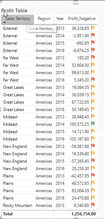
The results for the above set of icon-based rules are shown below. If you would like to add additional icons, you could do so within a theme you design and import from an external source. You can review the process of importing themes in this tip.
Additionally, icons can be referenced from a field. That field must point to an icon graphic file, gif, jpeg, or svg file types for instance, which are then displayed based on the information in the field. The field content must tell Power BI where to find the icon to be displayed. In the below example, again using the sales territory column and a new calculated column, Power BI looks to XML and the W3 specifications to draw a rectangle shape (we actually draw a square as the height and width are the same). Then each rectangle is filled with a different color based on the sales territory. Of course, this example uses a calculated DAX column, but similar data values could be designed within the source (query) populating the dataset.
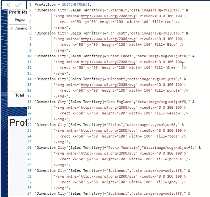
These above graphic specifications allow for a single source uniform graphic icon which can be color adjusted accordingly; please see these links about using svg files in Power BI: http://tutorials.jenkov.com/svg/index.html and https://hatfullofdata.blog/svg-in-power-bi-part-1/, the second website helped me to get the svg syntax correct! Similarly, you could also point to a GIF file online (be sure Power BI can access any of these files or website); the gif files can potentially be animated too.
Matrix Based Conditional Formatting in Power BI
Up to this point, all the examples have used the table visual. However, all the same conditional formatting options can be applied to a matrix.
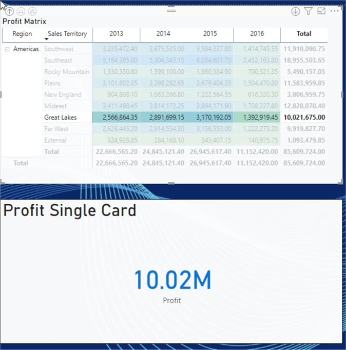
The results of the matrix profit value conditional formatting are shown in the next screen print. Remember, though, that only those fields in the values well, i.e. measures, can be conditionally formatted.
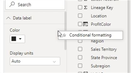
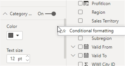
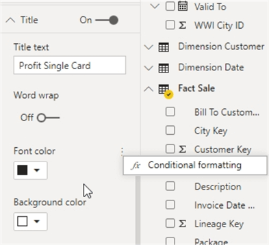
Moving on to conditional formatting for the card visual, we see this visual uses a different access path. After selecting the card visual, you must go to the Format (paint brush tab) and then the conditional formatting options can be access on the any of the following locations (note these locations are available on most visuals types and not just a card in many cases):
- Data label
- Category
- Title
- Background
In the below example, the data label is changing from green to blue to red based on the profit field.
The results of this conditional form rule are shown below. The data label is changed to red.

It should also be noted that the conditional formatting interacts with the selection and highlight functionality within Power BI. By selecting one of the regions in the matrix visual, shown subsequently, the card visual is filtered to just the Great Lakes sales territory, and the card data label changes colors to blue accordingly. Of course, this functionality works across all the various conditional formatting methods.
As we have seen throughout this tip, conditional formatting in Power BI is truly a “Power” feature which offers a great amount of flexibility and functionality. Its richest application is within a table, but other visuals also utilize significant conditional formatting functionality.
Would you like to do conditional formatting to the data colors on a chart? Rahul Mehta shows you how to complete that process in his tip on Power BI Dynamic Conditional Formatting.
Next Steps
Learn more about Power BI in this 3 hour training course.


About the author
 Scott Murray has a passion for crafting BI Solutions with SharePoint, SSAS, OLAP and SSRS.
This author pledges the content of this article is based on professional experience and not AI generated.
View all my tips
