By: Scott Murray | Comments (2) | Related: > Power BI
Problem
Power BI continues to add new features and one of newest features is the Smart Narrative which we will cover in this article. This new feature allows you to add a textual narrative to your reports to help provide additional information to the user.
Solution
Power BI continues to push forward with additional analytic functions built into the regular and available mix of visualizations. Of course, all visuals should tell a story that is clear to both the dashboard and report consumer, and certainly to the report designers. However, sometimes words are helpful and even insightful to explaining details. Sometimes report viewers need additional hints, in word form, to identify specific trends and ideas. I am so glad the Smart Narrative visual (and related Summarize feature) is now in Preview mode, and based on the latest Power BI blog, it will be a work in progress for several updates. Currently, a report consumer can utilize the Q & A functionality to interrogate a dashboard; you can learn more about the Q & A features at: Power BI Advanced Q & A Techniques and Power BI Advanced Q&A. These techniques will provide some basis for our work with Smart Narratives.
Download Latest Version of Power BI
In order to use Smart Narratives, be sure to download the latest version of Power BI desktop in order to follow along with the examples. Additionally, we will be using the WideWorldImportersDW database as a basis for our data sources; this database can be downloaded from GitHub. If you need a refresher on bringing data into Power BI please see: Querying SQL Server Data with Power BI Desktop.
Enable Power BI Smart Narrative
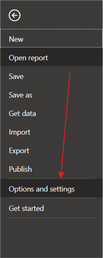
Our first step is to enable this preview feature in the Report Options by clicking on File in the tool bar and the Options and settings and then Options.
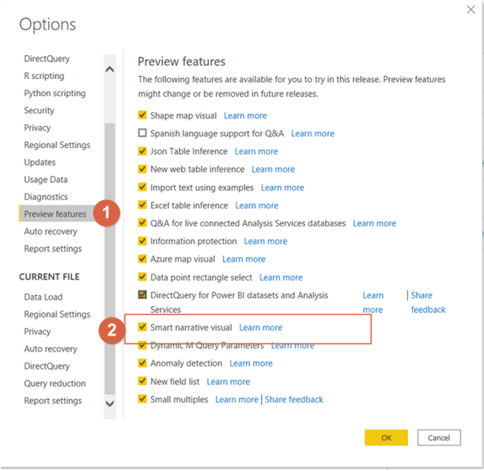
Next, check the box next to the Smart Narratives checkbox to enable this feature for use in the report. Notice that the Share feedback option is available here, and Microsoft is actively seeking feedback on this feature.
Create Power BI Smart Narrative Example
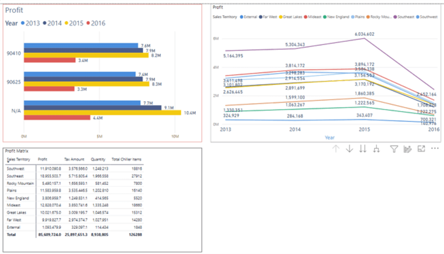
Next, we create a simple dashboard tab with a column chart, a matrix, and a line chart.
The smart narration feature is actually broken into two separate methods. The first method provides the ability to create a word-based narrative based on just a single visual, a summarize option. The second method actually provides the ability to create a full narrative for all valid and compatible visuals on a dashboard tab. We should emphasize the compatibility note as the following visuals cannot be integrated with the smart narrative feature:
- Tables
- Matrix
- Cards (both single and multi-row)
- Maps
- Many custom visuals or imported visuals
- KPIs
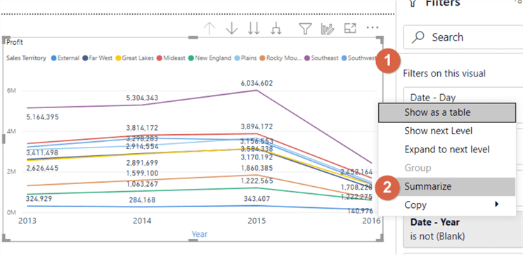
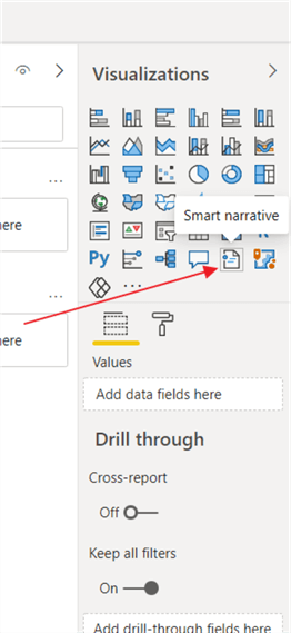
So, let us get started with the first method of creating a summary narrative for a single visual. Using the summarize option for an individual visual provides a quick and comprehensive, word-based summary of the detailed categories and measures on the visual. In order to generate the smart narrative, right click within the white space on the visual, and then select Summarize.
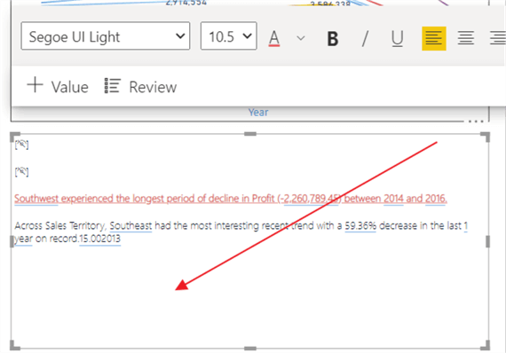
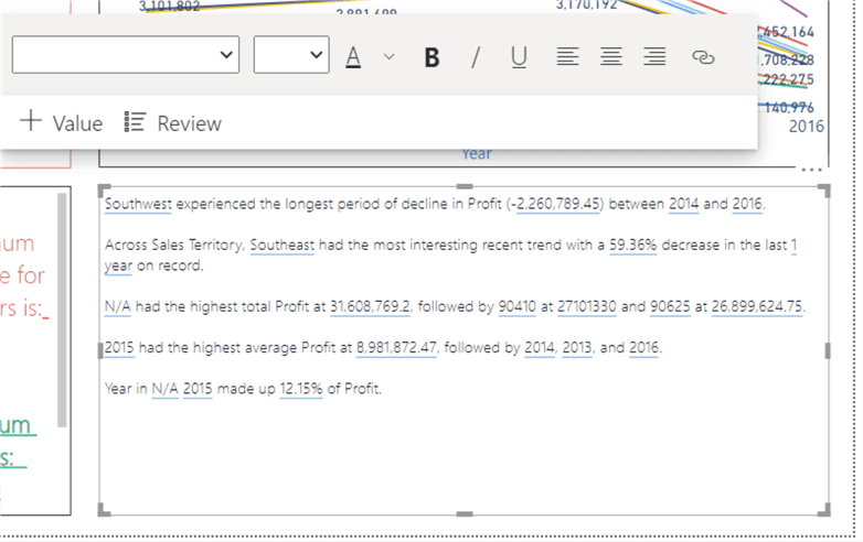
The summary is placed on an open area of the dashboard design grid, as shown below. The smart narrative picked out two key points about the data. First, it emphasizes the decrease in the Southwest sales region profits, and second it notes the Southeast region had the largest percentage decrease over the past year.
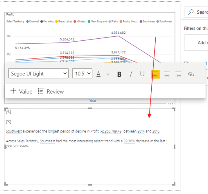
Once created, the summary narrative can be further customized through both formatting and through the addition of specific values, measures, and other columns from the visual and its related datasets. As shown next, the first step in customizing the narrative visual will focus on formatting changes. To enable these edits, you must first click on the smart narrative visual to start the editing process.
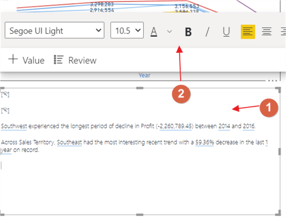
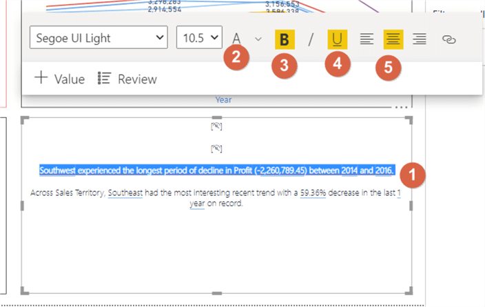
As illustrated subsequently, the edit toolbar opens and you can select and highlight specific text, and then choose specific desired formatting options. For this example, we are going to bold and underline the selected text, center it, and finally change the font color to red.
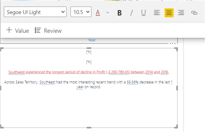
Now the font / text for the first line in the narrative is bolded, underlined, centered, and changed to the color red.
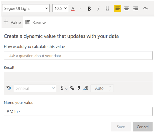
In addition to being able to adjust the formatting used in the single visual narrative, you can also add additional values to the narrative visual, along with text to describe the desired value. Thus, as shown below, we are creating a new value for the narrative by first clicking on the +Value button.
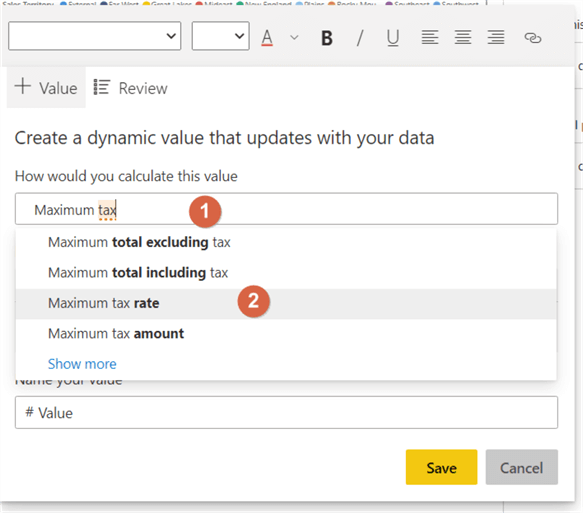
Subsequently, you start typing the requested aggregation measure and then the related field from the dataset. Thus, to get the maximum tax rate, we would type Maximum Tax Rate in the "How would you like to calculate this value" box. Power BI offers several suggested values as you type in your question / values.
Below this value entry box, we see several items:
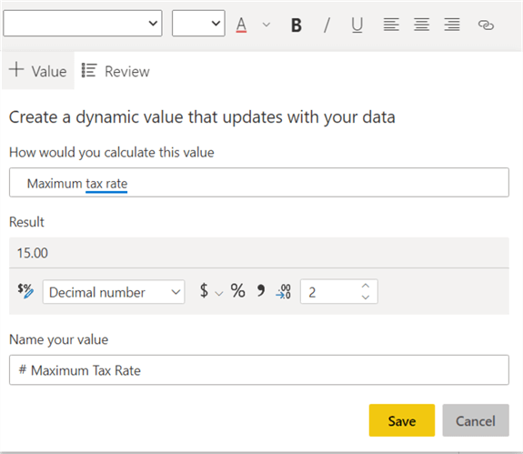
- The result of selected field / aggregation – 15.00 in the below example
- Formatting options for the field -- set the decimal places to 2 in the below example
- A way to name the field, which can be used to identify the field for alter editing. Otherwise, the default name will be Value 1, Value 2, etc, which is not very helpful -- Set to Maximum Tax Rate in the below example.
Once you are satisfied with the value, you can click on Save.
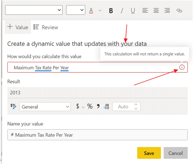
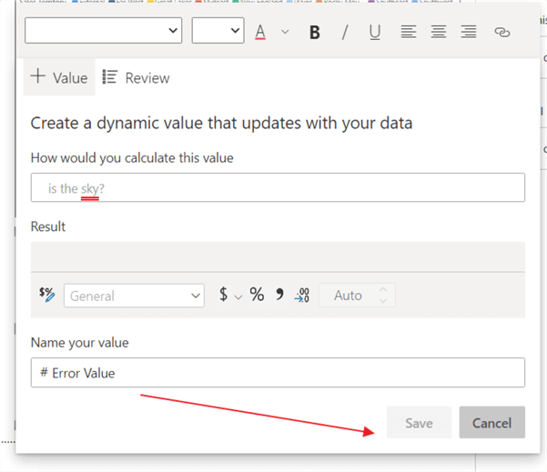
Similar to the functionality within Q and A techniques mentioned at the beginning of this tip, if Power BI is not sure about the question being asked or there is ambiguity about a value being requested, an information icon will show up on the right side of the input box. As illustrated below, "per year" is added to the Maximum Tax Rate value, but Power BI noted that this value is not a single value that can be displayed.
Furthermore, if Power BI cannot determine the requested values at all, because the question terms do not match the data set, double red lines will underline the value along with highlighting the word in red. In the below example, Power BI does not recognize "sky" as a value, measure, or category. Also, notice how no example result is shown.
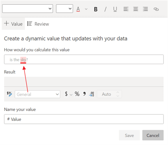
Finally, notice in situations where Power BI cannot determine a value, the Save button is not enabled!
Please note on the +Value tab, the value is only being created which sets it up for use in the smart narrative. However, the value itself is added to the narrative text but with NO context via leading or trailing text / words added to the narrative (we will get to that later in the tip!). That can be confusing as just a number is added.
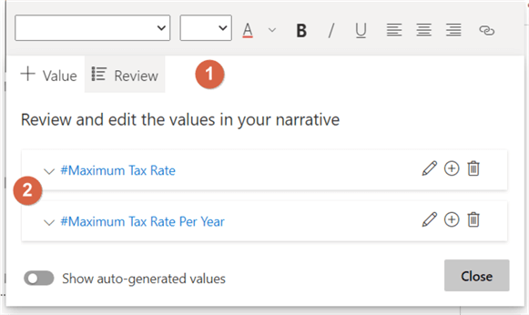
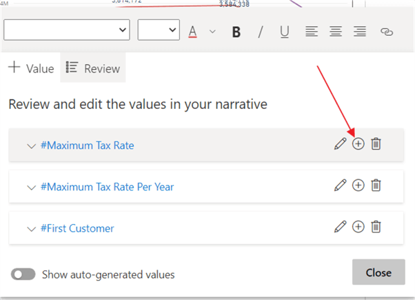
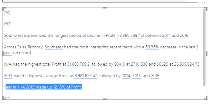
Moving to the review tab, after adding the new value, you have the option to edit (pencil button), delete (trash can) or add the value (+ button) to the existing smart narrative visual. The edit pencil button returns us to the + Value tab, which in turn allows changes to the value question, to the name of the value, and to the formatting options. The delete button of course deletes that value. You should note that if a value is deleted, there is no warning if that value is used in the smart narrative, and the value will just disappear from the narrative.
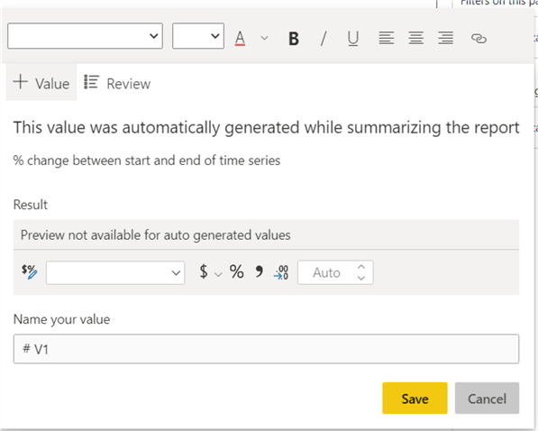
The Show Auto-Generated values option will show the values that have been generated by the initial creation of the narrative visual. Note that each visual is named #V1, #V2, and so on which does not tell you what that particular, default value means.
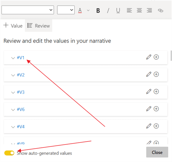
However, using the edit-pencil button option, you can drill into the value to see what value was generated. I am hoping that at some point, these names will be better labeled. Also, note that the value name cannot be changed, although the name textbox does not appear to be disabled.
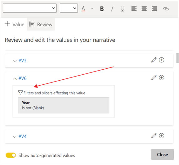
One other feature that is in my opinion a work in progress, is the applied filter option. Using the down arrow to the left of the value name, opens a filter and slicer preview for that particular value. However, in my testing, I was unable to determine exactly which filters were being applied or not applied to that value.
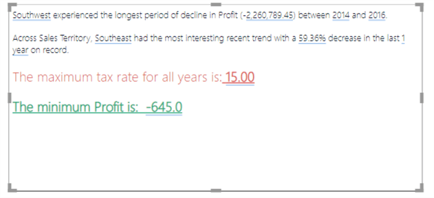
As noted previously, the process of adding specific values to the smart narratives is a two-step procedure if you want to add dynamic values with the context of some text / formatting. As shown below, the text, "The maximum tax rate for all years is:" is added to the smart narrative.
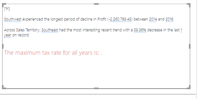
Next, clicking on the Review tab and then using the + plus button adds the Maximum Tax Rate to the smart narrative.
Now the maximum tax rate has been added to the narrative, as illustrated in the following screen print. We could continue to add other values as needed; in the below case we also added a minimum profit value too.
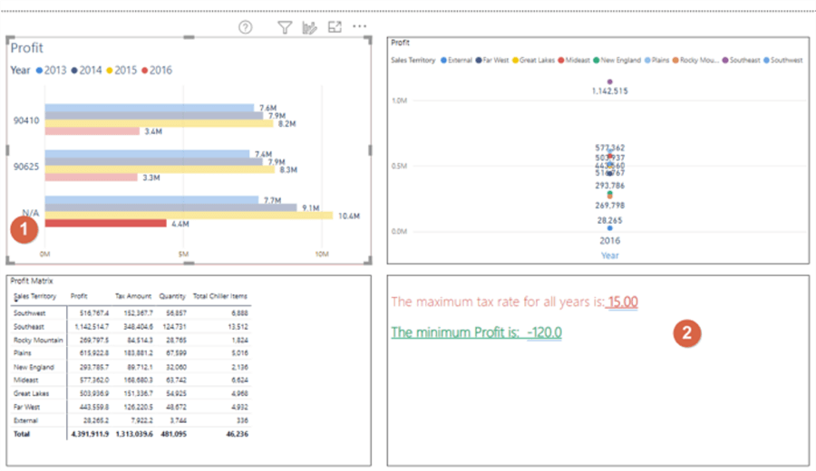
Now that we have a basic smart narrative, let us review how slicers, filters, and related cross-filtering interact with the smart narrative. Similar to other visuals, as a filter or slicer is selected, the smart narrative automatically updates for the filtered context value. As illustrated, selecting the 2016 – N/A red line in the upper left bar chart, contextually applies that value as a filter to the smart narrative (and the other visuals on the report). Notice the tax rate does not change (as it is still the maximum rate of 15%), but the minimum profit does change based on the contextual filtering.
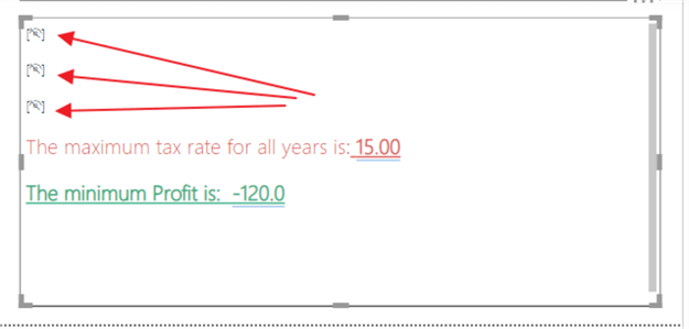
Finally, if no values exist for a particular summary value on the narrative, that particular set of linguistics and wording will not show within the narrative. It is replaced with the Power BI hidden symbol. A message pops up stating that "current data and filters produces no results for this value"; this message will only appear to the report developer.
Up to now, we have been using a single visual to display our work. However, the smart narrative visual can and does include the ability to review and interact with all visuals on a Power BI tab (less any of the non-compatible visuals such as the table or matrix or KPI).
To make this happen, we can select or drag a new smart narrative visual onto the design grid, and it automatically inserts a default narrative based on each of the various visuals on that page (not including any of the non-compatible visuals).
As shown below, the smart narrative visual automatically added information related to both the bar chart visual and the line chart visual. You see details about the sales territories, zip codes, years and profit (all related to those two visuals), but no mention is made about the fields and measures on the matrix.
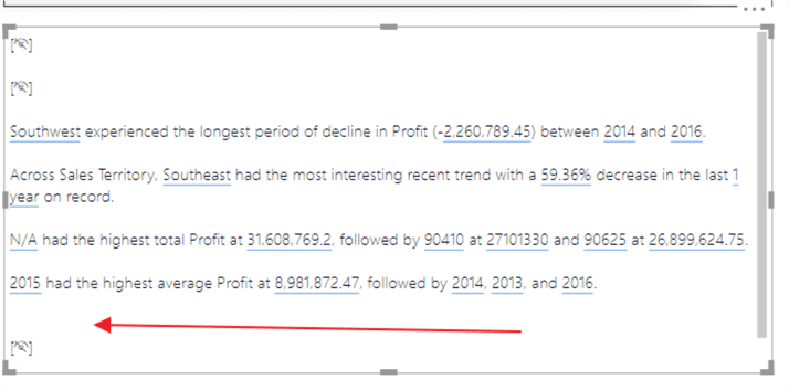
Similar to the single visual smart narrative, we can adjust and delete values as needed to this smart visual. Likewise, formatting can also be applied and changed using the same edit toolbar and window. Furthermore, as illustrated in the below example, we can actually delete an entire sentence including the values from the smart narrative itself; the last sentence did not make sense, so it was removed by selecting it and hitting the delete button. We can also manually type new sentences as needed which do not include a dynamic value.
The smart narrative visual takes our Power BI analysis to a higher level by providing report consumers with bullet point, word oriented type nuggets of details that may not be readily apparent on just a visual. Although this option is currently in preview mode, and likely needs some additional work, the preview features offer a rich way to supply a detailed narrative around the visuals on a dashboard. However, being in preview mode does lead to some limitations and possible ongoing caveats including not being able to use conditional formatting options and not being able to pin the smart narrative to a dashboard.
Next Steps
- All SQL Server Power BI Tips
- Data forecasting in Power BI - Data Forecasting and Analytics with Power BI Desktop
- Analytics in Power BI - Analytics with Power BI Desktop for Data Clustering
Learn more about Power BI in this 3 hour training course.


About the author
 Scott Murray has a passion for crafting BI Solutions with SharePoint, SSAS, OLAP and SSRS.
This author pledges the content of this article is based on professional experience and not AI generated.
View all my tips
