By: Scott Murray | Comments | Related: > Power BI
Problem
One of the problems with data analysis is the potential for data anomalies that can skew the results. There are several ways of detecting and dealing with anomalies and now Power BI has a way to detect anomalies and outliers in the data, which we will cover in this article.
Solution
If anyone wondered where Microsoft is heading with it's Power BI business intelligence solution, they can just look to all the preview features being rolled out each month. In particular, one feature that was recently released, and one which I am particularly excited about is anomaly detection.
Anomaly detection pushes the data reporting functionality to the next step, and begins to focus on analyzing the data that is being reported on and estimating where possible problems with the data could be present AND even attempting to identify the reason the data are exceptions. Additionally, you have the ability to customize the various settings for which anomalies are detected.
Getting Started with Microsoft Power BI Anomaly Detection
In order to use anomaly detection, be sure to download the latest version of Power BI desktop for on-premises installations. Additionally, we will be using the WideWorldImportersDW database as a basis for our data sources; this database can be downloaded from GitHub. If you need a refresher on bringing data (SQL Server, Excel, data warehouse, SalesForce, etc.) into Power BI please see this tip.
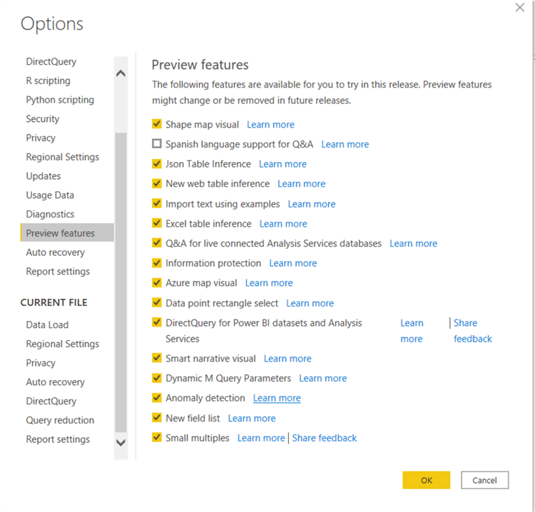
Our first step is to enable this preview feature in the Report Options by clicking on File in the tool bar and then selecting Options and settings and then Options. Then in the Preview Features tab, select the Anomaly Detection checkbox.
Power BI Reports for Anomaly Detection
Once anomaly detection is turned on, the next step is to create a new tab with a line graph data visualization. Here is where one of the caveats of this preview feature come into play. Currently only line graphs allow for the addition of anomaly detection. Thus, a single line chart is added to our example dashboard report.
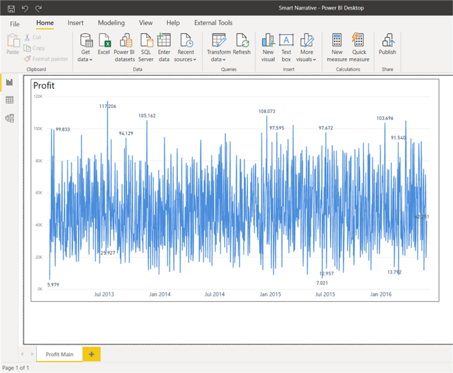
A second caveat that comes into play is that the line chart cannot utilize a legend; that in essence limits the line to just single measure or numeric value set. Also, a date series must be used in the x-axis. Now, we can add our first detection. To do so, first select the line chart visual and click on the Analyze magnifying class button in the Visualizations well.
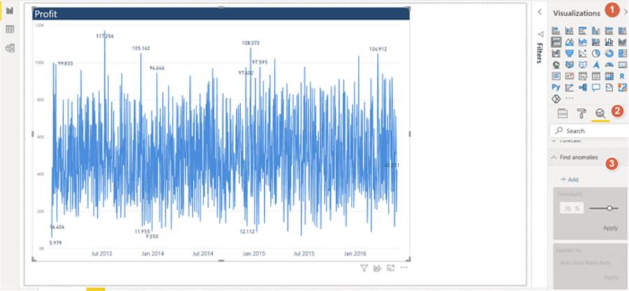
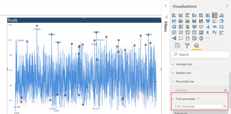
Clicking on the + Add enables the anomaly detection feature for the selected visual.
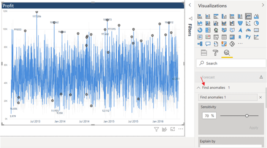
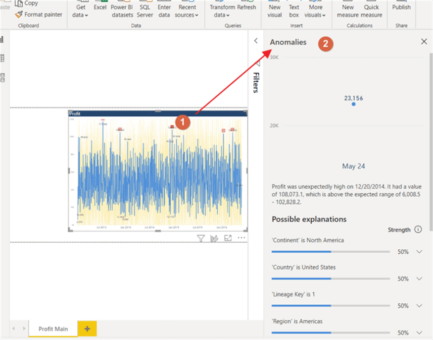
Upon clicking the add button, the Find Anomaly section un-grays and becomes enabled. Also notice in the above screen all the symbols appear on line chart. These items are all suspected anomalies. If desired, the name of the anomaly object can be changed by double clicking on the text box just below the Find anomalies header, as shown below.
The real power comes with the adjusting the Sensitivity setting. This setting uses an anomaly detection algorithm based off the SR-CNN algorithm whose roots stem from work in the computer vision, specifically looking for items that stand out (see the paper / presentation on this algorithm at: KDD 2019 | Time-Series Anomaly Detection Service at Microsoft). Thus, the algorithm is designed in such a way to apply the same sort of "find items that stand out" objective, except in this case, the Power BI engine is looking for values that do not match in the time series.
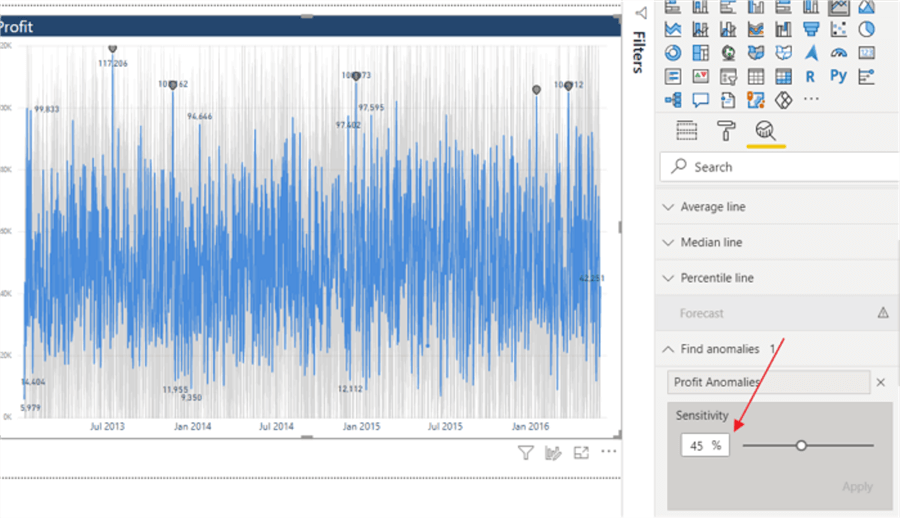
The sensitivity slider bar can be moved up or down. Moving the sensitivity up will cause the detection routine to increase the number of anomalies as the range of "normal" data becomes more limited. On the contrary, when the sensitivity level is decreased, the lower figure will cause less values to be outside the "normal range" and be marked as an anomaly. As shown the above screen print, a sensitivity level of 45% significantly decrease the number of marked anomalies.
In addition to setting the sensitivity threshold, we can also format several of the resulting objects from the anomaly detection. As shown below, the anomaly symbol, symbol size, and symbol color can all be adjusted. In the below example, the symbol is changed to a square while also increasing the size and changing the color.
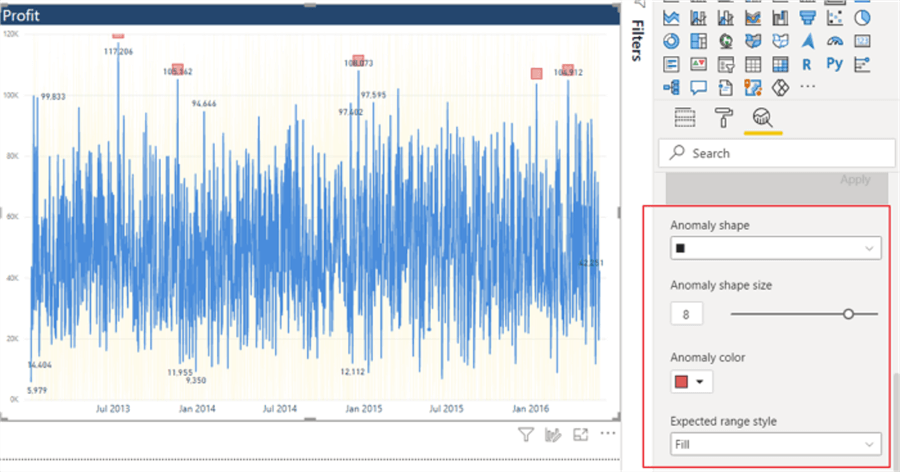
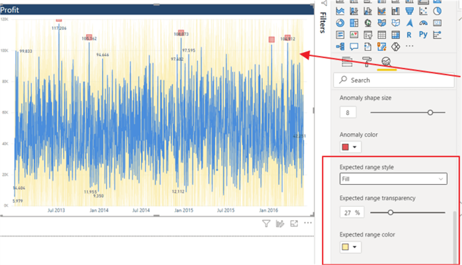
The anomaly detection also provides the expected range for each value and these objects can be formatted as appropriate. Thus, in the below example the transparency for the expected range was adjusted, and the range color was changed to yellow.
The final option for the anomaly detection provides the explanation capability. By simply clicking one of the anomalies, an explanation box will appear, as shown in the below illustration. The explanation box shows the anomaly(ies) that were detected, along with providing a list of possible explanations based on the data. As shown below, a continent of North America, a Region of Americas, and a country of United States all impact the outlier value at the 50% level.
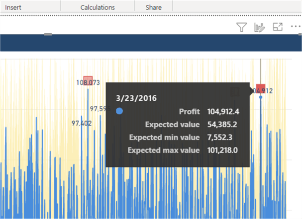
Also, notice when hovering over a particular date on the line chart that the tool tip provides the actual, expected and minimum and maximum range values.
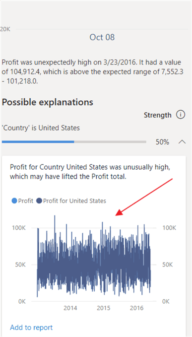
We can also drill any of the influencing figures by clicking the down arrow to the right of the possible explanation.
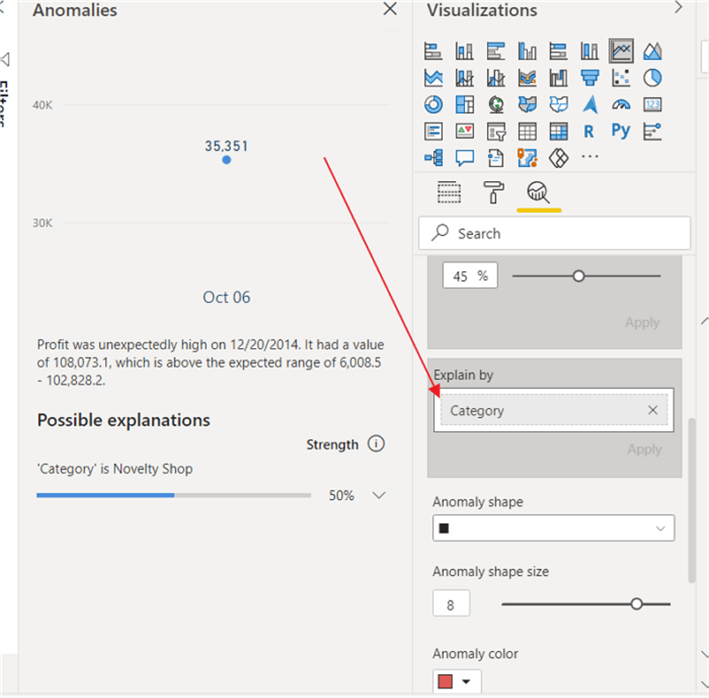
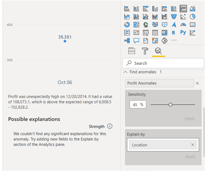
If we want to focus on one particular field to determine if it is influencing the data set (at the suspected time), we can add that field to the Explain item in the Analyze well.
If the item added to the Explain by field does not have any significant influence on the measure value being explored for anomalies, then that will be reported as illustrated in the subsequent screen shot.
The anomaly detection feature does honor and update according when changes are made to filters or slicers within a PBIX file; however at least twelve data values / specific measure values are needed for the detection process to work.
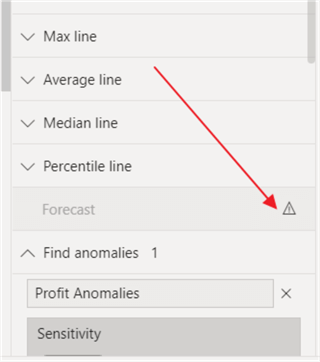
Additionally, when the find anomaly feature is enabled, the Forecast feature is disabled. Likewise, if a Min Line, a Max Line, an Average Line, a Median, or a Percentile line cannot be added. If you enable any of these lines the anomaly detection feature will disable.
The anomaly detection preview is definitely still in its infancy, but as it expands, it will definitely start to provide detailed analysis and evaluation during data analysts and data scientists data wrangling processes.
Next Steps
Learn more about Power BI in this 3 hour training course.


About the author
 Scott Murray has a passion for crafting BI Solutions with SharePoint, SSAS, OLAP and SSRS.
This author pledges the content of this article is based on professional experience and not AI generated.
View all my tips
