By: Rick Dobson | Updated: 2021-10-20 | Comments | Related: > Python
Problem
Provide a series of Python templates for creating pie chart data visualizations based on results from SQL Server queries. Begin with an initial template that introduces Python novices about how to create a basic pie chart. Present subsequent templates that build on the basic pie chart template to add slice identifiers, explode pie slices, present side-by-side pie charts for two different sets of counts, and illustrate how to assign custom colors to pie slices.
Solution
A popular adage is: "a picture is worth a thousand words". When working with counts for different categories, a pie chart is a common way to present results. This tutorial shows how to create a variety of different pie charts for displaying counts based on output from SQL Server queries. Whenever you are responsible for showing to others SQL Server query results with counts by category, this tip may help to make your data more impactful.
The initial SQL Server source data for this tip is a query results set that compares the outcome of four models for picking buy and sell dates for financial securities based on exponential moving averages. A prior tutorial, Creating and Comparing SQL Time Series Models, demonstrates how to obtain the outcomes with SQL Server for the data charted in this tutorial. The objective of the comparisons in the prior tutorial and the pie charts in this script is to show which model generates the highest returns for securities traders.
SQL Source Dataset
The model comparisons from the prior tip are summarized in the table displayed below; the data are from SQL Server that are copied to an Excel workbook.
- The table is embellished via a screen capture program with colored backgrounds in column B to help identify which model was best. The deeper the shade of green, the better the model performed. A background color of red denotes the worst performance.
- Each model was tested with six securities over a ten and a half year duration (from January 2011 through June 2021). Four models were created and compared in the prior tip. The rows in Column B contain a short phrase that characterizes the criteria of a model for picking buy and sell points for securities.
- The six securities are denoted in column A. Three securities are company stocks (AAPL, GOOGL, MSFT) and three additional securities are exchange traded funds (SPXL, TQQQ, UDOW).
- The main variable for representing the performance of each model is the
average percentage price change per cycle.
- A single buy-sell cycle from a model for a security is defined by a start date and an end date.
- Each model has different rules for picking successive buy and sell dates over the ten and a half year testing period.
- The rows in the display are sorted by average percentage price change per cycle.
- The average percentage price change per cycle is based on
- Change in price within a buy-sell cycle
- The division of change in price within a buy-sell cycle by the buy price for a buy-sell cycle for the percent change of a buy-sell cycle
- Average of the percent change in price for buy-sell cycles across each symbol for a model
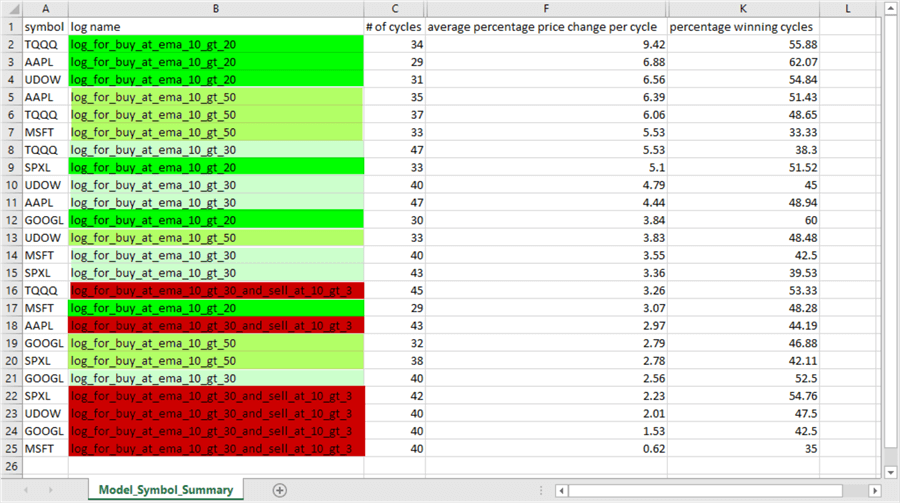
There are twenty-four rows in the preceding display – one for each symbol within each model. The rows can split into two halves. The top half is for the twelve rows with the highest average percentage price change per cycle. The bottom half is for the twelve rows with the smallest average percentage price change per cycle.
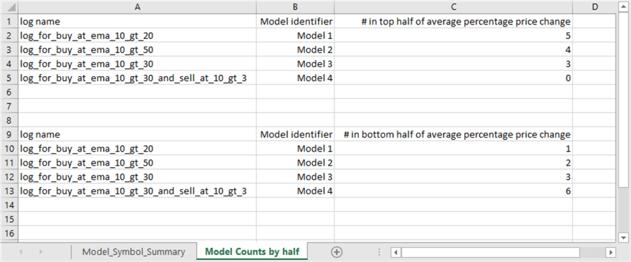
Here's an Excel worksheet excerpt that shows counts by model for the top and bottom halves for each model-symbol combination from the preceding display.
- Model 1 has five rows in the top half and one row in the bottom half. Model 1 is the best performing model.
- Model 4 has six rows in the bottom half and no rows in the top half. Model 4 is the worst performing model.
- Model 2 and Model 3 return results that are intermediate between those for Model 1 and Model 4.
The remainder of this tip presents pie charts created by Python for the preceding display.
Python script for a basic pie chart for beginners
One especially popular external library for helping Python to visualize data is Matplotlib. This library is often used with another external library named Numpy. For readers who do not already have access to a working version of Python with the Matplotlib and Numpy libraries installed, the following links may be helpful. The IDLE code editor for Python, which is used by this tip, can be downloaded automatically when you install Python from the link below.
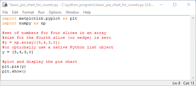
The following IDLE window displays a simple Python script for creating a simple pie chart.
- The Python script starts with references for the Matplotlib and Numpy libraries.
- Pyplot is a set of functions in Matplotlib that can be called programmatically
- Plt is an alias for pyplot
- A numpy array object can be specified by a numpy alias (np) as a preface to a set of square brackets with comma-separated numeric values for the array elements. The array object can be assigned to a Python variable named y. You can use the counts in the top half (5,4,3,0) to populate the numpy array.
- Alternatively, you can use a native Python list object. The code sample below illustrates the use of comma-separated numeric values from a Python list object.
- In the script below, the y list object is passed to a pie function, which configures a pie chart from within the Matplotlib Pyplot application programming interface.
- The pyplot show function displays the pie chart.
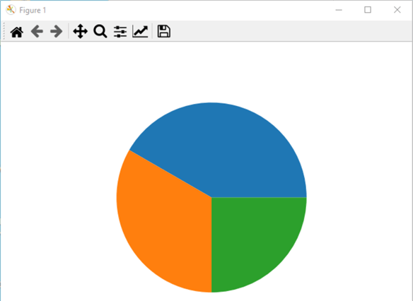
By selecting Run, Run Module from the IDLE menu (or just depressing F5 while in the IDLE window), you can run the preceding Python script, which creates a basic pie chart with plt.pie() and shows the pie chart with plt.show(). The following screen image shows a window with the pie chart.
- The pie chart contains three slices.
- The size and order of the slices correspond to the order of the values in the y list object.
- No fourth slice appears because the value of the fourth element in the y list object is zero.
- The pie slices start by default on the x axis, which corresponds to an invisible horizontal line through the middle of the pie. The slice for the first list element with a value of 5 appears as blue. This is the largest pie slice.
- The slice for the second list element appears next with a value of 4. This is the second largest pie slice. Its color is orange.
- The third slice corresponds to the value of three in the y list object. Its color is green.
- Colors are automatically assigned according to the Matplotlib default color cycle. The order of colors in the default color cycle are blue, orange, green, red, purple, brown, pink, gray, olive, cyan.
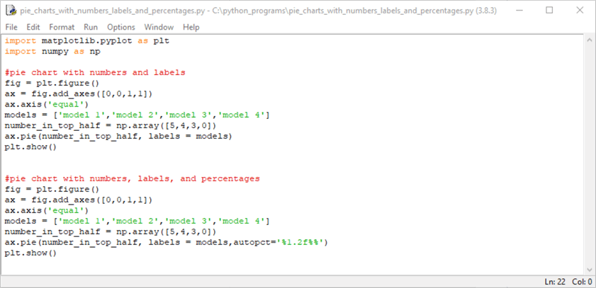
Adding labels and percentages for the slices in a pie chart
The next screen shot replaces the use of the native Python list elements for pie slice counts with Numpy array object elements. The code generates two charts – one with labels and the other with labels and percentages corresponding to the size of each pie slice.
The Numpy library is assigned an alias of np in its import statement. The syntax for specifying an array is np.array([comma-separated array element values]).
The first chart generated by the following script is for a figure with labels for the pie slices. The code for the pie chart appears after the import statements for the Matplotlib and Numpy libraries. The comment line before the code for the first plot is "#pie chart with numbers and labels".
- The figure object named fig is an outer container for a chart image. It is generated by the figure method of the pyplot functions in Matplotlib.
- The ax object is an inner container within a figure object for a chart image.
In the code for the first chart below, the add_axes method of the object named
fig adds an axis object named ax to the fig object.
- The lower left corner of the ax object has x and y coordinates of zero.
- The width and height of the ax object is 1 where these values denote the size of the fig container object. Therefore, the size of the ax object is the same as the fig object.
- The axis method with an argument of equal specifies that horizontal and vertical chart image extents are of equal proportions. Matplotlib frequently performs this function without an explicit declaration, but a specific setting forces the proportionality of the vertical and horizontal axes.
- The labels for the slices are denoted in the list object named models. Notice that the labels are string values inside a Python script object.
- The np.array() function specifies the raw size of the pie slices. The array element values are saved in the number_in_top_half Python variable.
- The pie method of the ax object configures the pie chart according to the prior specifications for the ax object within the fig object. The pie chart's labels parameter is set equal to the models list object.
- Finally, the show method of the pyplot functions displays the pie chart in the ax object.
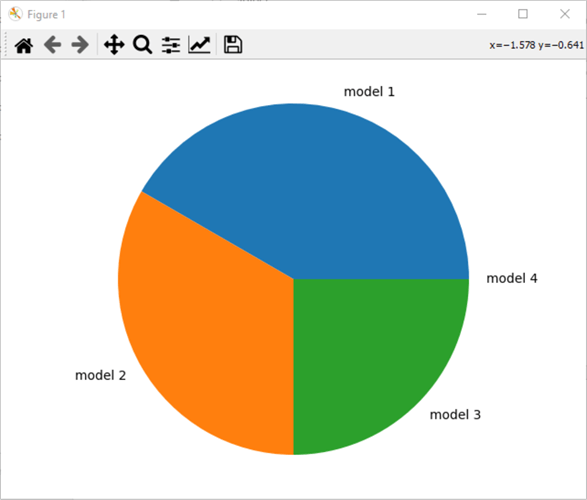
Here's the image of the first pie chart. Notice there are labels for all four pie slices, including the slice with a value of 0 (model 4). This chart is an improvement over the basic pie chart image displayed above. The improvements include a label for all four slices. Also, the preceding chart image did not identify the pie slices with labels.
The code for the second pie chart adds percentages that denote the proportion of the pie chart allocated to each slice. Matplotlib can compute these percentages with the inclusion of the autopct() function as a pie method argument. The autopct function takes the size values of the slices and sums them to return a percentage value that corresponds to the relative size value for each slice.
The following image shows the second pie chart from the preceding script. As you can see, the percentage values sum to 100% percent. Additionally, model 4 corresponds to a value of zero percentage value.

Exploding pie slices
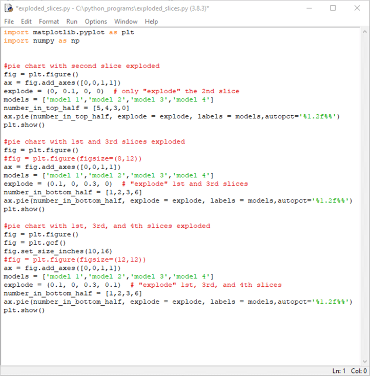
Selected slices of a pie chart may be exploded so that they are set apart from the other slices in a pie chart. You can use the explode parameter of pie method for an axis object to designate which slices are displaced from the other slices as well as how far slices are exploded (or displaced). The script in this section reverts to using a list object for setting the size of pie slices.
The following script file (exploded_slices.py) presents three examples of selectively exploding slices within a pie chart. The script for the first pie chart designates an explode parameter value of .1 for the second element in the explode list object. A value of .1 represents the smallest amount of displacement for a pie slice. The explode list object is assigned to the explode parameter of the pie method for the ax object. This assignment causes the second slice to be exploded to a negligible degree from the remaining pie slices. The show method in the script displays a pie chart based on the first code block in the script below.
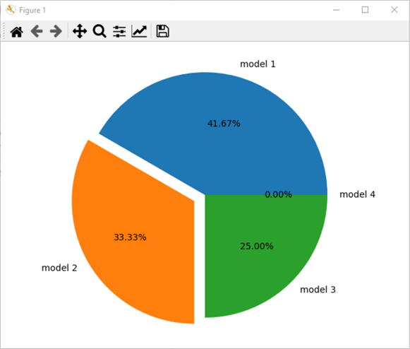
The following pie chart image shows the second slice (for model 2) exploded from the remaining slices in the pie chart. You can optionally click the file icon on the menu bar to save a pie chart image to a Windows folder.
The next pie chart is different from the preceding pie chart in several respects.
- First, the code for the second pie chart displays slices based on the counts of each model in the bottom half of average percentage price changes. All models in the bottom half of average percentage price changes have at least a count of 1.
- Second, two different slices are exploded: namely, those for model 1 and model 3.
- Third, the offset for the model 3 is .3, which is much larger than the offset of .1 for model 1.
The image for the second code block appears next.
- Notice that the slice percentage for models are different than in all preceding pie charts. The following chart is the first one to be based on average percentage changes in the bottom half as opposed to the top half.
- Next, the slices for model 1 and model 3 are displaced (or exploded) from the rest of the slices. The code for the chart shows how to explode concurrently two pie slices.
- The displacement for model 3 is demonstrably larger than for model 1.
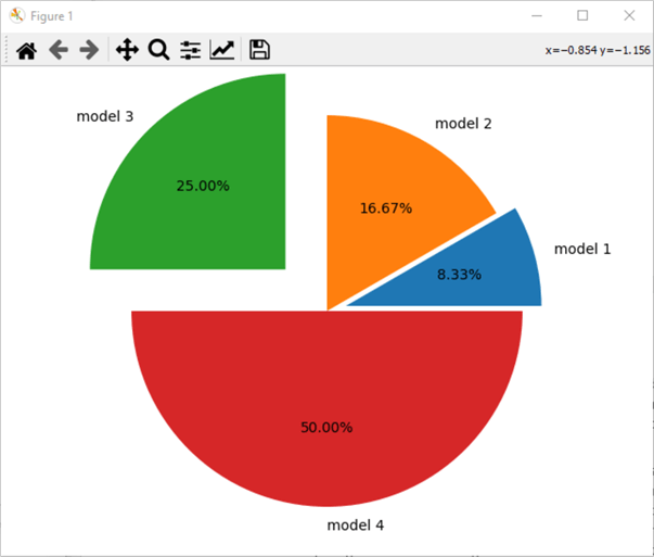
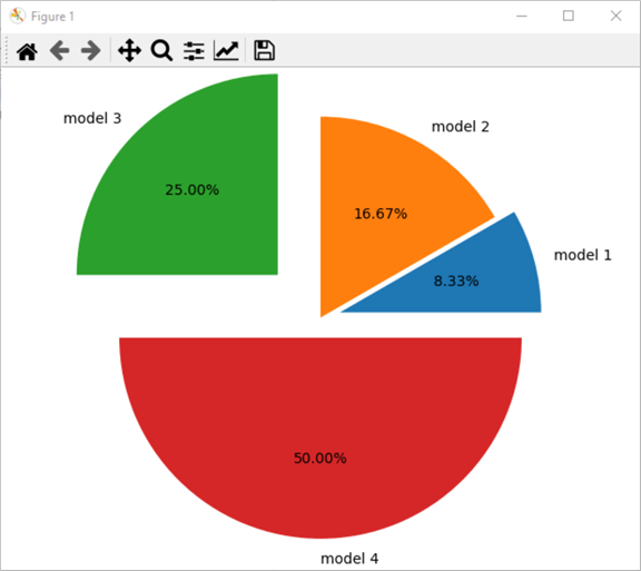
The code for the third pie chart in the preceding IDLE window illustrates how to concurrently explode three pie slices – namely, for models 1, 3, and 4. The right corner of the chart window can be dragged so that all model labels show in one figure image. You can also resize a pie chart figure by dragging the right corner of the chart window. The image for the third pie chart appears in the screen shot below.
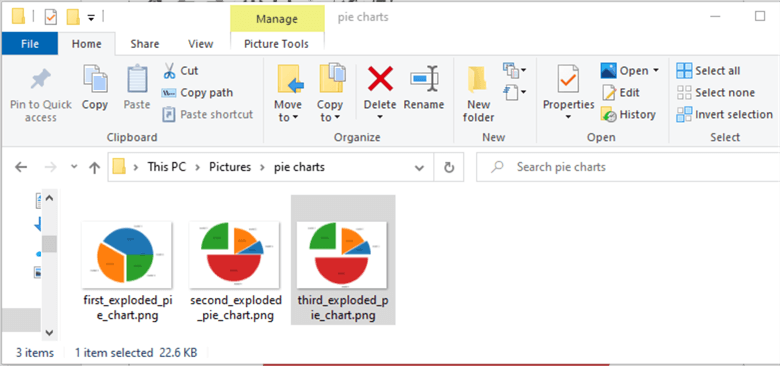
You can also optionally save one or more chart images by clicking the File icon in the window displaying a pie chart. The following screen shot shows from Windows Explorer a set of thumb nail pie chart images for three pie charts with exploded slices. The selected chart image is for the third chart image in this section.
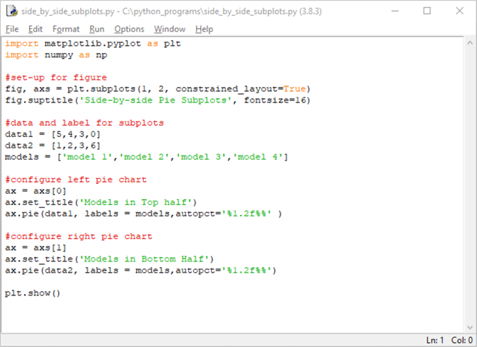
Displaying side-by-side pie charts
All the pie charts to this point in the tip are for one pie chart per figure. However, Matplotlib permits you to code more than one chart per figure. This section introduces this functionality with a simple example.
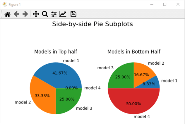
The example is for a single figure with two pie charts. The pie charts are side-by-side in the figure. Each pie chart is populated with different data. Recall that the underlying source data table sorts rows by average percentage change for each combination of model and symbol. There are twenty-four combinations from four models with each of six symbols.
- The first pie chart in the figure is for counts by model in the top half by average percentage change. This chart portrays the distribution of model outcomes in the top half.
- The second pie chart is for counts by model in the bottom half by average percentage change. This chart portrays the distribution of model outcomes in the bottom half.
- The side-by-side positioning of these two charts in the same figure helps
to clarify the relative performance of the models.
- The best model will have the most outcomes in the top half and concurrently have the least outcomes in the bottom half.
- On the other hand, the worst model will have the most outcomes in the bottom half and concurrently have the least outcomes in the top half.
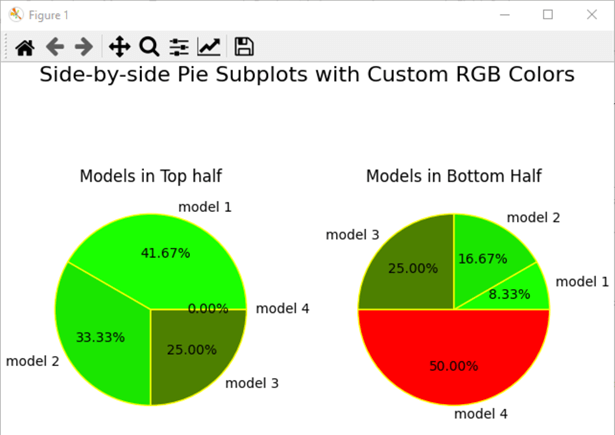
Here is what the figure for this section looks like.
- In the side-by-side comparison pie charts, you can readily see that model 1 has over 41 percent of the top half outcomes. Also, model 1 has just about 8 percent of the bottom half outcomes.
- On the other hand, model 4 has 0 percent of the top half outcomes and 50 percent of the bottom half outcomes.
- Model 2 generates marginally better outcomes than model 3 in that model 2 has 33 percent of the top half outcomes and just nearly 17 percent of the bottom half outcomes. In contrast, model 3 has the same percentage (25%) of outcomes in the top and bottom halves.
Here's the script for the preceding chart.
- After the import statements for the Matplotlib and Numpy libraries, the code declares two side-by-side charts in the figure with a subplots property setting for the plt application programming interface. The subplots property specifies one row of charts with two charts on a row.
- The subplots property also assigns a value of True to constrained_layout. This constrained_layout setting allows Matplotlib to adjust the positioning of chart elements, such as subplots and legends, to fit harmoniously within a figure even if other code does not directly support this objective.
- The suptitle property designates an overall title for both pie charts. The title text is "Side-by-side Pie Subplots".
- The next block of three code lines declares the sizes for the slices of
each pie as well as the slice labels.
- The size of slices for the top half are designated by the data1 list object. The data2 list object designates the slice sizes for outcomes in the bottom half.
- Both the top and bottom half outcomes have the same set of slice labels. The models list specifies these label values.
- The next block of three lines specifies the pie chart for the top half set
of outcomes.
- The first of the three lines specifies an axis (axs[0]) for the pie chart.
- The second line designates a title for the pie chart showing results for the top half.
- The third line invokes the pie method for the ax object to create the pie chart. The data1 list object is for slice sizes.
- The next block of three lines specifies the pie chart for the bottom half
set of outcomes.
- The axis for the bottom half is specified by axs[1] instead of axs[0].
- The subplot title is "Models in Bottom Half" instead of "Models in Top Half".
- The sizes for the pie slices are designated by the data2 list object instead of the data1 list object.
- After the figure with its pie charts are configured, the script terminates by invoking the show method from plt to display the side-by-side pie charts.
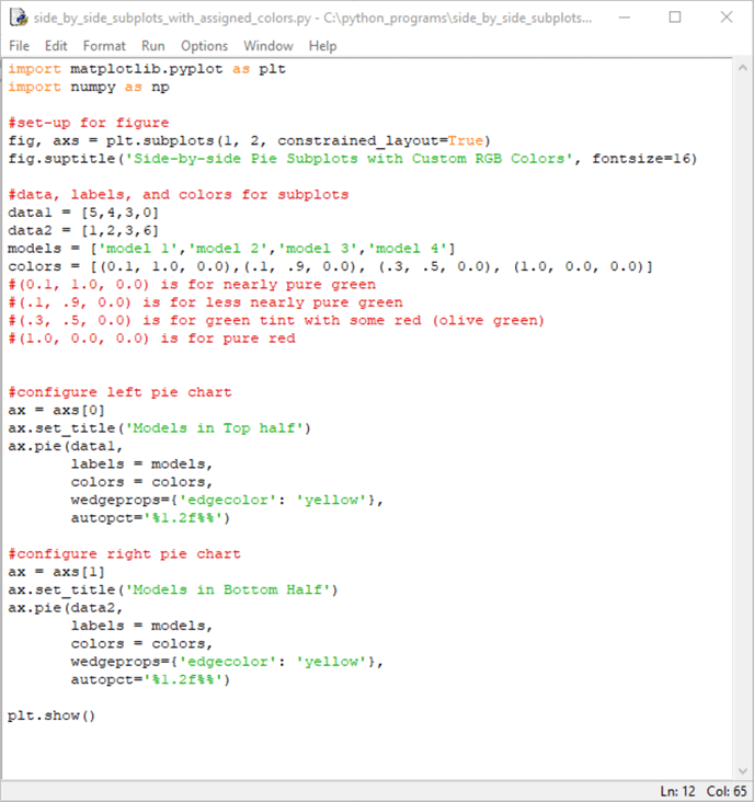
Displaying side-by-side pie charts with custom colors
The figure in this section assigns custom RGB colors to pie slices in the figure in the preceding section. RGB colors are based on combinations of the red, green, and blue primary colors. You can create custom colors by assigning values for each of the three primary colors.
Wedge is another term by which Matplotlib refers to a pie slice. Edgecolor is a property name for the border color around pie slices. You can set properties for a pie chart's wedge border with wedgeprops. The use of wedgeprops is optional, unless you want to set special properties, such as the border color for pie slices, through it.
Here's what the pie charts for this section look like.
- The custom colors for pie slices are assigned based on the model performance
for the pie slices.
- Slices for model 1 have the brightest green shade.
- Slices for model 2 have a less bright green shade.
- Slices for model 3 have an olive green shade.
- Finally, the slice for model 4 in the pie chart on the right side of the figure appears with a pure red color.
- The pie slices in this section are separated from each other with colored wedge borders. These wedge borders are assigned one of the standard Matplotlib color names. The color name is yellow.
Here is the script for the preceding figure.
- The figure's suptitle reflects the use of RGB custom colors for pie slices. All the other pie chart slices in this tip accept default color settings for pie slices.
- The RGB custom colors are a mixture of red, green, and blue colors (R, G,
B). The values for colors range from 0.0 through 1.0; the larger the value for
a color, the more intense the custom color can be. For example,
- nearly pure green can be specified by (0.1, 1.0, 0.0)
- less nearly pure green can be specified by ((0.1, 0.9, 0.0)
- a green tint with some red can be designated as (.3, .5, 0.0); this appears as olive green
- pure red is denoted as (1.0, 0.0, 0.0)
- Recall that the lines between pie slices are set by the edgecolor property of wedgeprops. The code shows the syntax for assigning a color name of yellow to the edgecolor property.
Next Steps
- This tip presents and describes a collection of Python scripts for implementing a basic pie chart and selected intermediate and advanced features for creating and displaying pie charts with Python. The pie charts show data based on a SQL Server results set. An effort has been made to present content in a way that enables you to replace the sample data in scripts with your own data. Therefore, one next step is to use the templates with your own data.
- Python and the Matplotlib external library is a powerful way to create and display pie charts based on data from SQL Server and other data archives. The Matplotlib library is a very rich (powerful and potentially complex) development environment for creating charts. If you wish to learn more about creating pie charts and other kinds of charts with Python than are presented in this tip, you will need to learn more about how to program Python and the Matplotlib library.
- Here are some links for getting started on learning more: Basic pie chart, Labeling a pie and a donut, Pie Demo2, Specifying Colors and Color Functions.
- The download for this tip includes five python script files as well as an Excel spreadsheet with the sample data used in the tip.
- Check out these additional resources:


About the author
 Rick Dobson is an author and an individual trader. He is also a SQL Server professional with decades of T-SQL experience that includes authoring books, running a national seminar practice, working for businesses on finance and healthcare development projects, and serving as a regular contributor to MSSQLTips.com. He has been growing his Python skills for more than the past half decade -- especially for data visualization and ETL tasks with JSON and CSV files. His most recent professional passions include financial time series data and analyses, AI models, and statistics. He believes the proper application of these skills can help traders and investors to make more profitable decisions.
This author pledges the content of this article is based on professional experience and not AI generated.
View all my tips
Article Last Updated: 2021-10-20
