By: Siddharth Mehta
Overview
In this chapter we are going to start to understand the details of visualizations and data controls for the Mobile Report Publisher. The most basic and traditional form of reporting focuses on a report is in the form of a data grid. Mobile Report Publisher provides three different types of data grids. We will review each of these in this chapter.
Explanation
Assuming that you have already installed Mobile Report Publisher, open the app and by default a new blank mobile report will open for authoring.
1) Drag and drop a simple data grid onto the grid layout of the report. By default, the Master layout will be open and you need to place your visualizations on this layout and configure them here. These controls would then become available in the mobile and tablet layout where you can size and position them.
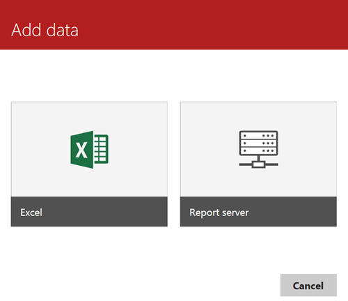
2) Click on the Data tab. If you have already added a simple data grid to the report layout, in the data tab you will find a sample table named SimulatedTable. You can click on the Add Data button to add data from either Excel files or a shared dataset deployed on the report server. Once you select the data source, the dataset will be available in the form of a table in the Data tab.
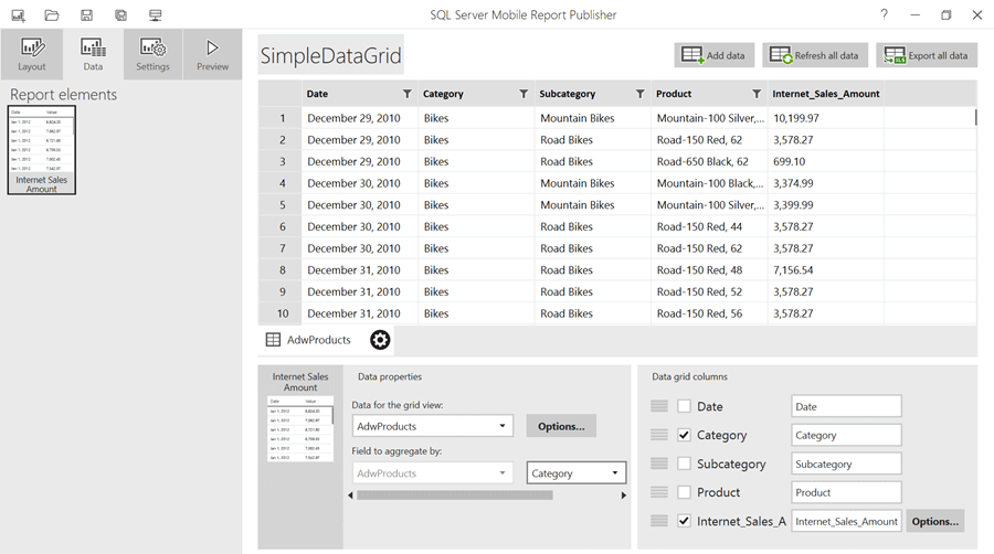
Simple Data Grid
3) Below is an example of data from a shared dataset that uses the SSAS AdventureWorks cube as the data source and executes a query that returns Internet Sales Amount measure by Product Hierarchies. The bottom half shows the Data properties for the Simple Data Grid, where we can configure the table to be used for the grid, fields to be displayed along with the display order, and the fields based on which data should be aggregated.
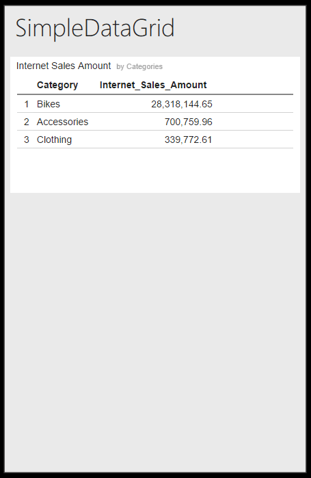
4) Preview this report and it would look like this in the mobile view.
Indicator Data Grid
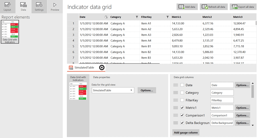
5) The next data grid in terms of features is the indicator data grid. This kind of grid is good for creating scorecards where different Key Performance Indicators (KPIs) are reported. It contains the same features as the simple data grid, with an additional option to add a gauge column as shown below.
6) Five different types of gauges are available to display indicators. Each type of indicator is shown below. Depending on the type of usage, we can configure the type of gauge.
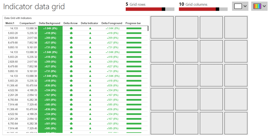
Chart Data Grid
7) The final data grid in terms of features is the chart data grid which allows you to add charts as well as gauges. Each chart is generally composed of many data points. Having transactional data and the related chart data in the same table is neither a good design nor advisable from a data growth standpoint. So when you add a chart data grid on the layout, you will find two tables as shown below.
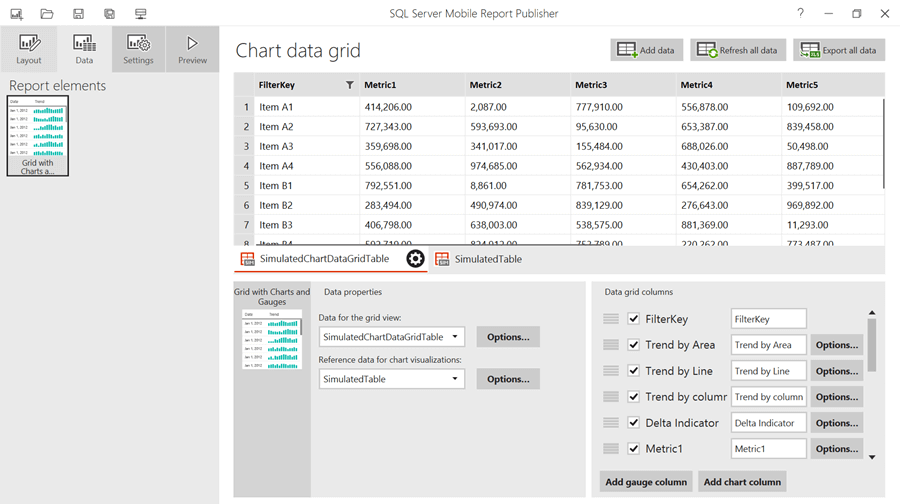
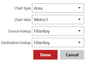
8) Also if you select the options for a chart field, you will find three types of charts to configure in the data grid. Also options are available to define keys based on which data in the two tables can be joined.
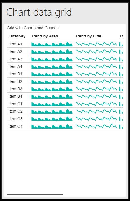
9) Click on the Preview tab to execute and preview the report.
In this way data grids can be used for detailed data reporting and for developing scorecards. In the next section, we will look at how to use Charts for mobile reporting.
Additional Information
- Consider using KPIs as a data source from a SSAS Cube, and developing dashboards using different types of data grids.
