By: Siddharth Mehta
Overview
Reporting data on maps is a standard reporting technique for data that is to be analyzed over geography. This form of reporting is also known as Geospatial Reporting. Mobile Report Publisher offers three different types of maps - Gradient heat map, Range stop heat map and Bubble map. Our intention is to understand the use of each type of map. A detailed explanation every map property is beyond the scope of this tutorial. We will cover each map briefly and touch upon important details.
Explanation
Below we will discuss the different map types.
Gradient Heat Map
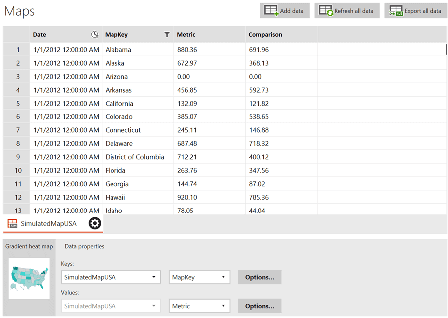
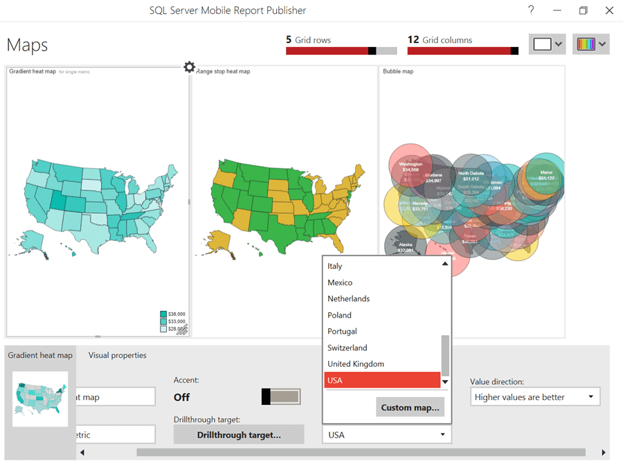
The first map available for geospatial reporting is Gradient heat map. Each map control ships with a set of default out-of-box maps which can be used as the base layer for reporting data. A heat map is a visual in which a single color (and in some cases multiple colors) ranging from the lightest shade to the darkest shade are used to represent the relative value of a metric compared to other values in a set. In the case of a Gradient heat map, data for each region in the map is shown with a different tone of color depending on the value associated with the geography. The lowest value available in the dataset is considered the minimum and the largest value as maximum. The configuration for this with the default sample data is shown below.
Range Stop Heat Map
A range stop heat map allows us to define thresholds for values as we have done previously in charts and gauges.
Bubble Map
A bubble map overlays bubbles on each region of the map and the size of the bubble is relative to the value of the metric associated with the region. Displaying a bubble map on a mobile screen space, that has a large number of regional divisions in a map can make the graphic overloaded with information which cannot be analyzed with limited screen space. So careful consideration is required while making a decision of displaying a bubble map on a mobile layout.
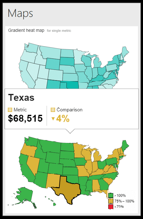
Even a gradient or range stop heat map has a lot of information, but all the numeric values are not displayed upfront on the map. When the report is accessed on the mobile screen and any particular region is clicked, a pop-up appears which shows the actual value associated with the region. This keeps the graphic clean and analyzable and more detailed information is provided on demand.
Maps and Data Grids generally need more space on a report than any other visualization. Consider developing a small report in mobile layout that has one chart, one map and one gauge at least to experience how much space is required for different visualizations to render them gracefully on mobile layouts.
Additional Information
- Maps are ESRI shapes. Mobile Report Publisher has provisions to add custom shapes as maps. Consider reading this tip for more details.
