By: Kun Lee | Comments (5) | Related: > Performance Tuning
Problem
In a previous tip, "Setting up Performance Monitor to always collect performance statistics" I wrote about how to collect performance monitor data, but once you have the data then what do you do with it. In this tip I will show you how I use Excel to analyze the data to help determine where your bottlenecks may be and also an easy way to create quick reports and charts for your SQL Servers.
Solution
Before we get started here are a couple of things you will need for this tip.
- Microsoft Excel 2007 - you also can use Excel 2003 or earlier version but for this tip, I used the latest version.
- Perfmon trace files at least one day in "csv" format. - if you have a file in "blg" format, you can easily convert it by using the "relog" tool. When I get a chance, I will write another tip about the relog tool and other tools that work well with Perfmon. To collect data using Perfmon you can review this tip Setting up Performance Monitor to always collect performance statistics.
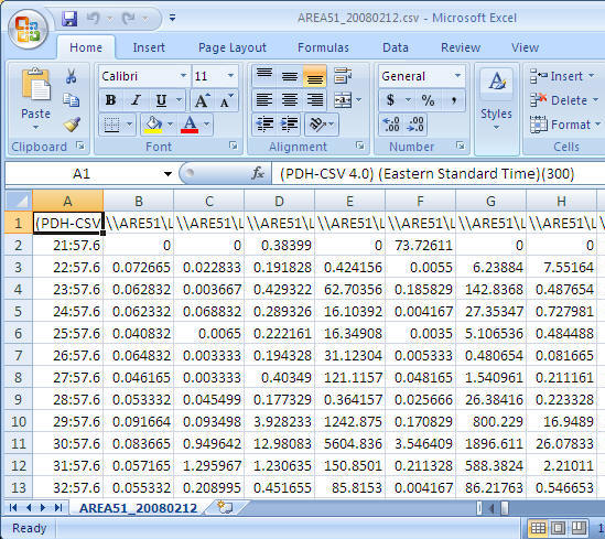
Step 1: Open the csv file
Once you have collected the performance data you can open the csv file using Excel and you should see data similar to the following.
Step 2: Adjust the format
To allow easy reporting of the data there are a few things that I do to adjust the data.
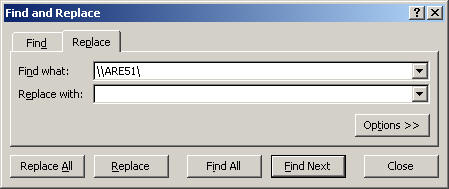
- Replace server name with an empty string - it helps to make reading the counter names easier. In this case I am replacing "\\AREA51\" the name of my server to nothing. (This is optional, but recommended)
- Cell - A1: Replace "(PDH-CSV 4.0) (Eastern Standard Time)(300)" with "Time" (Optional, but recommended)
- Delete the second row - very often, the first data row has bad data
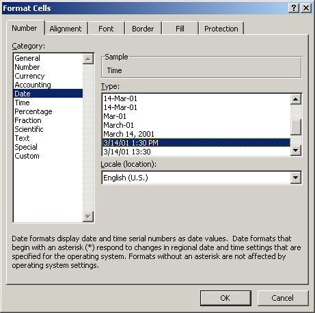
- Change COLUMN A cell format to "date time"
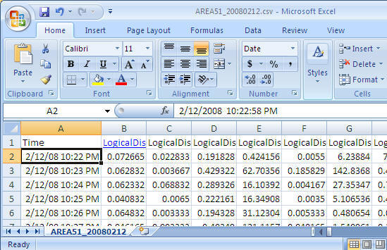
Final look before we start using it the data.
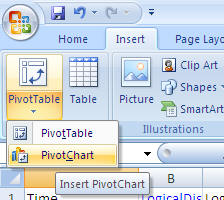
Step 3: Create PivotTable with PivotChart
- From the Insert menu select PivotTable and then select PivotChart as shown below
-
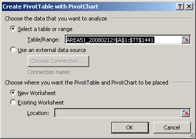
Take the default settings and click "OK"
-
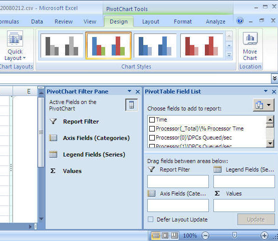
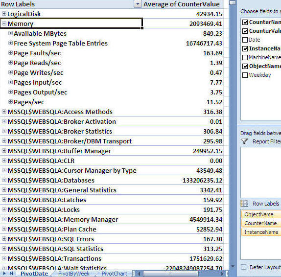
After you select the above you will get a screen similar to the following. (to get a bigger workspace area you can close the "PivotChart Filter Pane")
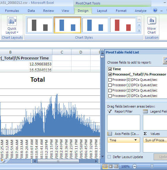
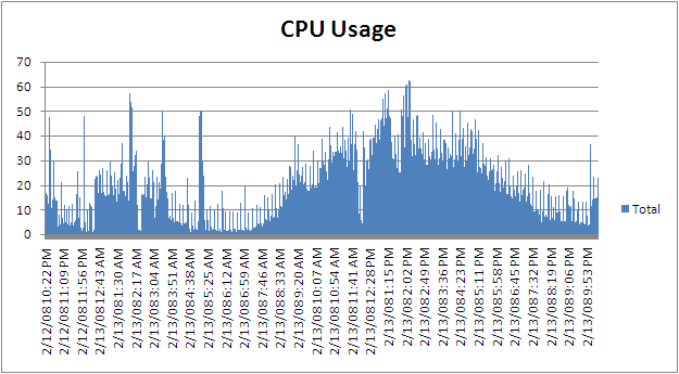
Step 4: Let's generate our first graph
For this example we will look at CPU
- From the "PivotTable Field List" select "Time" and drag it into the "Axis Fields (Categories)" area
- From the "PivotTable Field List" select "Process(_Total)\% Process Time" and drag it into the "Values" area
- At this point you will have a graph similar to the one shown below
-
You can now just select the chart and copy and paste it into a report, an email, Word document etc... as shown below
-
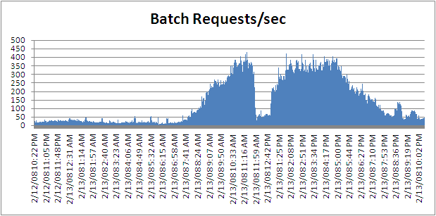
If you want to change it from processor time to batch requests you can remove "Process(_Total)\% Process Time" and select "SQLServer:SQL Statistics\Batch Requests/sec" and you will get a chart like below
Next Steps
- There are many ways to extend this reporting to make it more useful for both short term and long term needs. In order to do that, it is easier to load the Perfmon data into SQL Server and use the power of SQL Server along with Excel to generate the reports.
- By using the "relog" tool, you can load the Perfmon data directly into SQL Server
- By using the "logman" tool, you can setup Perfmon to store the performance data directly to SQL Server
- To get you started you can download a sample CSV file here with a lot of performance counters
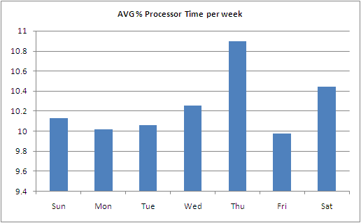
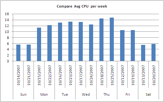
- Here are a few more examples of reports and charts you can create
Sample 1
Sample 2
Sample 3


About the author
 Kun Lee is a database administrator and his areas of interest are database administration, architecture, data modeling and development.
This author pledges the content of this article is based on professional experience and not AI generated.
View all my tips
