By: Scott Murray | Comments (5) | Related: > Reporting Services Development
Problem
What can I do with Analytical Marker Maps in SQL Server Reporting Services? How do you implement these types of maps? What visualization options are available with the maps?
Solution
Maps are a wonderful addition to your chart and visualization toolbox for SQL Server Reporting Services (SSRS); they provide rich visualization at the various levels of location all while giving you the ability to add layers on top of predefined maps, shape files or even Bing Maps. In particular we can actually add shape analytic maps onto the map layers to create visualization details which describe a statistical data point related to a localized map value. We can add many layers on top of a base map, however care must be taken to be sure the map does not get "over populated with details" which can reduce clarity and cause confusion. Furthermore, the marker component of our map layer can actually represent the data value either by adjusting the size of the bubble or shape, adjusting the color of the bubble or shape, or by changing the marker design itself to signify the various values. This last item probably sounds confusing, but it just means that a different symbol gets assigned a different range of values, so for instance, a circle could mean 101 to 200, a star could signify 201-300, a diamond could mean 301-400, and so one. Finally, a map could contain different layers with different data to display for each layer. For instance, we could add a base layer that displays all the counties in a particular state in the United States and adjust the background color of the county based on the median income of the county. Then we could add a "bubble or shape" layer, that showed the spending per capita. Bing Maps bring a further layer of visualizations that is not always available in the included maps and shape files.
We will use the Adventure Works databases as the basis for our SSRS Analytical Marker Maps. The 2014 versions of the regular and data warehouse databases, along with the SSAS cube database backups are available on Codeplex: https://msftdbprodsamples.codeplex.com/releases/view/125550. Once you download and install the SQL Server databases, we will subsequently use SQL Server Data Tools for Business Intelligence (SSDT-BI) for Visual Studio 2013 to develop reports. You can download SSDT-BI from: http://www.microsoft.com/en-us/download/details.aspx?id=42313.
Utilizing SSRS Analytical Marker Maps
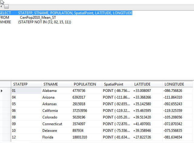
Using a bubble or analytic map is great way to show multiple data layers or data points all on a single map. For our example we are going to utilize a dataset which list the population of each state in the United States. Furthermore, the dataset contains the spatial data point which represents latitude and longitude of the population center of each state. An example of the dataset is displayed below. Thus our first steps are to start SSDT-BI, create a new SSRS project, and then create a new report.
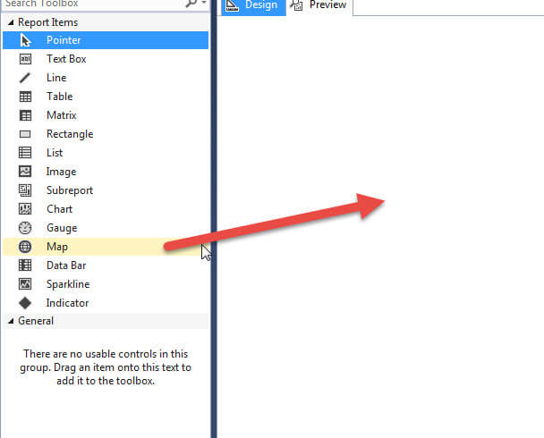
Next, drag the Map Object from the toolbox onto the report grid.
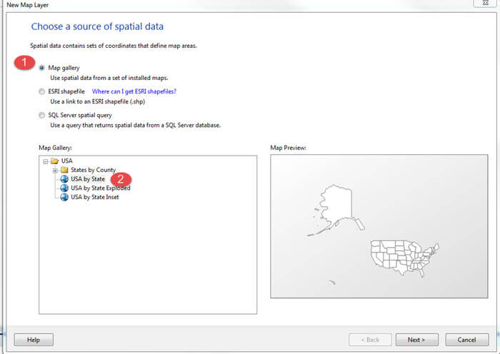
Once we drop the Map object onto the report grid, the New Map Layer wizard opens. As shown next, we first are going to create a USA by State layer to drop our data onto. Thus, we first need to select the Map gallery option. Second, the USA by State gallery is selected.
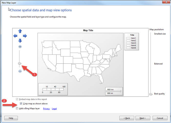
Notice in the previous screen print, the state
of Alaska is so large that the continental US is somewhat compressed.
For our data, we are excluding Alaska, Hawaii, and Puerto Rico, so we
crop the map to show just the continental US, as illustrated below and then click next to move to the next screen.
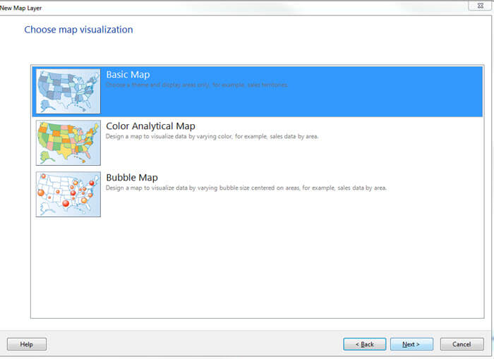
For this example, we select basic map (we will add the marker analytics as a second layer); this current layer is used to just display the outline map for us to use for our additional layers.
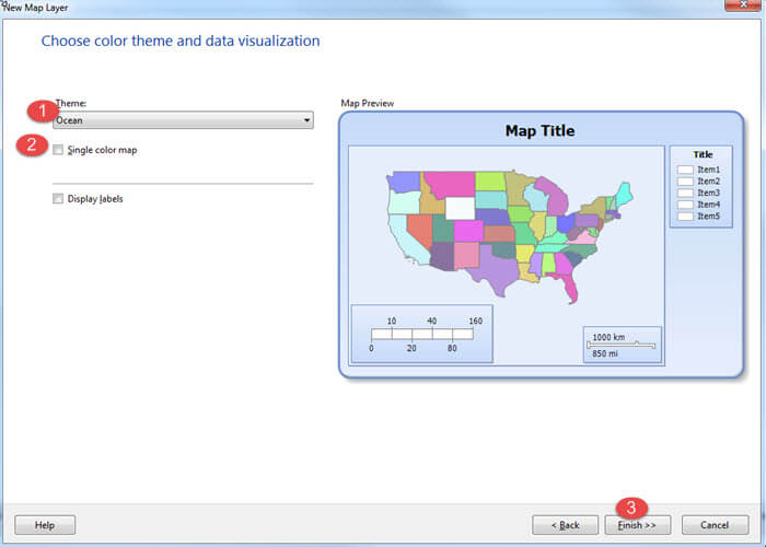
As shown next, we finish the wizard, by selecting a Theme, Ocean for this example. Next we uncheck the Single color map check box to make it easier to see the outline of each state. Last, we click finish.
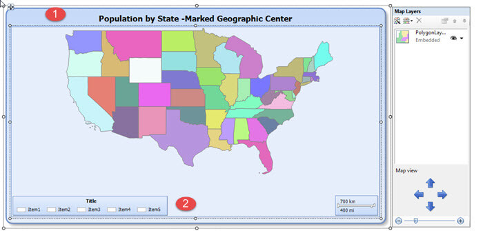
Finally, we finish up with a few visual housekeeping items, such as adding a title, moving the legend to the bottom of the map, and resizing the object on our grid. You are probably thinking, wow, we added a map to a report, so what?
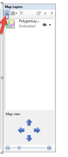
Out next steps actually add the analytic data points to the map to
really show off its power. Thus in the map layer area, we click on the
New Map Layer wizard button as shown next.
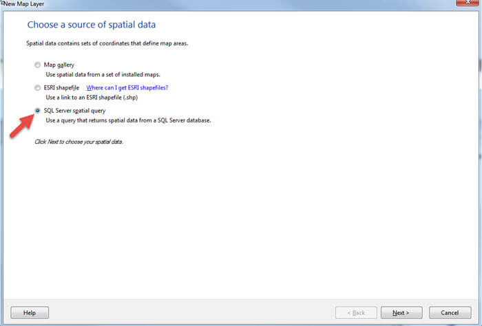
This button opens a wizard similar to the previous map wizard; however in this instance we are going to select the SQL Server Spatial Query as shown below. Spatial data is generally Geography or Geometry data types.
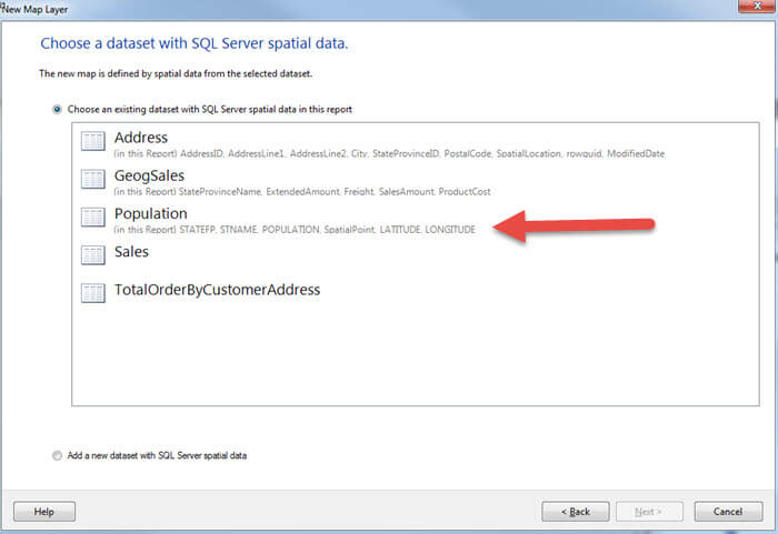
Next, we select our dataset with the spatial data for the population by state.
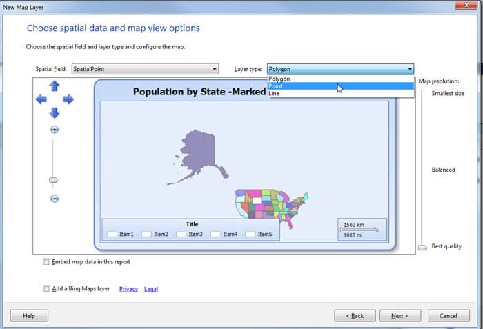
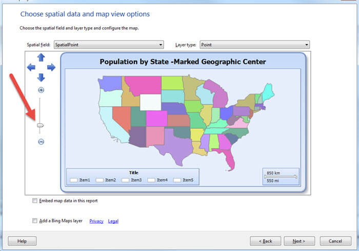
On the next screen we select the field which contains the spatial data and also the Layer type, Point in this example. These selections are shown in the first screen print below. In the second screen print, you see that we zoom in on the map to show just the continental United States.
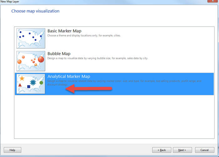
As shown next, we now select the Analytical Marker Map option.
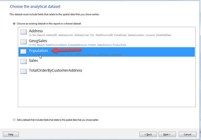
We again select the Population as the basis for our Analytical markers, as illustrated below.
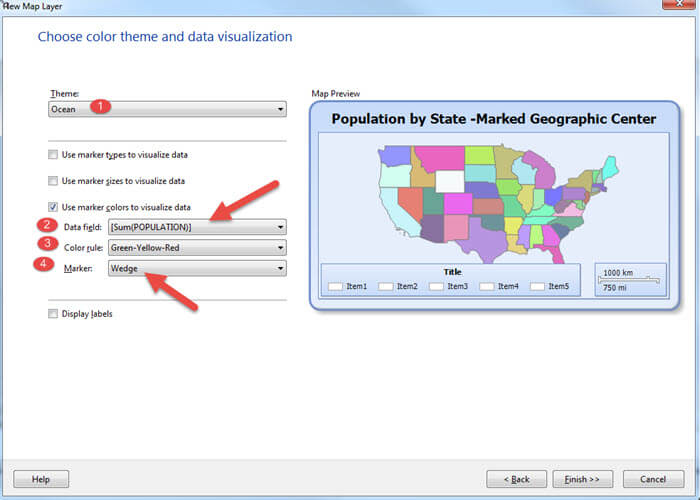
Finally, as noted below, we select a Theme for
our layer, define the color
rule (color of the marker), select the field that will be analyzed (population), and finally define what marker will be
used.
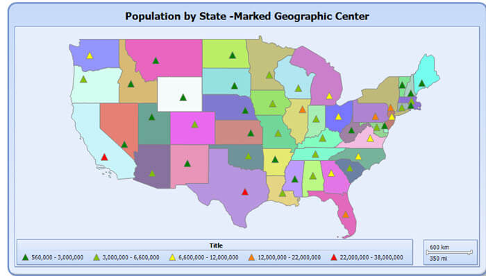
Now by reviewing the below screen prints, we see
a pretty informative map. First each "wedge" simply shows us where the
geographical center of the population resides. Second, the color of the
marker signifies the range where the state population falls within.
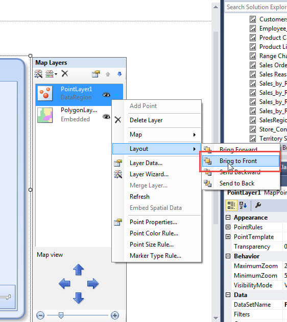
One item that often comes up when dealing
with layers is that the marker level will "fall behind" the background
map, the 48 continental states layer in our example. In those cases we may
need to bring our Analytical marker layer to the front most position.
We complete this task by clicking on the blue down arrow to the right
of the layer name. Next select Layout > Bring to Front. The order
the layers appear in the list notates the order of the layering from top to bottom.
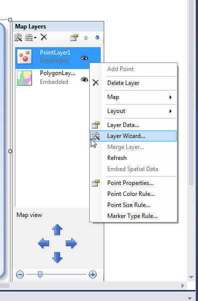
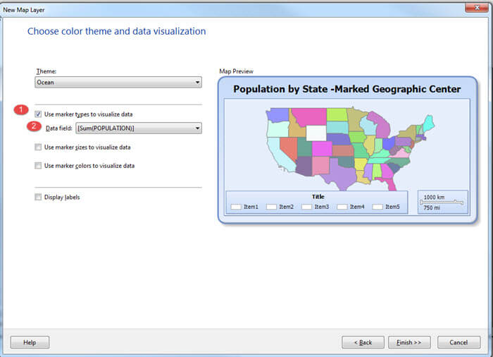
Let us use the size of the marker instead of the color of the marker to define the population size. We can make this change by again selecting the blue down arrow next to the Analytic Point layer and then choosing the Layer Wizard.
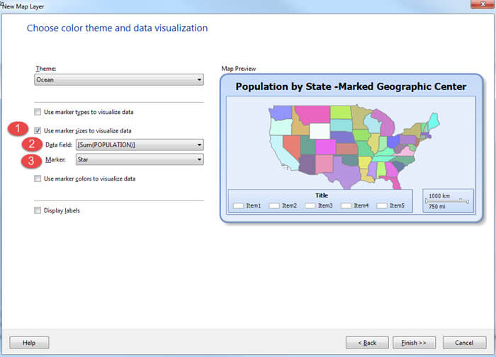
We then scroll through the screens until we get
to the Choose color theme and data visualization window on the wizard.
Next we select Use marker size to visualize data, again select
population for the Data field, and finally select a Marker. As shown
below, we are using a Star for the marker now.
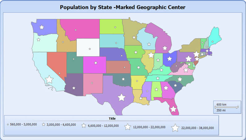
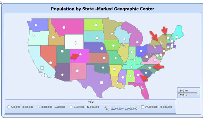
The marker size version of the map is shown below. I really like this version as it makes the population sizes stand out.
Our last variation uses different marker symbols to
define the population range. For this selection, as illustrated below,
we only select the data field to use, population in our example.
Our final version of the map is shown below; notice how each symbol defines a different population range.
We can enhance our map by actually adding a Bing Map layer to underlay the Point and 48 states map ( polygon layer ) layers.
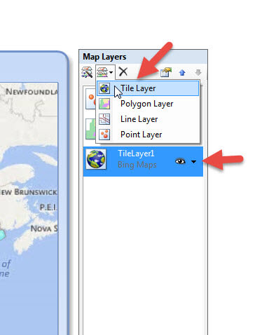
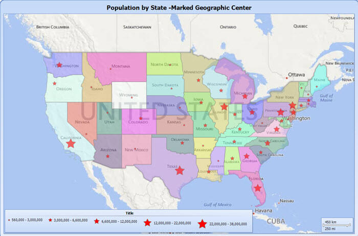
The Bing Map adds some perspective for the map
along with some labels. You will also notice that the color of the star
marker was changed to red; the color can be changed by going to the
Point Properties and then going to Fill window to select a color.
Conclusion
Analytical marker and bubble maps provide rich mapping functionality to display not only a map, but also related data values. When dealing with maps, care must be taken to understand what mapping and data values are selected for what layer. For this tip, we described adding an analytic marker layers on top of a base map of the United States; however, bubble markers provide similar functionality. For analytical markers, we can display the data either by the marker color, the marker size, or the marker symbol. However in order to use a marker, the spatial mapping type must be selected in the layer wizard. Once the spatial type is selected, we can define the spatial data either as a point, a polygon, or a line and then define what data field should be used as the basis for the marker. Finally, a Bing map under layer can easily be added to a map to provide additional perspective for the analytical markers.
Next Steps
- Based on the steps outlined in this tip, consider the using analytical maps in your application as needed.
- Check out these additional resources


About the author
 Scott Murray has a passion for crafting BI Solutions with SharePoint, SSAS, OLAP and SSRS.
This author pledges the content of this article is based on professional experience and not AI generated.
View all my tips
