By: Koen Verbeeck | Comments (7) | Related: > SQL Server 2016
Problem
At the time of writing, SQL Server 2016 preview (CTP 2.2) has been released and it contains a few exciting changes for SQL Server Reporting Services (SSRS). One of the new additions is a new chart type: the treemap. This tip will give an introduction on how to create a treemap graph.
Solution
Test Data
First of all, we need data for our treemap. In the tip Retrieving file sizes from the file system using Power Query it is explained how you can use Power Query to extract the file sizes of all the files in a folder and its subfolders. The resulting data looks like this:
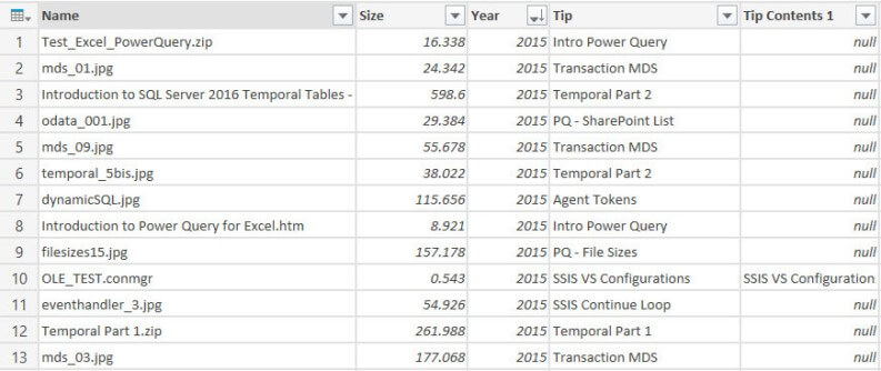
The data consists of all the files found with their corresponding file size and to which folder hierarchy the file belongs. There are 3 main folders, corresponding for each year I have been writing for MSSQLTips: 2013, 2014 and 2015. Each folder has different subfolders, where each subfolder corresponds with a tip I wrote.
The easiest way to get this data into Reporting Services, is to import the final Excel worksheet into a SQL Server table using the Import wizard. For more information on this wizard, check the tip Simple way to import data into SQL Server.
You can download an Excel workbook with sample data here.
SQL Server 2016 preview
As mentioned earlier, at the time of writing SQL Server 2016 is still in preview (currently CTP 2.2 has been released). This means that the look and feel of Reporting Services and its charts can still change and that functionality might change, disappear or be added.
Another issue is there is for the moment not yet a new version of SSDT-BI (the Visual Studio shell for developing business intelligence solutions) released for SQL Server 2016. You can develop BI solutions for SQL Server 2016 preview using SSDT-BI 2013 (which is actually for SQL Server 2014), but it has only SQL Server 2014 features. So how are we going to test SSRS functionality now? Luckily Report Builder has already been updated and included in the SQL Server 2016 CTP 2.2 release, so in this tip we’ll use Report Builder to create the treemap.
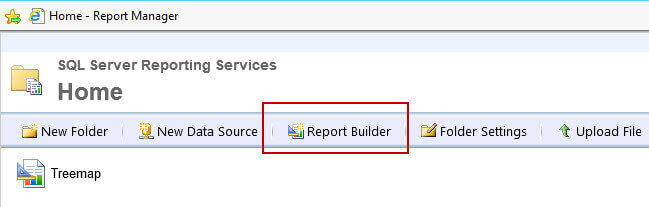
In order to use Report Builder, you need to install SSRS 2016 CTP 2.2 (or later), preferably not on your production machine. Then you navigate to Report Manager - typically the URL has the format http://myserver/Reports - where you can launch Report Builder.
Creating a Treemap
What is a treemap exactly? According to the dataviz catalogue:
Treemaps are an alternative way of visualizing the hierarchical structure of a Tree Diagram while also displaying quantities for each category via area size.
But an example may be more clear:
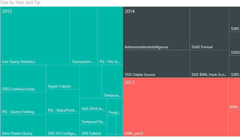
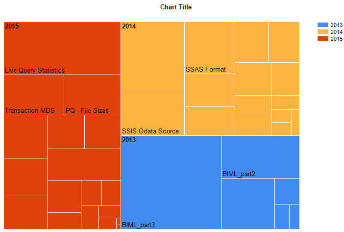
This example, created by Power BI Desktop, shows the sizes for the different subfolders in three main folders. The bigger the folder size, the bigger the corresponding square in the treemap. You can compare the overall shape of the three main squares of the folders 2013, 2014 and 2015 with each other, but in each folder you can also compare the file sizes of their corresponding subfolders. You can for example, immediately see that the folder BIML_part3 has the biggest size of all the different subfolders. The goals of this tip is to create a similar chart with SSRS 2016 using Report Builder.
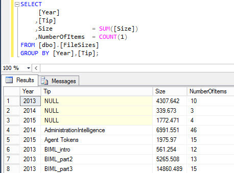
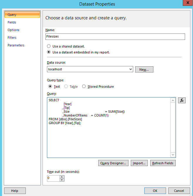
First, open Report Builder, create a blank report and add a data source pointing to your SQL Server database. Then add a dataset and include a query to fetch the data needed for the treemap. I used the following query to get the data to the tip level:
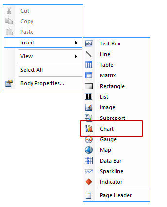
Next we need to insert a chart into the report canvas.
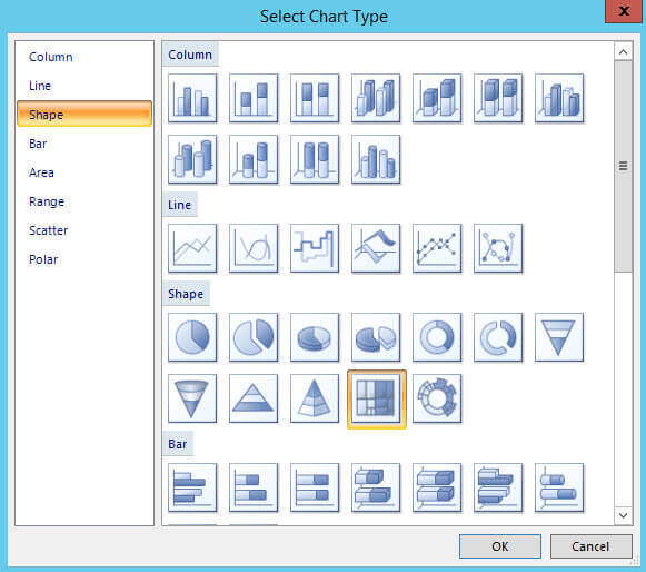
The treemap chart type is listed under the Shape types:
After the chart has been added to the canvas, click on it so the Chart Data window opens up. Add the field Size to Values.
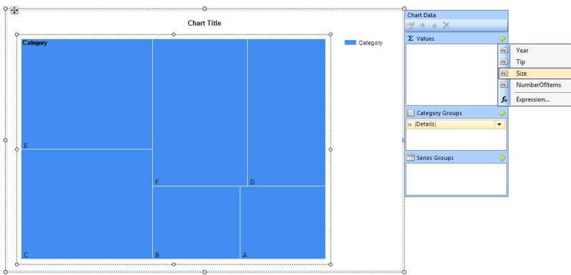
Next put Tip on Category Groups and Year on Series Groups.
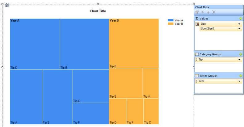
When you preview the report, you get the following result:
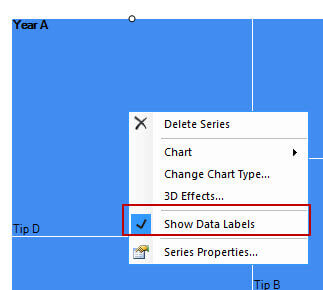
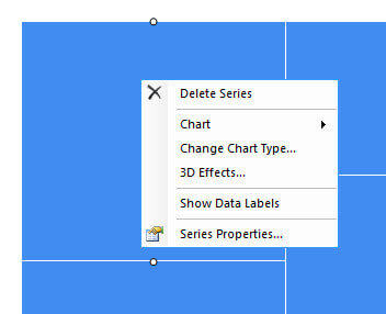
Like this, the chart is quite useless because SSRS doesn’t show most of the labels because they are too long (in sharp contrast with the treemap created with Power BI desktop, where most of the labels were visible). An option would be to make the font size smaller for the data labels, but they would have to be really small to fit most of the labels in the chart and this defeats the purpose of having labels at all. Another option is not to display the name of the tip, but rather just the total size in kilobytes. This can be done by right-clicking the chart and deselect Show Data Labels.
The treemap now shows the size instead of the tip name, which is the same as setting the property UseValueAsLabel to true.
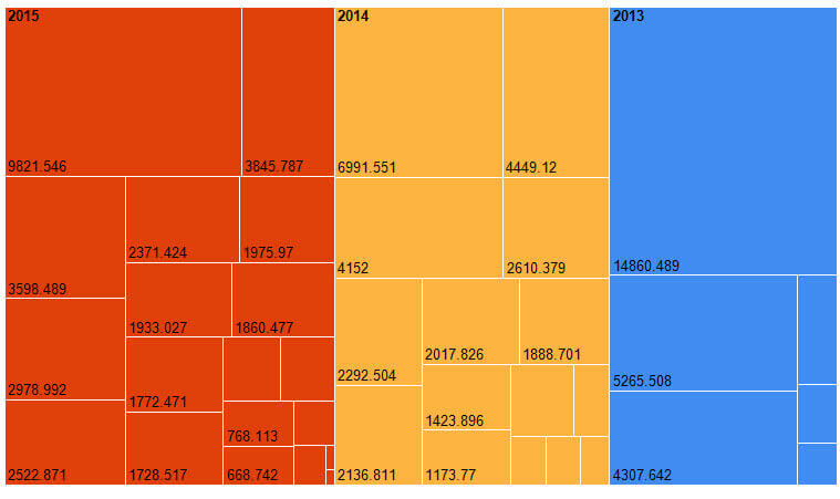
Most of the squares now have a label, although the smaller squares still don’t. If you deselect Show Data Labels one more time, all the labels disappear.
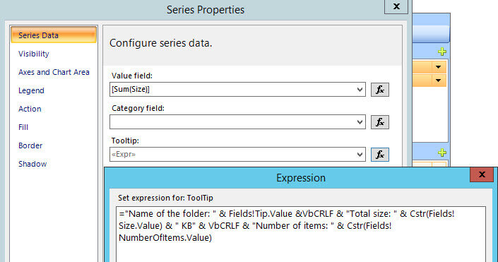
Maybe a better option is to show labels for the series (the different years) and the size, and have a tooltip displaying extra information when needed. This can be done by setting the following expression for the tooltip on the series:
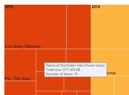
This results in the following tooltip:
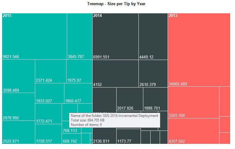
After applying some cosmetics - dropping the legend, changing the tile, changing the font color of the labels and choosing different colors for the series groups - the treemap is finished:
Conclusion
Treemaps are a welcome addition to the Reporting Services chart types. The chart is quite easy to configure, but it doesn’t display the labels quite nicely. A work around is to create a tooltip to show you relevant information.
Next Steps
- Try it out yourself! Download the sample data and create your own treemap.
- Download Power BI desktop from PowerBI.com and create a treemap over there (you can use the same sample data). Which one do you like best? Let me know in the comments!
- For more SQL Server 2016, read these other SQL Server 2016 Tips.
- For more Reporting Services tips: Reporting Services Charts Tips.


About the author
 Koen Verbeeck is a seasoned business intelligence consultant at AE. He has over a decade of experience with the Microsoft Data Platform in numerous industries. He holds several certifications and is a prolific writer contributing content about SSIS, ADF, SSAS, SSRS, MDS, Power BI, Snowflake and Azure services. He has spoken at PASS, SQLBits, dataMinds Connect and delivers webinars on MSSQLTips.com. Koen has been awarded the Microsoft MVP data platform award for many years.
This author pledges the content of this article is based on professional experience and not AI generated.
View all my tips
