By: Dallas Snider | Comments (1) | Related: > Reporting Services Development
Problem
I need to plot a distribution of data, but would prefer to use a line instead of a histogram. Also, I need the basic statistics of the data set to appear on the page. How can I do this?
Solution
SQL Server Reporting Services (SSRS) will allow you to plot a distribution of data with a line instead of a histogram along with basic statistics such as min, max, mean, standard deviation, median and mode. This will need to be done with multiple queries and it is important to set up and test your queries to return the values you would like to display.
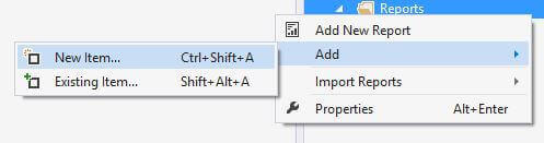
Let's start with a blank report instead of using the SSRS Report Wizard. In the Solution Explorer, left click on Reports, select Add, select New Item.
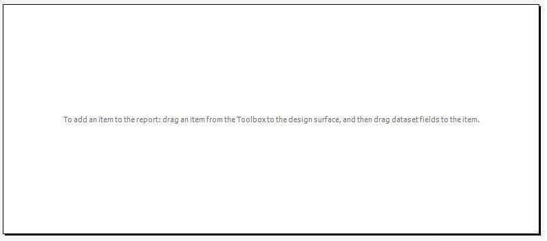
The blank report is shown below.
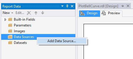
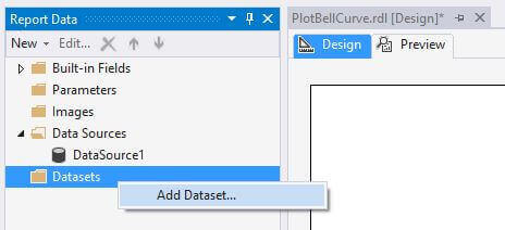
In the Report Data window, right-click on Data Sources and then choose Add Data Source.
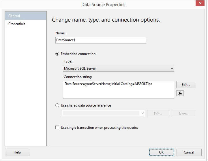
In the Data Source Properties window, define an embedded connection, define a new shared data source, or select an existing shared data source reference. Click on OK when finished.
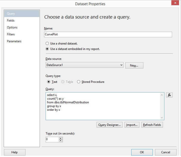
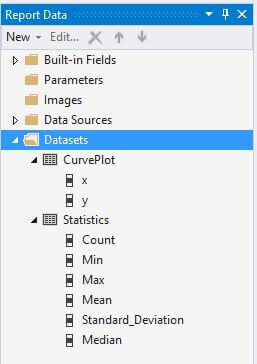
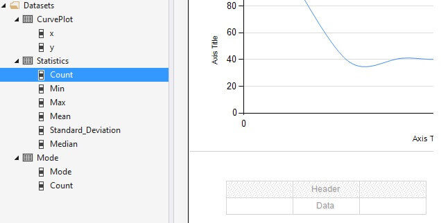
Next, we want to add 3 datasets. The first for the data that will plot the curve, a second dataset for the basic statistics, and a third dataset for the mode alone. Because there can be more than one mode in a set of data, we will handle mode differently later in this tip. Right-click on Datasets in the Report Data window and choose Add Dataset...
In the Dataset Properties window
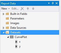
The Report Data window should appear as shown below. We see the dataset along with its fields (columns).
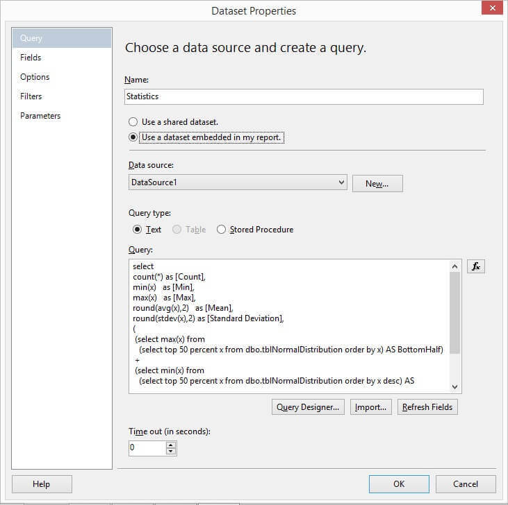
Next, we will add our second dataset that contains basic statistics about the data in the plot. The T-SQL used in the query is shown here with the properties window below the query.
select
count(*) as [Count],
min(x)   as [Min],
max(x)   as [Max],
round(avg(x),2)   as [Mean],
round(stdev(x),2) as [Standard Deviation],
(
 (select max(x) from
   (select top 50 percent x from dbo.tblNormalDistribution order by x) AS BottomHalf)
 +
 (select min(x) from
   (select top 50 percent x from dbo.tblNormalDistribution order by x desc) AS TopHalf)
) / 2 AS Median
from dbo.tblNormalDistribution
The Report Data window should now show both datasets.
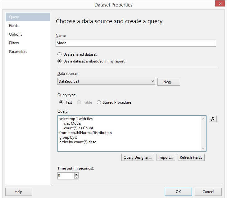
The third dataset for mode will be added as demonstrated here. This needs to be a separate dataset because there can be more than one mode. The results of this query will need to be placed in its own table so all of the returned rows can be displayed.
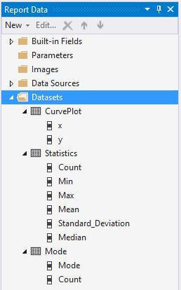
The Report Data window should display all three datasets with their fields. Now we are ready to add the graphical components to our reports.
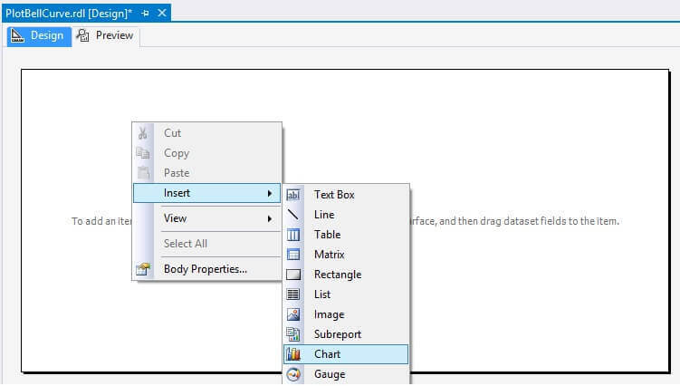
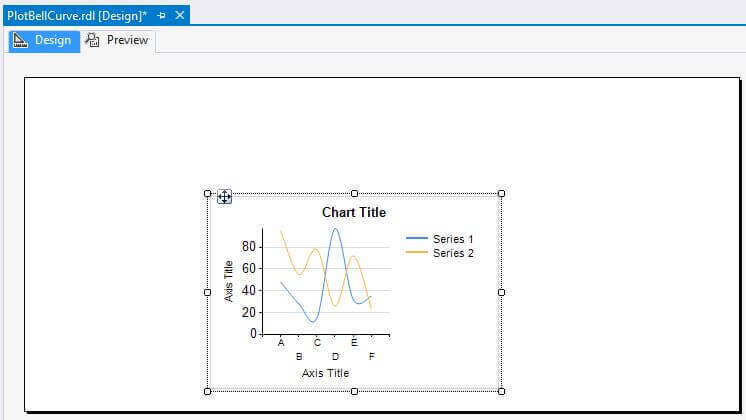
In our report palette, right-click on the palette and choose Insert, then Chart.
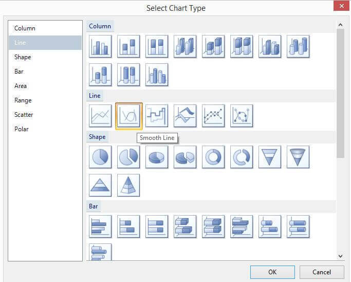
In the Select Chart Type window, click on Smooth Line and then OK. If you have a sufficient number of data points, you might get similar results with the Line chart type.
In the image below, we see the default chart settings for the Smooth Line chart type. These will need to be changed and we will walk through these steps next.
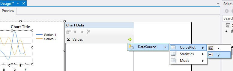
Click on the chart. In the Chart Data window, click on the green plus sign to the right of Values to "Add field". Choose your data source, the name of the data set that contains the curve plot data, and the y value to be plotted on the chart.
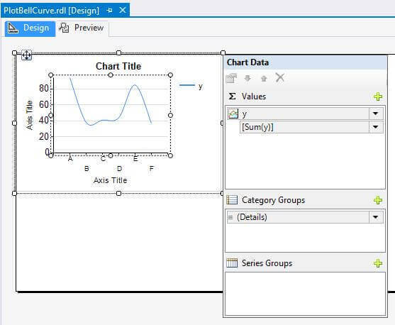
By default, a sum field is also added as shown below.
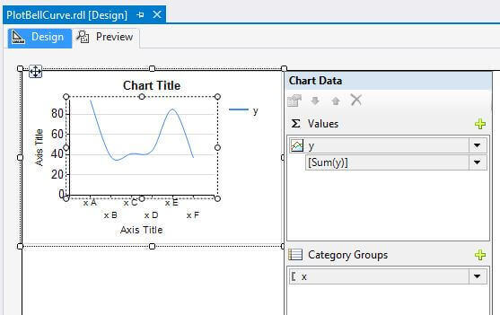
Next, we will add our x-axis values by clicking on the green plus sign to the right of Category Groups to "Add field" and then selecting our x-axis field.
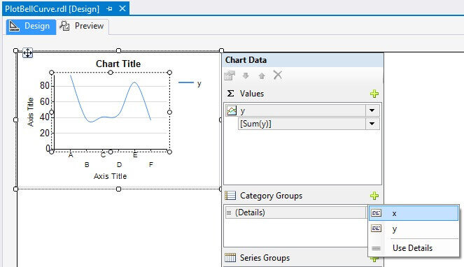
Our chart data configuration is now complete.
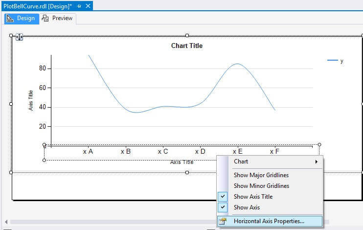
Next, we will modify the horizontal axis. I have expanded the chart so it fills in the entire width of the report. Right-click on the horizontal axis and then click on "Horizontal Axis Properties...".
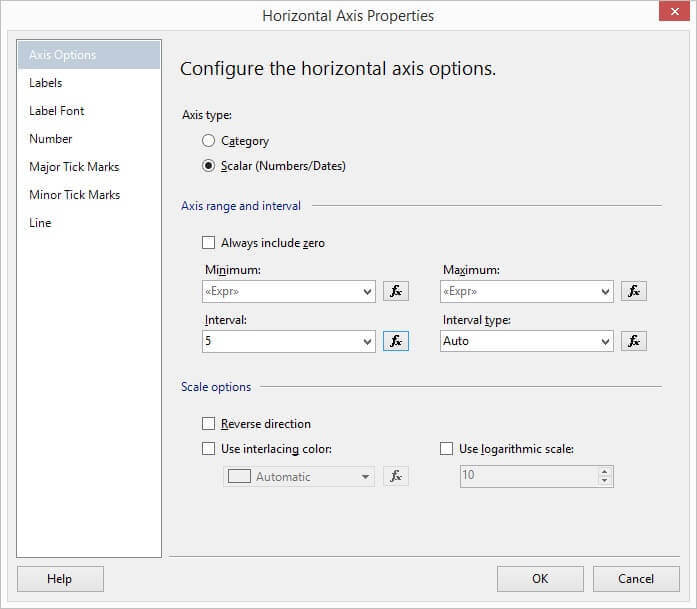
In the Horizontal Axis Properties window, we want to choose "Axis Options" and set "Axis Type" to "Scalar" so we can set the numeric properties of the axis.
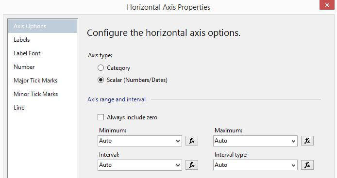
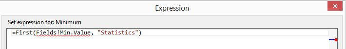
Now we will create expressions for the Minimum, Maximum and Interval. For each expression, click on the "Fx" button to the right of the drop-down list box. We will use the following expression to pull the Min field from our Statistics dataset we created above and then set the value for the Minimum horizontal axis value: =First(Fields!Min.Value, "Statistics"). If you wish to set the value to a constant number, you can do that also.
Please ignore the warning message.
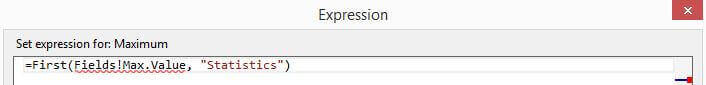
We will use the following expression to set the value for Maximum: =First(Fields!Max.Value, "Statistics")
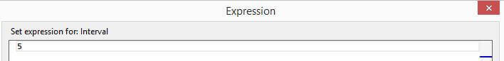
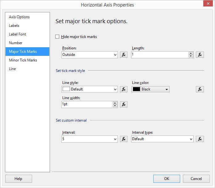
Next, we will set the interval to 5.
The Horizontal Axis Properties window should now appear as shown here.
Click on Major Tick Marks and set the Interval to 5 as we did above on the Axis Options page. Click OK.
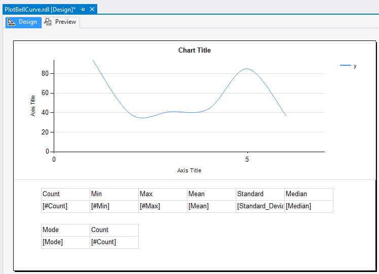
Please note the report will NOT look correct in the Design view.
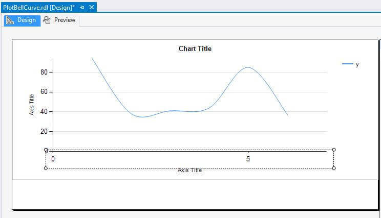
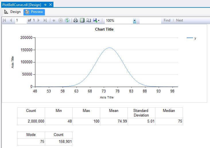
Click on Preview to see the rendered report.
Next, we want to create tables for the fields in our Statistics and Mode datasets. At the bottom of the report, right-click and choose Insert, and then choose Table.
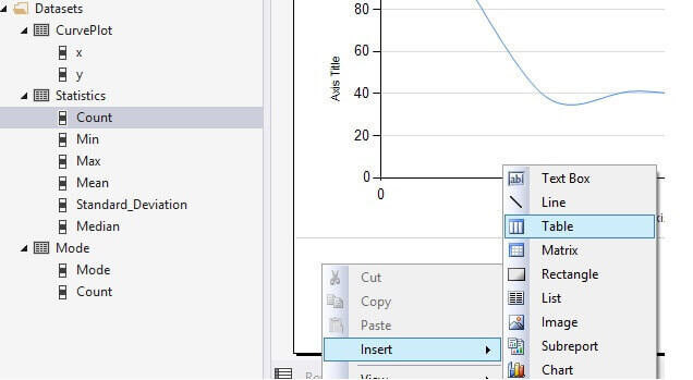
A blank table is inserted.
Drag and drop each field from the Statistics dataset into the table's columns.
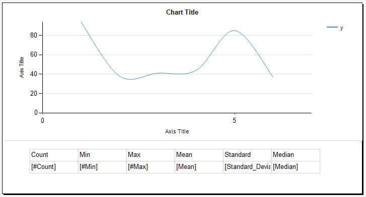
Insert a second table and then drag and drop each field from the Mode dataset into the table's columns.
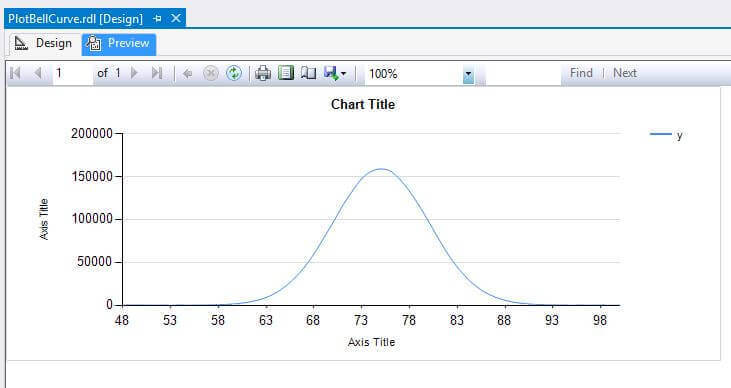
After some minor formatting, we see the report in the Preview window..
Next Steps
You can make changes to the Chart Title, Axis Titles, add a report header and footer, and do some more formatting of the tables. Also, make sure the report renders correctly on the report server. Finally, please check out these other tips and tutorials on SSRS on MSSQLTips.com.
- SQL Server Reporting Services Charts Tips
- Create a Greenbar Report in SQL Server Reporting Services
- Remove Question Mark and Show Correct Total Number of Pages in SSRS Report
- SQL Server Reporting Services Tutorial
- Our complete tutorial list


About the author
 Dr. Dallas Snider is an Assistant Professor in the Computer Science Department at the University of West Florida and has 18+ years of SQL experience.
This author pledges the content of this article is based on professional experience and not AI generated.
View all my tips
