By: Siddharth Mehta | Comments | Related: > Power BI Charts
Problem
In a previous tip, we learned how to represent a pre-calculated fixed statistic on visualizations using a constant line. In today’s time where data grows at faster speeds than ever, a constant line is useful only for parameters that remain constant like targets or for historical data that will not change. Predictive modeling has a considerable dependency on summary statistics to explain the structure of data. Some of the key summary / descriptive statistics are mean, median, standard deviation, variance, and percentiles / quantiles. In this tip, we will learn how to represent dynamic visualizations using Power BI Desktop.
Solution
Power BI dynamic reference lines can be used to create a reference line for a set of visualizations.
First, we need data to populate a visualization on which we to create reference lines. I recommend installing the AdventureWorks sample database, which has a number of tables to populate visualizations with sample data. Assuming the sample data is available, open Power BI Desktop and click on the Get Data menu. We need to connect to the data source where you have the sample data and import the data. In this tip, we will be using the ProspectiveBuyer table from the AdventureWorks database by following the steps mentioned below.
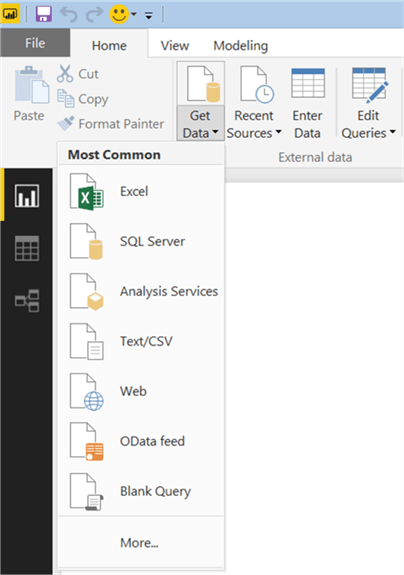
Click on the Get Data menu in the Power BI user interface as shown below. This should bring up options to select from a list of different data sources. In this case, the data is hosted in SQL Server in the AdventureWorks database. Therefore, we will select SQL Server as the data source.
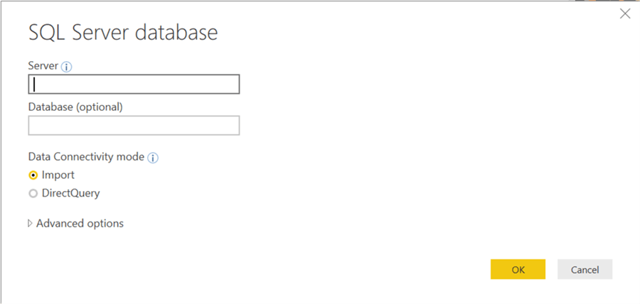
After selecting the data source, the next step is to provide connection details as shown below. Provide the server name and optionally the database name on which the data is hosted. It is recommended to provide the database name as the connecting string to SQL Server needs it as a part of the connection. The next option is Data Connectivity mode for which there are two options. Either we can import data into Power BI or the data can be read directly from the data source while the report is being processed. There are certain Power BI options that require data in a specific format to enable analytics related features, so consider selecting the Import option for now.
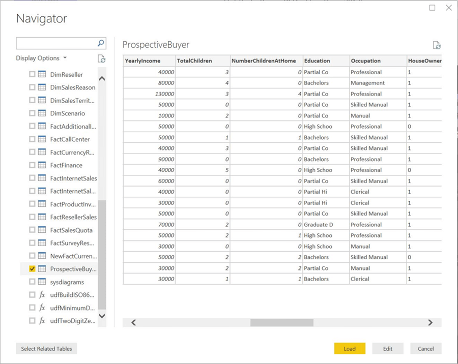
After you select the data source, you will be presented with a list of different tables and views hosted in the database to which the connection has been made.
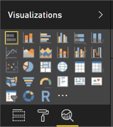
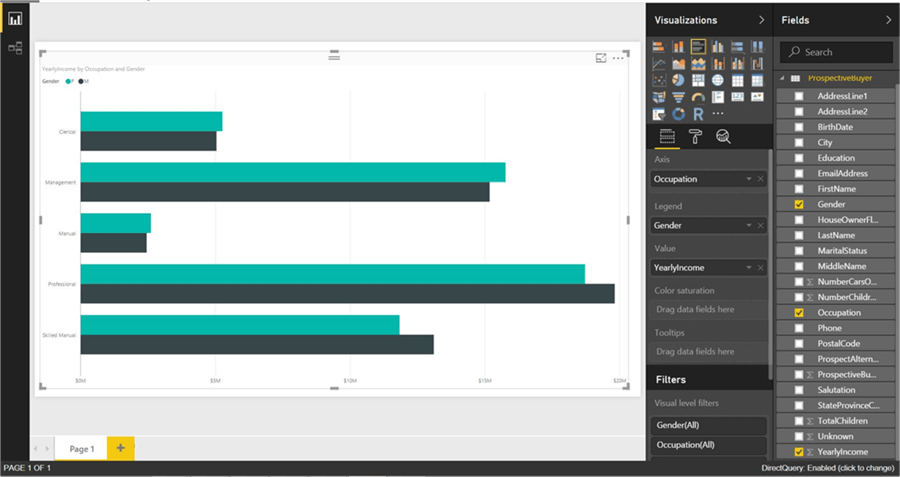
After the data is available, we need to create a clustered bar chart of Yearly Income by Occupation. Click on the clustered bar chart from the visualizations pane and click on the report layout to create a bar chart.
Select the Yearly Income and Occupation fields, to add these fields to the chart. After you select the relevant fields, the visualization should look as shown below.
Now let's say we intend to represent measures of central tendency to analyze and explain the data visually. Mean, median, mode, percentiles are common statistics used to measure. You can learn more about these from the exploratory data analysis section of the Machine Learning Tutorial.
Now that you understood these statistic functions, now it is time to create reference lines for these on the chart.
Click on the analytics pane and you should be able to find options to create a constant line, min line, max line, average line, median line and percentile line. Note, the Area chart, Line chart, Scatter chart, Clustered Column chart, and Clustered Bar chart are the only charts that support full range of dynamic reference lines.
Here is a description of common properties for all these lines.
- Measure – This property sets the field for which the statistic is to be calculated. In our case, let's say that we want to add this line for the field that the bars are representing, which is the Yearly Income field.
- Color – You can select any color for the line. It is recommended to select a contrasting color compared to the color of the bars on the chart, so that the line is clearly visible on the chart.
- Transparency – This property determines how bright the line will appear on the chart. A transparency value of zero means the line is a pure solid color line on the chart. On the other hand, a transparency of 100% would make the line invisible on the chart. You can set the value of the property to 50%, so the line blends partially into the UI without visually obstructing any details, though retaining its significance.
- Style – This property can have one of the three values: Dashed, Dotted and Solid. I personally prefer to use the dashed line, which provides a perforated line type visual to show tear-out style of separation between different sections.
- Position – This property can have one of the two values – "In-Front" or "Behind". This means whether you want to line to be on the top of the bars of the chart or behind the bars. If you select "Behind", the line would be visible only from the bar separation sections. It is advisable to select the "In-Front" value for this property.
- Data Label – This property determines whether you want to display text in the form of a data label for the line. By default, this property is set to off. Once you set the value of this property as "On", other options to format the label like Color, Text, etc. will appear. You can then select appropriate values for these properties of data label to format the text as required.
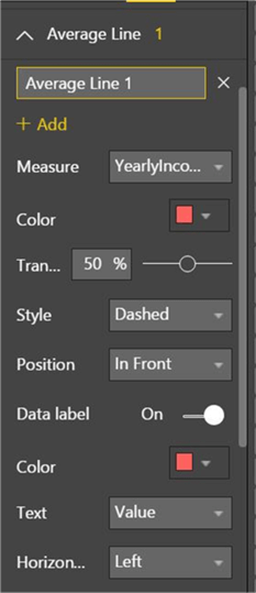
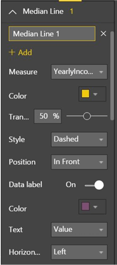
Mean is the average of the entire range of values in a field, and median is the exact middle value given all the values of the field in an ascending sorted order. The good part is that we do not have to calculate this, as the reference line has the built-in functionality to calculate this. We just need to specify the field and format options to display the line on the visualization.
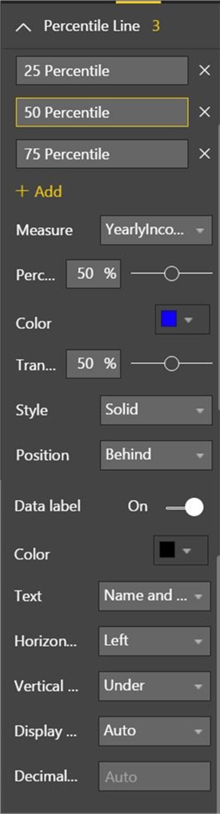
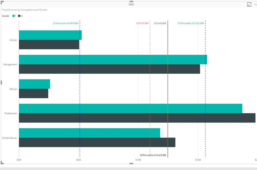
There can be only one mean and median for a field. To explain the distribution of data, percentiles / quantiles are a good statistic. We can use a percentile line as shown below. Generally, in descriptive statistics data in analyzed in terms of quantiles and used in visualizations like box-plots. Therefore, we have to create at least three lines to represent 25, 50 and 75 percentiles. The 100 percentile is obvious and does not need an explicit line to represent it. Select the proper formatting options to display the three percentile lines.
Once you have added the lines, the visualization should look as shown below. Looking at the below visualization, the following derivations become visually explicit:
- Mean and median have a difference of approximately 2M, which is a possible indication that the data may have outliers.
- Yearly income of all occupations falls under 75 percentile and only the Professional occupation category is ranging beyond it. This is a sign that this category of occupation may have outliers.
- These kind of interpretations are not explicit just by looking at the scales of the visualization. One may though calculate it from the scales, but these dynamic reference lines eliminate the need for such calculations and makes the data analysis easier and faster.
In the next part of the Power BI Analytics tip series, we would learn how to forecast data using Power BI Desktop.
Next Steps
- Consider creating dynamic reference lines using different charts to analyze the summary statistics as well as distribution of data.
- Check out this tip Analytics with Power BI Desktop Using Constant Lines
Learn more about Power BI in this 3 hour training course.


About the author
 Siddharth Mehta is an Associate Manager with Accenture in the Avanade Division focusing on Business Intelligence.
This author pledges the content of this article is based on professional experience and not AI generated.
View all my tips
