By: Siddharth Mehta | Comments | Related: > Power BI Charts
Problem
The process of analyzing data in the context of geography by overlaying a map is generally known as Geospatial Analysis. Power BI is one of the tools in the Microsoft Technology stack that allows geospatial analysis using an approach that is not very technically intuitive.
This approach helps business analysts quickly visualize, analyze and query data without the need for development teams to build complex queries for facilitating such analysis. In this tip, we will learn how to use Power BI Desktop to perform some geospatial analysis and quickly derive insights.
Solution
Power BI Desktop provides a Bing Maps control that can be used to perform geospatial analysis, which we will use for this exercise.
First, we need some geospatial test data to get started with the analysis in Power BI Desktop. One great resource of data can be downloaded for free from here. As of the writing of this tip, the basic version of World Cities Database contains around 7,300 records of population in different cities of the world along with their classification by province and country as of 2015. This dataset is available for download in a CSV format and is good for simple analysis. So, download it onto your local machine. We will assume that you also have Power BI Desktop installed on your local machine.
Follow the below steps to start the analysis of this geospatial data in Power BI Desktop.
Open Power BI Desktop, and from the Get Data menu, select CSV as the data we have is in a CSV file format. After clicking on it, you will be provided with a dialog box to select the file. Select the file that you downloaded from the World Cities database.
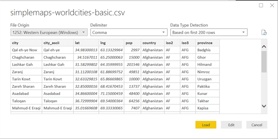
As soon as you select the file, it will read a few records from the file and provide a preview as shown below. Make sure you can read the data and click on Load button to load the data and model in Power BI Desktop.
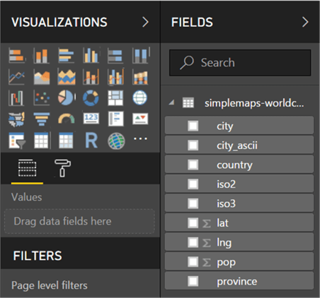
After loading the data, you should be able to find all the fields in the dataset in the fields pane of the Power BI Desktop as shown below. City, country and province are self-explanatory. Lat is latitude, lng is longitude, city_ascii is the ascii compliant name of the city, iso2 and iso3 are the iso standard abbreviations of the country, and pop is the population of the city.
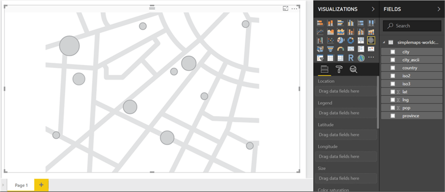
Now it’s time to add the map control, which has the icon of a globe in the 3rd row to the right in the above picture. Click on it to add the control on the report layout, and expand it to the size of the window layout. It should look as shown below.
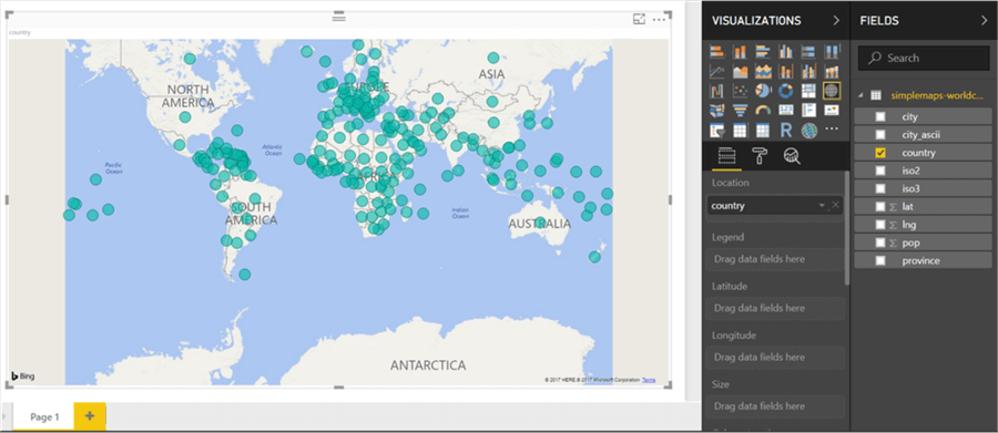
Now it’s time to add data to the control. Click on the Country field and select it. This will add a field to the Location section of the map property, and you should be able to see the data on the map very quickly.
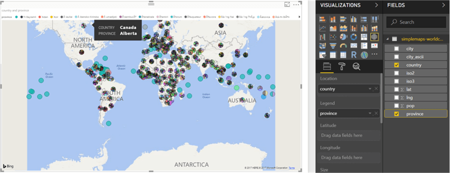
Let’s say our intention is to analyze data in the hierarchy of Country – Province – City, which is generally the typical hierarchy followed for geospatial reporting. Click on the province field in the fields pane, and you should be able to see the changes in the map as shown below. By default, this field gets added to the Legend section, so the data for each country is not categorized by the province field, and you can split the data in each province. If you hover the mouse over any region, you can see the country and province name too.
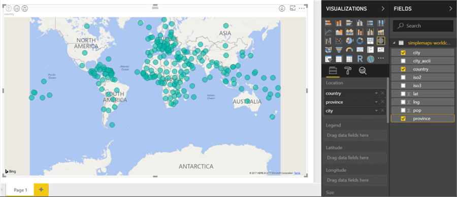
We do not want this style of reporting, though it lets us quickly identify a handful of countries which do not have any provinces at all. We intend to create a hierarchy, so drag the province field from the legend section and add it below country in the location section. Also, add city under province in the same manner and your fields pane as well as the map should look as shown below.
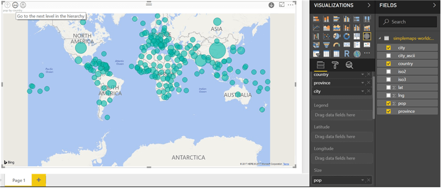
We can optionally select latitude and longitude to pinpoint a location in the map. Here we have exact names of the country, province, and city and Bing is easily able to map it. Any data entered in the location section of the map control is sent to Bing for geocoding and pin-pointing on the map. In case you do not have the location details, you can optionally use latitude and longitude too. If you analyze the data, you will find that all locations have been correctly mapped, but the size of circles seems to be equal which a business user can interpret as all places having equal population. To change this, drag the pop field from the fields pane and drop it on the size section as shown below. This will immediately update the size of the circles and you will be able to see that China, India, US and South America have locations with some of the largest populations.
Now it’s time to drill down into the hierarchy. As seen in the above picture, select the downward arrow on the top-right corner of the map to enable drill-down on the map. After that, click on the double-arrow icon on the top-left of the map to drill down the data to the next level in the hierarchy as shown below. This shows the data by province. You can use the upward facing arrow icon on the top-left corner to drill-up the hierarchy. Let’s say we want to focus on data in the USA. If you double-click in the area around the USA and drag the map in the center, you will find the data in the map as shown below.
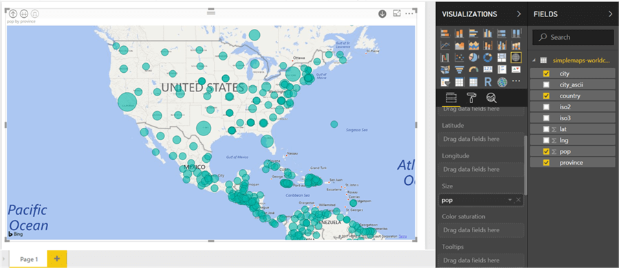
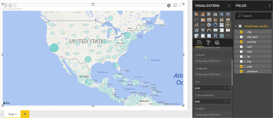
From the above picture, California, Texas, Florida and New York provinces (or states) seem to have the highest population in the USA. We can also highlight the data based on an additional attribute of the map, which is the color of the bubble. As we do not have additional attributes, we can use the population attribute again for the example. Drag and drop the pop field in the Color Saturation section and you should be able to see the changes in the map as shown below. By changing the color saturation according to the weight of an attribute, it makes it easier to visually identify the outliers in the dataset.
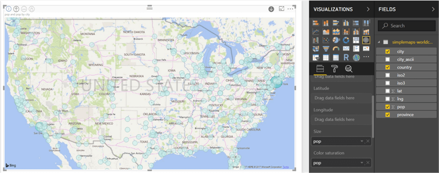
Click again on the double-arrow icon to drill down into the data to the city level and you should be able to see the changes in the map as shown below. In contrast to the areas having the biggest population at a province level, based on the size and color intensity of the bubble, there are only two major cities – LA and NY which seem to have the highest populations compared to other cities in the USA.
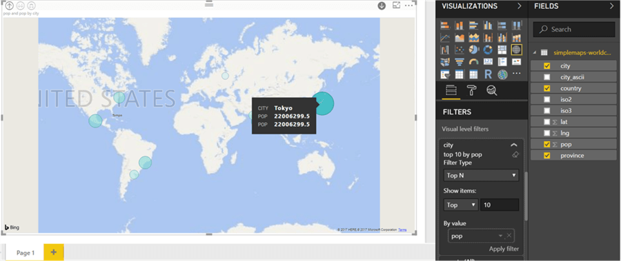
Now let’s say that we intend to find the top 10 cities in the entire world having the largest population. We can use filters to accomplish this. Scroll down in the map controls pane, and select values in the filter properties of city attribute as shown below. Filter type should be TOP N, number of elements to filter should be 10 and the attribute by which data is to be filtered is pop. This means to filter the top 10 cities by population. From this you can see that NY is in top 10 list, but LA is not.
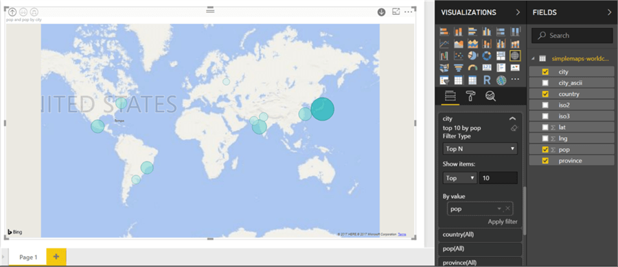
If you hover over the biggest dark green bubble, you will find that Tokyo is the city with the highest population in the world. You can also use the drill down section in the filters area to drill down into the data by a certain attribute.
In this way, using Power BI Desktop, one can easily analyze geospatial data with the least technical complexity to quickly derive insights into the data.
Next Steps
- Try using more complex datasets in Power BI Desktop, and analyze the data using different dimensions or attributes using the Drill Through feature.
- Check out these other Power BI tips.
Learn more about Power BI in this 3 hour training course.


About the author
 Siddharth Mehta is an Associate Manager with Accenture in the Avanade Division focusing on Business Intelligence.
This author pledges the content of this article is based on professional experience and not AI generated.
View all my tips
