By: Siddharth Mehta | Comments | Related: > Power BI Charts
Problem
Stacked bar charts and stacked column charts are the fundamental charts for starting entry level segmentation analysis that involves categorical data. The shortcoming of stacked charts is that the total length or width represents the total of any given category. So, one can analyze segmentation only within a given category, but cannot analyze measures from a distinct perspective. A chart is required that allows us to analyze the weight of the overall category relative to other categories, along with its segments. In this tip, we will understand how to perform segmentation analysis using a unique chart in Power BI Desktop.
Solution
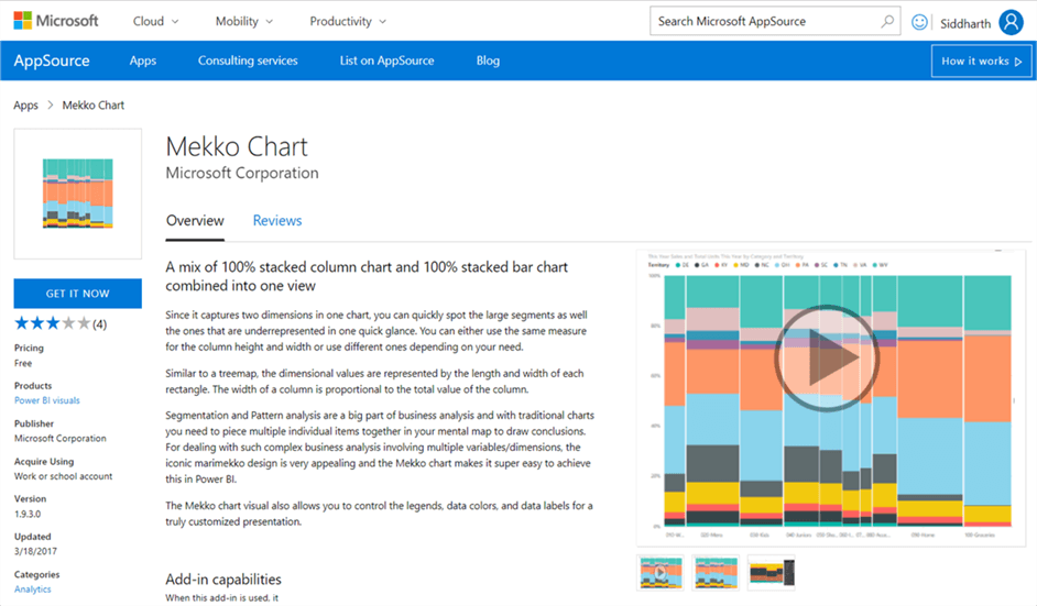
Power BI provides Mekko Charts in the Power BI Visual Gallery to perform segmentation analysis on categorical data.
Marimekko design or the Mekko Chart is a type of variable-width bar chart like a tree map or mosaic plot in which all the bars are of equal height, there are no spaces between the bars, and the bars are in turn each divided into segments of different width. Marimekko charts are generally used for categorical data analysis. You can read more about Marimekko here.
In this tip we will create Mekko Chart in Power BI Desktop using some sample data, using which we would analyze categorical data. We will also compare the stacked charts side by side to understand the advantage of using the Mekko Chart. It is assumed that Power BI Desktop is already installed on the development machine. The sample data used in this tip can be downloaded from here. Follow the steps as mentioned below.
1) The first step is to download the Mekko Chart from here, as it is not available by default in Power BI Desktop.
2) After downloading the file, open Power BI Desktop. You can click on the ellipsis in the visualization tab and select “Import from file” menu option. This will open a dialog box to select the visualization package file, to add the visualization in Power BI. Select the downloaded file and it should add the mekko chart to Power BI Desktop visualizations gallery.
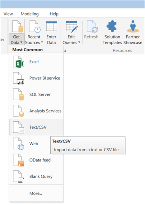
3) First, we need to import the sample data which we will be used to create the visualizations for data analysis. Select the Get Data menu as shown below, and select “Text/CSV” as our sample data is stored in a CSV file.
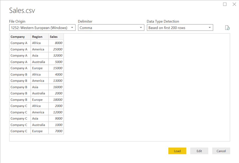
4) This will open a dialog box to select the CSV file. Navigate to the path where you have stored the CSV file, select the file and click OK. This will open a dialog box as shown below. A few rows from the file are read to preview the data as shown below. Click Load to load this data into the data model.
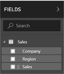
5) After the data is loaded in the data model, it should look like this in the Power BI Desktop as shown below.
6) Let’s first use stacked column chart to analyze the data that we just loaded. Click on the stacked column chart and this will add the control on the report layout as shown below.
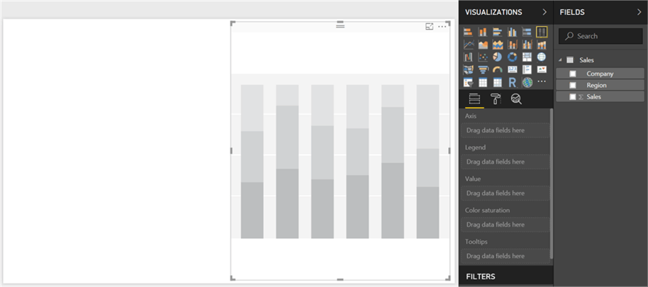
7) Select the data fields: Company, Region and Sum of Sales and those will be added in order to the Axis, Legend and Values section as shown below.
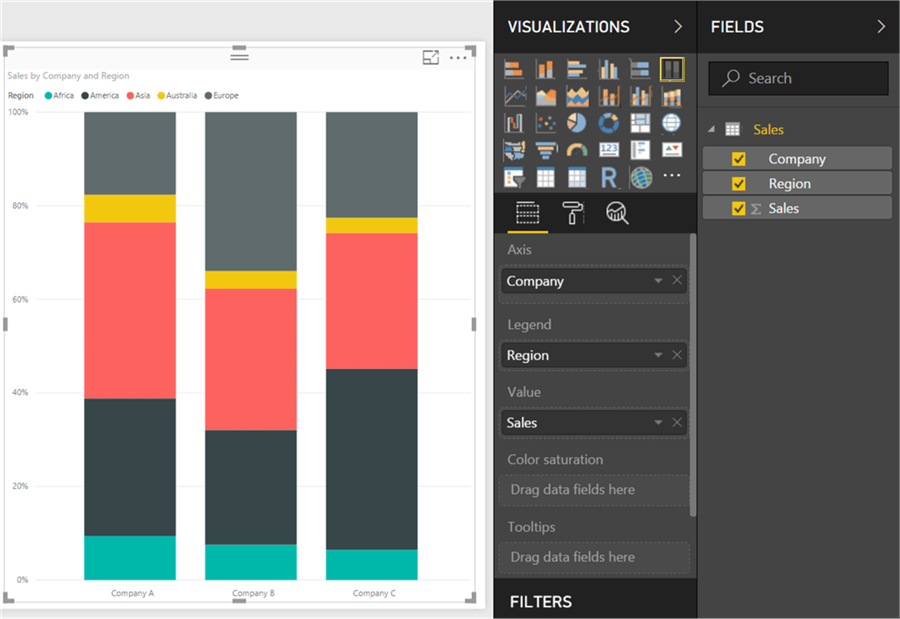
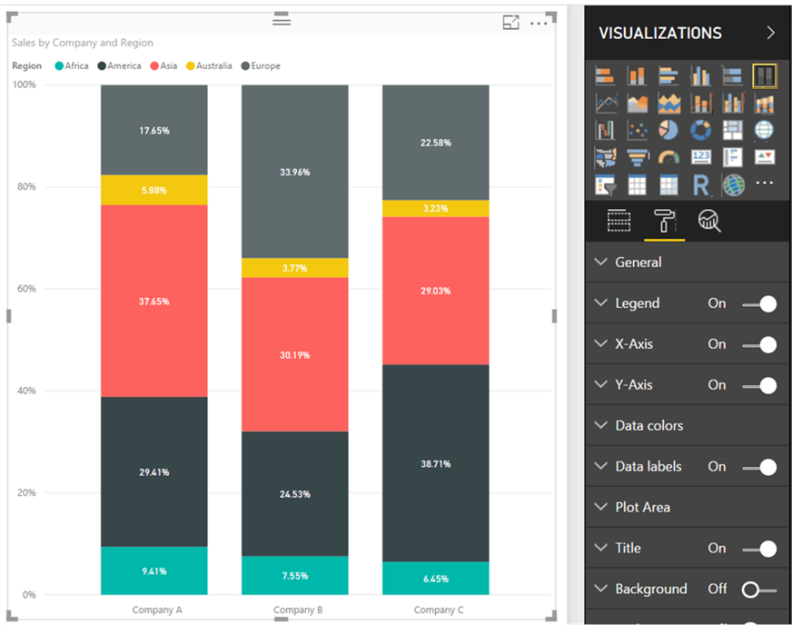
8) As you can see, there are three distinct values in the Company axis, and five distinct values in the Legend axis. The height of the assorted colors represents the proportion of sales. But it’s not clear how much Company A, B and C contributes to the overall sales of the organization comparatively. Also, one piece of detail that is not explicit here is the proportion or percentage of Sales. Navigate to the format menu, and turn on the data labels as shown below, so that we can see the exact percentage of each item within a category.
9) Similarly, add a stacked bar chart on the side and populate this with the exact same detail using the same steps explained above. This will create the chart as shown below.
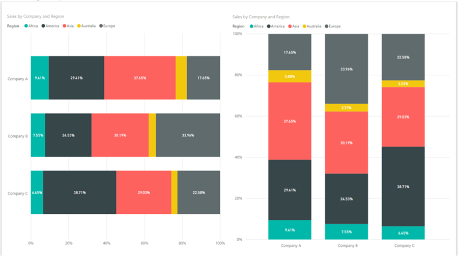
10) One detail that is not clear from both of these charts is how much is the contribution of one company in the overall sales. Now let’s add a Mekko Chart that we added during the start of this exercise, and populate it with the exact same data using the steps explained above.
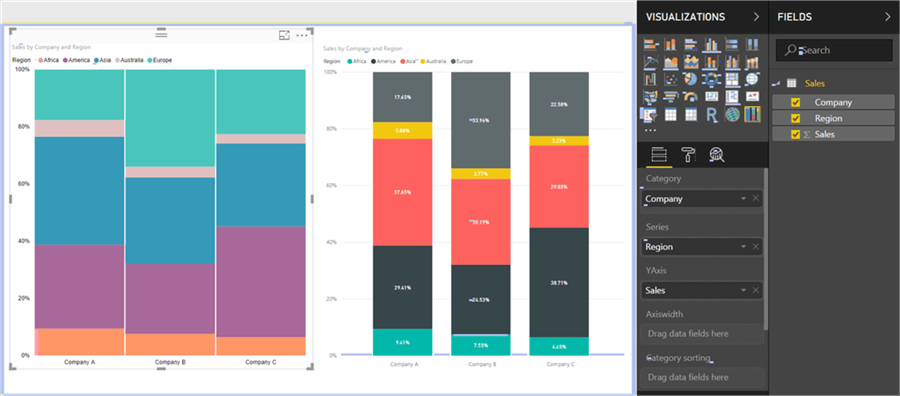
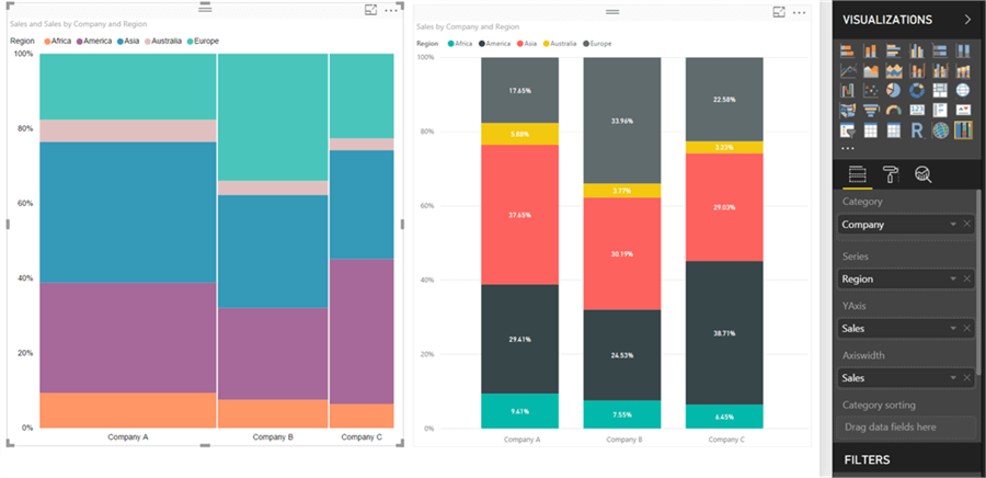
11) Until now, the proportion looks the same. Add the Sum of Sales field again to the axis-width section as well. This will change the visualization as shown below. From the below visualization of the Mekko Chart, it is easy to identify the weight of each sales segment in the overall sales. Now it is easy to make out from the Mekko Chart that the overall contribution of Company A is the highest in overall sales.
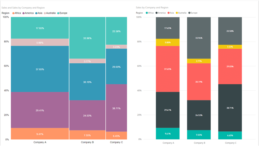
12) Let’s make this more interactive by turning on the data labels from the format section. Now the visualization should look as shown below. By making a combination of a stacked bar and a stacked column chart, the Mekko Chart resembles a tree map.
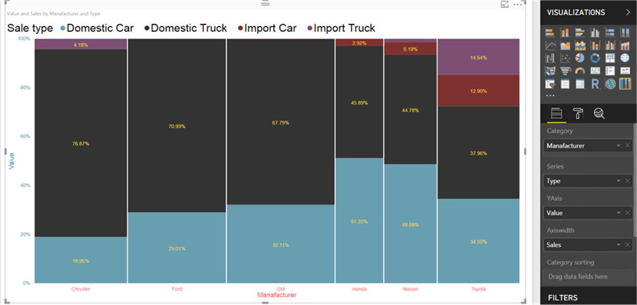
13) One can also use a different measure for the width axis to render the width of each segment. Below is an example of this. In this visualization, vehicle manufacturers represent the categories, each color in the bar represents the type of vehicle, the value of the vehicles is represented by the height of color, and the overall sales by the manufacturer is represented by the width of the bar. Derivation can be easily made from this visualization, like for example, Honda has the largest sale of domestic cars compared to other vehicles, but the overall sales of Honda is probably the lowest compared to other manufacturers.
One point to note is that although the Mekko Chart solves a visualization design problem, it suffers from the same problems as stacked charts. It is not easy to visually compare each segment if the similar segments are not lined up side by side. You can read more about the limitations of Mekko Charts from here. It’s advisable to understand the use case first and then apply Mekko Charts for segmentation analysis, as there are other charts like mosaic plot, tree maps, heat maps, etc. for diverse types of segmentation analysis.
Next Steps
- Try modifying the legends, data colors, and data labels for a truly customized presentation of the Mekko Chart.
Learn more about Power BI in this 3 hour training course.


About the author
 Siddharth Mehta is an Associate Manager with Accenture in the Avanade Division focusing on Business Intelligence.
This author pledges the content of this article is based on professional experience and not AI generated.
View all my tips
