By: Siddharth Mehta | Comments (7) | Related: > Microsoft Excel Integration
Problem
Measuring progress over time is a standard project management activity. Projects that are executed in an agile manner typically using the agile methodology have more frequent needs to track progress over time than projects that are executed using a waterfall model. In the agile methodology, there are multiple iterations of tasks and each iteration is generically called a sprint. One way of interpreting the progress of tasks is by estimating the total effort required for a task versus the actual incremental effort burned each day in each sprint. This data can be graphically represented in a chart to track the amount of work or the total team bandwidth available to complete the tasks. The actual data may be captured in a variety of tools like Microsoft Project, TFS, Excel and others. Generally, the easiest way to track and share this data is by importing this data in Excel and creating a chart. In this tip we will learn how to create a graph to visually track progress of tasks / consumed efforts over time.
Solution
A burndown chart is a standard mechanism of monitoring the progress of tasks and consumed efforts over a period. To follow the steps below, you will need to have Microsoft Excel accessible and installed. Assuming that Excel is available, open Excel and follow the below steps to create a burndown chart.
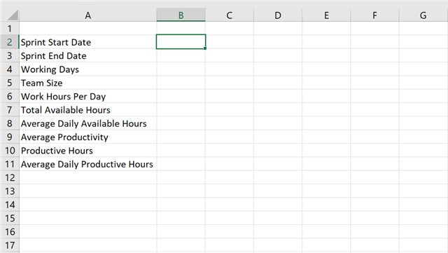
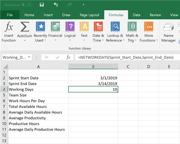
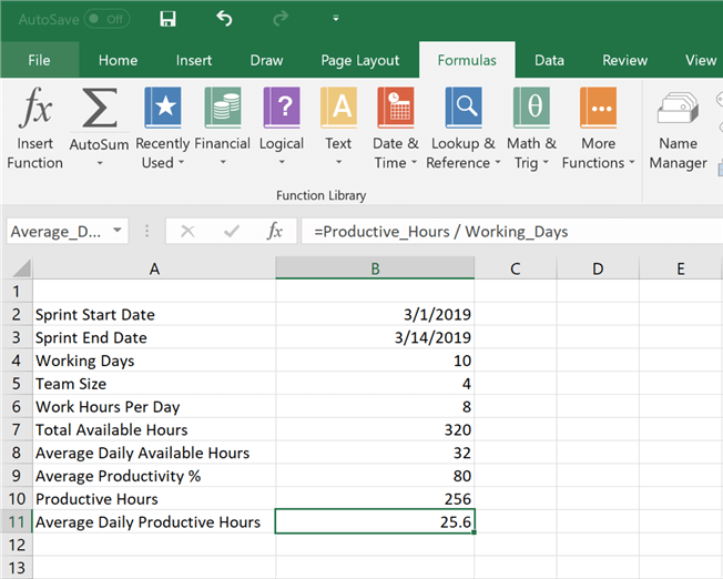
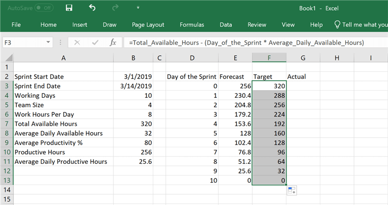
Step 1) First, we need to create some parameters to capture the state of the tasks and time. Assume that we intend to track the progress of tasks for one sprint. Create the following labels in Excel as shown below. We need start and end dates of the sprint to calculate total working days. A product of working days, team size (# of developers) and work hours per day (which is typically 8-9 hours depending upon the organization policy) would derive total available work hours as well as average daily work hours for the entire sprint. In a perfect world, all the available work hours would be productive, but it's rarely the case that every team member is 100% productive. So, to account for a realistic estimate, a project / program manager can account a realistic estimate by calculating the average productivity percentage. This would help to derive the total productive hours and average daily productive hours.
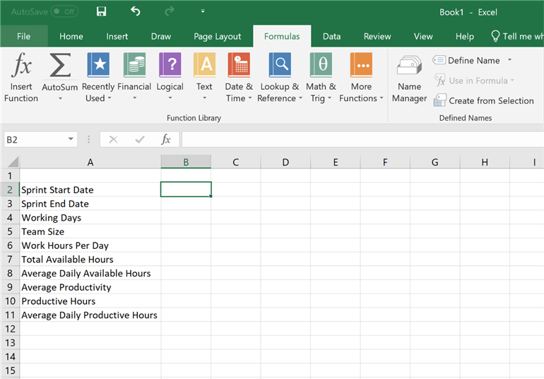
Step 2) After the labels are created, we need to create names for each of them, so that we do not have to refer to the values of these labels by column name and number. For this, open the formula menu as shown below, and click on the Define Name menu item.
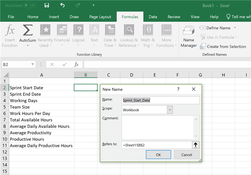
Step 3) Once you click on Define Name, a pop-up window would open suggesting a name and the cell for which the name would be created. Accept the default name (which is generally the label in column A with spaces replaced by "_"), and create the name for every label in column A.
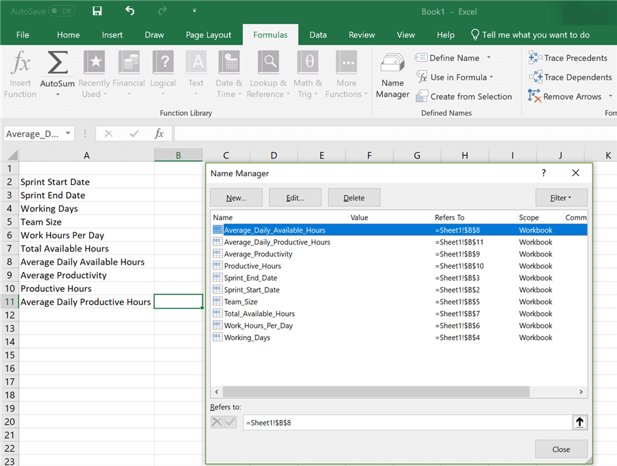
Step 4) After you have created all the labels, click on the Name Manager icon in the Formulas menu bar, and you should be able to see all the names as shown below.
Step 5) Now it's time to fill up data in the fields that we have created. Add a sample start date and end date. Generally, sprints are of 2 weeks, so I have added the date accordingly to keep a time of 2 weeks i.e. 1 sprint. For the working days field, use the networkdays function with start date and end date as input parameters, and it would calculate working days – which would be 10 (i.e. 5 working days in each week).
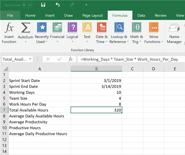
Step 6) Key in details for total # of developers i.e. team size and # of hours they would work per day. After that add a formula for total available hours as shown below, to derive the sum total of time available to complete all tasks in the given sprint.
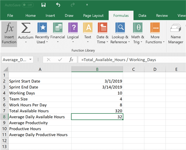
Step 7) Key in the formula for average daily hours which is total hours / team size as shown below.
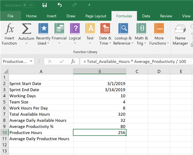
Step 8) Let's assume that the average realistic developer productivity is 80%. Key in the same and update the formula for Productive hours based on the average productivity percentage as shown below.
Step 9) Finally, update the formula for average daily productive hours, similar to the one we did for average daily available hours, as shown below.
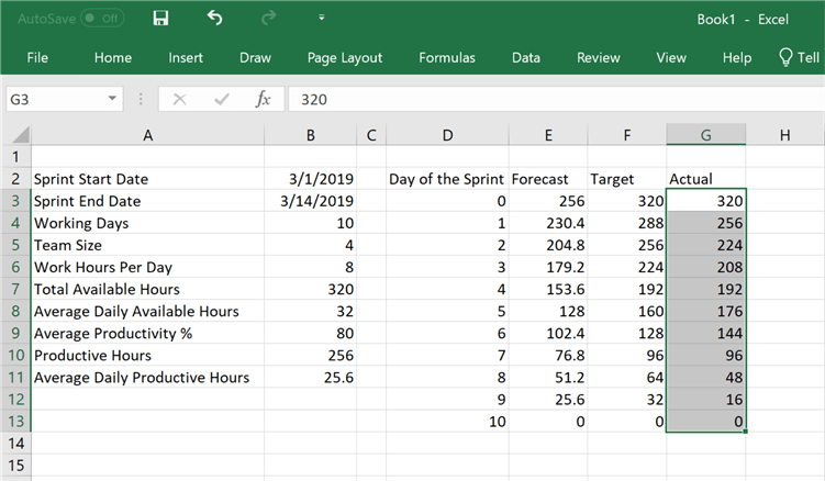
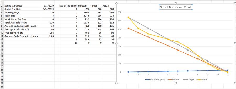
Step 10) After the values are derived for the parameters that influence available efforts and time, we need to create a table to capture effort for each day in the sprint. So, create fields to capture this detail as shown below. Actual effort would come from the daily capture of sum total effort put-in by each team member, forecast would be based on ideal and uniform spread of effort for each day based on productive hours, and target would be based on total available hours.
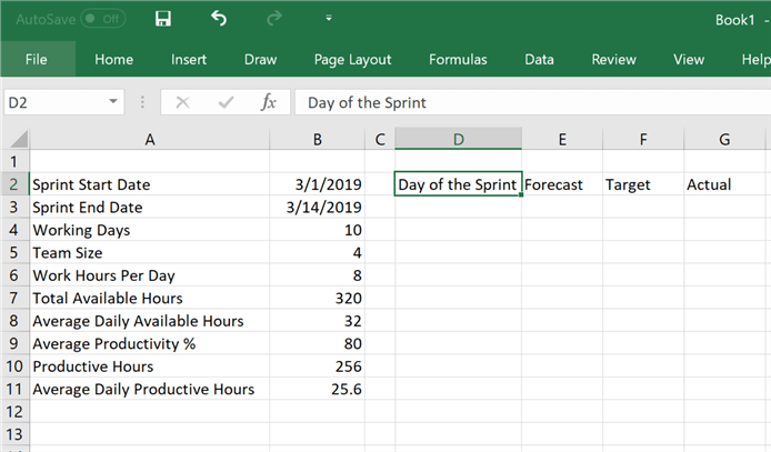
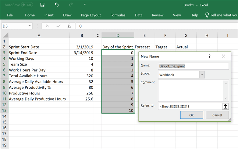
Step 11) Add values to Day of Sprint starting from Day 0 to Day 10, considering we have 10 working days in the sprint and 100% of effort will be available on Day 0 before the sprint starts. Also, name this section of data as we did in Step 2.
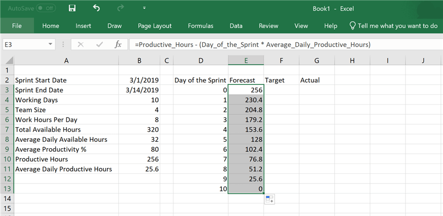
Step 12) The formula of the forecast value will be calculated as difference of total productive hours, and product of number of the day and average productive hours available each day for the entire team. In other words, we assume that 25.6 hours are available each day, and ideally that much effort will be burned each day. So, we reduce that much effort from the total available effort each day, which would result in no effort available to burn at the end of the sprint on last day i.e. day 10. And this means that ideally work progresses uniformly on each day and eventually completes on the last day of the sprint.
Step 13) Repeat Step 12 for the Target field, with the formula shown below. Here instead of productive hours we are using work hours available to burn as per the organizational policy.
Step 14) Now its time to update the actual effort spent by the team on the tasks. This is a measure of actual progress of tasks / the bandwidth available with the team to spend on the tasks with every moving day. This can be captured using an effort log table shown below or any convenient means. The ultimate intention of this data collection is to derive the total effort spent on each day and report the remainder effort in the Actual column. In our case, we have created data that shows that developer initially burned a lot of efforts, then efforts slowed down as only a portion of the team was working, again they picked up and started adding more effort, and in the end the team again worked partially with standard effort hours per day. Total Burn shows the moving total of effort burned each day and Available Effort shows the moving total of the remainder total effort available at the end of each day.
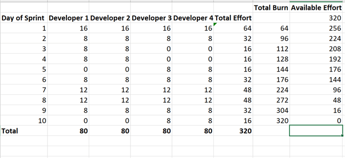
Step 15) For our charting exercise, we only need column "Available Effort". So, key in the same as shown below.
Step 16) Now it's time to create the chart. Select the effort table, from the Insert menu select the line chart with Markers as shown below.
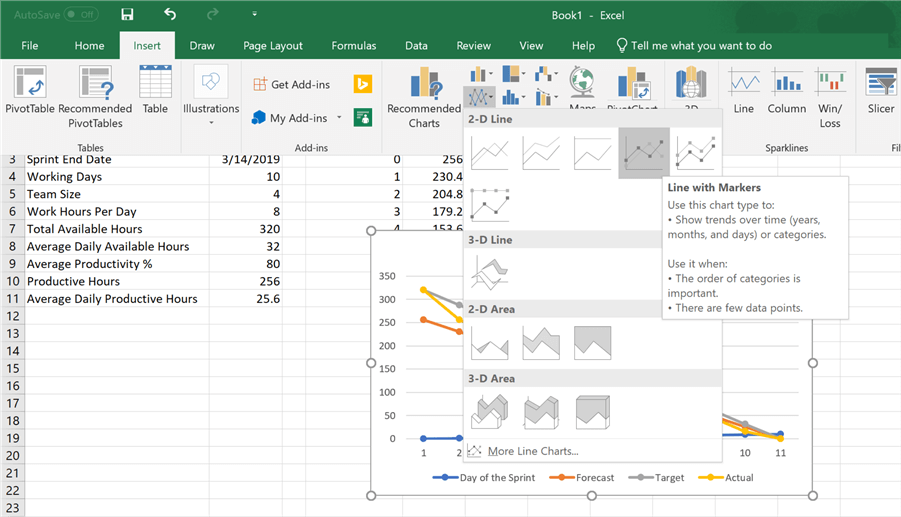
Step 17) After the chart is added, it would look as shown below. Edit the title and name it something appropriate. The categories are correctly created, but the sprint days (blue line) should be on the horizontal axis instead of vertical axis. To fix this, right-click on the chart and click on Select Data menu option.
Step 18) This will open a pop-up window as shown below.
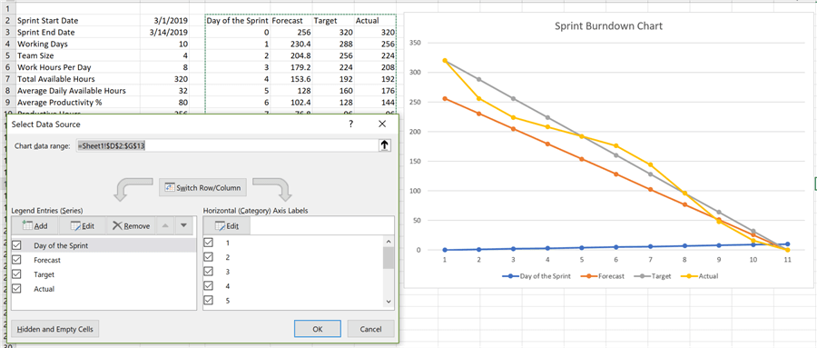
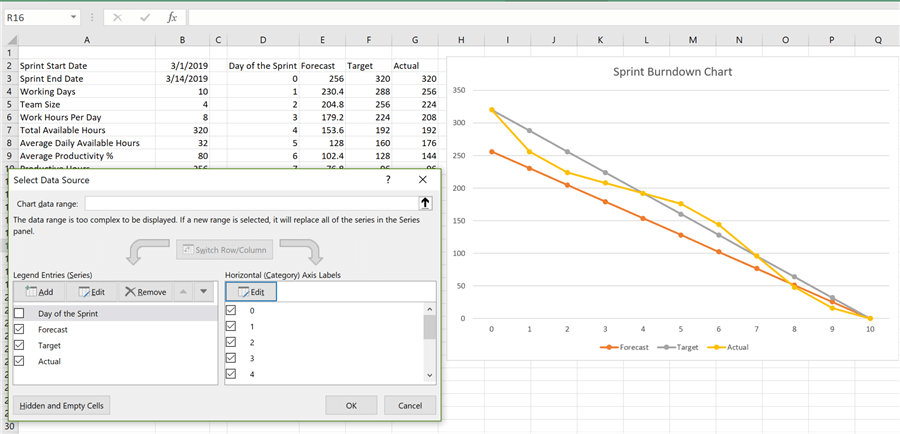
Step 19) Uncheck the Day of the Sprint field from the Legend Entries section, click on the Edit button in the Category axis labels section and select the range of values in the Day of the Sprint field as shown below. Now all the efforts are perfectly shown on the chart where all of them end at the same note at the end of the sprint.
Step 20) You can select any line on the graph, right-click and then change the color option to fit the coloring scheme that you desire, as shown below.
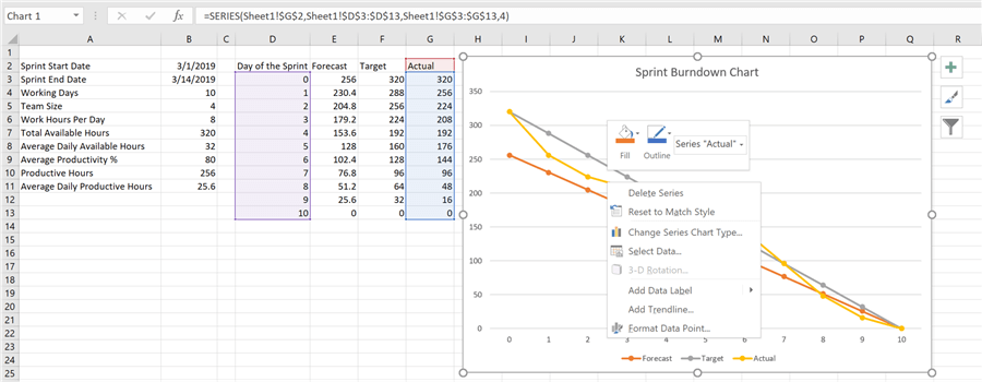
Step 21) Here I have changed the colors of the lines as well as markers for demonstration. If you hover your mouse, you would be able to read the data point values as well.
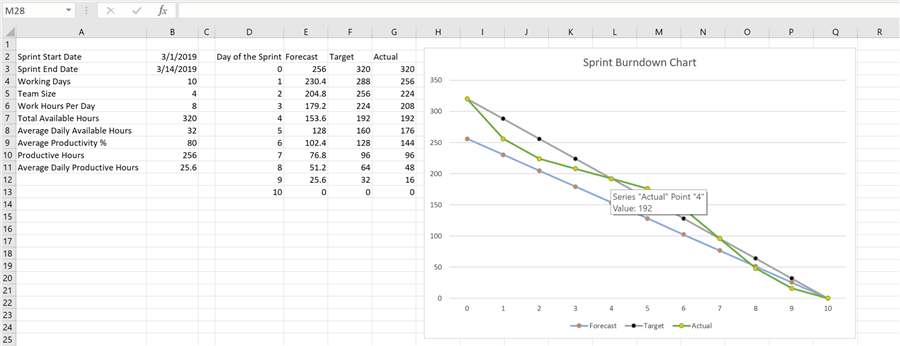
Finally, let's analyze this burndown graph. The grey line represents the ideal state of progress of tasks / burn of the effort with every moving day. The blue line represents a more realistic anticipated / forecasted progress / burn of the effort with every moving day. The green line shows a curve below the grey line for the initial 4 days, which means that team has made a more progress than projected / burned more effort than planned in these 4 days. Then the curve is above the grey line, which means that the team is now making less progress / burning less efforts than planned. And finally, towards the end, the team started burning more effort, but adjusted it on the last day to meet the planned burn rate. The same kind of comparison can be done between forecasted vs actual (i.e. blue line and green line).
In this way, one can easily create a burn-down chart in a few easy steps. This chart can be modified to fit any number of sprints or even can be used for any kind of execution model like waterfall. Using a few basic formulas and a set of parameters, one can create and/or modify the burndown charts to suit their needs.
Next Steps
- Consider adding error handling to the formulas to make the burn-down chart more robust and accommodating for changes.


About the author
 Siddharth Mehta is an Associate Manager with Accenture in the Avanade Division focusing on Business Intelligence.
This author pledges the content of this article is based on professional experience and not AI generated.
View all my tips
