By: Siddharth Mehta
Overview
In this last lesson of this tutorial, we have reached a phase where we are ready to analyze a sample dataset with Python. For visual analytics in SQL Server, developers have been primarily using Excel / SSRS / Power BI / Powerpivot / Powerview or other similar tools to source data from tables / views and create visualizations. Sometimes data analysts / data scientists in particular need statistical visualizations for deeper data analysis. Also, for large datasets it might not always be possible to let the entire data be read from external tools for various reasons.
In general, generating statistical visualizations in much more code-intensive than doing the same with R. Python provides a built-in library for graphical analysis called matplotlib, as well as it contains built-in functions to generate graphical plots for quick data analysis which can come handy while developing / exploring data science algorithms. In this lesson we will look at one of the ways to analyze data in a graphical manner using Python to understand data distribution and outlier analysis.
Explanation
Using Matplotlib in Python
Python typically creates images using a matplotlib plot for graphical output. You can capture the output of this plot and store the image in a varbinary data type for rendering in an application, or you can save the images to any of the support file formats (.JPG, .PDF, etc.). In Python, we can collect the output of plotting functions and save the output to a file. Let’s work through an example.
Generating graphs / plots in Python
For the purpose of discussion, we will be using the AdventureWorks DW sample database available from Microsoft. This database is a data warehouse that contains dimensions and fact tables. One table of interest is the FactResellerSales table with contains approximately 60k records. Let’s say that we intend to analyze transactions where the product had to be sold at loss. We can find this with a simple T-SQL query as well, but our intention is to find transactions which are exceptionally away from the group. In this case, there may be many products which were sold at a loss compared to all other transactions. So let’s start with the analysis of this dataset.
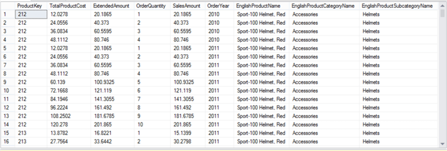
In order to analyze loss, we need to know basically two parameters – production cost and sales amount. The data in question is transactional is nature. Most of the developers work with at least one transactional database in their day-to-day job, so this example should be relatable. There can be products which may have been sold many times at the same price in a year. So we need to find each transaction for a product with a unique production cost, sales amount and financial year. You can use the below query and the result set would get reduced to 5347 rows from 60k rows.
select distinct F.ProductKey, F.TotalProductCost, F.ExtendedAmount, F.OrderQuantity,
F.SalesAmount, Year(F.OrderDate) as OrderYear,
P.EnglishProductName, C.EnglishProductCategoryName,  S.EnglishProductSubcategoryName
from FactResellerSales F
join DimProduct P on F.ProductKey = P.ProductKey
join DimProductSubcategory S on S.ProductSubcategoryKey = P.ProductSubcategoryKey
join DimProductCategory C on C.ProductCategoryKey = S.ProductCategoryKey
Order by F.ProductKey, Year(F.OrderDate)
We have included qualitative attributes of the product like Product Category and Product Subcategory by joining relevant tables. We need to use this dataset multiple times, so it is advisable to create a view using the above query. We have created a view named MyPythonTestData using the above definition. Now it’s time to create our first plot. Execute the below code.
execute sp_execute_external_script
@language = N'Python',
@script = N'
import matplotlib
matplotlib.use("Agg")
import matplotlib.pyplot as plt
import pandas as pd
import numpy as np
# Create data
colors = (0,0,0)
area = np.pi*3
fig_handle = plt.figure(figsize=(10,10))
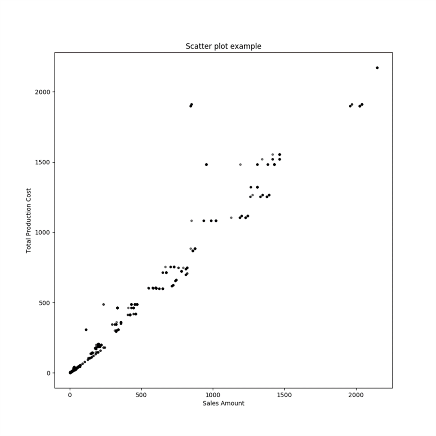
plt.scatter(InputDataSet.ExtendedAmount, InputDataSet.TotalProductCost, s=area, c=colors, alpha=0.5)
plt.title("Scatter plot example")
plt.xlabel("Sales Amount")
plt.ylabel("Total Production Cost")
plt.savefig("c:\\scatterplot.png")
',
@input_data_1 = N'Select cast(TotalProductCost as float) TotalProductCost, cast(ExtendedAmount as float) ExtendedAmount from MyPythonTestData'
Here we are creating a matplotlib plot using figure function in the Python script. We are specifying the dimensions of the output file as well as the file path in the subsequent lines of code. Using the scatter function we are creating a scatterplot graph where we are plotting ExtendedAmount on the x-axis, TotalProductCost on the y-axis. Once the output of the graph is generated we are saving the output to a file using the “savefig” function. The output of the graph should look as shown below.
In order to analyze the data in a detailed manner, one would need to add color to the data points by category as shown below. This will help to immediately identify the outliers along with their category. Achieving this in Python requires a few lines of coding, which is shown below. Libraries like Bokeh, GGPlot2, Plotly and other such libraries can be used for easier and better visualizations in Python. Some of these may require a paid license and exporting the output from these libraries to an image file using T-SQL is also not generally known or tested. To understand the below code, consider reading the matplotllib documentation in detail from here.
execute sp_execute_external_script
@language = N'Python',
@script = N'
import matplotlib
matplotlib.use("Agg")
import matplotlib.pyplot as plt
import pandas as pd
import numpy as np

# Create data
colors = (0,0,0)
area = np.pi*10

fig_handle = plt.figure(figsize=(10,10))

fig, ax = plt.subplots(figsize=(10,10))
df1 = InputDataSet[InputDataSet["EnglishProductCategoryName"] == "Accessories"]
df2 = InputDataSet[InputDataSet["EnglishProductCategoryName"] == "Bikes"]
df3 = InputDataSet[InputDataSet["EnglishProductCategoryName"] == "Components"]
df4 = InputDataSet[InputDataSet["EnglishProductCategoryName"] == "Clothing"]

ax.scatter(df1.ExtendedAmount, df1.TotalProductCost, c="black", label="Accessories",alpha=0.3, s=area, edgecolors="none")
ax.scatter(df2.ExtendedAmount, df2.TotalProductCost, c="red", label="Bikes",alpha=0.3, s=area, edgecolors="none")
ax.scatter(df3.ExtendedAmount, df3.TotalProductCost, c="green", label="Components",alpha=0.3, s=area, edgecolors="none")
ax.scatter(df4.ExtendedAmount, df4.TotalProductCost, c="blue", label="Clothing",alpha=0.3, s=area, edgecolors="none")

ax.legend()

plt.title("Scatter plot of Bikes Data")
plt.xlabel("Sales Amount")
plt.ylabel("Total Production Cost")
plt.savefig("c:\\colored-scatterplot.png")

',
@input_data_1 = N'Select cast(TotalProductCost as float) TotalProductCost, cast(ExtendedAmount as float) ExtendedAmount, EnglishProductCategoryName, EnglishProductSubCategoryName from MyPythonTestData'
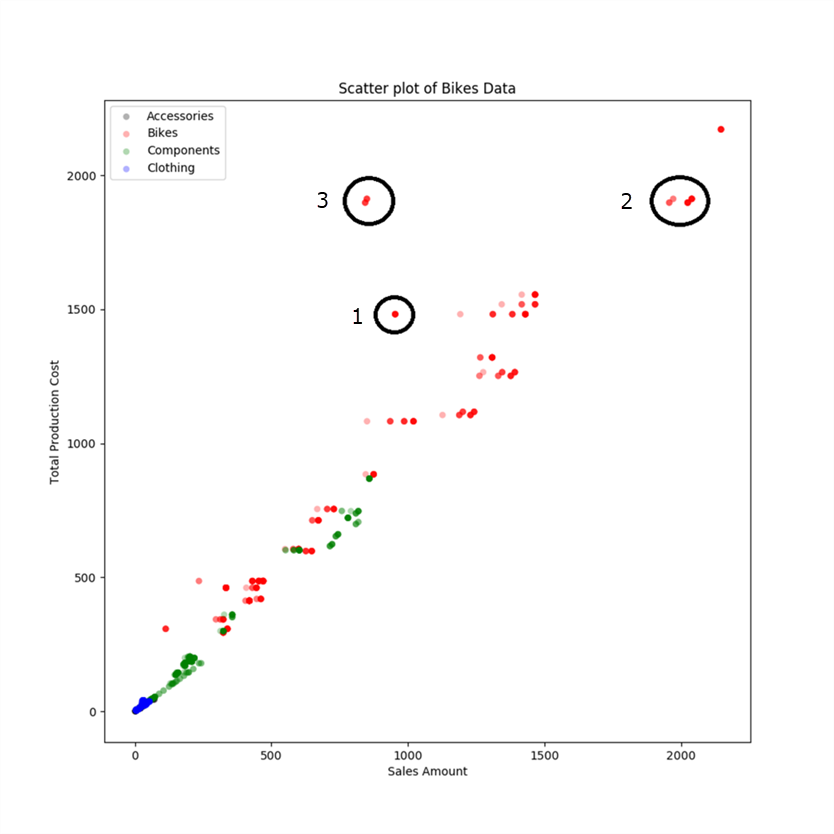
If you study the graph above, you will find that there many products are neck-to-neck on production cost vs sales amount. There are some products whose production cost is higher than sales amount which is undesirable from a business perspective. Some of such points are marked in black circles with number 1 besides them. But they are still not that far away from the group. If you study the points in circles marked as 2, these are the points with highest manufacturing cost and sales amount. But the points in circles marked as 3 have almost the same production cost but the sales amount are almost half of it. So this is the first point of investigation for outlier analysis.
We saw that the dataset we used contained more than 5k points and the above graph does not seem to have that many points. The reason for this is that many products may have the exact same production cost and sales amount, in that case a group of data points overlay on each other looking like a single point. The points in circle 3 seems like 2 data points, and the red color signifies their category is Bikes. So now let’s get rid of other categories of data and look at only Bikes data.
execute sp_execute_external_script
@language = N'Python',
@script = N'
import matplotlib
matplotlib.use("Agg")
import matplotlib.pyplot as plt
import pandas as pd
import numpy as np

# Create data
colors = (0,0,0)
area = np.pi*3

fig_handle = plt.figure(figsize=(10,10))
plt.scatter(InputDataSet.ExtendedAmount, InputDataSet.TotalProductCost, s=area, c=colors, alpha=0.5)
plt.title("Scatter plot of Bikes Data")
plt.xlabel("Sales Amount")
plt.ylabel("Total Production Cost")
plt.savefig("c:\\subcategory-scatterplot.png")

',
@input_data_1 = N'Select cast(TotalProductCost as float) TotalProductCost, cast(ExtendedAmount as float) ExtendedAmount from MyPythonTestData where EnglishProductCategoryName = ''Bikes'''
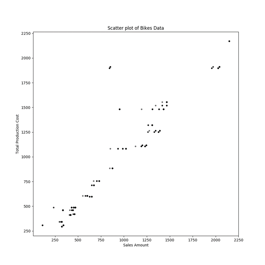
In order to analyze the data in a detailed manner, one would need to add color to the data points by sub-category as shown below. Using the above code example, where we added colors by category, apply the same logic to the graph shown above to color sub-categories and you will be able to generate a graph as shown below. This will help to immediately identify the outliers along with their sub-category.
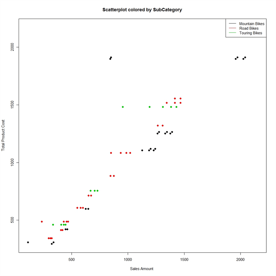
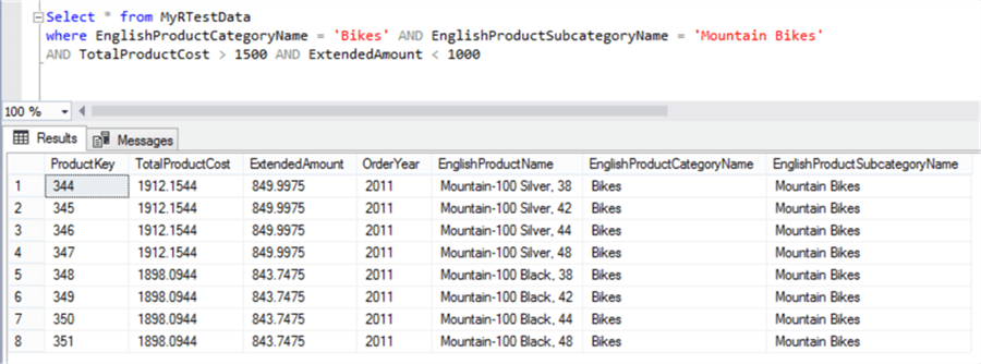
From this graph the blue color of the points in question shows that these points are of Mountain Bikes subcategory. These points have a production cost of more than 1500 / close to 2000, and sales amount of less than 1000. If you execute a query on the dataset with the filters shown below, you should be able to figure out the outlier data quickly.
So in this way, by applying graphical analysis in Python, we were able to visually compare how production cost is affecting sales cost in near linear fashion. We were able to proportionally compare all the products production cost vs sales amount performance, and find the high potential outliers almost instantly and visually. And finally we zeroed down on the exact outlier products which had poor performance. This example has been kept as simple as possible. The actual real life applications are immensely more complex, computation intensive and voluminous. It is comparatively easier to implement graphics in R than in Python. Considering learning the same example in the R Tutorial to compare how easily you can implement the same in R.
Python Scripts as a Stored Procedure
Not all T-SQL scripts need to use Python scripts. Also Python Scripts are highly probable to involve complex calculations developed by data analysts / data scientists / database developers after deep analysis. So after the exploration / analysis phase is over as we did above, it is advisable to wrap Python scripts inside a stored procedure for centralizing logic and easy administration.
Useful Resources
Below are some useful links to Python resources.
- Python Basics
- Python Standard Library
- Matplotlib Gallery
Summary
We started this tutorial assuming the student is totally new to Python. Architecturally and conceptually anyone new to Python would have questions on what is Python, why to use it and how will it make a difference in day-to-day work of SQL Server professionals.
We understood the answer to all these questions, analyzed Python integration architecture with SQL Server 2017 in the first lesson followed by a detailed installation, configuration and basic acceptance testing of Python using tools like Visual Studio 2017 and SSMS.
In the third lesson we learned the basic programming constructs of R like variables, operators, loops, etc. and understood how to execute basic Python scripts with T-SQL. After learning the basics, we saw an interesting use-case of Python where we used Python to calculate a bunch of statistics for a number of fields with a single line of code.
In this last lesson, we learned to create graphical visualizations with Python from T-SQL and data stored in SQL Server to complete the analytics cycle. I hope this tutorial provides a launch-pad for enthusiasts who are keen to apply the power of Python to SQL Server datasets.
