By: Siddharth Mehta | Comments | Related: > Reporting Services Charts
Problem
Distribution analysis is generally performed on quantitative data, by individually plotting data points on a graph. After plotting these points, visual clusters can be identified, which also helps in outliers analysis. This methodology is generally useful when data points are plotted based on just two parameters on a X and Y axis using a scatter plot graph as an example. To carry out distribution analysis on aggregated data or data points having multiple parameters, box plot charts can be used. In this tip, we will take a look at how to box plot charts in SQL Server Reporting Services.
Solution
Before we can start to create a report with a box-plot chart, we need to have a dataset that suits the requirement. In SSRS, a box-plot chart typically has four different parameters for any data point: High, Low, Open and Close. In this regard, 'High' can be considered the max value, 'Low' can be considered the min value, 'Open' can be considered as a placeholder for starting or actual value and 'Close' can be considered as a placeholder for closing or targeted value.
Create a SQL Server Reporting Services Box Plot Chart
Follow the steps below to create a box-plot chart for outliers analysis:
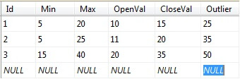
1) Create a table and populate it with data as shown in the below screenshot.
2) Create a new SSRS report, insert a chart control and select box-plot chart as the chart type.
3) Create a data source and dataset to read the table we created in Step 1.
4) Drag the Max field from the dataset fields, and drop it on the values area of chart data pane. This would create a series, and would have four fields - High, Low, Open, Close. Configure the fields with respective fields from the dataset. Once configured, the chart data should look like the first series shown in the below screenshot.
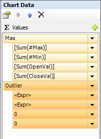
5) Drag the outliers field and drop it below the first series. Say we are only interested in the total number of outliers, so we would configure the 'High' and 'Low' fields with the actual value of the outlier field to keep it the same then configure the 'open' and 'close' parameters with a zero value.
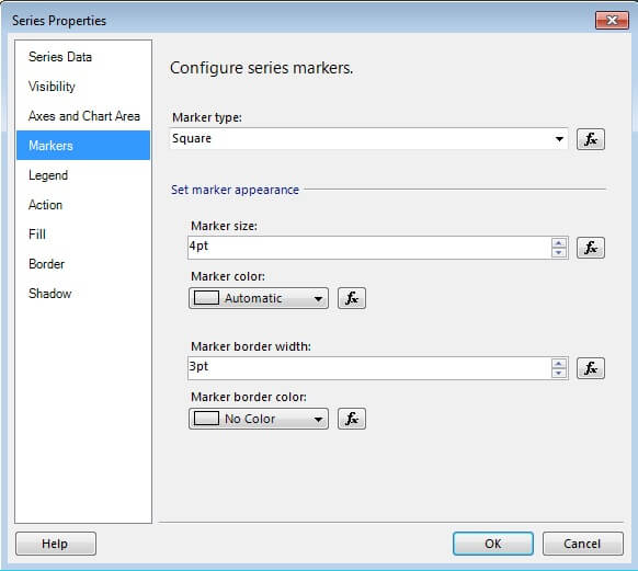
6) In a box-plot chart, you can mark 'High' field with a marker. Select the outlier series in the chart data pane and select properties. Select the Marker tab and configure the marker type and marker size as shown in the below screenshot.
7) Preview the report, and you should find the box-plot chart as shown in the below screenshot.
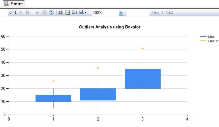
If you consider 1, 2 and 3 on the x axis as three different projects, and rest of the values as the number of team members allocated to a project, you would be able to compare the distribution of resourcing in each project. If you consider outliers as the number of team members who resigned from that project, you would be able to compare active and ex-team member distribution. You can configure the series outliers with all the fields to compare the distribution.
Next Steps
- Try to add more data fields to dataset and configure outliers series with those fields.
- Explore other properties of box-plot chart.


About the author
 Siddharth Mehta is an Associate Manager with Accenture in the Avanade Division focusing on Business Intelligence.
This author pledges the content of this article is based on professional experience and not AI generated.
View all my tips
