By: Rick Dobson | Comments (3) | Related: > Reporting Services Charts
Problem
Our startup stock advisory firm wants to leverage its SQL Server high-low-open-close stock price database by offering Candlestick charts to clients and prospects. Please provide some easy-to-follow examples about how to implement this capability.Solution
MSSQLTips.com includes several articles demonstrating how to download and build a SQL Server stock price database (Using SQL Server Data Analysis for Stock Trading Strategies, SQL Server Data Mining Strategies for Stock Buy and Sell Recommendations , Pass Historical Data for Stocks from Google Finance to SQL Server). The prior tips all included coverage of how to populate a high-low-open-close stock price database. Candlestick charts are a frequently used financial analysis tool for displaying high-low-open-close stock price series.
This tip drills down into SQL Server Reporting Services (SSRS) for displaying high-low-open-close stock price series. The tip shows and describes in a step-by-step fashion SSRS user interfaces for creating Candlestick charts. You will also learn how to copy a chart file and then modify the copy within an SSRS project. Three charts are created for a stock from the stock price database created in a prior MSSQLTips.com article (Pass Historical Data for Stocks from Google Finance to SQL Server).
Step-by-step instructions for creating your first Candlestick chart
In order to create a Candlestick chart with SSRS, you can first create a SSRS Report Server Project and give the project a name, such as MSSQLTips_EOD_StockPrice_CandleSticks.
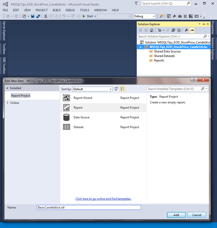
Next, you need to add a new a Report item and give the item a name. The following screen shot shows the assignment of the name BasicCandleStick to a report item in the MSSQLTips_EOD_StockPrice_CandleSticks SSRS project. Notice that the report item has an .rdl file type. This is the type of file that SSRS uses to store the settings associated with a report item. As you make selections through the SSRS UI, the .rdl file gets populated with settings that match your selections.
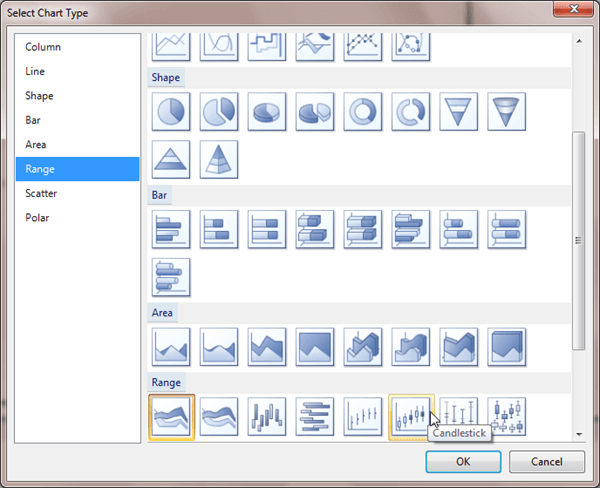
Candlestick charts display a lot of details, and you may therefore find it useful to enlarge the default size of the report item window so the details are easy to view. Next, choose to insert a Chart object within the report. You can designate a Candlestick chart by choosing a Range chart type and then selecting a Candlestick type of Range chart. The following screen shot shows this selection.
After selecting a Candlestick type of chart, SSRS prompts you to designate a data source and query for the chart. Initially, you need to choose between using a shared data source or an embedded data source for the chart. For the sample charts in this tip, we use embedded data sources.
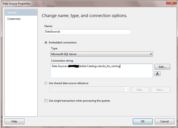
The core essence of a data source is a SQL Server instance name and a database name within the instance. You can choose to edit the connection properties for a new data source and then specify a server instance name, a database name on the instance and login credentials that will connect to the database on the database server. It is a good practice to click the Test Connection button within the Connection Properties dialog box before going on to specify a query.
The following screen shot shows the Data Source Properties dialog after a server and database were selected for the BasicCandlestick chart. The Data Source name, which is covered for security reasons, shows the name of the server instance. The Initial Catalog name points to the name of the database on the server. The stocks_for_mining database is the name of the database created in a prior tip that contains a table with daily historical end-of-day stock price data that are suitable for display in a Candlestick chart.
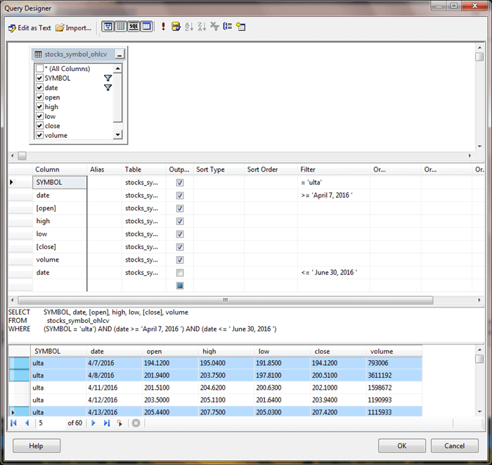
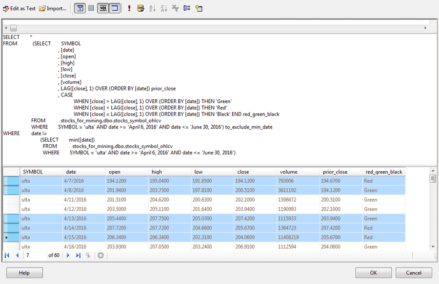
The next screen shot presents a Query Designer view of a query and an excerpt from its results set used as a resource by the BasicCandlestick chart. The FROM clause designates as its source a table named stocks_symbol_ohlcv in the stocks_for_mining database. This table contains standard end-of-day data for a collection of stock symbols; each symbol references the stock for a different company. In addition to SYMBOL, column values are for date and several different daily stock performance indicators, such as high price, low price, open price, close price, and volume. A WHERE clause selects data exclusively for the ULTA stock symbol, which is for a salon, cosmetics, and fragrance corporation.
The Candlestick chart represents the high, low, open, and close prices for each day for the ulta stock symbol. Normally, a Candlestick chart displays the price data for a symbol over a selected date range, such as from April 7, 2016 through June 30, 2016. This range is also specified in the query's WHERE clause.
The results pane shows the first five rows of the query's result set. Additionally, the first, second, and fifth rows are highlighted.
- The first row has the same open and close prices.
- The second row has a higher open price than close price.
- The fifth row has a higher close price than open price.
The values of the open price relative to the close price affects the appearance of the candle in a Candlestick chart. Therefore, the candle for any day can quickly depict whether a stock price went up, down, or stayed the same on any given day.
After specifying your embedded data source and dataset, you can select your chart and be prompted with a Chart Data window. Click the plus sign (+) in the window and select High. Then, enter Sum(high) as the first selection in the Chart Data window. The next screen shot shows the final screen after making these selections.
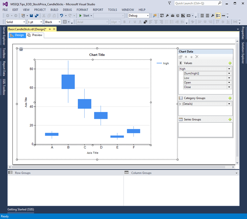
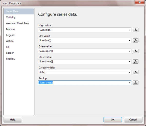
Next, right-click any Candlestick bar in the Design View tab for the chart and choose Series Properties. This choice opens the Series Properties dialog box, which you can use to specify the low, open, and close values for each candlestick in a Candlestick chart. The high, low, open, and close values plot along the vertical axis of a Candlestick chart. Additionally, you can specify date as the column for category values along the horizontal axis. It is often helpful to designate a Tooltip value for a Candlestick value to show a value for any candlestick in a Candlestick chart. For the BasicCandleStick chart, close price values are designated as Tooltip values. While volume is in the result set because it is routinely reported with other stock performance indicators, the volume indicator does not appear directly within a Candlestick chart. The following screen shot shows these selections in the Series Properties dialog box for the BasicCandleStick chart.
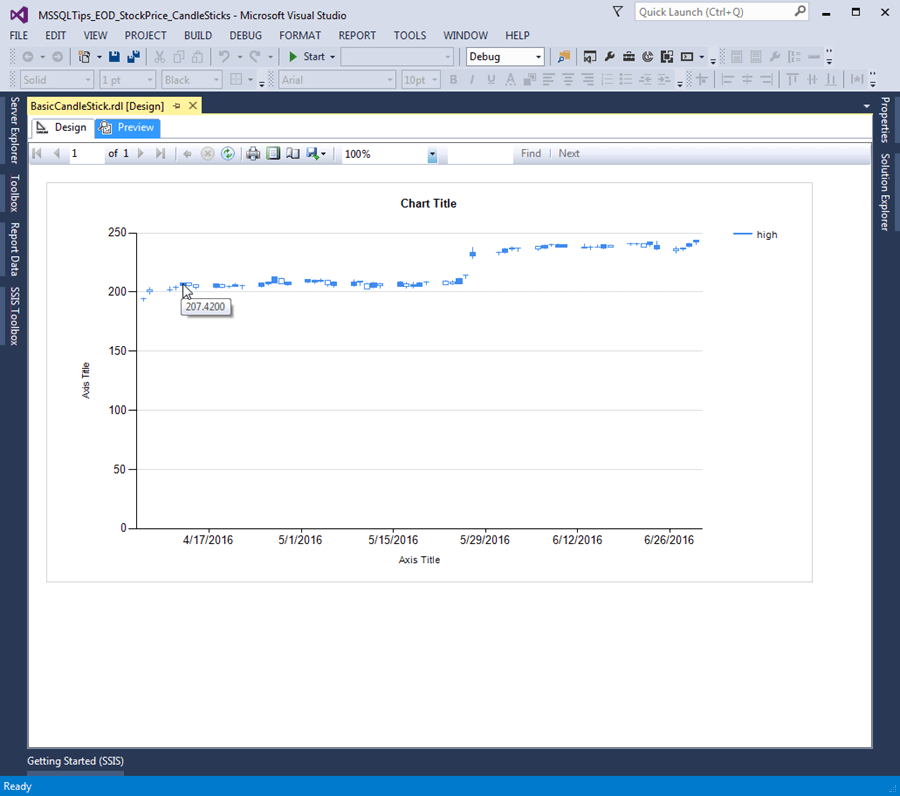
After confirming your selections, you can return to the CandleStick chart and switch from the Design view to the Preview display of the chart. The screen shot below shows the cursor resting on the candlestick for the fifth result set row. Notice that the Tooltip shows a value of 207.4200, which corresponds to the close value of the fifth row in the preceding Query Design screen shot.
As mentioned above, Candlestick charts are especially useful for indicating the relationship of the close and open prices on any day.
- For example, notice that the fifth candlestick, has a solid candle; this is because its close value is greater than its open value.
- In contrast, the second candlestick is open, which is because its close value is less than its open value.
- Finally, the first candlestick has no bar in its candle; it is just one line instead of a box depicting a candle. This is because the open and close prices are identical.
The third and fourth candlesticks look very similar to the first candlestick in which the open and close prices are identical. However, if you check the result set in the preceding Query Design view screen shot, you will notice that the open and close values are just close to one another, but not identical. This difference between the first candlestick and the third and fourth candlesticks would be more obvious if the candles were more evenly displayed along the vertical axis instead of pushed to the top area of the chart.
The final point worth noting about the BasicCandlestick chart is that the ends of the wicks at the top and the bottom of each candlestick denote the high and low prices for each day.
Refining the BasicCandlestick chart
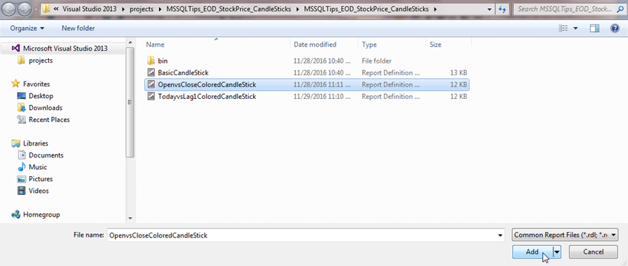
With the addition of just two new settings and a tweak, we can create a new Candlestick chart that dramatically improves the appearance of the preceding Candlestick chart. Begin by adding a new item named OpenvsCloseColoredCandlestick. Then, reproduce the steps exactly as described in the previous section for the BasicCandlestick item.
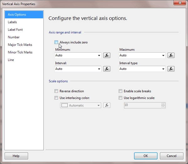
After the OpenvsCloseColoredCandlestick chart looks exactly like the previously created BasicCandlestick, right click the vertical axis in the Design view of the OpenvsCloseColoredCandlestick chart, and choose the Vertical Axis Properties context menu item. Then, choose Axis Options. In the Vertical Axis Properties dialog box, clear the Always include zero box. By default, this box is selected. The screen shot below shows the box after it is cleared. Clearing the box allows SSRS to space the data more evenly along the vertical axis because the chart does have to include 0 on the vertical axis.
After confirming your new, non-default vertical axis property setting, right-click any candle in Design view and choose Series Properties. Then, select the Fill menu item on the left side of the Series Properties dialog box. The screen shot below indicates how the screen looks just before a click of the Color fx button.
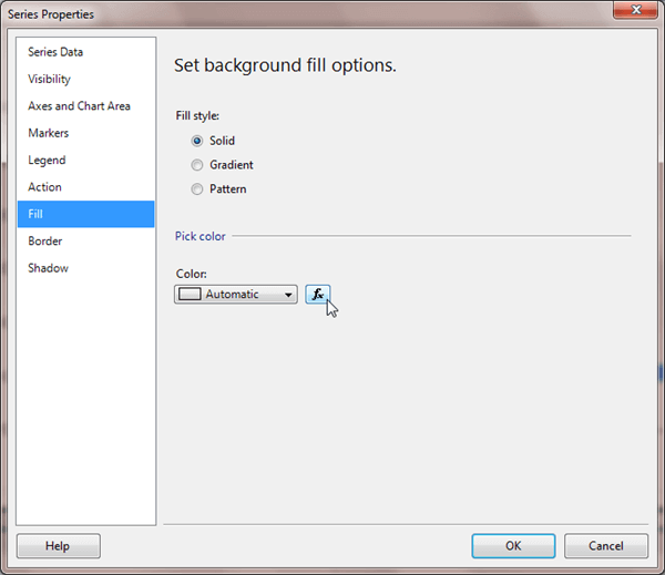
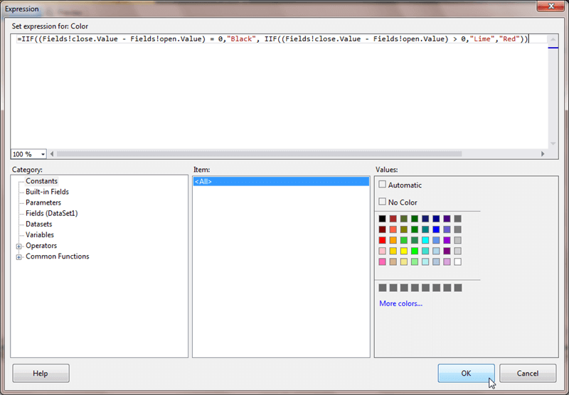
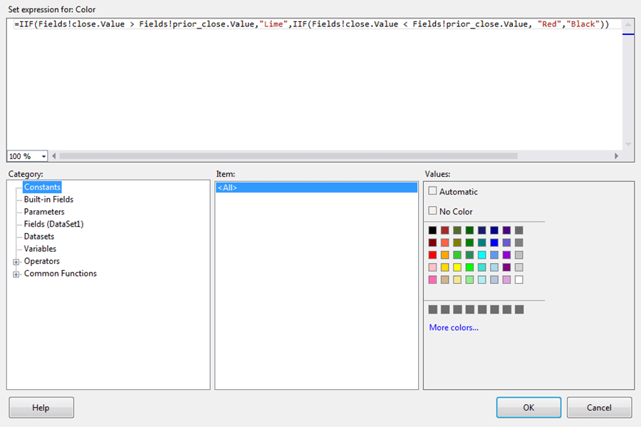
In the Expression dialog box, enter the expression in the screen shot below. The expression assigns one of three colors to a candlestick based on close price versus the open price for a day's end-of-day trading values.
- If the open and close prices are identical, then the candlestick is assigned a Black color
- If the close price is greater than the open price, then the candlestick is assigned a Lime color; the chart uses Lime instead of Green because on some monitors Lime appears more vivid
- If the close price is not equal to or greater than the open price (namely, it is less than the open price), then the candlestick is assigned a Red color
After confirming your color settings, right click the Legend on the chart in Design view. Choose Delete Legend. You do not need a Legend for a Candlestick chart because this kind of chart typically shows just one stock symbol per chart.
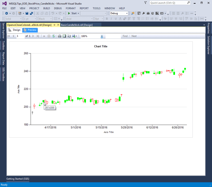
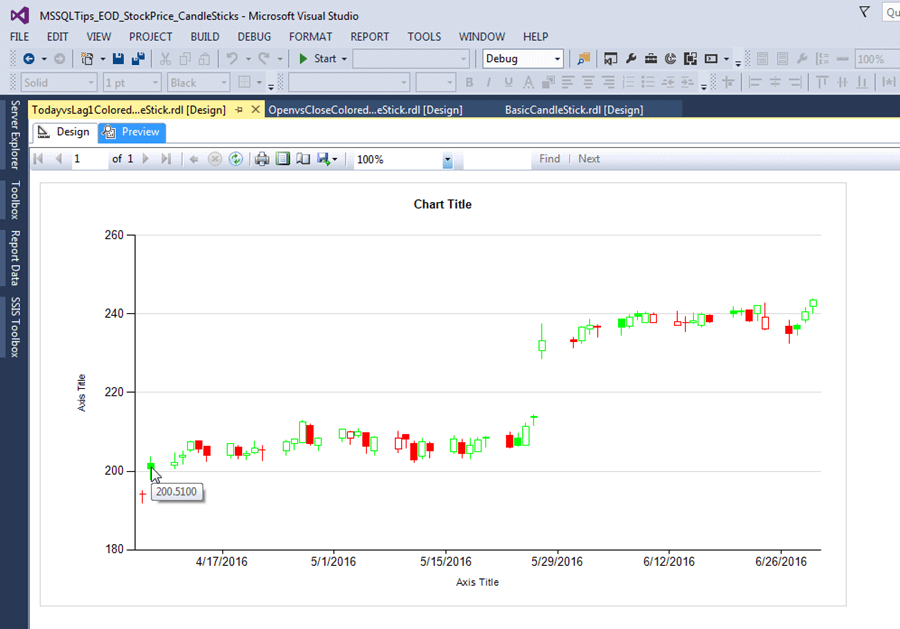
By clicking Preview, you can view the result of your changes for the OpenvsCloseColoredCandlestick chart. The screen shot below shows the chart with the new axis and fill property settings as well as the design tweak to delete the Legend. However, the values for the data points are the same as those created for the BasicCandleStick chart. Therefore, you can view the query design and excerpted values for this chart's query result set in the Query Design screen shot for the BasicCandleStick chart.
The image below shows the chart with the cursor resting on the fifth data point. For this point, the close value of 207.4200 is greater than the open value of 205.4400. Notice that the candle is green to reflect the relationship of the close and open values for the data point. Also, note that the bar for the candlestick is filled.
If the close price is lower than the open price as for the second data point, the candle is red with an open bar.
For its first result set value, the chart shows a box with no height (namely, a horizontal line) and a black color. This is because the close and open prices are the same on this trading day. A Candlestick chart only shows a bar for a candle when the open and close prices are different - the greater the difference, the longer the bar.
Many stock traders and analysts are used to Candlestick charts showing green open bars when the close price is above the open price. Conversely, their Candlestick charts display red closed bars when the close price is below the open price. Microsoft's default way of filling for Candlestick charts is to display closed bars when the close value is greater than the open value.
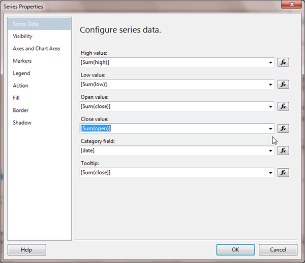
You can, however, readily have SSRS Candlestick charts display similarly to the typical way for stock traders: just flip the close and open price assignments in the Series Properties dialog from what the headings suggest. For example, make your Series Properties look like the following screen shot. Notice how the [Sum(close)] setting is assigned to the Open value property. Similarly, the [Sum(open)] setting is assigned to the Close value property.
When you flip your Open value and Close value property settings as indicated above, then you get a Candlestick chart with green open bars for days when the close price exceeds the open price. Furthermore, the more the close price exceeds the open price, the taller the bar in the candlestick appears. However, when the close price is below the open price, the bar in the candlestick for a day is closed.
When you have completed the Series Properties settings described above, you can save the changed chart with the new settings so that the OpenvsCloseColoredCandleStick.rdl chart file represents bars in the standard way for stock traders. The following screen shot shows the modified CandleStick chart in Preview mode. After saving your settings, you have two charts in the Solution Explorer window for the SSRS project - one named BasicCandleStick.rdl and the other called OpenvsCloseColoredCandleStick.rdl.
Creating a new CandleStick chart from a previously saved Report Definition File
The instructions for creating the OpenvsCloseColoredCandleStick chart started by re-creating manual settings from the BasicCandleStick chart. However, there is another way to base one chart on another. As indicated earlier, an .rdl file, which stands for Report Definition File, contains the settings from any previously created and saved report. Therefore, you can clone one chart from a previously saved .rdl file. This cloning process of copying a previously saved .rdl file allows you to modify a previously created chart without having to duplicate all the steps for the original chart manually. As the number of settings for a chart increases, the advantage of .rdl-based cloning grow.
Let's say we wanted to create a new chart named TodayvsLag1ColoredCandleStick that modifies selected elements of the OpenvsCloseColoredCandleStick chart. To accomplish this, you can save the OpenvsCloseColoredCandleStick.rdl file as TodayvsLag1ColoredCandleStick.rdl. This saves the existing OpenvsCloseColoredCandleStick.rdl file with the new name of TodayvsLag1ColoredCandleStick.rdl.
Your SSRS solution now has two different .rdl files with different names having exactly the same settings. However, only the clone with a new name appears in the Solution Explorer window. Your original .rdl file for the OpenvsCloseColoredCandleStick chart is still in the project's file folder, but it does not show initially in Solution Explorer window. To make the original chart visible in the SSRS Solution Explorer window, simply select Reports in the Solution Explorer window and choose Add, Existing Item. Then, select the OpenvsCloseColoredCandleStick.rdl file. At the end of these steps, all three .rdl files will appear in the project's Solution Explorer window.
The following screen shot shows an excerpt from the Windows folder for the MSSQLTips_EOD_StockPrice_CandleSticks SSRS project. There is one .rdl file for each of the two charts in the SSRS project created at the end of the preceding section. The OpenvsCloseColoredCandleStick chart has one Report Definition File and the BasicCandleStick chart has another Report Definition File. These .rdl files appear highlighted in the screen shot below.
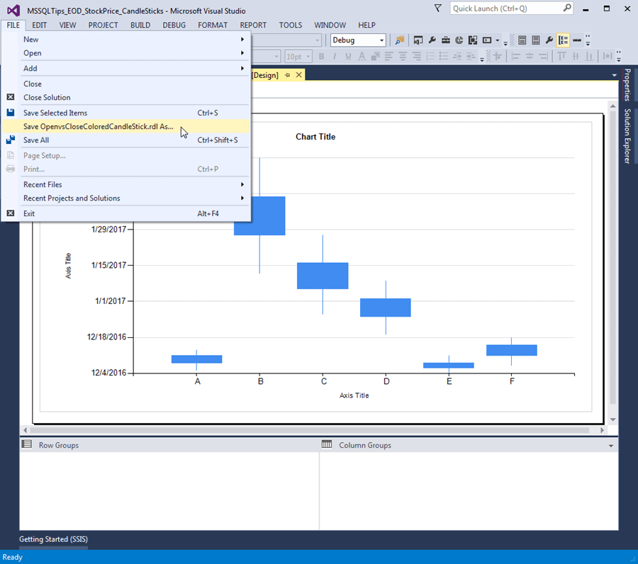
To start the cloning process from inside the SSRS project, you can select the OpenvsCloseColoredCandleStick Design view tab, and choose File Save As menu item for the selected chart. See the screen shot below for this menu selection. Then, you can save the .rdl file with a new name, such as TodayvsLag1ColoredCandleStick. After this, just two .rdl files appear in the project's Solution Explorer window - BasicCandleStick.rdl and TodayvsLag1ColoredCandleStick.rdl. The original OpenvsCloseColoredCandleStick.rdl file is still in the project's Windows folder, but it does not appear in the Solution Explorer window.
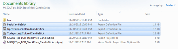
The following screen shot shows the Windows folder for the MSSQLTips_EOD_StockPrice_CandleSticks SSRS project after the File Save As menu item is invoked.
Now, you are ready to add the original .rdl file back into the Solution Explorer window. To accomplish this, right-click Reports in the Solution Explorer window and choose Add, Existing Item. Next, select the OpenvsCloseColoredCandleStick.rdl file, and click Add.
Now, you are ready to tweak the TodayvsLag1ColoredCandleStick chart into one that is different from the last saved version of the OpenvsCloseColoredCandleStick chart. Additionally, both the un-cloned chart and the one to be tweaked are both in the SSRS user interface for easy reference.
The following screen shot shows the T-SQL code in the Query Designer for the TodayvsLag1ColoredCandleStick chart. This query uses a Lag function to compare the current day's close price to the previous day's close price. The Lag function is used for two columns in the result set.
- The prior_close column simply displays the prior day's close price
- The red_green_black column relies on both the Lag function and a Case statement to return a value of Green, Red, or Black depending on the how the close price for the current day compares to the close price from the prior day
- If today's close price is greater than the prior day's close price, then red_green_black is Green
- If today's close price is less than the prior day's close price, then red_green_black is Red
- If today's close price exactly matches yesterday's close price, then red_green_black is Black
Notice that the nested query, to_exclude_min_date, selects data from April 6, 2016 through June 30, 2016. The WHERE clause in the outer query excludes the initial value for April 6 because the Lag function has a NULL value for this data point in the nested query. There is a more efficient way to write the WHERE clause for the outer query, but this formulation in the screen shot emphasizes that we are excluding just the minimum date from the date range of April 6, 2016 through June 30, 2016, which is the date range for the inner, nested query.
The red_green_black column value in the chart's result set depends on the relationship of today's close price relative to the preceding day's close price. However, the original OpenvsCloseColoredCandleStick chart just compares the open and close prices for today's trading data to determine the color of a candlestick. For the TodayvsLag1ColoredCandleStick chart to reflect the red_green_black column values from its query result set, the Series Properties, Fill color expression must be updated. The following screen shot shows an expression that can implement the new color scheme. Notice the expression uses close.Value for today's close price and prior_close.Value for the preceding day's close price. As with the earlier color expression, the Lime color value is used to represent Green.
Since the screen shot below is our second and final change to the TodayvsLag1ColoredCandleStick chart, it is a good idea to save the .rdl file at this point to preserve the changes.
With these two tweaks completed, we are ready to examine the newly formatted TodayvsLag1ColoredCandleStick chart based on the result set values displayed in the preceding Query Design window.
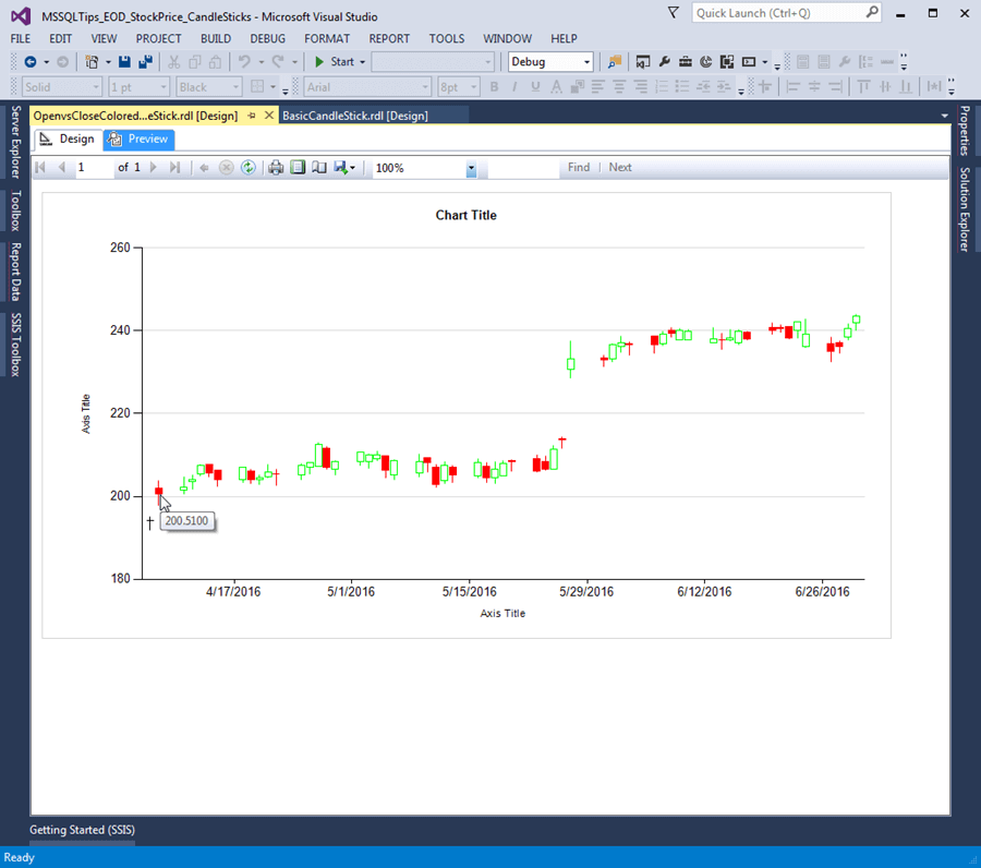
- Notice the cursor rests on the second day of trading data. The second point's close value is 200.5100. This value is greater than the prior_close value of 194.1200. This explains why the bar for the candlestick has a green shade. On the other hand, the close price for the second row in the result set is below the open price (201.9400) so the bar's candlestick is filled.
- The first point's color is now red. This is because the close price for the first row in the result set is below the prior day's close price (194.1200 vs. 194.6700).
- The fifth candlestick has a green shade and an open bar. The color indicates that the close price for the fifth day is greater than the prior day's close price. The open bar confirms that during the day the stock's price rose from its opening price to a higher closing price at the day's end.
- The sixth and seventh candlesticks both have a red color to denote that today's close price is below the prior day's close price. Additionally, the bars for both candlesticks are filled, which indicates that the close prices are below the open prices within each trading day.
Next Steps
This tip can be of value whether or not you are regularly creating Candlestick charts with SSRS. This is because the tip highlights the SSRS user interface for charts generally. Some of these elements will be the same no matter what kind of chart you make in SSRS. Additionally, the tip also illustrates a trick for easily cloning and tweaking one chart based on another. This tip actually applies to any type of SSRS report.
If you are working with end-of-day stock price data either for monitoring your own investments or because you have a job in the financial services industry, then this tip presents an easy and inexpensive way to generate Candlestick charts with SSRS for a SQL Server database. The process for generating the source data for this file is available from this prior tip (Pass Historical Data for Stocks from Google Finance to SQL Server). Also, you can download the SSRS project for this tip which includes all three charts described in this tip. The tip demonstrates how you can readily use a different dataset for any of the three SSRS project charts.
Check out these other SSRS tips:
- SQL Server Reporting Services Development Tips
- SQL Server Reporting Services Charts Tips
- SQL Server Reporting Services Formatting Tips


About the author
 Rick Dobson is an author and an individual trader. He is also a SQL Server professional with decades of T-SQL experience that includes authoring books, running a national seminar practice, working for businesses on finance and healthcare development projects, and serving as a regular contributor to MSSQLTips.com. He has been growing his Python skills for more than the past half decade -- especially for data visualization and ETL tasks with JSON and CSV files. His most recent professional passions include financial time series data and analyses, AI models, and statistics. He believes the proper application of these skills can help traders and investors to make more profitable decisions.
This author pledges the content of this article is based on professional experience and not AI generated.
View all my tips
