By: Koen Verbeeck | Comments | Related: > Reporting Services Development
Problem
I’d like to create a dumbbell plot in SQL Server Reporting Services (SSRS), but the chart type is not available there. How can I create such a visualization in SSRS using the built-in tools?
Solution
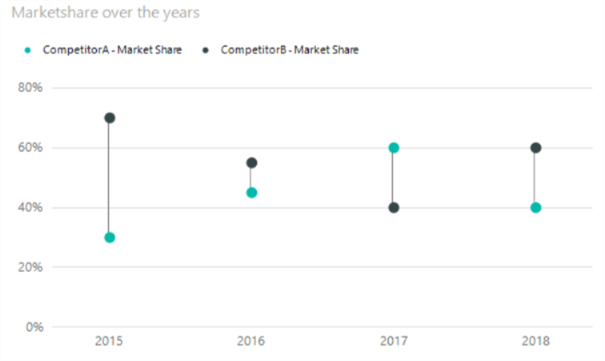
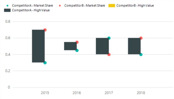
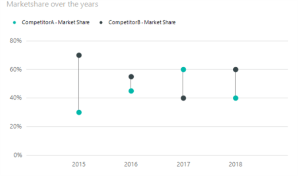
In this tip, we’ll show you how you can create a dumbbell plot using SQL Server Data Tools (SSDT) and the built-in visualization types. A dumbbell plot is a combination of a range chart and a point chart. It typically visualizes a couple of points in time, depicting different categories against each other, for example two political parties, man versus women, two competitors and so on. We would like to create the following visualization, showing market share of two competitors over the different years:
The dumbbell plot is not an available chart type in SSRS, so we’ll need to improvise.
Creating the Dumbbell Plot in SSRS
Test Data
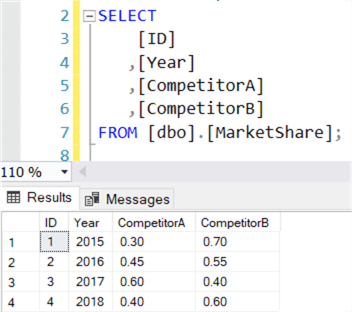
The first step is to get data to show on the plot. With the following SQL statement, you can create a table and populate it with sample data:
CREATE TABLE [dbo].[MarketShare]
(
    [ID]          INT           IDENTITY(1,1) NOT NULL
   ,[Year]        INT           NOT NULL
   ,[CompetitorA] NUMERIC(3, 2) NOT NULL
   ,[CompetitorB] NUMERIC(3, 2) NOT NULL
);

INSERT INTO [dbo].[MarketShare]
(
    [Year]
   ,[CompetitorA]
   ,[CompetitorB]
)
VALUES   (2015,0.30,0.70)
        ,(2016,0.45,0.55)
        ,(2017,0.60,0.40)
        ,(2018,0.40,0.60);
The data has the following format:
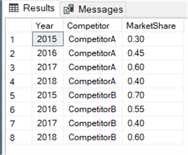
However, to get this data on the chart, we’ll need to reformat it. A better form would be if the data is unpivoted. With the following query we can get the data in the desired format:
SELECT
    [Year]
    ,Competitor  = 'CompetitorA'
    ,MarketShare = [CompetitorA]
FROM [dbo].[MarketShare]
UNION ALL
SELECT
    [Year]
    ,Competitor  = 'CompetitorB'
    ,MarketShare = [CompetitorB]
FROM [dbo].[MarketShare];
The result set:
Since we only have two competitors, the query works fine using UNION ALL. However, if multiple competitors are considered, it might be a better option to use the UNPIVOT operator.
Creating the Dumbbell Plot
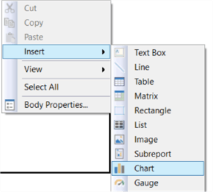
Create a new SSRS report, a connection to your database. Add a data set with the query from the previous section. Add a chart unto the canvas by right-clicking it and selecting Chart from the context menu.
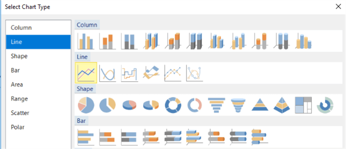
Choose a Line Chart from the various options:
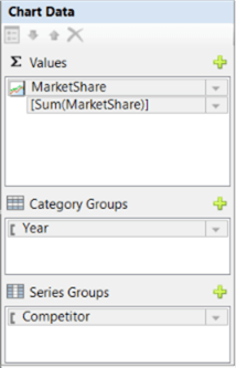
Click on the chart and specify MarketShare as the value, Year as the Category and Competitor as the series.
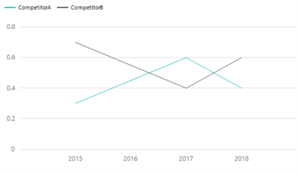
We now have the following line chart:
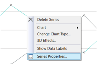
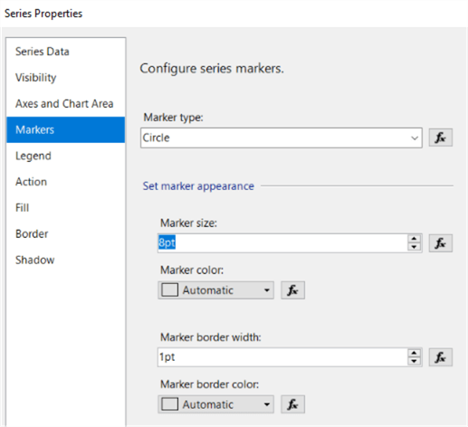
We now need to turn this line chart into a point plot. Right-click on the series and go to its properties.
First, we’re going to show the points by enabling the markers in the Markers pane. Choose Circle as the marker type and set the size to 8 points.
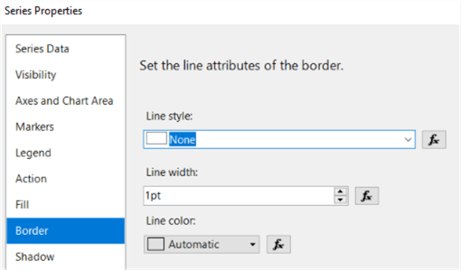
Next, we’re going to hide the lines themselves. Go to the Border pane and set the Line Style to None.
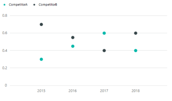
We now have the following visualization:
The next step is to add the lines between each two points. Before we can do this, we need some extra data: the start and end point for each line. Using window functions, we can adjust the query like this to find the high and low value for each year:
WITH CTE_MarketShare AS
(
    SELECT
        [Year]
       ,Competitor  = 'CompetitorA'
       ,MarketShare = [CompetitorA]
       ,[Sign]      = SIGN([CompetitorB] - [CompetitorA])
    FROM [dbo].[MarketShare]
    UNION ALL
    SELECT
        [Year]
       ,Competitor  = 'CompetitorB'
       ,MarketShare = [CompetitorB]
       ,[Sign]      = NULL
    FROM [dbo].[MarketShare]
)
SELECT
    [Year]
   ,[Competitor]
   ,[MarketShare]
   ,LowValue        = IIF(Competitor = 'CompetitorB'
                            , NULL
                            ,MIN([MarketShare]) OVER(PARTITION BY [Year])
                         )
   ,HighValue       = IIF(Competitor = 'CompetitorB'
                            , NULL
                            ,MAX([MarketShare]) OVER(PARTITION BY [Year])
                         )
   ,[Sign]
FROM [CTE_MarketShare];
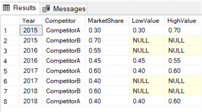
You can read all about window functions in the window functions tutorial. Since we only need to draw the line once, we calculate it only for CompetitorA and set it to NULL for CompetitorB. The result set:
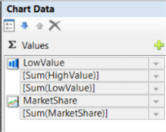
Let’s add this data to the chart. In the chart data, click on the green plus icon next to Values. Select LowValue (or HighValue) from the context menu.
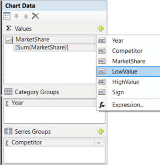
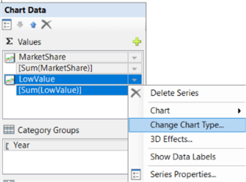
This new value series will default to extra lines on the chart. Click on the arrow next to LowValue and choose Change Chart Type… from the menu.
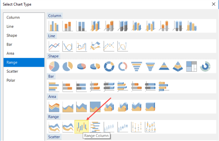
The visualization option that comes closes to “a floating line” is the Range Column. Select this option.
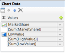
In the chart data, we need to specify the low and high point of the column. These are the high and low value from the query.
We now have the following chart:
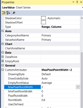
We’re getting close. There’s no option in the editors though to specify the width of the column. However, there is one property buried deep in the property menu: MaxPixelPointWidth.
When we set this to two, we get the desired effect of the dumbbell plot:
Formatting the Dumbbell Plot
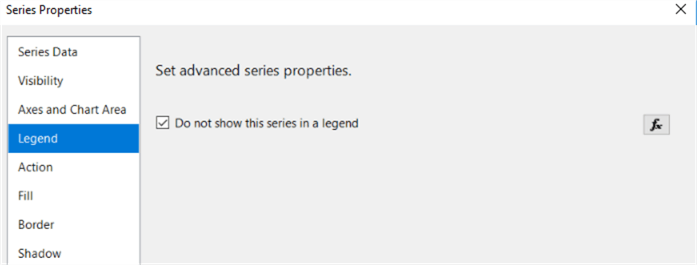
As a finishing touch, we’re going to format the chart so it confirms more to best practices. First, we’re going to hide the legend for the range columns. Click on the series and in the properties, go to the Legend pane. Simply disable the legend there.
Some minor changes:
- Add a chart title and make the font size a bit bigger
- Format the vertical axis as a percentage
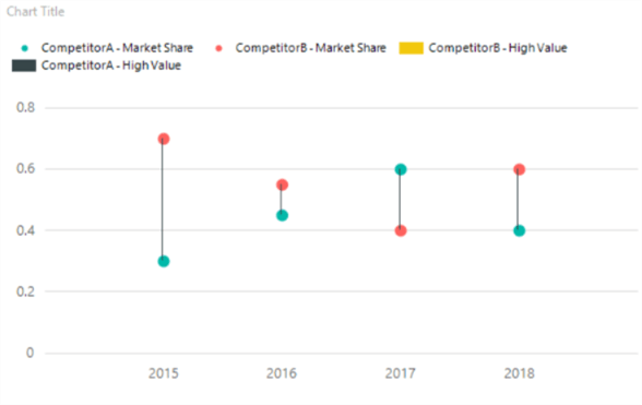
When you look closely to the chart, you can see the lines are drawn over the points:
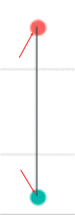
To get rid of this effect, the line needs to be drawn “before” the points are drawn. Simply change the order of the values in the chart data, so the range column appear first:
We now have the following chart:
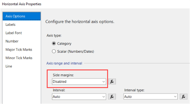
As the cherry on the pie, let’s change the margins of the horizontal axis so less white space is used. Right-click on the horizontal axis and go to its properties. In the Axis Options pane, set the side margins to Disabled.
The dumbbell plot is now finished:
Next Steps
- You can follow along with the instructions in this tip to create your own dumbbell plot.
- More tips about creating charts in SSRS:
- Creating a box plot graph in SQL Server Reporting Services
- Create a Treemap Graph in SQL Server Reporting Services 2016
- How to create a heat map graph in SQL Server Reporting Services 2016
- How to create a Sunburst Graph in SQL Server Reporting Services 2016
- How to Create a Slope Chart in SSRS part 1 and part 2.
- For more Reporting Services tips: Reporting Services Tips.


About the author
 Koen Verbeeck is a seasoned business intelligence consultant at AE. He has over a decade of experience with the Microsoft Data Platform in numerous industries. He holds several certifications and is a prolific writer contributing content about SSIS, ADF, SSAS, SSRS, MDS, Power BI, Snowflake and Azure services. He has spoken at PASS, SQLBits, dataMinds Connect and delivers webinars on MSSQLTips.com. Koen has been awarded the Microsoft MVP data platform award for many years.
This author pledges the content of this article is based on professional experience and not AI generated.
View all my tips
