By: Nai Biao Zhou | Updated: 2023-08-24 | Comments (1) | Related: > Microsoft Excel Integration
Problem
DAX, which stands for Data Analysis eXpression, is a query and functional language (Seamark, 2018). Data analysts can use DAX to solve business problems over a data model. Several business intelligence tools, such as Microsoft Power BI, Microsoft Power Pivot for Excel, and Microsoft Analysis Services, adopt this formula language. When using DAX to build efficient data models, data analysts can spend less time on data preparation and more time discovering insights in the data. However, DAX sounds intimidating to data analysts with limited programming backgrounds. How do these data analysts learn fundamental DAX?
Solution
DAX is a simple language, and many DAX functions are similar to Excel functions. Therefore, people already using Excel can use DAX in their data preparation tasks in a few hours. Let us look at how to write an Excel formula. As shown in Figure 1, in order to compute the sum of the "Sales Revenue" column in the Excel table "SalesRevenue," we type an equal sign, followed by the function name "SUM" and the required argument "SalesRevenue[Sales Revenue])" that represents the "Sales Revenue" column in the table.
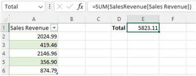
Figure 1 An Excel formula adds all the numbers in a column
Like Excel, DAX also provides the SUM function that adds all the numbers in a column. As shown in Figure 2, we create a measure that computes the sum of sales revenue. The syntax used to create the measure in this example is the same as in the Excel formula. Note that we use the ":=" assignment operator to create the measure "Total" in Excel. By the way, Power BI uses the "=" assignment operator to create a measure.
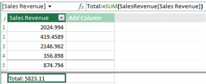
Figure 2 A DAX formula adds all the numbers in a column
The comparison between formulas in Figure 1 and Figure 2 implies that learning the basics of DAX is straightforward and relatively easy for Excel users to pick up. A good understanding of DAX's most fundamental concepts is sufficient for us to start using DAX. However, we should know that some advanced concepts are complicated, such as evaluation contexts, iterations, and context transitions (Ferrari & Russo, 2019).
To practice using DAX functions, we design a data analysis project that analyzes sales data from a fictitious multinational manufacturing company, i.e., Adventure Works Cycles. The company uses a relational database for daily business operations. We want to create reports that answer the following four typical questions:
- How does sales revenue vary by month for each product category?
- How does online sales revenue vary by month for each product category?
- What do the underlying trends look like after using the 3-month moving average technique to smooth data?
- How do specific product categories contribute to the monthly total sales?
We start with an Excel workbook that contains a data model and sales transaction data. We can click here to download the workbook. Next, we use DAX to extend the data model. We then create pivot reports using Microsoft® Excel® for Microsoft 365 MSO (Version 2303 Build 16.0.16227.20202) 32-bit to answer the business questions.
The reports should look like Figure 3. The first pivot table can answer questions 1 and 2, while the line chart answers question 3. We can answer question 4 by looking at the second pivot table.
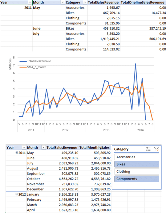
Figure 3 The Sales summary reports
While walking through the process of creating the pivot report, we explore the following techniques and DAX functions:
- Creating calculated columns.
- Creating measures.
- SUM
- CALCULATE
- IF
- ISBLANK
- BLANK
- DATESINPERIOD
- LASTDATE
- MAX
- ALL
- ALLEXCEPT
1 – Starting with the Data Model
A data model is a set of tables linked by relationships (Ferrari & Russo, 2019). After creating a data model in a workbook, we can create pivot tables from the data model. If we have a well-designed data model filled with good quality data and the reporting requirements are simple, we can create a pivot report without explicitly using DAX language (Horne, 2020). This way, we can drag and drop data fields to a pivot table in Excel and answer the business questions. Behind the scenes, when we add a numeric field to a pivot table, Excel automatically creates an implicit measure.
1.1 View the Data Model Diagram
Open the downloaded workbook. Click the Data -> Manage Data Model command to open the Power Pivot for Excel window. Select the Home -> Diagram View command to show the data model diagram, as shown in Figure 4. The data model has three tables: SalesTransaction, ProductCategory, and Calendar. There are associations between these tables.
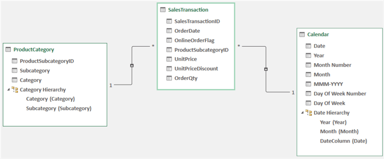
Figure 4 The initial data model in the Excel workbook
1.2 Examine Tables
A table in the data model is a set of rows containing information about a single entity, such as a product category, a sales transaction, or a calendar date. Every row in the table represents an entity instance, and every column represents an instance's attribute. Each table should have a primary key that identifies a row and defines the lowest level of information stored in the table (i.e., granularity, a fundamental concept in data analysis).
The ProductCategory table contains data about product categories and subcategories. The column ProductionSubcategoryID has unique values, and each value determines a production subcategory. Therefore, this column is the table's primary key, and each row represents a product subcategory. The table name seems misleading. Figure 5 shows the sample data in the tables. Note that the values in the Category column are not unique.
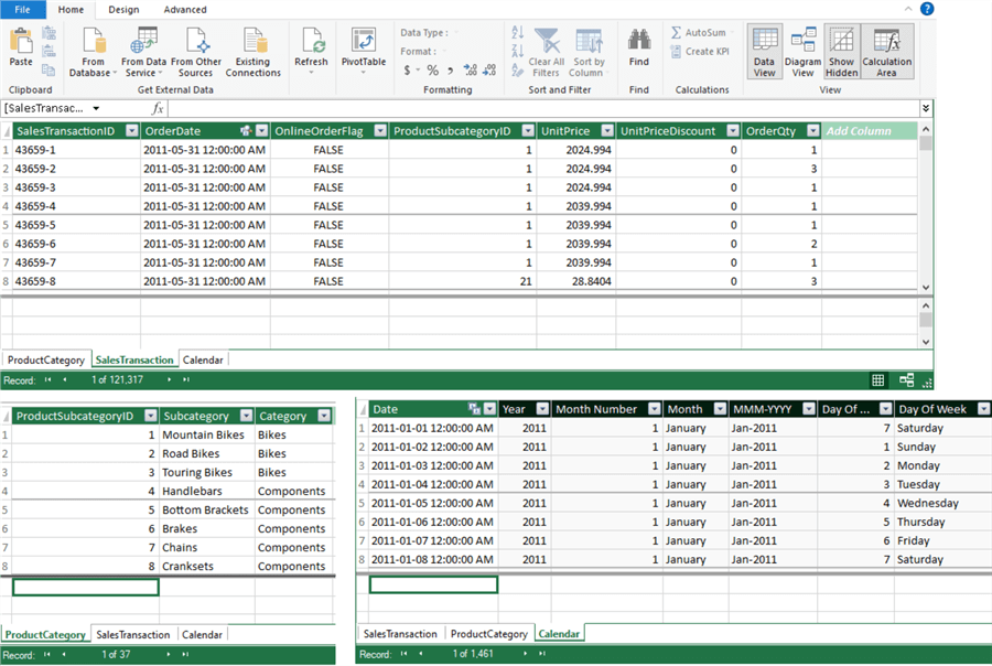
Figure 5 Sample data in the tables
The SalesTransaction table contains sales transaction information. The table has a column ProductSubCategoryID. Therefore, we can link these two tables through the ProductSubCategoryID. We can expand the SalesTransaction table with more product category information by joining these two tables. We call the column ProductSubCategoryID a foreign key. A foreign key is a column (or combination of columns) in one table that refers to a primary key in another.
The Calendar table contains every day from 2011-01-01 to 2014-12-31. The primary key is the Date column, which links to the OrderDate column in the SalesTransaction table; therefore, the OrderDate column is a foreign key in the SalesTransaction table. The other columns (attributes) in the Calendar table provide more information about the day, for example, Year, Month, and Day of the Week.
1.3 Inspect Table Relationships
A relationship, represented by a line connecting the two tables in the model diagram, is a link between these two tables. The diagram demonstrates a relationship between the ProductCategory and SalesTransaction tables. A single production subcategory corresponds to many sales transactions. In contrast, a single sales transaction only links to a single production subcategory. We call this relationship a one-to-many relationship. The ProductCategory table is the one-side of the relationship, denoted with a 1. At the same time, the SalesTransaction is the many-side of the relationship, denoted with a *.
The data model diagram also shows an arrow in the middle of a connection line. The arrow represents the filtering direction, which always starts from the one-side of the relationship to the many-side. With each category in the ProductCategory table, we can count the sum of OrderQty in the SalesTransaction table. To demonstrate the concept, let us create a pivot table from the data model (Zhou, 2023). We drag and drop the Category field of the ProductCategory table to the Rows area and the OrderQty field of the SalesTransaction table to the Values area. The pivot table should look like Figure 6.
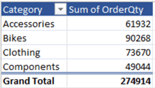
Figure 6 Filtering occurs from the one-side of the relationship to the many-side
Because of the one-to-many relationship between the ProductCategory and SalesTransaction tables, Excel filters sales transaction data according to the category on the rows. For example, the first row of the Sum of OrderQty column in Figure 6 shows the total number of ordered products in the Accessories category. For testing purposes, we can delete the one-to-many relationship and obtain another pivot table which should look like Figure 7. Since the filtering on the SalesTransaction table does not happen, the table shows the same value for all the rows, i.e., the total number of ordered products in the SalesTransaction table.
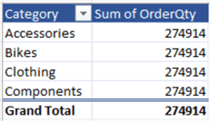
Figure 7 Filtering does not happen when there is not a one-to-many relationship between the two tables
Suppose business users only have interests in the number of ordered products, and the reports that look like Figure 5 can satisfy the requirements. In that case, we do not need to use DAX to create measures. The implicit measure (i.e., the Sum of OrderQty) is sufficient. However, the data model and the report cannot answer the four business questions mentioned earlier; therefore, we should use DAX to extend the data model.
2 – Creating a Calculated Column in the Data Model
Sales revenue is a critical determinant of profitability for a business. However, we cannot find the sales revenue data from the data model. We have UnitPrice, UnitPriceDiscount, and OrderQty columns in the SalesTransaction table. Therefore, we create a calculated column to extend a table using DAX.
2.1 Create a Calculated Column to Extend a Table
To calculate the sales revenue, we multiply the number of products or services sold by the price per unit (Kelly, 2020). When the business applies a discount to the price, we use the following formula to compute sales revenue:
Sales Revenue = Units Sold X (1 - Discount) X Sales Price
The DAX query engine evaluates the calculated column on a row-by-row basis within the table. The computation happens during the table processing phase but not during the query execution phase. Therefore, adding a calculated column to a data model increases data refresh time. In addition, a calculated column occupies some space in the computer memory (Russo, 2022).
2.1.1 Create the Sales Revenue Column. Open the downloaded workbook and click the Data -> Manage Data Model command to open the Power Pivot for Excel window. By default, the window shows the Data View of the model, as shown in Figure 5, in which we can perform data-driven tasks such as creating calculated columns. Next, select the SalesTransaction table (tab). Then, scroll to the right-most column, an empty column labeled Add Column. After clicking on the first empty cell in the column, we enter the following formula in the formula bar:
= [UnitPrice] * (1 - [UnitPriceDiscount]) * [OrderQty]
The formula begins with an equal sign operator (=). Multiplication (*) and subtraction (-) are mathematical operators. The referenced columns [UnitPrice], [UnitPriceDiscount], and [OrderQty] should always be inside brackets []. We calculate a value for each row in the calculated column using values of the referenced columns for the current row. The calculated column formula does not directly access the values of other rows.
Next, hit the Enter key to confirm the entry. The calculated values appear in the column. By default, the name of the new column is Calculated Column 1. We should always assign a column a meaningful name. Therefore, we double-click the column name and change the name to SalesRevenue. The SalesTransaction table should look like Figure 8.
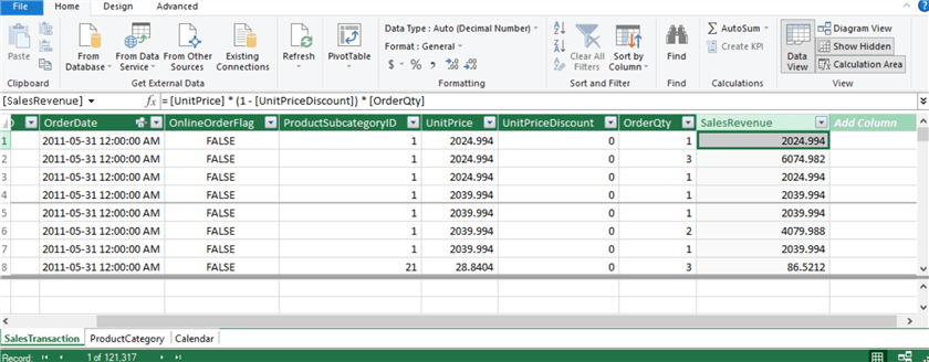
Figure 8 Add a calculated column
In addition to these DAX operators, we can use DAX functions, such as the CONCATENATE function, to create calculated columns (Zhou, 2023). To review a list of functions we can use in the formula, we click the Insert Function (fx) button on the left of the formula bar to open the Insert function dialog. Figure 9 shows the Select a Function list box that displays all available functions.
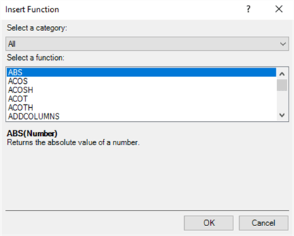
Figure 9 The Insert Function dialog
Switch to the Calendar table (tab). All columns Except the Date column are calculated columns, as shown in Figure 10. The following block lists all formulas used in these calculated columns. We added short comments within the DAX code to explain the formulas. The comments beginning with two forward slashes (//) are a great way to make code easier to understand (McKay, 2020).
=YEAR([Date])              // column: Year
=MONTH([Date])             // column: Month Number
=FORMAT([Date],"MMMM")     // column: Month
=FORMAT([Date],"MMM-YYYY") // column: Month-YYYY
=WEEKDAY([Date])           // column: Day of Week Number
=FORMAT([Date],"DDDD")     // column: Day of Week
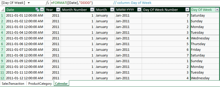
Figure 10 The Calculated columns in the Calendar table.
2.1.2 Understand Row Context. DAX calculates
the values for each row in the SalesRevenue column because it has the context: for
each row, it uses the formula = [UnitPrice] * (1 - [UnitPriceDiscount]) * [OrderQty]
to calculate a value on one row at a time. Every row in the table has a different
row context. For example, in the first row in
Figure 8,
the value of 2024.994 in the current row was calculated from the value of 2024.994
in the UnitPrice column, the value of 0 in the UnitPriceDiscount column, and the
value of 1 in the OrderQty column.
The easiest way to think of row context is the current row in a table. Excel determines values in a calculated column based on the row context. When we load data into a data model from data sources, Excel evaluates the formula that defines the calculated column for every row in the table.
2.2 Change the Data Format for a Calculated Column
When we create a new column in a data model, Excel automatically applies data types and formats. For example, the calculated column SalesRevenue, as shown in Figure 8, has a data type of Decimal Number. The auto-detected data type is appropriate in this case; however, we want to use a comma to separate groups of thousands. Additionally, all values in the column should have two decimal places. We can format this column in the data model; then, by default, all reports that get data from this data model use the same format defined in the data model (Thomas, 2022). This way, it is convenient for us to maintain format consistency across reports.
Select the calculated column (i.e., SalesRevenue). Then, we can use the commands in the Formatting group on the Home tab to change the formats. As shown in Figure 11, the format of the SalesRevenue column satisfies our requirements. We can use the commands in the Formatting group to format any columns.
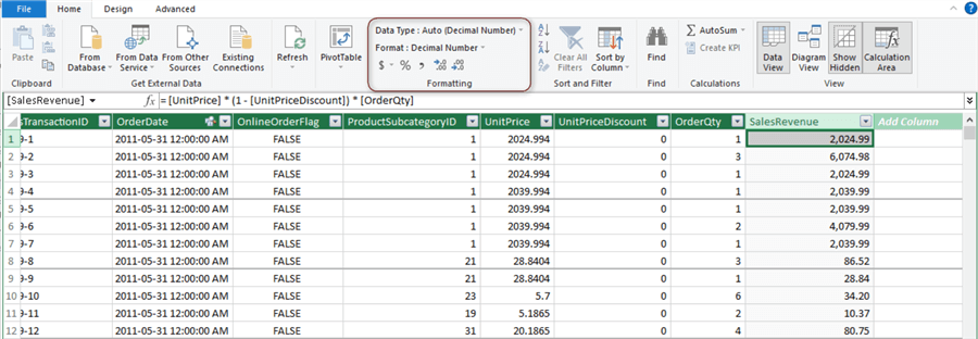
Figure 11 Format the calculated column
3 – Creating Measures in the Data Model
Measures are another method to extend a DAX data model. Rather than performing calculations row-by-row, we use measures to aggregate values from many rows in a table. A measure does not add data to the memory space that a data model uses. However, it may impact the speed of user interactions because Excel evaluates measures at query time.
3.1 Compute the Total Amount of Sales Revenue for Every Month and Product Category
We want to create a measure that calculates the total revenue. We then can answer the first business question, i.e., How does sales revenue vary by month for each product category? DAX language provides many aggregation functions that return a scalar value (SQLBI, 2023). The SUM function adds all the numeric values in a column and returns the calculation result. Here is the syntax for using the function:
SUM (table[column])
The function returns a blank value if there are no rows in the table with a non-blank value.
3.1.1 Create a Measure Formula to Sum Sales Revenue. Activate the Power Pivot for Excel window and show the data model in the Data View mode. Next, switch to the SalesTransaction table (tab). Below the table is the Calculation Area where we can create, edit, and manage measures within the model. Click the Home -> Calculation Area command in the View group to display the Calculation Area if the area does not appear. Then, click on any empty cell in the Calculation Area and add the following line into the formula bar:
TotalSalesRevenue:=SUM(SalesTransaction[SalesRevenue])
Press the ENTER key to confirm the entry. The formula adds all the numbers in the SalesRevenue column from the SalesTransaction table. We can find the return in the Calculation Area, as shown in Figure 12. Like formatting columns, we use the commands in the Formatting group to format measures. We can put measures to any table without affecting the calculation. However, we often store measures in tables that provide data for calculation. Some may prefer a dedicated table to store some or all the measures (Allington, 2019).
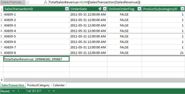
Figure 12 Create a measure to compute the total sales revenue.
When creating a pivot table from the data model, we can find the measure in the SalesTransaction table. An "fx" icon beside the field can differentiate the measure from other columns (including the calculated columns). We can only drag and drop the measures to the Values area. We cannot place the measures in Filters, Columns, and Rows areas. However, we can place calculated columns in any area. Figure 13 shows a pivot table we created from the data model (Zhou, 2023). This table demonstrates how each product category's sales revenue varies by month.
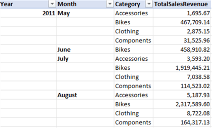
Figure 13 Shows sales revenue by month for each product category
3.1.2 Understand Filter Context. The filter context is more complex than the row context. The easiest way to think of filter context is by looking at filters currently active on the data model. When we create a pivot table, each row (or column) filters the entire SalesTransaction table. Figure 14 demonstrates the filter context within the highlighted cell. With a unique filter context generated by row selection, we can present each product category's total sales by month even though the TotalSalesRevenue measure seems to sum sales revenue over the entire SalesTransaction table.
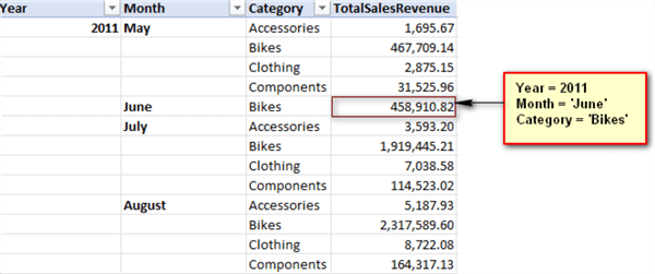
Figure 14 The filter context within a cell
The Year and Month data is from the Calendar table, the Category data is from the ProductCategory table, and the SalesRevenue data is from the SalesTransaction table. The data model diagram in Figure 4 presents their relationships. With a one-to-many relationship between two tables, a filter applied to the table on the one-side of the relationship can automatically filter the table on the many-side (Horne, 2020). Therefore, the row selection filters from the other two tables can apply to the SalesTransaction table.
We can implicitly use row, column, slicer, and filter selection to create filter context. Alternatively, the CALCULATE function can create an explicit filter context. The CALCULATE function is arguably one of the most important (and most popular) DAX functions (Wanka, 2019). The CALCULATE function can completely change the filter context that comes from visuals (Gharani, 2021). The syntax of the function looks like the following:
CALCULATE(<expression>[, <filter1> [, <filter2> [, …]]])
The first argument, the expression, is mandatory. Then, the function can take one or more optional filter arguments. All the filters are evaluated together, and their order does not matter. We can use these filters to override all existing filters or supplement the existing filters with other filters. There are three types of filters:
- Boolean filter expressions
- Table filter expressions
- Filter modification functions
When we do not pass any filter to the function, DAX evaluates the expression in the implicit filter context. For example, the following formula returns the same value as the formula used in Section 3.1.1.
TotalSalesRevenue:=CALCULATE(SUM(SalesTransaction[SalesRevenue]))
3.2 Evaluate Measures with a Boolean Filter Expression
A Boolean expression filter is a traditional filter that evaluates TRUE or FALSE. For example, the following formula calculates the sum of online sales revenue:
TotalOnelineSalesRevenue:=
CALCULATE(
   SUM(SalesTransaction[SalesRevenue]),
   SalesTransaction[OnlineOrderFlag] = TRUE
)
The CALCULATE function evaluates the expression in a modified filter context that restricts the calculation only to include rows where OnlineOrderFlag = TRUE. We use the formula to create a new measure, TotalOnelineSalesRevenue. Figure 15 demonstrates the modified filter context within the highlighted cell.
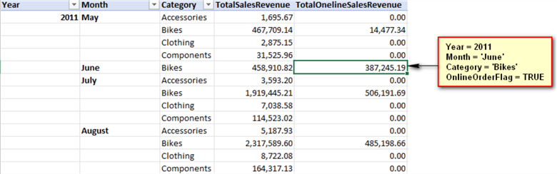
Figure 15 The modified filter context within a cell
The comparison between Figure 14 and Figure 15 indicates that the TotalOnelineSalesRevenue measure applies a filter for the OnlineOrderFlag column in addition to the implicit filter context. There may be a conflict between the filters explicitly defined in the CALCULATE function and the implicit filter context. In this case, the filters from the CALCULATE function win (Gharani, 2021). Let us create a measure to sum sales revenue of bikes in Jun 2011:
BikesSalesRevenueJun2011:=CALCULATE(
   SUM(SalesTransaction[SalesRevenue]),
   ProductCategory[Category] = "Bikes",
   'Calendar'[Year] = 2011,
   'Calendar'[Month] = "June"
)
Figure 16 shows the values of this measure in different cells. For every row selection, the value does not change because the explicit filters specified in the CALCULATE function override the row selection filters. Note that the measure has value for every combination of Year, Month, and Category, even though there is no sales transaction. This observation helps us understand that Excel evaluates a measure on a table rather than a row-by-row basis.
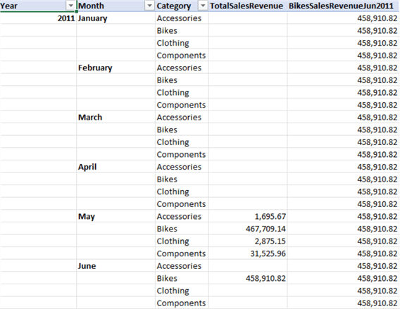
Figure 16 Explicit filter context overrides existing implicit filter context
We do not want to show values where there is no sales transaction. We can use the IF, ISBLANK, and BLANK functions to make a cell blank when products in that category have no sales that month. The IF function checks a condition and returns the first value when the condition is TRUE; otherwise, the function returns the second value. The syntax looks like the following:
IF(<logical_test>, <value_if_true>[, <value_if_false>])
The ISBLANK function checks whether a value is blank and returns TRUE or FALSE. The BLANK function returns a blank. Then, we re-write the formula to compute the BikesSalesRevenueJun2011 measure:
BikesSalesRevenueJun2011:=
IF(ISBLANK(SUM(SalesTransaction[SalesRevenue])),
BLANK(),
CALCULATE(
   SUM(SalesTransaction[SalesRevenue]),
   ProductCategory[Category] = "Bikes",
   'Calendar'[Year] = 2011,
   'Calendar'[Month] ="June")
)
The measure returns a blank value when a value in the TotalSalesRevenue column is blank. As shown in Figure 17, the pivot table does not show items with no data on rows.
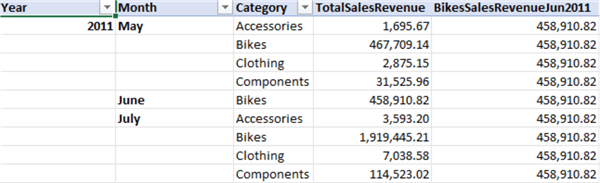
Figure 17 Hide Items with no data on rows
3.3 Evaluate Measures with a Table Filter Expression
The table expression filter implements a table object as a filter. The filter could be a reference to a model table. It also could be a function that returns a table object. In addition, we can use the FILTER function to apply complex filter conditions that a Boolean filter expression cannot define.
We want to use the simple moving average (SMA) to smooth a series of data points and reveal underlying trends. We compute an average by dividing the sum of the data values in a dataset by the size of the dataset. To "move" the average, we remove the first item in the dataset, append a new item, and then average the dataset. When we compute moving averages for a time series, the averages form a new time series. The new time series becomes flat because the calculation removes rapid fluctuations (Zhou, 2021).
We use the DATESINPERIOD function to construct a table containing a data column in a defined period. Here is the syntax of the function:
DATESINPERIOD(<dates>, <start_date>, <number_of_intervals>, <interval>)
We also need to use the LASTDATE function that returns the last date in the current context. The syntax should look like the following:
LASTDATE(<dates>)
The following expression returns a table that contains a column of dates from the past three months:
DATESINPERIOD('Calendar'[date],LASTDATE('Calendar'[date]),-3,Month)
When calculating the moving average of the past three months, we sum up the sales revenue for the previous three months and divide it by the month count (Ranjan, 2023). The following formula implements this method:
SMA_3_month:=CALCULATE(
      SUM(SalesTransaction[SalesRevenue]),
      DATESINPERIOD('Calendar'[date],LASTDATE('Calendar'[date]),-3,Month)
)/3
However, as shown in Figure 18, the first two averages are incorrect. The formula always divides the total sales revenue by three. However, we cannot calculate the 3-month moving average for the first two months because 3-month data is unavailable.
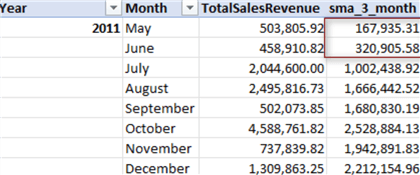
Figure 18 Simple moving average with errors
For the sake of simplicity, we write fixed conditions into the DAX formula to hide the first two values. We use the MAX function for the evaluation because these columns have many values.
SMA_3_month:=IF(MAX('Calendar'[Year]) = 2011
         && (MAX('Calendar'[Month]) = "June" || MAX('Calendar'[Month]) = "May"),
      BLANK(),
      CALCULATE(
      SUM(SalesTransaction[SalesRevenue]),
      DATESINPERIOD('Calendar'[Date],LASTDATE('Calendar'[Date]),-3,Month))/3
      )
Figure 19 shows the plot of the moving averages. The SMA line is smoother than the monthly sales, simplifying the trend analysis process (Ranjan, 2020).
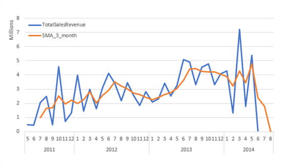
Figure 19 Simple moving average
3.4 Evaluate Measures with Filter Modifier Functions
Filter modifier functions provide us with more additional control over the filter context. We often use these two functions to remove applied filters (SQLBI, 2023):
- ALL: ignores filters on a table or the specified columns; therefore, returns all the rows in the table or all the values in the columns.
Syntax: ALL([<table> | <column>[, <column>[, <column>[,…]]]])
We can use this function to clear filters and create calculations on all the rows in a table.
- ALLEXCEPT: removes all context filters in the table except those on the specified columns.
Syntax: ALLEXCEPT(<table>,<column>[,<column>[,…]])
We can use this function to remove many filters from a table.
We can assume the report has a Category slicer, as shown in Figure 20. This way, users can look at sales revenue for specific product categories. We want to add a new column beside the TotalSalesRevenue column. The new column provides total monthly sales revenue regardless of the category selection.
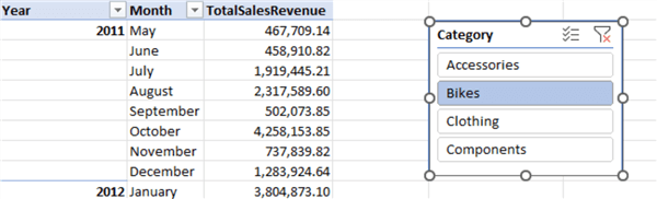
Figure 20 Use a slicer to filter the pivot table
We can use the ALL function to ignore the Category selection. The following formula uses the function to remove the filter on Category selection and calculate the sum over the remaining rows after row selection (i.e., Year and Month) on the SalesTransaction table. This way, Excel summarizes sales revenue over the selected Year and Month (the implied context filter) and for all Category values.
TotalMonthlySales:=CALCULATE(
   SUM(SalesTransaction[SalesRevenue]),
   ALL(ProductCategory[Category]))
Figure 21 demonstrates the new column, TotalMonthlySales. When we select different categories in the Category slicer, the values in the TotalSalesRevenue column change accordingly, but those in the TotalMonthlySales column do not. This way, we can determine how much the selected product categories have contributed to the monthly sales.
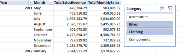
Figure 21 The TotalMonthlySales column ignores the Category selection in the slicer
3.5 Get Values from the Data Model Directly
When creating a report, we may need to include a measure value in the title or elsewhere. In this case, a pivot table may not work for us. For example, we want a specific cell to show the sales revenue for bikes in May 2011. We can use the Excel function CUBEVALUE to retrieve a single value from the measure defined in the data model. Here is the syntax for using the function:
CUBEVALUE(connection, [member_expression1], [member_expression2], …)
The first argument is a connection, always ThisWorkbookDataModel in an Excel data model (Allen, 2020). The first member expression tells what data we want to retrieve from the data model. The other member expressions act as filters. The following formula retrieves the sales revenue for bikes in May 2011:
=CUBEVALUE("ThisWorkbookDataModel","[TotalSalesRevenue]",
"[Calendar].[Year].&[2011]",
"[Calendar].[Month].&[May]",
"[ProductCategory].[Category].&[Bikes]")
This formula returns the total bike sales in May 2011 from the data model. Figure 22 demonstrates the value returned.
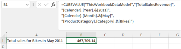
Figure 22 Get values from the data model directly
4 – Comparing Calculated Columns and Measures
Calculated columns and measures use DAX expressions but operate very differently. We use calculated columns to create new columns in a table, while we use measures to aggregate the values of rows. In addition, Excel evaluates the values in calculated columns when we define them or during a dataset refresh. In contrast, measures are computed at query time when values on a report use them. When creating a pivot table, we can place a calculated column in all areas; however, we can only place a measure in the Values area. These differences help determine when to use calculated columns and when to use measures.
We prefer to use a calculated column whenever we want to do the following tasks (Horne, 2020):
- Place the calculated values in a slicer.
- Place the calculated values in a pivot table's rows, columns, or filters.
- Place the calculated values on the axes of a chart.
- Use the calculated value as a filter condition in a DAX query.
- Define an expression that is strictly bound to the current row.
In all other cases, we prefer to use measures because they do not consume memory and disk space.
Summary
DAX is a functional language used in some self-service BI tools. DAX can solve data analysis problems based on a collection of functions, operators, and constants. Many DAX functions are very similar to functions in Excel; therefore, it is easy for users to get started. We can use DAX to extend data models and create new information from data already in the models.
As a beginner, we aim to use DAX functions to answer business questions quickly. In this tip, we defined four typical business questions. We then used DAX to create metrics to answer these questions. We provided a step-by-step process to create Excel reports. We recommended that users follow those steps to create the Excel reports and know how to use some DAX functions.
We started by examining a data model, a set of tables linked by relationships. We then covered the technique to create a calculated column. We introduced row context to have a better understanding of the calculated column.
Next, we discussed measures. We explored one of the most powerful functions in DAX, the CALCULATE function. The function allows us to alter the filter context. The tip provided three examples to show how to modify filter context. We also introduced the CUBEVALUE function, which could directly retrieve a value from a data model.
Finally, the article compared measures to calculated columns. Measures differ from calculated columns in the context of evaluation. We can use a calculated column in a report like any other column in a table. However, measures have some restrictions; for example, we cannot use measures as filter conditions in a DAX query. We recommend using measures when possible.
Reference
Allen, B. (2020). Cube Formulas – The Best Excel Formulas You’re Not Using. https://macrordinary.ca/2020/08/19/cube-formulas-the-best-excel-formulas-youre-not-using/.
Allington, M. (2014). 5 common mistakes made by self taught DAX students. https://p3adaptive.com/2014/10/5-common-mistakes-made-by-self-taught-dax-students/.
Allington, M. (2019). Using Measure Tables in Power BI. https://exceleratorbi.com.au/measure-tables-in-power-bi/.
Gharani, L. (2021). DAX CALCULATE Function Made Easy to Understand. https://www.xelplus.com/dax-calculate-function/.
Gharani, L. (2021). DAX CALCULATE Function Made Easy to Understand (just one word). https://youtu.be/40xO1MD_CCs.
Ferrari, A. & Russo, M. (2019). Definitive Guide to DAX, The: Business intelligence for Microsoft Power BI, SQL Server Analysis Services, and Excel, 2nd Edition. London, UK: Pearson Education, Inc.
Horne, I. (2020). Hands-On Business Intelligence with DAX. Birmingham, UK: Packt Publishing.
Kelly, T. (2020). What Is Sales Revenue? What It Is & How to Calculate It. https://www.netsuite.com/portal/resource/articles/financial-management/sales-revenue.shtml.
McKay, S. (2020). DAX Variables and Comments To Simplify Formulas. https://blog.enterprisedna.co/dax-variables-and-comments-to-simplify-formulas/.
Ranjan, V. (2020). Moving Average using DAX. https://www.vivran.in/post/moving-average-using-dax.
Ranjan, V. (2023). Moving Average using DAX, p2. https://www.vivran.in/post/moving-average-using-dax-p2.
Russo, M. (2022). Calculated Columns and Measures in DAX. https://www.sqlbi.com/articles/calculated-columns-and-measures-in-dax/.
Seamark, P. (2018). DAX 101: What are Data Analysis Expressions? https://www.apress.com/gp/blog/all-blog-posts/dax-101/15805266.
SQLBI. (2023). The DAX language. https://dax.guide.
Thomas, M. (2022). Getting Started with DAX in Excel [FULL COURSE]. https://www.youtube.com/live/9oZIr92KRfY.
Wanka, T. (2019). 10 Reasons why our Power BI Users love DAX. https://www.linkedin.com/pulse/10-reasons-why-our-power-bi-users-love-dax-torsten-wanka.
Zhou, N. (2023). Creating Pivot Reports in Excel: A Step-by-Step Tutorial for Beginners. https://www.mssqltips.com/sqlservertip/7705/pivot-tables-in-excel-beginners-tutorial/.
Zhou, N. (2021). Exploring Four Simple Time Series Forecasting Methods with R Examples. https://www.mssqltips.com/sqlservertip/6778/time-series-forecasting-methods-with-r-examples
Next Steps
- Learning the fundamentals of DAX is simple, and we can start using it immediately if we are familiar with using Excel functions. However, understanding advanced concepts like evaluation contexts, iterations, and context transfers will probably make things look complicated (Ferrari & Russo, 2019). So, mastering DAX requires time and patience. Since variables can improve performance, reliability, readability and reduce complexity, we must learn how to use variables in our DAX formulas. Next, we should know how to use DAX studio to create and run DAX queries. When discussing DAX, there are always multiple writing methods. We can try different DAX functions to implement business requirements. In addition, many authors have contributed to introducing DAX language. The author gives references illuminating particular points, which guide interested readers to other valuable tutorials.
- Check out these related tips:
- Creating Pivot Reports in Excel: A Step-by-Step Tutorial for Beginners
- Using Power Query in Excel for Data Extraction from a SQL Server Database
- Using Power Query to Combine Data from Multiple Sheets in Excel
- Exploring Four Simple Time Series Forecasting Methods with R Examples
- Using Simple Linear Regression to Make Predictions
- Getting Started with the DAX queries for SQL Server Analysis Services
- SQL Server Reporting Services Report Builder with DAX Query Support
- Calculate Relative Weeks in Power BI


About the author
 Nai Biao Zhou is a Senior Software Developer with 20+ years of experience in software development, specializing in Data Warehousing, Business Intelligence, Data Mining and solution architecture design.
This author pledges the content of this article is based on professional experience and not AI generated.
View all my tips
Article Last Updated: 2023-08-24
