By: Siddharth Mehta
Overview
Certain inferences are easier and faster to make with the help of graphical analysis instead of looking at many numbers. There are a huge variety of visualizations in statistics depending upon the type of analysis and category of variables. Some of them are pretty fundamental and used in almost every kind of analysis as a starting point. The most commonly used visualizations for graphical exploratory analysis are: Histogram, Density Plot, Box Plot and Scatterplot.
Histogram
Histogram is a kind of bar graph. To construct a histogram, the first step is to "bin" the range of values, that is divide the entire range of values into a series of intervals and then count how many values fall into each interval. The bins are specified as consecutive, non-overlapping intervals of a variable. The bins (intervals) must be adjacent, and are often (but are not required to be) of equal size. Histograms give a rough sense of the density of the underlying distribution of the data, and often for density estimation.
To understand the way histograms are created, consider the below dataset. Let’s say we want to understand the distribution of games won in this dataset. We can divide all the values in the Won field into a fixed range of buckets and depending on the number of records in each bucket, we can create a bar chart called a histogram.
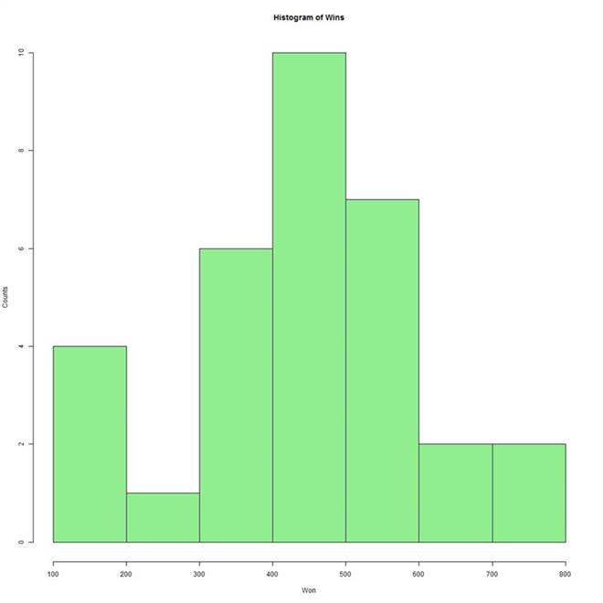
When you create a histogram, it looks as shown below. The below chart is created using R and T-SQL. We will understand how to do this at the end of this section. This histogram explains that the data seems to be nearly normally distributed. The second bar chart from the range of 200 to 300 though is something to investigate. In addition, we can clearly figure out that there is a total of 10 teams who won 400 – 500 games.
Kernel Density Plot
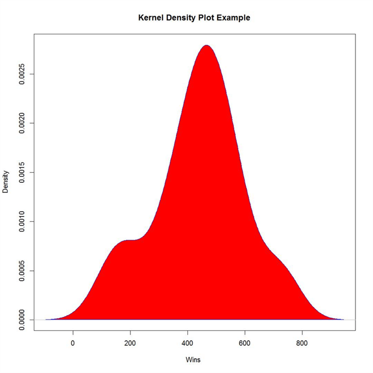
A histogram is a good starting point to understand the distribution of data. Histogram results can vary wildly if you set a different number of bins or simply change the start and end of a bin, especially with a relatively small amount of data. This can make interpretation hard. The limitation is that you really have to imagine the shape of spread in the dataset. A more efficient way to visualize the shape of distribution is by plotting a kernel density plot as shown below. A Kernel Density Plot is actually a smooth histogram. There is a lot more science involved in density estimation than just drawing a smooth curve that describes the spread of data. You can read more about that here.
Below is a Kernel Density Plot of games won. It describes the spread of the same data that is shown in the histogram above. The chart below is created using R and T-SQL. We will understand how to do this at the end of this section.
Box Plot
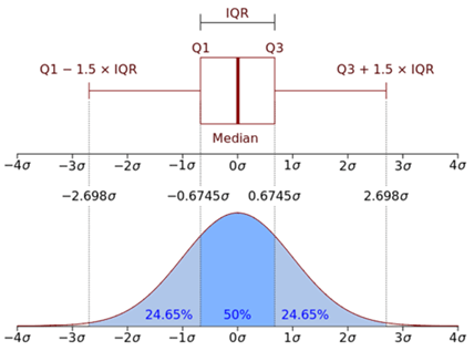
In descriptive statistics, a box plot or boxplot is a method for graphically depicting groups of numerical data through their quartiles. Box plots may also have lines extending vertically from the boxes (whiskers) indicating variability outside the upper and lower quartiles, hence the terms box-and-whisker plot. We briefly touched upon Inter Quartile Range (IQR) in the last section. If you analyze the diagram below, here the size of the box is equal to IQR and length of whiskers is 1.5 times IQR summed with Q1 or Q3. A Boxplot is usually the first choice for outlier analysis on a single variable / field. Also, a boxplot summarizes a lot of information like Median, Q1, Q3, as well as any outliers.
If you compare it with normal distribution, you can also estimate the probability. To interpret the below diagram, you would need to know the mean, median, standard deviation, normal distribution, and IQR. This goes to prove the point that fundamental statistics is extremely essential to work on Machine Learning systems. We are still just at the first phase of machine learning where we are exploring the distribution of data.
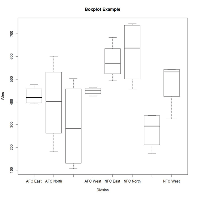
Below is a box-plot that shows the spread of Wins grouped by the Team Division. From the below boxplot chart, it is easy to figure out that the AFC South division (3rd box) has the largest spread of data. The AFC South contains the team having the least number of wins and the NFC North contains the team having the highest number of wins. There does not seem to be any outliers, which are generally represented by dots above the whiskers on either side. There are a few more derivations you can make from this box-plot provided you understand the science behind box-plots. The chart below is created using R and T-SQL. We will understand how to do this at the end of this section.
Scatterplot
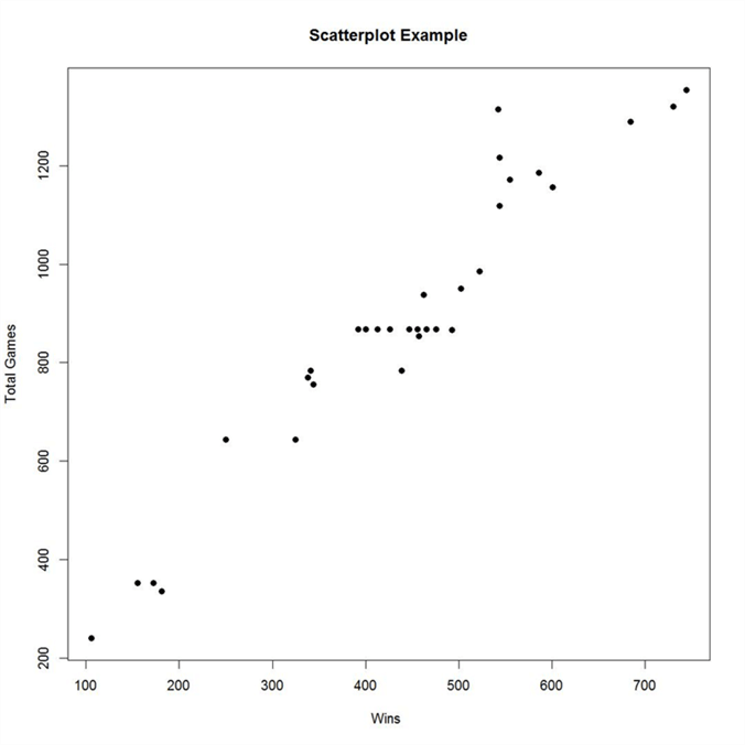
We already saw some visualizations that explains the measure of central tendency as well as measures of dispersion. The visualization that explains the measure of association i.e. correlation is best-analyzed using a scatterplot. Using a scatterplot, one can study the nature of relationships between two variables / two fields with each other. Below is an example of a scatterplot having Total Games on Y-axis and Total Wins on X-axis. From this plot, one can easily visualize that there seems to be a near linear relationship between the two variables. The number of wins proportionally increases with total number of games played by a team. The below chart is also created using R and T-SQL.
Now let us quickly look at the code that generates the above visualizations in SQL Server 2017 using T-SQL and R.
DECLARE @sqlquery nvarchar(max) =  N'SELECT Won, Team, Division, TotalGames FROM NFLTest'

EXECUTE sp_execute_external_script @language = N'R',
@script = N'

   jpeg(filename="C:\\temp\\plots\\Wins_Histogram.jpeg", width = 1080, height = 1080, units = "px", pointsize = 12, quality = 75,);
   hist(InputDataSet$Won, col = ''lightgreen'', xlab=''Won'', ylab = ''Counts'', main = ''Histogram of Wins'');

   jpeg(filename="C:\\temp\\plots\\Wins_vs_TotalGames.jpeg", width = 1080, height = 1080, units = "px", pointsize = 20, quality = 75,);
   plot(InputDataSet$Won, InputDataSet$TotalGames, main="Scatterplot Example", xlab="Wins ", ylab="Total Games", pch=19)

   jpeg(filename="C:\\temp\\plots\\Wins_Density.jpeg", width = 1080, height = 1080, units = "px", pointsize = 20, quality = 75,);
   data <- density(InputDataSet$Won)-
   plot(data, main="Kernel Density Plot Example",  xlab="Wins ", pch=19)
   polygon(data, col="red", border="blue")

   jpeg(filename="C:\\temp\\plots\\Wins_Teams_Boxplot.jpeg", width = 1080, height = 1080, units = "px", pointsize = 20, quality = 75,);
   boxplot(InputDataSet$Won~InputDataSet$Division,data=mtcars, main="Boxplot Example", xlab="Division", ylab="Wins")

   dev.off();
   ',
@input_data_1 = @sqlquery
Here we are using the jpeg function to specify the path of the file where we want to save the chart along with details of the resolution. Then we are using different plotting functions like hist and plot to create the different kinds of charts. The dataset being used is passed by the @sqlquery parameter where we are just reading the fields from a table. To use this data inside the R script, we are using the default dataset name – InputDataSet and referring to the fields using the $ sign (i.e. InputDataSet$Won). Inside the charting functions, we are providing charting related details like color, x-axis label, y-axis label, main, etc.
With this, we create 4 graphs with just a few lines of R script inside the T-SQL sp_execute_external_script stored procedure. When you execute this code, the jpeg function creates the graphic device to which the plotting functions render the output and three jpeg files with the respective charts are saved in the file path specified in the code.
Additional Information
- Consider using any sample data and try drawing inferences about the shape and spread of data using these basic visualizations.
- The entire purpose of this graphical analysis is to analyze whether the data is normally distributed and balanced or whether it would require some standardization. Also, it helps to understand the relationship between different fields in a dataset.
