Maps in SQL Server 2008 R2 Reporting Services

By:   |   Comments (15)   |   Related: 1 | 2 | > Reporting Services Development


Problem

I noticed a new feature in SQL Server 2008 R2 Reporting Services that allows you to render maps in your reports. Can you provide some details on this new feature and can I take advantage of it even though don't have any spatial columns in my data warehouse?

Solution

SQL Server 2008 introduced new spatial data types including a geography type that can be used to stored latitude and longitude coordinates. The new map feature in SQL Server Reporting Services 2008 R2 works with the geography type as well as with state abbreviations, state names, or state numbers. The built-in map feature allows you to add a map to a report and show the states in the US or the counties within a state. You can use the map to render one or more data points, providing a slick visualization of your data by state or county within a state.

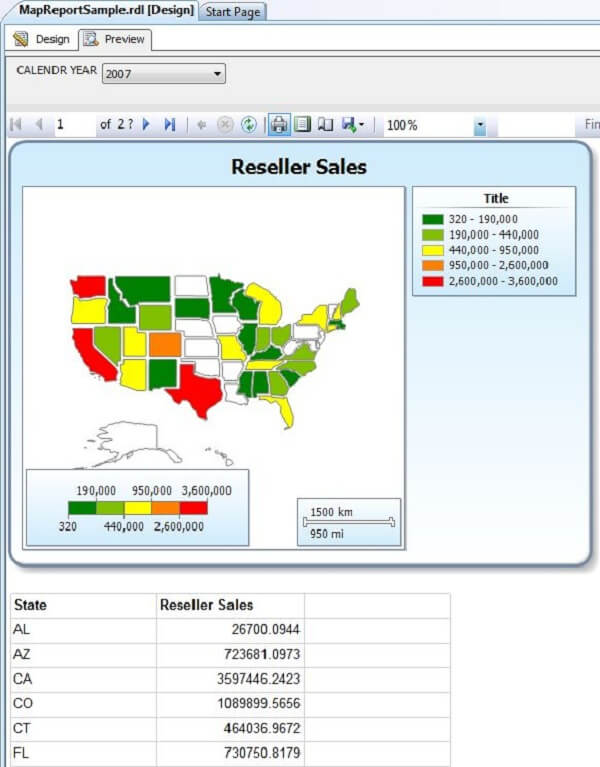
In this tip I will walk through creating a report with a map. As an example I will create a simple report using Business Intelligence Development Studio (BIDS). A preview of the report is shown below:

a new feature in SQL Server 2008 R2 Reporting Services that allows you to render maps in your reports

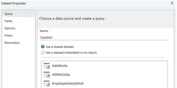
My report will use the AdventureWorksDW2008R2 database and show reseller sales by state. I will use the following query to retrieve the total reseller sales for a given calendar year by state:

SELECT g.StateProvinceCode, SUM(f.ExtendedAmount) Sales  FROM dbo.FactResellerSales f  JOIN dbo.DimDate d ON d.DateKey = f.ShipDateKey  JOIN dbo.DimReseller s ON s.ResellerKey = f.ResellerKey  JOIN dbo.DimGeography g ON g.GeographyKey = s.GeographyKey  WHERE d.CalendarYear = @CALENDAR_YEAR  AND g.CountryRegionCode = 'US'  GROUP BY g.StateProvinceCode  

To add a map to a report, double click Map from the Toolbox as shown below:.

double click Map from the Toolbox

The Map wizard will be launched as shown below:

create a simple report using Business Intelligence Development Studio (BIDS)

The easiest way to get started is to select Map gallery which includes the built-in maps. Choose USA by State Exploded then click Next to proceed to the spatial data and map view options as shown below:

the easiest way to get started is to select Map gallery which includes the built-in maps

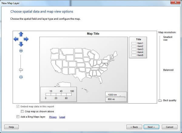
The above dialog provides for customizing the map resolution, cropping, and adding a Bing Maps layer. The Bing Maps layer options are a road view, aerial view, or a combination of the two. With the Bing Maps layer you will need an internet connection when running the report in order to retrieve the Bing Maps. For our purposes just accept the defaults and click Next to continue to display the Choose map visualization dialog as shown below:

you will need an internet connection when running the report in order to retrieve the Bing Maps

The Basic Map displays data on the map, the Color Analytical Map provides color-coding based on the data, and the Bubble Map shows bubbles proportionately sized based on the data. Choose the Color Analytical Map and click Next to display the dialog to select the state column in the dataset as shown below:
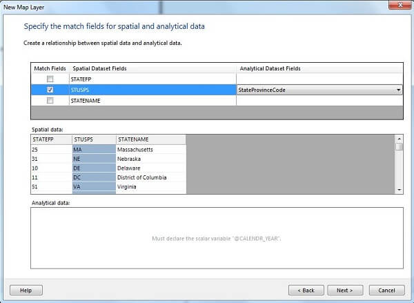
Choose the Color Analytical Map

The dataset query that I'm using has a column named StateProvinceCode which is the two character state abbreviation. Click the check box in the Match Fields column next to STUPS (i.e. state abbreviation used by the US postal service) then click Next to continue and display the Choose color theme and data visualization dialog is displayed as shown below:

display the Choose color theme and data visualization dialog

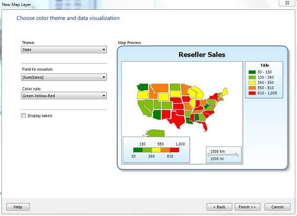
Choose a Theme, the Field to visualize and Color rule. The Theme is the color schema in the area around the map. The Field to visualize is the column in your dataset that you want to render on the map; in my case it is Sales. The Color rule sets the shading in the map. The map automatically analyzes the distribution of values in the Field to visualize and comes up with the various color shades and ranges of values for each. If the Display labels checkbox is checked, the value for the Field to visualize will be displayed on the map. In this case it's best to not check Display labels as the numbers are too large to render on the map within some of the states.

Click Finish to complete the Map Wizard, then click the Preview tab to see the report as shown below:

click the Preview tab to see the report a

There are a number of additional customizations that can be done to the map. Click on the blank area of the map (i.e. the area inside of the red rectangle as shown below) to display the Map Layers dialog. Click on the blue area then select from the menu as shown below:

display the Map Layers dialog

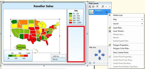
Some of the available options are to add a layer to the map, delete a layer, edit the Layer Data options, run the Layer Wizard, etc.

Next Steps
  • The mapping capability in SQL Server Reporting Services 2008 R2 is a nice addition to the product and it's very easy to get started.
  • You can download the AdventureWorks sample database used in the report from this CodePlex site.
  • You can download the sample report here.


sql server categories

sql server webinars

subscribe to mssqltips

sql server tutorials

sql server white papers

next tip


About the author
MSSQLTips author Ray Barley Ray Barley is a Principal Architect at IT Resource Partners and a MSSQLTips.com BI Expert.

This author pledges the content of this article is based on professional experience and not AI generated.

View all my tips


Comments For This Article


Monday, June 15, 2015 - 3:25:40 PM - Tina Back To Top (37927)

Hi. This is great information.


However, we don't want to plot a point for a zipcode; we want a shaded area based on a group of longitude/latitude coordinates.

Ideas how this can be achieved?


Thank you in advance.

TS


Friday, April 25, 2014 - 1:37:40 PM - Ray Barley Back To Top (30522)

As i understand it "The map automatically analyzes the distribution of values in the Field to visualize and comes up with the various color shades and ranges of values for each."  In your case the field to visualize is the route number so you need a route number associated with each city.

What you might need to do is tweak the route number values so that the map will see them as so different that each route value will get its own color.  For instance if you added a column to your dataset which was the route number multiplied by 1,000,000 and use that column as the field to visualize I think that might work. 


This is just a guess though


Friday, April 25, 2014 - 12:29:00 PM - Andy Fu Back To Top (30520)

Hi Ray,

Here is my project:

Route_1: City1, City2, City3, ....

Route_2: City10, City20, City30, ...

Route_3: ...


We may have multiple routes in our dataset. We'd like to show them in the different color. Is it possible to do it with SSRS map?

Thank you so much for any input,

Andy


Saturday, October 19, 2013 - 10:02:24 AM - Gangadhar Back To Top (27197)

Hi Sir,

Thank you,

Thank you very much..

This Map is very useful of my course..


Tuesday, October 1, 2013 - 3:11:40 PM - Maiyana Back To Top (27005)

HI there, 

I have been working on the Heat map report , I have create the report sales for Florida state and on the map will show every county name and color , when i preview my report some county name and color are not showing on the map some showing, the query have sales every county. 

-at the Map Polygon Layer Properties -> Analytical data -> COUNTYFP = [County_Code]

- Map Polygon Properties ->#COUNTYNAME  

here is my query 

SELECT SUM(oi.sweepAmount)AS Total, CNTY.description AS County, c.countyID AS CountyID, CNTY.id, CNTY.FIPSCountyCode AS'County Code'FROM Orders AS o INNERJOIN OrderItems AS oi ON oi.orderID = o.id INNERJOIN Customers AS c ON c.id = o.customerID INNERJOIN CustomerAddresses AS cd ON c.id = cd.customerID LEFTOUTERJOIN Counties AS CNTY ON c.countyID = CNTY.id GROUPBY CNTY.description, c.countyID, CNTY.id, CNTY.FIPSCountyCode

I do alot of research and still didn't solve this problem yet. Some body help please !!
Thank you.

Wednesday, September 11, 2013 - 10:45:24 AM - Anand Back To Top (26731)

Hi,

Could you please mentioned the steps by step process to create Heat map in SSRS 2008.I have tried and download the code but it is not working from my end.

Please help me in this...

Thanks,
Anand


Friday, February 15, 2013 - 4:59:29 AM - Pankaj Back To Top (22141)

Sir,

how can i develop a map reports with colour expression condition on data


Friday, September 16, 2011 - 8:57:48 AM - Adam Wheatley Back To Top (14667)

Everything is set up correctly. I was trying this map at work, when the data would not show up. I tried the exact same report at home and it worked perfectly. So I know I'm setting it up correctly at work. Now I'm starting to think there is some sort of network or firewall blocking this map report. Does anyone know if these maps need to pass through a network or firewall? I assume no...the data I'm using is readily available to me at work, so I dont see why this would be the case, but I can see no other solution as the exact same report set up works for me at home. (Different data) but the data is set up exactly the same work vs home. 


Thanks


Nice tutorial by the way!!


Thursday, September 15, 2011 - 6:41:47 PM - Ray Barley Back To Top (14663)

By preview I assume you mean preview the report.  Since your query does return data check and make sure how you're associating the data with the map.  In the map wizard this is done in the dialog "Specify the match fields for spatial and analytical data".  In the example my dataset had a column with the 2 character state abbreviation in which case you would associate the column with the STUSPS Spatial Data Field.


Thursday, September 15, 2011 - 6:23:35 PM - Adam Wheatley Back To Top (14662)

I followed this tutorial exactly, only when in preview the map shows no data. I dropped the same query into a table and did get data there. Any reasons why there would be no data?  


Monday, May 23, 2011 - 6:19:58 AM - Ray Barley Back To Top (13890)

The Reporting Services mapping feature uses data from TIGER/Line Shapefiles provided courtesy of the U.S. Census Bureau and only includes the United States.

Maybe there is some thrid party solution available.


Monday, May 23, 2011 - 5:23:42 AM - RichardC Back To Top (13889)

What about maps for countries other than the US?


Can we use them?


If we can use them, then how?


Thanks


Friday, December 10, 2010 - 11:00:53 AM - Ray Barley Back To Top (10447)

Maps are not included in a service pack for SQL Server 2008.  This is a SQL Server 2008 R2 feature.  Did you install R2?    Are you running the version of Business Intelligence Development Studio that comes with SQL Server 2008 R2?  You could also run Report Builder 3.0 and see the maps as well.  You have to have an instance of Reporting Services 2008 R2.


Friday, December 10, 2010 - 9:29:12 AM - Brett Back To Top (10445)

I really want to give this a try, but I can not get the map option to show up in my toolbar.  I've updated to sp2 and deleted all the toolbox.*.tbd files from %userprofile%\Local Settings\Application Data\Microsoft\VisualStudio\9.0 to force visual studio to rebuild my toolbox, but to no avail.  The map option is still not there.  Is this an extra thing you have to purchase?  Can someone point me in the right direction


Wednesday, December 8, 2010 - 6:19:07 AM - Dinesh Back To Top (10425)

Cool feature !!!


get free sql tips
agree to terms