Problem
Microsoft has introduced a new BI product that will provide 3D data visualization using Bing Maps. This product is still in beta and is codenamed “GeoFlow” but should be out late 2013 or early 2014. This preview will allow you to plot geographic and temporal data visually, analyze that data in 3D, and create visual tours. It is a really cool product and I can’t wait to use it in a business atmosphere.
Solution
In this tip, I’ll discuss the prerequisites and how to install “GeoFlow” and I’ll give an introduction on how to use this feature.
Prerequisites:
- Requires Microsoft Office Professional Plus 2013 or Office 365 ProPlus
- Supports 32-bit or 64-bit machines
- Requires Windows 7, Windows 8, or Windows Server 2008R2 (requires .NET Framework 4.0)
- Requires internet access
Installation
Download and install the preview from Microsoft Download Center (make sure Excel is closed while installing)
Open Excel and “Maps” will appear as a new item in the “Insert” tab of the Excel ribbon.

Now that “GeoFlow is installed, we can begin using the new feature.
For this tip, I’m using the AdventureWorks2012 database and the result set from the following query imported into Excel:
  SELECT
  OrderDate,
  ShipDate,
  AddressLine1,
  City,
  PostalCode,
  StateProvinceCode
  FROM [AdventureWorks2012].[Sales].[SalesOrderHeader] soh
  JOIN [AdventureWorks2012].[Person].[Address] ps ON soh.ShipToAddressID = ps.AddressID
  JOIN [AdventureWorks2012].[Person].[StateProvince] psp ON psp.StateProvinceID = ps.StateProvinceID
  WHERE StateProvinceCode = 'CA'

Once you have the data in Excel, click on the “Insert” tab on the Office ribbon and click Map. You should now see the “GeoFlow” globe.
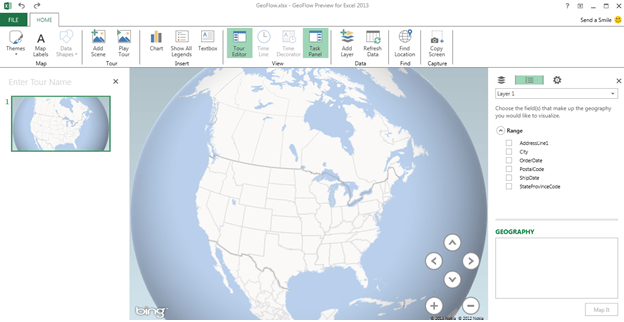
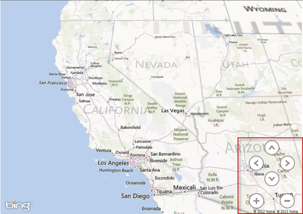
There are a few tabs you can use right away in the ribbon bar. Under the “Map” item you can change Themes and add Map Labels. I like to enable the Map labels so I can see a more detailed version of the map. You can also zoom in and out and move the map using the arrows and +/- buttons in the bottom right corner of the map.
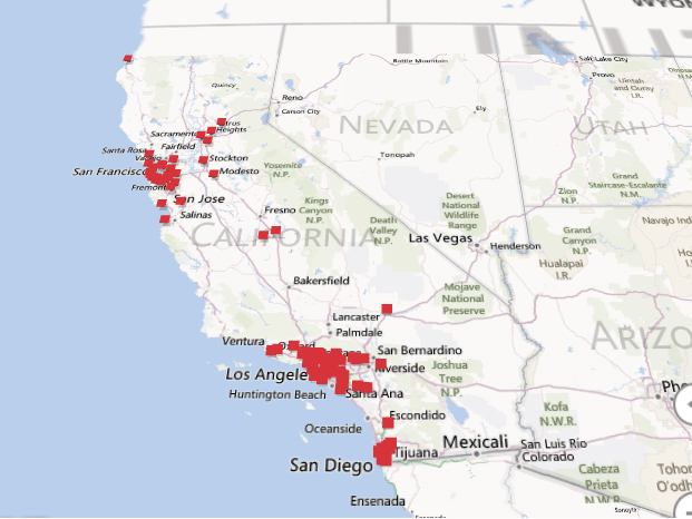
On the right side you see the “Layer” pane. This is where you will choose your geography visualizations. For this example Ill select “PostalCode” under the range section and since we know that this column stores zip codes we’ll map it to “Zip” under the Geography section.

Once the fields are selected, click Map It.
You might notice that 86 records were updated meaning that there are 86 unique zip codes in California and it placed a marker on each zip code.
That’s useful information, but we want to know how many items were ordered during a specific timeframe.
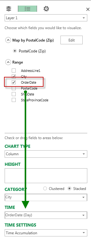
On the layer pane, click City to display the number of products ordered.
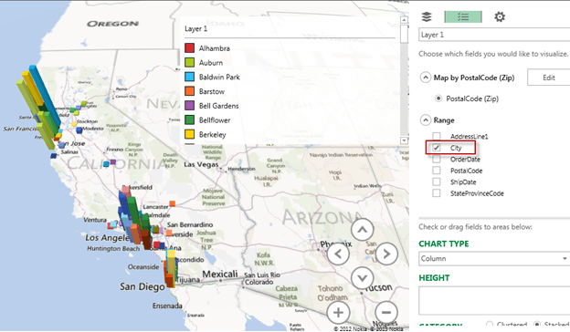
After clicking city, you will notice a Legend pops up displaying each city and a stacked column chart appears. If you hover over a chart item you will see a tooltip that displays information such as zip code, number of products ordered and the name of the city.

In the layer pane, you can change the chart type to Column, Bubble, or Heat Map. Scroll down to the bottom of the chart options and you will see “Time”. Drag the “OrderDate” column into the box.
You now have created a “Tour” that you can replay to see when the products were ordered. In the ribbon bar, if you click “Play Tour” you can watch the progress of products being ordered.

You can add multiple scenes or layers to create more complex maps. The Microsoft Excel blog offers a good tutorial using Dallas, TX utility information to make a nice “GeoFlow” presentation.
You can also add charts, annotations and textboxes to the maps to make it more presentable.
To change the layer properties, click on the Gear icon in the Layers pane. Here you can change the name of the layer and change height and thickness of the chart items.
Finished product:

Next Steps
- In this example, we mapped data using Zip Codes (PostalCode), but you can map data in a variety of ways including city, state, county, latitude and longitude, street, etc.
- Learn more about Excel BI from Microsoft here
- This is a great tool for businesses that like to track historical data by geographic locations.

Brady has been in the IT industry for 10+ years. He has worked in administrative roles using MSSQL 2000 to 2012 as well as Sharepoint 2007 and 2010. He currently serves as a Database Administrator in Nashville, TN. You can view his blog @ http://www.sqlbrady.com.
- MSSQLTips Awards: Trendsetter (25+ tips) – 2013