By: Pablo Echeverria | Comments (4) | Related: More > Database Administration
Problem
We’re asked to generate a SQL Server database size report every 45 days, including data from the last 45 days, predicting the size for the next 45 days, with a graph, and sent by email to a large list of recipients.
There are several solutions to accomplish this task, like Power BI and SSRS, and if you already have them, you may put in a similar effort and obtain a similar result with one caveat: the report may not be sent by email unless every user subscribes to the published report, but it can be accessed online if you set up the permissions for each of them.
However, if you don’t have any of these tools, then R has the advantage over the others of being free, it allows statistical analysis of the data, and allows outputting a graph that can be attached to an email.
You may think SQL Server integration with R is only possible in SQL Server 2016, but actually R can get data from any version of SQL Server.
Solution
Let’s start with the prerequisites to make this work.
Download and install R studio. Here is the download Link.
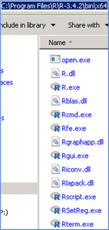
Take note where R studio is installed, specifically the file named RScript.exe. We’re going to call the program from PowerShell, so slashes must not be escaped.
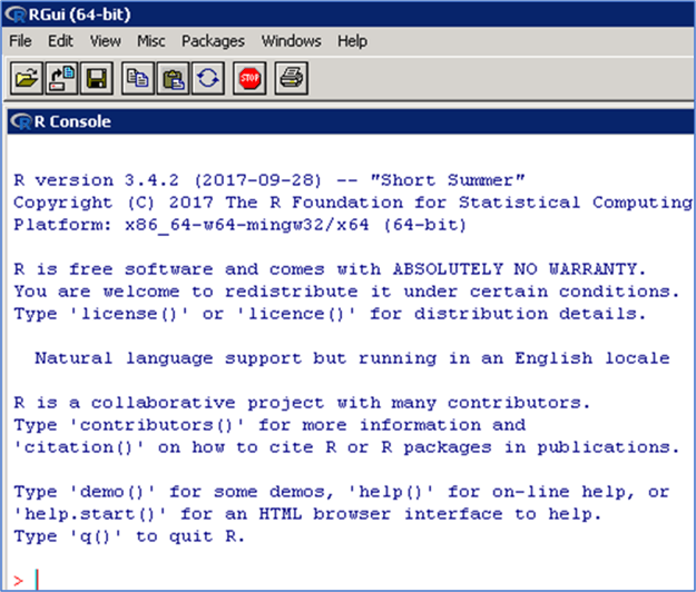
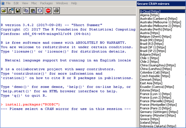
Open R studio and install RODBC with this command: install.packages("RODBC"). It is going to ask you the CRAN mirror to use, just choose one near you, making sure it has RODBC in their list of packages.

With this setup, I’m going to have a server where R studio is installed (Server A), which connects to the server where the data is stored (Server B), then process the data locally using R, generate the image locally, and send it by email. This will eliminate the need to have R installed on all of the servers.
Connect to your data
You can download the entire script here.
First, load the library RODBC:
library(RODBC);
Second, create a connection to your server:
sqlcnn <- odbcDriverConnect("Driver={SQL Server
Native Client 11.0};Server=YOURSERVER\\YOURINSTANCE;Trusted_Connection=yes;");
Note that you can connect to any version of SQL Server as long as your connection string works, and note that if you’re connecting to a named instance, you must escape the slash.
And finally, get the data from your source:
data <- sqlQuery(sqlcnn, "SELECT DATEDIFF(DD, DATEADD(DD, -45, GETDATE()), [bs].[backup_start_date]) [Date],
SUM([bs].[backup_size])/1024/1024/1024 [Size]
FROM [msdb].[dbo].[backupmediafamily] [bmf]
INNER JOIN [msdb].[dbo].[backupset] [bs] ON [bmf].[media_set_id] = [bs].[media_set_id]
WHERE [bs].[backup_start_date] >= DATEADD(DD, -45, GETDATE())
AND [bmf].[physical_device_name] LIKE 'D:\\BACKUP\\%'
AND [bs].[type] = 'D'
GROUP BY DATEDIFF(DD, DATEADD(DD, -45, GETDATE()), [bs].[backup_start_date])
ORDER BY 1");
close(sqlcnn);
Because we’re creating daily backups of all databases, this is accurate to get the used space. Note that we have already run this query in SSMS to know our data, and we know it varies from 650 GB to 750 GB. Also note that for loading the data into R, we need to escape the slash in the physical_device_name. Finally, we close the connection to our database.
Analyze your data
First, plot the data to see how it behaves: plot(data, type="l", las=1, col="green", xlim=c(0, 90), ylim=c(650, 750)); Note we’re using type=”l” to draw a line, put the Y label vertical with “las=1”, set the color green with col=”green”, and because we’re going to plot the prediction for the next 45 days, we will plot from day 0 to 90 with xlim=c(0,90). We also knew our Y limits when we ran the query in SSMS, so we plot from 650 to 750 with ylim=c(650, 750).
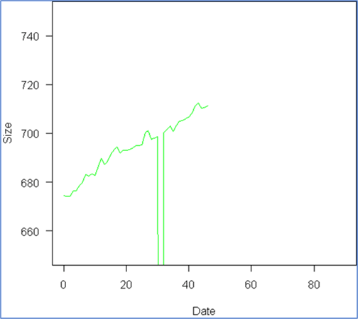
We can see a linear model fits the data trend, and although we can see something odd happened around day 30, we want to see how much this affects our estimate. So we proceed to create the linear model: model <- lm(Size ~ Date, data); where the formula would be Size=a+b*Date. Then we add it to the graph with a blue color: abline(model, col="blue");
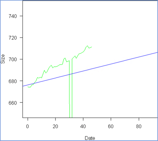
We can see the outlier around day 30 totally ruined our model, due to a requirement to not backup all databases on a certain date, and because we know this is going to continue occurring, we need to find a solution. Here is a very useful link about outlier treatment: Link.
So we follow the recommendations and proceed with capping the outliers:
x <- data[,2];
qnt <- quantile(x, probs=c(.25, .75), na.rm = T);
caps <- quantile(x, probs=c(.05, .95), na.rm = T);
H <- 1.5 * IQR(x, na.rm = T);
x[x < (qnt[1] - H)] <- caps[1];
x[x > (qnt[2] + H)] <- caps[2];
data[,2] <- x;
First we create a copy of our data. Second, we get the boundaries of 25th and 75th quantiles of the data. Third, we get the values of the 5th and 95th quantiles of the data. Fourth, we calculate the limit at which a value is considered an outlier, that is, 1.5 times the inter quartile range or IQR, which is the difference between 75th and 25th quantiles, and assign that to the variable H. Finally, anything below the “25th percentile minus H” is replaced with the 5th percentile, and anything above the “75th percentile plus H” is replaced with the 95th percentile. Finally, we re-assign these values to our original data. Now we proceed to plot the data, calculate the model, and add it to the graph, with the same instructions as before:
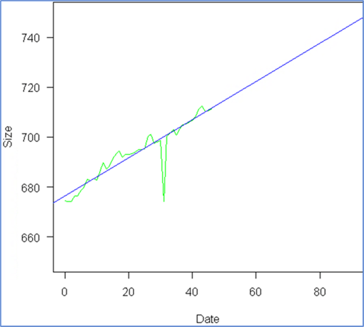
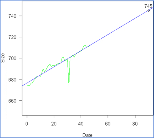
And we see the model fits our data accurately. Now we just want to include an extra element: the expected value at day 90, so we add a few more instructions:
x <- 90;
y <- round(predict(model, data.frame(Date=c(x))));
points(x, y);
text(x, y, y, pos=3);
First, we want to know the information for day 90, so we assign this to variable X, then we calculate the Y value using the model, next we draw the point at that location, and finally we add the label with the estimated size, and here is the result:
Generate image and send by email
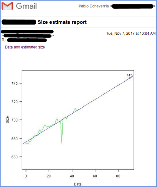
Now, we just need to integrate everything using PowerShell by using the attached script. When the email is sent, it will look similar to this:
There were some adjustments we had to make:
- The $connectionString variable is different on each environment; you need to modify it as needed.
- There are two variables, $graphicPath and $graphichName, which hold the path to the image to be attached. This is because we need to reference the image when it is created, embedded, referenced in the HTML, and deleted once the email has been sent. You can modify them as needed.
- There are four variables for sending the email: $mailServer, $mailFrom, $mailTo, $mailSubject. You must modify them with your own values, depending on your environment.
- Note that your “ylim” when plotting the data needs to be adjusted depending on your results; I’ll leave it to the reader to calculate these limits so that this report won’t need to be adjusted every month.
- After you’ve tested your PowerShell code to prove it works, you can create a scheduled job for it to run automatically every month.
Next Steps
- Download the script for this tip.
- You may need to learn more about R and the features it provides, there are multiple image types with properties, and there are multiple graphic types with properties. Check out this link: Link
- Even if this is for generating a graphic, the integration between R and any version of SQL Server can be used to do more complex analysis.
- You may need to add custom HTML and CSS for a more complete report; check out my other tip about reports in PowerShell: Link.
About the author
 Pablo Echeverria is a talented database administrator and C#.Net software developer since 2006. Pablo wrote the book "Hands-on data virtualization with Polybase". He is also talented at tuning long-running queries in Oracle and SQL Server, reducing the execution time to milliseconds and the resource usage up to 10%. He loves learning and connecting new technologies providing expert-level insight as well as being proficient with scripting languages like PowerShell and bash. You can find several Oracle-related tips in his LinkedIn profile.
This author pledges the content of this article is based on professional experience and not AI generated.
View all my tips


