Problem
Graph analysis can be divided into two parts – Graph Rendering and Graph Querying. There are many ready to use visualizations available in 3rd party tools as well as frameworks like R and Python which provides ready to use graph visualization where one can submit a dataset and the control will render the visualization. Often the limitation with such controls is that there are limited customization options. Such visuals are good for immediate or limited scale graph datasets. For large scale graph applications where the graph contains millions of nodes and edges, full control over each aspect of the graph is required in terms of its rendering as well as graph traversal.
In this tip we will see how to create a graph with different aesthetic customizations to represent the graphical nature of the data in a visually interpretable manner. Generating a graph is just the first part of the graph analysis process. The other part of the analysis is querying the graph and rendering the results of the query in the graph visualization. In this tip we will learn how to query graph data and render each step of the analysis in the graph visualization.
Solution
DiagrammeR is a R package that has all the necessary constructs to generate a graph with the minutest customization on every aesthetic element of the graph.
Steps to Create a Graph Using SQL Server and R
1) First we need to ensure that SQL Server 2017, SSMS and R Server is installed on the development machine. If you need to refer to the installation steps, you can follow the installation section of this R tutorial.
2) We will need to install R packages named – DiagrammeR, Magittr and DiagrammeRsvg. You can read the instructions from this link on how to install packages on a R server.
3) Before we start developing the actual code there are some basic elements of a graph that we need to understand. At the very high level, there are at least two major elements of a graph – a node and an edge. A node is the basic entity and edge represents the relationships between these entities. Using these two basic attributes, any kind of graph can be created or described.
4) Let’s start by creating a node. We need to execute the sp_execute_external_script stored procedure which allows external R scripts to be executed in SQL Server. In the below code, we are creating 9 nodes using the create_node_df function. We are assigning a type attribute to the nodes as well as labels to each node. Here nodes mean the actual entities in a dataset. We are using hard-coded entities, but you have the option to also read data from a SQL Server table and read that data in the R script using InputDataSet data frame. After creating the nodes, we are using the create graph function with the nodes as an input parameter to generate a graph. After that we export the graph to a png image.
EXECUTE sp_execute_external_script @language = N'R', @script = N'
library(DiagrammeR)
library(magrittr)
library(DiagrammeRsvg)
nodes <- create_node_df(n=9,
                        type=c("fruit", "fruit", "fruit", "veg", "veg", "veg", "nut", "nut", "nut"),
                  label=c("pineapple", "apple", "apricot", "cucumber", "celery", "endive", "hazelnut", "almond", "chestnut"),
                  style="filled",
                  shape="polygon")
graph <- create_graph(nodes_df = nodes )

export_graph(graph, file_name = "C:\\temp\\GraphH.png", file_type = "png", width=800, height=800)
'
5) Once the above code is executed successfully, the visual would look as shown below. This diagram does not exactly look like a graph. The missing elements are the edges i.e. the relationship between the nodes. Before we start dealing with the aesthetics of the nodes and edges, we first need to make the visual look like an actual graph.

6) To add the edges to the nodes, we need to use the create_edge_df function, which takes two arguments – From and To. The From parameter specifies the start node and the To parameter specifies the end node, to create the edge from source to destination. After the edges are created, we pass this as a parameter to the graph.
EXECUTE sp_execute_external_script @language = N'R', @script = N'
library(DiagrammeR)
library(magrittr)
library(DiagrammeRsvg)
nodes <- create_node_df(n=9,
                  type=c("fruit", "fruit", "fruit", "veg", "veg", "veg", "nut", "nut", "nut"),
                  label=c("pineapple", "apple", "apricot", "cucumber", "celery", "endive", "hazelnut", "almond", "chestnut"),
                  style="filled",
                  shape="polygon")
edges <- create_edge_df(
    from = c(9, 3, 6, 2, 4, 2, 8, 2, 5, 5),
    to = c(1, 1, 4, 3, 7, 8, 1, 5, 3, 6))
graph <- create_graph(nodes_df = nodes, edges_df = edges )

export_graph(graph, file_name = "C:\\temp\\Graph.png", file_type = "png", width=800, height=800)
'
7) After you execute the above code successfully, your graph should look as shown below. If you compare it with the previous graph, you will be able to see the arrows linking the nodes, which are the edges that we created.

8) We are now ready to start modifying the different aesthetic elements of the node. These attributes can be categorized in the following categories.
- Shape
- Style
- Size
- Color
- Fonts
- Position
- Direction
- Labels
9) Let’s try to change the shape of the nodes. Add a parameter in the create_node_df function named shape = “oval” to change the shape of the nodes. Execute the code and the graph should look as shown below.

10) The graph looks better and different now. We had used the type attribute while creating the nodes. We can color the nodes based on the types using the fillcolor attribute. Modify the above code and add one more parameter to the create_node_df function as mentioned below. Execute the code after modifying and the graph would look as shown below.
fillcolor = c("orange", "orange", "orange", "aqua", "aqua", "aqua", "lightgreen", "lightgreen", "lightgreen")

11) The text of the graph is an essential element of the graph from a usability perspective. The fonts of the nodes can be changed using the following parameters as mentioned below. After adding the below parameters and executing the code, the graph would look as shown below.
fontname="Helvetica", fontsize="16", fontcolor="black"

12) As you can see in the above graph, the fonts are not fitting in the size of the nodes. We can modify the width of the nodes using the width parameter and assigning it a value of 1.5 as shown below. The final code for the nodes should look as shown below after all the modifications mentioned above are done.
EXECUTE sp_execute_external_script @language = N'R', @script = N'
library(DiagrammeR)
library(magrittr)
library(DiagrammeRsvg)
nodes <- create_node_df(n=9,
                        type=c("fruit", "fruit", "fruit", "veg", "veg", "veg", "nut", "nut", "nut"),
                  label=c("pineapple", "apple", "apricot", "cucumber", "celery", "endive", "hazelnut", "almond", "chestnut"),
                  style="filled",
                  shape="oval",
                  fillcolor = c("orange", "orange", "orange", "aqua", "aqua", "aqua", "lightgreen", "lightgreen", "lightgreen"),
                  fontname="Helvetica",
                  fontsize="16",
                  fontcolor="black",
                  width="1.5"
                  )
edges <- create_edge_df(
    from = c(9, 3, 6, 2, 4, 2, 8, 2, 5, 5),
    to = c(1, 1, 4, 3, 7, 8, 1, 5, 3, 6)
   )
graph <- create_graph(nodes_df = nodes, edges_df = edges )
export_graph(graph, file_name = "C:\\temp\\Graph.png", file_type = "png", width=800, height=800)
'
13)After executing the above code, the graph should look as shown below. There are more options to modify other aesthetic elements of the node, and you can refer to the DiagrammeR documentation.
14) Now that we have modified the visual elements of the nodes, it’s time to modify the visual elements of edges. In the above graph, the edges look thin and do not look bold and explicit. We can increase the width of the edges using the penwidth parameter in the create_edge_df function as penwidth=”3.0”. Modify the code and then execute it, and the graph would look as shown below.

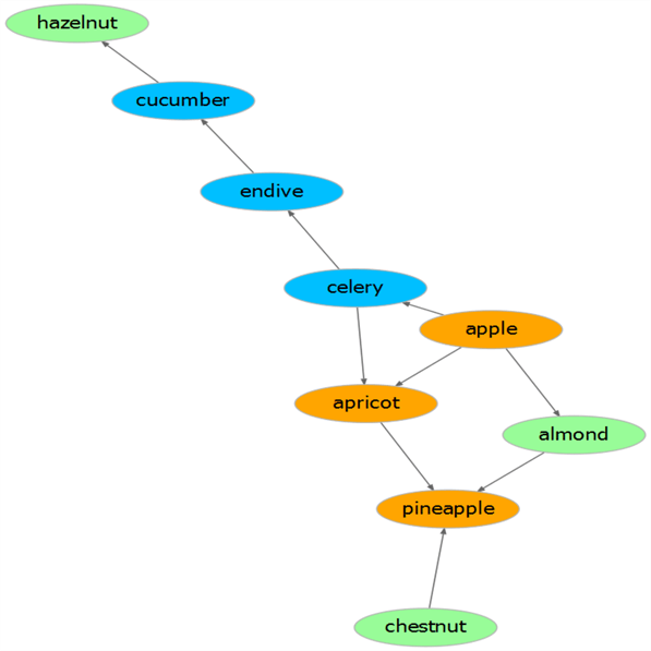
15) The arrows look uni-directional and the arrow heads are not visually explicit. We can change that using the arrowsize as well as the dir parameter which controls the size and direction of the arrows respectively. After you make the changes, the final code should look as shown below.
EXECUTE sp_execute_external_script @language = N'R', @script = N'
library(DiagrammeR)
library(magrittr)
library(DiagrammeRsvg)
nodes <- create_node_df(n=9,
                        type=c("fruit", "fruit", "fruit", "veg", "veg", "veg", "nut", "nut", "nut"),
                  label=c("pineapple", "apple", "apricot", "cucumber", "celery", "endive", "hazelnut", "almond", "chestnut"),
                  style="filled",
                  shape="oval",
                  fillcolor = c("orange", "orange", "orange", "aqua", "aqua", "aqua", "lightgreen", "lightgreen", "lightgreen"),
                  fontname="Helvetica",
                  fontsize="16",
                  fontcolor="black",
                  width="1.5"
                  )
edges <- create_edge_df(
    from = c(9, 3, 6, 2, 4, 2, 8, 2, 5, 5),
    to = c(1, 1, 4, 3, 7, 8, 1, 5, 3, 6),
   penwidth = "3.0",
   dir = "both",
   arrowsize = "1.0"
   )
graph <- create_graph(nodes_df = nodes, edges_df = edges )

export_graph(graph, file_name = "C:\\temp\\Graph.png", file_type = "png", width=800, height=800)
'
16)Execute the code and the final graph will get generated as shown below with bi-directional arrows and larger arrow heads.

Summary
In this way, we can easily generate a graph by just using three functions. These functions support many formatting parameters which control the visual aesthetic of the graph elements, which we saw in the above steps. In the next part of the tip, we will build upon this foundation of graph rendering and learn how to query and navigate different graph elements as well as visually describe the query results of the graph.
Next Steps
- The DiagrammeR package provides full customization of graph elements. Consider exploring all the formatting parameters and different functions supported by this package to minutely control the look and feel of each granular detail of the graph to make it look crisp and sharp.

Siddharth has more than 14 years of experience in the IT Industry, with more than a decade of experience in Business Intelligence and Analytics, for clients banking, logistics, government, Media Entertainment, products, life sciences and other domains. He has been a lead architect for a portfolio of 40+ apps, containing apps in web, mobile, BI, Analytics, data warehousing, reporting, collaboration, CMS, NoSQL and other technologies. He has several certifications and is a published author for online and print-media publications, as well as the MSDN Library.
In his present role, he remains responsible for architecture design, technology stack selection, infrastructure design, 3rd party products evaluation and procurement, and performance engineering. These applications use technologies like Elasticsearch / Lucene, MongoDB, SharePoint 2013 and 2010, jQuery-based framework like Highcharts and GoJS, SQL Server and the Microsoft Business Intelligence stack (SSIS, SSAS, SSRS, MDX, PowerPivot, PowerView), jQueryMobile, Bootstrap, iOS xCode framework, and many others.
- MSSQLTips Awards: Champion (100+ tips) – 2018 | Author of the Year – 2017 | Author Contender – 2016, 2018-2019