Problem
Can I use indicators in SQL Server Reporting Services, like those visuals available in Power BI?
Solution
SQL Server Reporting Services (SSRS) continues to be the go to tool for paginated types of reports, and although SSRS does not have the full interactive functionality of Power BI, it still trumps Power BI when it comes to creating a report that needs to be printed or exported to PDF, Word, PowerPoint, HTML, or Excel (see Exporting SQL Server Reporting Services Reports to PowerPoint or Export SQL Server Reporting Services Report Data into Multiple Excel Worksheets).
Likewise, a little-known feature in SSRS is its ability to make extensive use of indicators in order to generate icons with a report. These icons or indicators include sets of visuals or you can actually customize the indicators as needed to meet report consumers need. Furthermore, the indicators are group aware, so they will automatically be evaluated based on the scope of the group, columns or rows, within the Tablix object in SSRS. Moreover, this option can be customized to a higher level of scoping, which we will discuss later in our tip.
SSRS Indicators
To get started we first need to be sure to setup our environment. It would be beneficial to have the latest IDE environment for SSRS development which at this time would be Visual Studio 2019. Additionally, the Reporting Service Projects extension must be added to Visual Studio to allow for development of SSRS reports, as shown below.

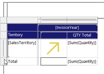
Our first step in the process is to setup a sample report. The report will be a simple report that contains a single tablix object. As shown below the tablix contains one row group by Sales Territory and one column group which is by Invoice Year.


The sales value is showing various values, and a simple indicator, based on these raw values, can be added to these measures. Either the indicator can be placed within the same text box as the figure being evaluated, or it can be placed within another column. I generally preferred placing it within another column for additional flexibility on the space it occupies. Otherwise, you will be required to add two textboxes within the cell that will house the indicator and the actual value (which can get tricky to manage).
To add the indicator, simply right click on the cell, select Insert and then Select indicator, as shown below.

Next, the type of indicator is selected. Generally, you have a set of 3 to 5 indicators in each set.

Depending on the cell that was selected, you have two possible outcomes; if the cell where the insert was initiated has a value, then that value will automatically be used as the basis for the indicator. However, if the field is blank, no value is selected as the basis for the indicator and additional work is needed to setup the indicator properties.
To set the specific value for the indicator along with many other properties, you must select and right click on the indicator and then select the properties option.

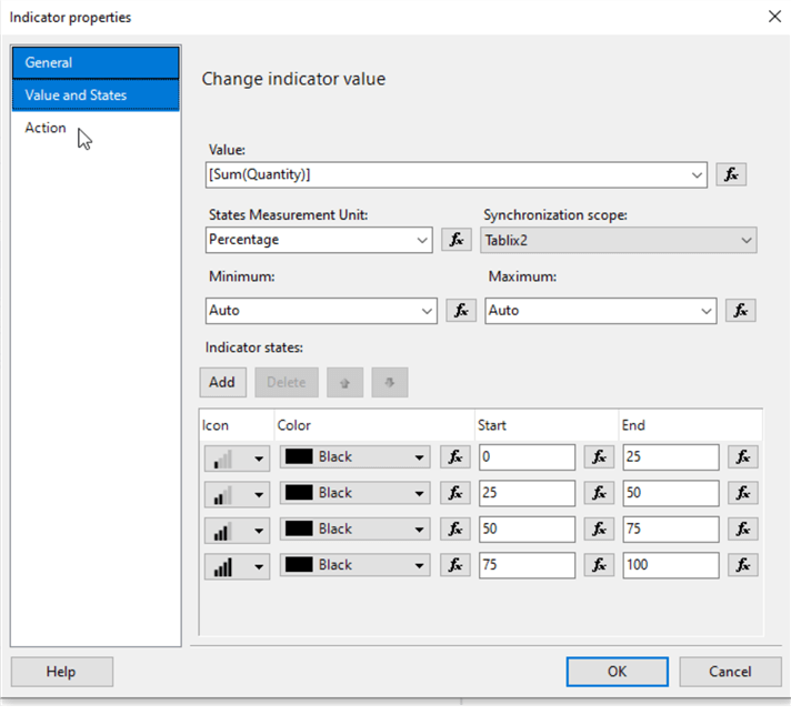
On the General property tab, we can name the indicator and add a tooltip.

The next screen, Values and States, is the important screen. The Value setting is where you set the measure that is used to be evaluated, Sum of the Quantify field in the below example. Following the Value field, the four subsequent fields are very important for the appropriate display of the indicator.

The States Measurement Unit property defines where the value will be evaluated as a % of the highest and lowest values or whether the figures will be evaluated using the raw numeric settings. The default is by percent, and as you can see in the above screen print, the default setting of percent automatically creates a 0-100% set of bins for each value. The percent calculation occurs automatically. Additionally, with the Percentage State selected, the Synchronization scope can be changed to a higher-level scope (i.e. go from group to tablix or data region). Finally, the minimum and maximum values can be set. Later in the tip we will discuss what can be displayed when values exist outside of these ranges.

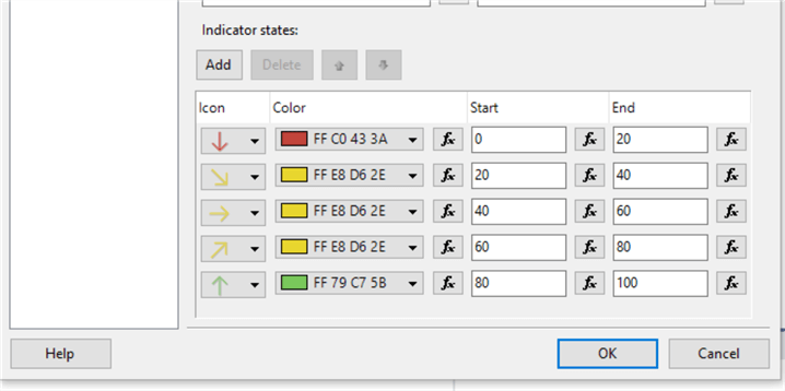
Ultimately, the Indicator states area allows for the selection of the icon, the color, and the start and end range.
Finally, the Action tab allows the icon to come “alive” by allowing navigation to another report, to a bookmark within the existing report, or to some external URL.

The result of our indicator is shown below.

We can easily add a completely different indicator to the total row as shown in the below example. Notice this indicator display will be based on ranges of actual numeric values.

Now, the total row shows colored circles based of hard coded numeric values. Notice how the icon fills up the cell space based on the size of the cell.

As an alternative, you can actually set the range high and low value setting from a parameter, formula, or function. Thus if you have several indicators to set, having to make a change to the value thresholds would be easier to change in just one location (i.e. a dataset or parameter) as opposed to each indicator.

Let us move on to some of the more advanced options that can be used with indicators. First, let us change the icon that will be used. The image files can either be embedded within the report or can be from an external URL. In the below example, two images were loaded into the report as embedded images.

Moving back to the properties window and specifically Value and States tab, clicking on the down arrow next to the icon opens up an icon selection pane.

Next, clicking on the Image link (word) allows the selection of source, either external, embedded, or database as the image source. After making the source selection, you can complete the source details; in the below example, we are reading in the image from the images embedded in the report. One image for the 300,001 to 800,000 binn and another image for the 800,001 + category.

Now instead of the predefined icons, the report is now displaying icons that are from our custom images. The number of images is limitless, but they should be bound by what can be easily understood.

If the icon set needs to be changed, selecting and right clicking on the icon and then the down arrow next to the indicator name provides the ability to easily switch out the icon set.

Now we are using a set of 4 bars to determine the range.

Notice in the below illustration how after switching the icon set, the start and stop ranges automatically adjust to the new number of icons (switching from 5 to 4).
The icon set now shows a set of bar charts

We can easily change the color for each column to a customized set of colors as shown below, simply by clicking on the down arrow next to each color. This functionality is available for any of the icon sets which allows for colors to be branded for your own situation or organization. Note the custom colors are not available for embedded, database, or external images that are used.

Now each chart range uses its own color.

Another option that can be set allows us to rotate the icon at a 0 to 360 rotation. This option, shown below with the header of Angle, provides for easy rotation of the selected icon or image.

The result of rotating our icon set 90 degrees is illustrated in the below report.

One other set of properties that can be set is a maximum or minimum value, and likewise an out of range appearance. First, we must set the maximum or minimum values in the Values and states tab. In the subsequent illustration, the maximum value is set to 120,000 (note even though we are using the percent measurement unit, the minimum and maximum values are the true measure figures).

Next the Out of Range Appearance properties are set. The fill color denotes the color of the icon, while the Indicator Style denotes the icon that will be used, for example a flag as utilized below. Now when the report encounters a quantity greater than 120,000, a red flag will show as the icon.

The updated report with the out or range appearance set to red flag is displayed next.

Finally, we can also control the scaled size of each indicator using a scale factor of 0 to 1. Thus, a factor of .25 would be ¼ the size of a regular icon. In the below example the SignalMeterThreeFiled icon is set to be 75% of the normal size. This option is a bit tricky to find, but selecting the icon, going to the main properties window within Visual Studio, and selecting the ellipse next to Stages > Collection gets you to the Collection editor. Here the scale factor can be set.

Now running the report shows the icon set scaled from 0.25 to 1.00, depending on the related icon.

Conclusion
In this tip we covered some of the various SSRS indicators that are available to be used within a report and further discussed some of the detailed properties that allow for extensive customization of these icons.
Next Steps
- All MSSQLTips.com SSRS Development Tips

I have a passion for crafting Business Intelligence Solutions for my user groups. My experience includes almost 15 years of SQL Server involvement with the last 12 years focused specifically on Business Intelligence, SharePoint, OLAP, SSRS, and Decision Support solutions. Currently, I am a Business Intelligence Architect in the healthcare industry, and I also teach database and analytics classes for Kennesaw State University, Southern New Hampshire University, and Reinhardt University. My education includes an MBA and an undergraduate in Accounting (yes I am a reformed accountant!), both from Kennesaw State University. I enjoy every day by trying to grow my faith and spend precious time with my family. I have been happily married to my wife of over 20 years, and we have two teenagers one who we home school with the help of a University Model School, Cornerstone Prep in Acworth, GA (cornerstoneprep.org). Our other child is a Construction Management major at KSU’s Southern Poly / Marietta campus. We are a soccer and Cross Country (XC) family who play, coach, and referee soccer or run for fun most every day. For several years, our family has volunteered (and played with the dogs and cats) at Etowah Valley Humane Society in Cartersville, GA.
- MSSQLTips Awards: Champion (100+tips) – 2016 | Author of the Year – 2015 | Author Contender – 2014, 2016-2021