By: Brady Upton | Comments (3) | Related: > Microsoft Excel Integration
Problem
I have read all the tips regarding PowerPivot using SQL Server as a data source, but I've started using Excel 2013 and need some help making a nice, simple dashboard for a presentation coming up. Any suggestions?
Solution
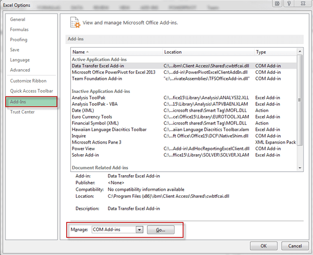
Excel 2013 changes things up a bit when it comes to installing PowerPivot. In previous versions you had to download the component and install, but with Excel 2013 it comes installed as an add-in, but disabled by default. To enable PowerPivot, open Excel, go to File, Options, Add-Ins, select COM Add-ins and click Go.
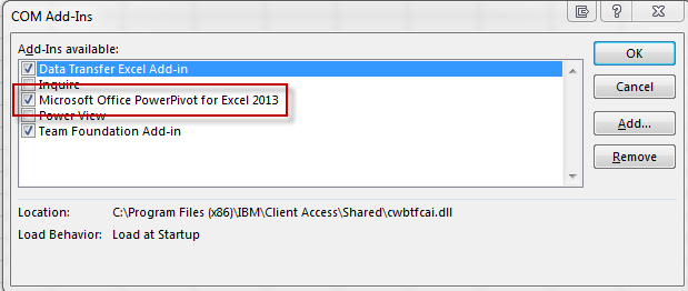
This will open up the COM Add-Ins dialog box. Click "Microsoft Office PowerPivot for Excel 2013" and hit OK.
After successfully enabling PowerPivot, the tab should appear at the top of the Excel spreadsheet.
Creating a dashboard
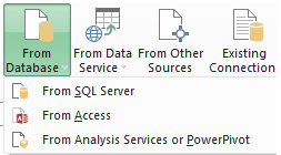
There are a few different ways in which to import data into Excel to use with PowerPivot. Some of these ways include:
-
From database
-
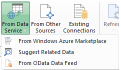
From Data Service
-
From other sources such as Oracle, Excel, flat files, etc.
Click here to view examples of importing data into PowerPivot using the above methods.
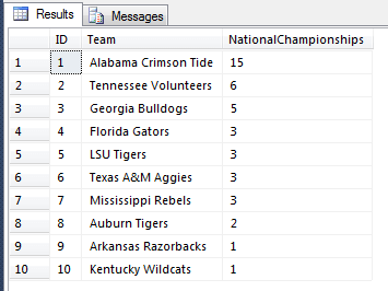
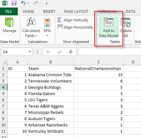
For this example, and simplicity sake, I will just run a query and simply copy and paste my results into the Excel spreadsheet. The query results look like this:
Once the results are copied and pasted into Excel, click the PowerPivot tab and click Add to Data Model:
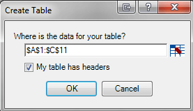
On the create table dialog box, make sure you select the range for your data and click "My table has headers"
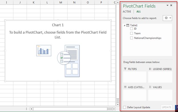
After clicking OK, the PowerPivot window should appear. To start creating the dashboard, click PivotTable, PivotChart, then select New Worksheet:
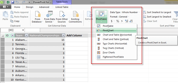
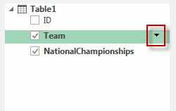
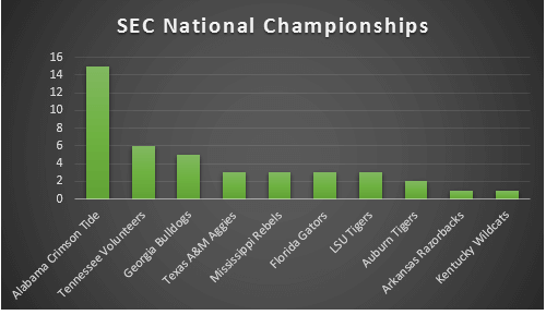
For this example, my boss needs to see each Team and how many National Championships they have won in a graph. Easy enough. Click on the PivotChart, and the PivotChart Fields The list should appear on the right side. If the Field list doesn't appear, right click in the Chart and select Show Field List:
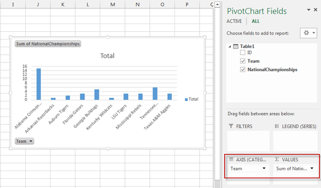
Drag Team to the AXIS box below and drag NationalChampionships to the VALUES box below. This indicates that we will be reporting on each team with National Championships being the value we want to show.
Cleanup Graph Options
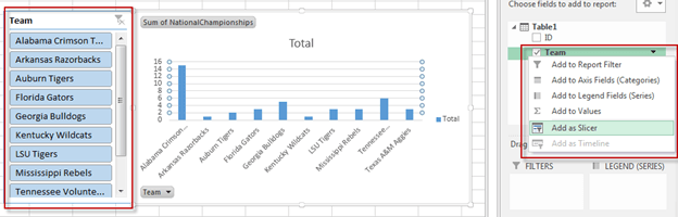
Add a Slicer
We now have a graph that displays the information we need, but we still need this in a presentable form. One thing we can do is add a slicer so we can choose between which teams we want to display. To do this, right click Team and choose Add Slicer. You can then drag the slicer so that it doesn't cover up the graph and resize as needed.
If you click on a team in the slicer, for example, Alabama Crimson Tide, you will notice it shows results for only Alabama Crimson Tide:
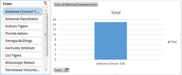
You can also CTRL+click to select multiple teams or click the ![]() to set the slicer back to default.
to set the slicer back to default.
Change Order of Results
By default the graph puts the teams in alphabetical order, but maybe we want to change the graph to display the National Championships in order. To do this, click the down arrow beside Team and click More Sort Options. Change the Sort to Descending (Z to A) by: Sum of NationalChampionships:
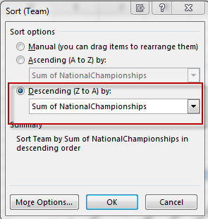
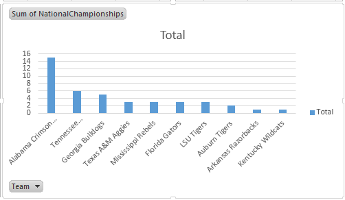
The graph should now be sorted by National Championships:
Change title and remove Legend and unwanted buttons
Another cleanup option is to change the title of the graph and remove some unwanted buttons. To do this, simply click on the title and rename it.
To remove the legend, simply click and delete.
To hide the buttons, right click the button and select "Hide Buttons"
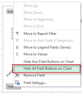
Our chart is almost presentable:

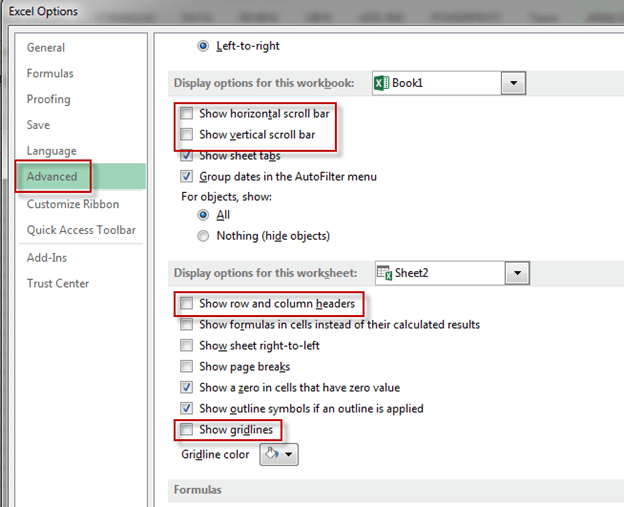
Remove Gridlines, Scrollbars, and Headers
Another option to clean up the spreadsheet is to remove some of the Excel based options. A few things that can be removed by going to File, Options, Advanced are scroll bars, row and column headers, and gridlines.
Simply uncheck all of these to make the background more presentable:
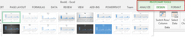
Add Style to Chart
To add a style to the chart, click on the chart and select the Design tab under PivotChart Tools. Here you can choose from multiple Chart Styles:
For this example, I'll choose Style 9:

Change color of bar graph
To change the color of the bars in the graph click on the chart and select the Design tab under PivotChart Tools. Click the Change Colors dropdown and select a color. For this example, I'll choose Green:
Other cleanup options can include font and font size, themes, etc.
Next Steps
- View more PowerPivot tips here that includes uploading the finished dashboard to SharePoint.
- Learn more about PowerPivot and all of it's capabilities at Microsoft.com


About the author
 Brady Upton is a Database Administrator and SharePoint superstar in Nashville, TN.
This author pledges the content of this article is based on professional experience and not AI generated.
View all my tips
