By: Dallas Snider | Comments | Related: > Analysis Services Development
Problem
How do I interpret the Lift Chart found on the Mining Accuracy tab of a SQL Server 2014 Analysis Services Data Mining structure?
Solution
In this tip, we will examine different lift charts produced by the data mining models for three different sets of data. The first set of data, stored in tblLiftChart1, will classify perfectly with no false positives or false negatives. The second set of data, stored in tblLiftChart2, will cause the classification algorithm to predict with 50 percent accuracy. The third set of data, stored in tblLiftChart3, will cause the classification algorithm to generate 20 percent false positives and false negatives. Each table will have 20,000 rows and we will use the Neural Network algorithm to classify the data with 30 percent of the records held out for testing. Let's begin by creating three small tables with the following T-SQL Code.
--drop the tables for this example if they exist
IF EXISTS (SELECT name FROM sys.tables WHERE name = N'tblLiftChart1')
 drop table dbo.tblLiftChart1
go
IF EXISTS (SELECT name FROM sys.tables WHERE name = N'tblLiftChart2')
 drop table dbo.tblLiftChart2
go
IF EXISTS (SELECT name FROM sys.tables WHERE name = N'tblLiftChart3')
 drop table dbo.tblLiftChart3
go
create table dbo.tblLiftChart1
(
 pkLiftChart integer identity(1,1) not null Primary Key,
 x decimal(3,2) not null,
 y decimal(3,2) not null,
 class varchar(3) not null
)
create table dbo.tblLiftChart2
(
 pkLiftChart integer identity(1,1) not null Primary Key,
 x decimal(3,2) not null,
 y decimal(3,2) not null,
 class varchar(3) not null
)
create table dbo.tblLiftChart3
(
 pkLiftChart integer identity(1,1) not null Primary Key,
 x decimal(3,2) not null,
 y decimal(3,2) not null,
 class varchar(3) not null
)
Next, let's populate our sample tables and then select the row count of the tables.
SET NOCOUNT ON
GO
--Populate tblLiftChart1
declare @i integer=1
begin transaction
while @i<=10000
begin
  insert into dbo.tblLiftChart1 values (rand()+1.0, rand()+1.0,'YES')--100% true positive
  insert into dbo.tblLiftChart1 values (rand(), rand(), 'NO')        --100% true negative
  set @i=@i+1
end
commit
go

--Populate tblLiftChart2
declare @i integer=1
begin transaction
while @i<=5000
begin
  insert into dbo.tblLiftChart2 values (rand()+1.0, rand()+1.0,'YES')--50% true positive
  insert into dbo.tblLiftChart2 values (rand(), rand(), 'NO')        --50% true negative
  insert into dbo.tblLiftChart2 values (rand()+1.0, rand()+1.0,'NO') --50% false negative
  insert into dbo.tblLiftChart2 values (rand(), rand(), 'YES')       --50% false positive
  set @i=@i+1
end
commit
go

--Populate tblLiftChart3
declare @i integer=1
begin transaction
while @i<=8000
begin
  insert into dbo.tblLiftChart3 values (rand()+1.0, rand()+1.0,'YES')--80% true positive
  insert into dbo.tblLiftChart3 values (rand(), rand(), 'NO')        --80% true negative
  set @i=@i+1
end
commit
go

declare @i integer=1
begin transaction
while @i<=2000
begin
  insert into dbo.tblLiftChart3 values (rand()+1.0, rand()+1.0,'NO') --20% false negative
  insert into dbo.tblLiftChart3 values (rand(),rand(),'YES')         --20% false positive
  set @i=@i+1
end
commit

SELECT count(*) FROM dbo.tblLiftChart1
SELECT count(*) FROM dbo.tblLiftChart2
SELECT count(*) FROM dbo.tblLiftChart3
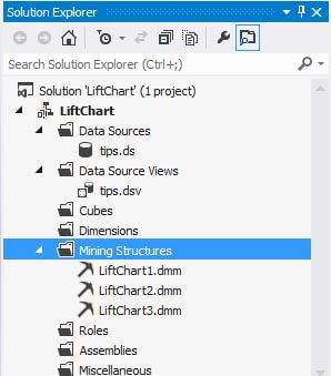
I created a SQL Server 2014 Analysis Services Multidimensional and Data Mining Project in Visual Studio. The Solution Explorer window for this project is shown below. There is one mining structure per table.
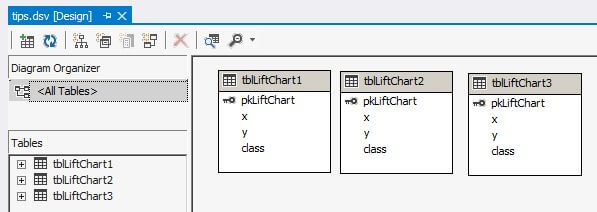
The three tables we just created are included in the data source view as shown below.
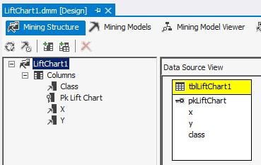
Each mining structure is similar to what is shown next.
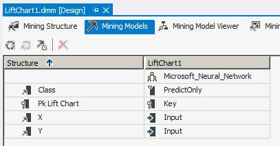
Each mining model is also similar with pkLiftChart as the primary key, X and Y are the input columns and Class is the predicted column.
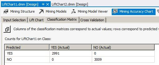
After deploying and processing the data mining models, we open the LiftChart1 data mining object, click on the Mining Accuracy Chart tab and then the Classification Matrix tab. We see the Classification Matrix for the mining model built from the data in tblLiftChart1. The classification matrix is also known as a confusion matrix in some data mining texts. The classification matrix is built from the 30 percent of the data held out for testing. The sum of the counts in the matrix is 6,000 which is 30 percent of the 20,000 rows in tblLiftChart1. We see there are 2,991 true positives and 3,009 true negatives.
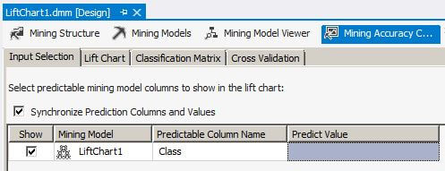
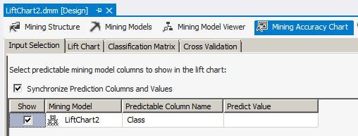
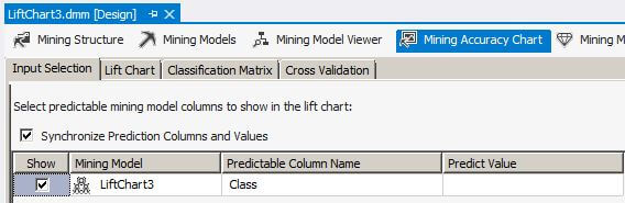
On the Input Selection tab, let's leave the Predict Value blank. This is very important because the lift chart behaves differently when there is a value selected in the Predict Value column.
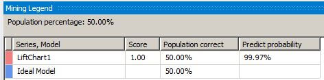
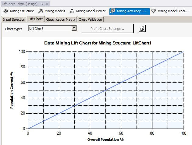
Now let's click on the Lift Chart tab to display the Lift Chart and Mining Legend. The Mining Legend shows that two lines should be displayed, one for LiftChart1 and one for the Ideal Model. For a perfect classification model, as we have for LiftChart1, the Ideal Model is on top of the LiftChart1 line. The solid gray vertical bar can be clicked and moved horizontally to examine different values along the plotted line in the Mining Legend window. The Mining Legend window shows that for 50 percent of the overall population, 50 percent were correctly predicted with a 99.97 percent probability that the mining algorithm can predict correctly.
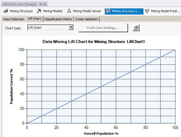
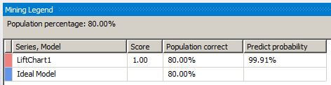
When we slide the gray vertical bar to the 80 percent overall population value, the Mining Legend window shows that for 80 percent of the overall population, 80 percent were correctly predicted with a 99.91 percent probability that the mining algorithm can predict correctly.
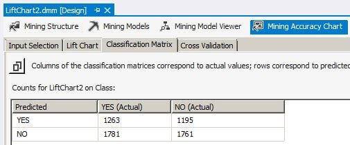
We don't live in a perfect world, so let's move to LiftChart2. While the numbers in the Classification Matrix are not equal, the value for sensitivity is 0.51 and specificity is 0.49 which is expected for the data in tblLiftChart2.
Once again we will leave the Predict Value blank on the Input Selection tab.
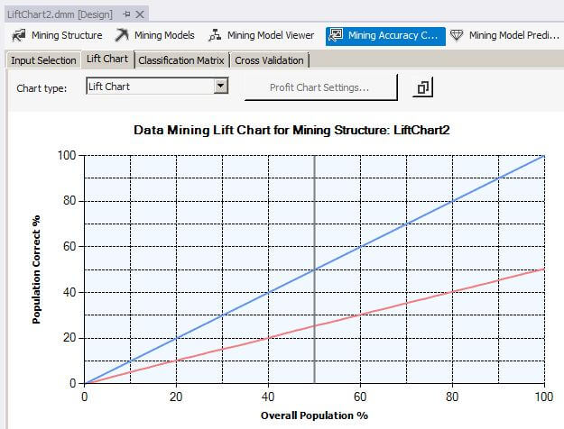
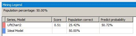
When we click on the Lift Chart for the LiftChart2 mining model, we see the line for the LiftChart2 separated from the Ideal Model line. For a perfect classification model, as we have for LiftChart1, the Ideal Model is on top of the LiftChart1 line. For the LiftChart2 model, the Mining Legend window shows that for 50 percent of the overall population, 25 percent were correctly predicted with a 50.72 percent probability that the mining algorithm can predict correctly.
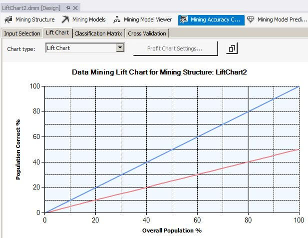
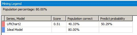
When we slide the gray vertical bar to the 80 percent overall population value, the Mining Legend window shows that for 80 percent of the overall population, 40 percent were correctly predicted with a 50.29 percent probability that the mining algorithm can predict correctly.
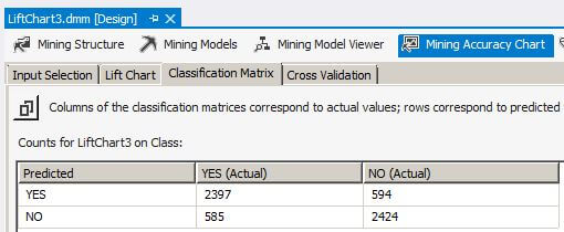
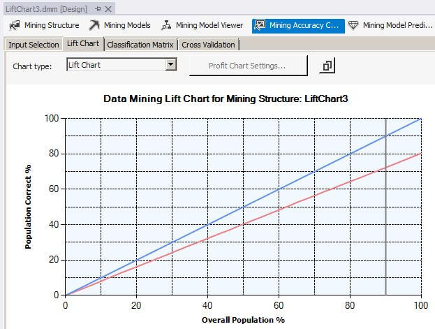
Now we will turn our attention to LiftChart3. The classification matrix shows approximately 80 percent of the data is a true positive or true negative while approximately 20 percent of the data is a false positive or false negative. This corresponds with the population of the source table we created above.
Still leaving the Predict Value blank on the Input Selection tab.
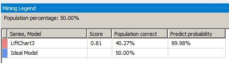
We can see that the LiftChart3 line and the Ideal Model lines are still separated, but not as much as in the previous example. For the LiftChart3 model, the Mining Legend window shows that for 50 percent of the overall population, 40 percent were correctly predicted with a 99.98 percent probability that the mining algorithm can predict correctly.
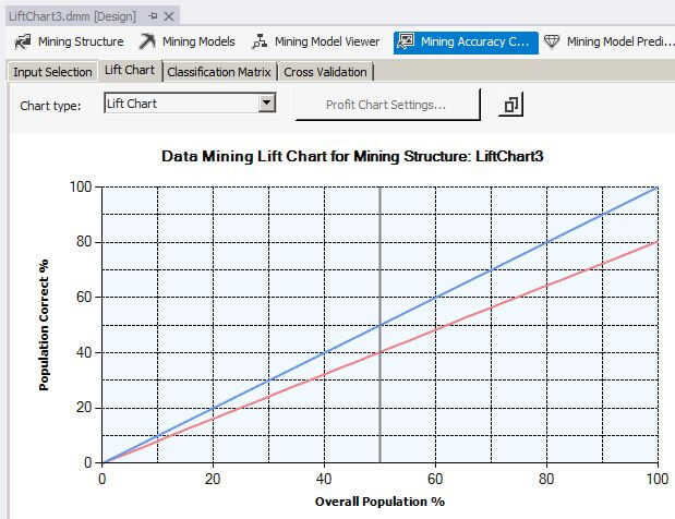
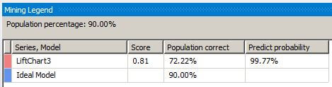
When we slide the gray vertical bar to the 80 percent overall population value, the Mining Legend window shows that for 90 percent of the overall population, 72 percent were correctly predicted with a 99.77 percent probability that the mining algorithm can predict correctly.
Summary
When the Predict Value on the Input Selection tab is blank, a classification algorithm is deemed to be better as its Lift Chart line approaches the Ideal Model line. Please note that currently there is not a Receiver Operating Characteristic (ROC) curve plot in Analysis Services, so we have to use the Lift Chart to graphically represent the quality of the classifier.
Next Steps
Try variations in the percentage of false positives and false negatives. Also, check out these other tips on data mining in SQL Server Analysis Services.
- SQL Server 2012 Analysis Services Association Rules Data Mining Example
- Explaining the Calculations of Probability and Importance for Complex Association Rules in SQL Server 2012 Analysis Services
- Classic Machine Learning Example In SQL Server Analysis Services
- Microsoft Naïve Bayes Data Mining Model in SQL Server Analysis Services
- Data Mining Clustering Example in SQL Server Analysis Services SSAS
- SQL Server Analysis Services Glossary


About the author
 Dr. Dallas Snider is an Assistant Professor in the Computer Science Department at the University of West Florida and has 18+ years of SQL experience.
This author pledges the content of this article is based on professional experience and not AI generated.
View all my tips
