Problem
At the time of writing, SQL Server 2016 preview (CTP 2.2) has been released and it contains a few exciting changes for SQL Server Reporting Services (SSRS). One of the new additions is a new chart type: the sunburst. This tip will give an introduction on how to create a sunburst graph.
Solution
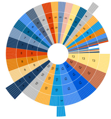
A sunburst graph is a graph type ideal for displaying hierarchical data. It’s called a sunburst because if you have an unbalanced hierarchy (meaning some branches stop earlier than others) the chart looks a bit like a sun with rays shooting out:

Here we have a “ray” shooting out for February, as it is the only month for which there is weekly data. In fact a sunburst chart is just a donut chart (which is a pie chart with a hole in the middle), but with multiple layers. If slices of a layer have missing data (the missing weeks for all the months except February), the graph doesn’t show anything for those slices.
As you can see, a sunburst chart is ideal for giving a sense of how the data relates to a hierarchy and how an outer ring contributes to an inner ring, but it lacks in precision. It’s hard to compare slices with each other and you can’t read exact numeric data from it, unless you use labels, annotations or tooltips. A treemap can display hierarchical data as well and because it uses rectangles, it’s a bit easier to compare relative sizes with each other. For more information about treemaps in SSRS, check out – How to create a Treemap Graph in Reporting Services 2016.
The Office help page has a nice article on how to create a sunburst chart in Excel 2016: Create a sunburst chart in Office 2016. The sample data of that article is used to make the example above in SSRS.
Test Data
First of all, we need data for our sunburst chart. The AdventureWorksDW database contains a great unbalanced hierarchy: the employee dimension. This dimension is modeled as a parent-child relationship, but with the following query we can get a flattened hierarchy:
SELECT
 Level1Key= l1.[EmployeeKey]
,Level1Name= l1.FirstName + ' ' + l1.LastName
,Level2Key= l2.[EmployeeKey]
,Level2Name= l2.FirstName + ' ' + l2.LastName
,Level3Key= l3.[EmployeeKey]
,Level3Name= l3.FirstName + ' ' + l3.LastName
,Level4Key= l4.[EmployeeKey]
,Level4Name= l4.FirstName + ' ' + l4.LastName
,Level5Key= l5.[EmployeeKey]
,Level5Name= l5.FirstName + ' ' + l5.LastName
,EmpCount= 1
FROM  [AdventureWorksDW2014].[dbo].[DimEmployee] l1
LEFT JOIN [AdventureWorksDW2014].[dbo].[DimEmployee] l2 ON l1.EmployeeKey = l2.ParentEmployeeKey AND l2.[Status] = 'Current'
LEFT JOIN [AdventureWorksDW2014].[dbo].[DimEmployee] l3 ON l2.EmployeeKey = l3.ParentEmployeeKey AND l3.[Status] = 'Current'
LEFT JOIN [AdventureWorksDW2014].[dbo].[DimEmployee] l4 ON l3.EmployeeKey = l4.ParentEmployeeKey AND l4.[Status] = 'Current'
LEFT JOIN [AdventureWorksDW2014].[dbo].[DimEmployee] l5 ON l4.EmployeeKey = l5.ParentEmployeeKey AND l5.[Status] = 'Current'
WHEREl1.[Status] = 'Current'
AND l1.ParentEmployeeKey IS NULL -- top of the hierarchy
ORDER BY l2.EmployeeKey, l3.EmployeeKey, l4.EmployeeKey, l5.EmployeeKey;
GO
Remember this dimension is a type 2 SCD, so we need to filter on the current rows. This hierarchy is 5 levels deep, but not every branch of the hierarchy goes that far down:
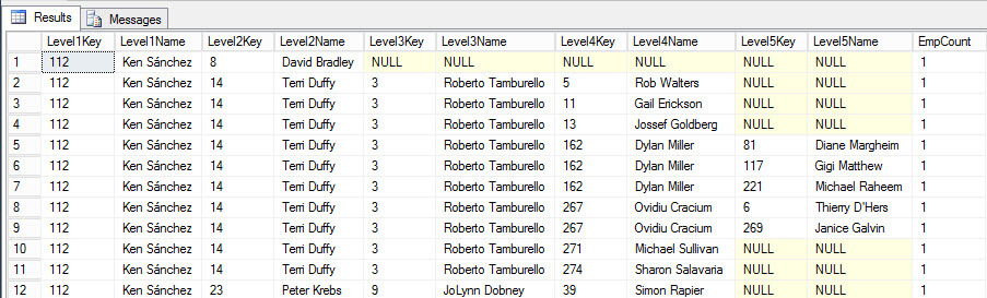
Every time NULL values start showing up, it’s a sign the branch has stopped at a particular level and this is where the sunburst chart will empty space.
SQL Server 2016 preview
As mentioned earlier, at the time of writing SQL Server 2016 is still in preview (currently CTP 2.2 has been released). This means that the look and feel of Reporting Services and its charts can still change and that functionality might change, disappear or be added.
Another issue is a new version of the SSDT-BI (the Visual Studio shell for developing business intelligence solutions) has not been released for SQL Server 2016. You can develop BI solutions for SQL Server 2016 preview using SSDT-BI 2013 (which is actually for SQL Server 2014), but it has only SQL Server 2014 features. So how are we going to test now SSRS functionality? Luckily Report Builder has already been updated and included in the SQL Server 2016 CTP 2.2 release, so in this tip we’ll use Report Builder to create the treemap.
In order to use Report Builder, you need to install SSRS 2016 CTP 2.2 (or later), preferably not on your production machine. Then you navigate to Report Manager – typically the URL has the format http://myserver/Reports – where you can launch Report Builder.
Creating a Sunburst Chart in SQL Server 2016 Reporting Services
First create a blank report with Report Builder, add a connection to your database and add a dataset with the query from the Test Data section of this tip. Next add a new chart to the canvas.

The sunburst chart type is listed under the Shape types:

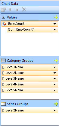
After the chart has been added to the canvas, click on it so the Chart Data window opens up. Add the field EmpCount to Values.
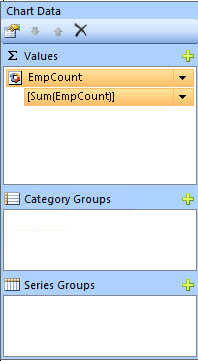
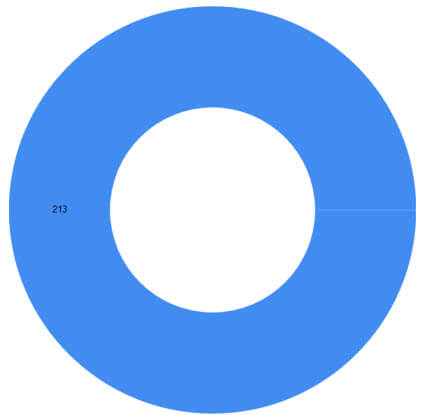
Although you get a preview, if you run the report you end up with an empty chart (nothing is displayed). The chart will only display data once there are category groups defined. So let’s put Level1 Name on Category Groups.
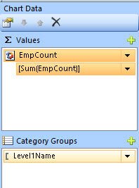
When you preview the report, you get the first ring of the sunburst. The data label shows the total number of employees:
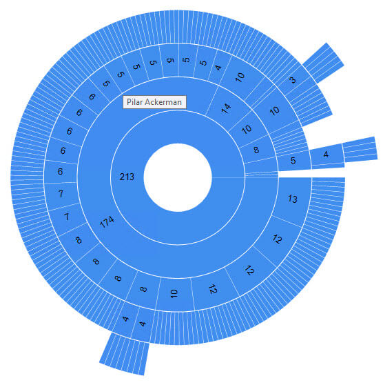
Each time we add another level to the category groups, another ring is added to the sunburst.

To add more color to the sunburst, you can add fields to the series groups. Let’s add the name of level 2.
This will result in the sunburst being divided by color in slices depending on who is their superior on level 2.
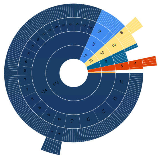
The graph now shows the real strength of sunburst graphs. You can immediately see that a large part of the company have one common executive at level 2, while the (small) remainder is divided under multiple executives. Adding more levels to series groups has however a counterproductive effect. SSRS takes the level with the lowest grain and divides colors amongst that level. If there are a lot of members on that level, you get too many colors. The chart then resembles the color wheel of your local paint shop.
Unfortunately in the current CTP release of SQL Server 2016, tooltips aren’t working properly. If you define an expression, it only shows in the outer ring. All other rings display by default in the field defined in category groups. This will probably change in the future.
You also have no control over the different slices. When using pie charts, there are a whole bunch of properties you can set to control how slices behave. A very interesting one is pie start angle, where you can set at which “hour of the clock” the first slice starts.
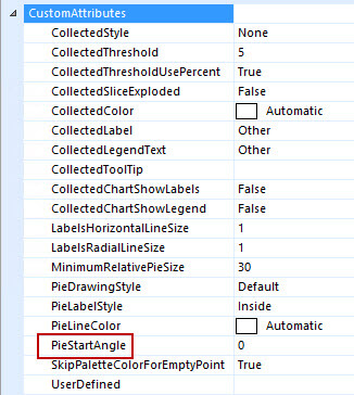
There are no such properties for the sunburst chart, but again, this might change in the future.
Conclusion
The sunburst graph type is a nice addition to the toolset of the SSRS developer. It shows the dependency of various members in a hierarchy quite well. However, it lacks in displaying accurate information since it’s hard to compare individual slices. The sunburst chart type has a few minor issues, but those might be solved in later releases of SQL Server 2016.
Next Steps
- Try it out yourself! Download and install the SQL Server 2016 preview and follow the steps in this tip to create your own sunburst chart.
- For more SQL Server 2016, read these other SQL Server 2016 Tips.
- For more Reporting Services tips: Reporting Services Charts Tips.

Koen Verbeeck is a seasoned business intelligence consultant with over a decade of experience with the Microsoft Data Platform. He holds several certifications, including Azure Data Engineer. He’s a prolific writer, with over 375 articles on technologies such as Microsoft Fabric, SSIS, ADF, SSAS, SSRS, MDS, Power BI, Snowflake and Azure services. He has spoken at various events such as PASS, SQLBits, dataMinds Connect and many others. He frequently delivers educational webinars on MSSQLTips.com. For his efforts, Koen has been awarded the Microsoft MVP data platform award for many years.
- MSSQLTips Awards:
- Leadership Award (200+ Tips) – 2021
- Author of the Year – 2014/2020/2022
- Author Contender – 2024/2025