Problem
What formatting functions are available in Power BI, especially those that make customizing a table or visualization easier?
Solution
I often tell my report consumers that getting the data is EASY; but formatting the data “just right” is very hard. Some folks like the data to be very compact or linear. Others, like lots of color or contrast. It is a balancing act, but in this tip we will cover some of the ways to make the formatting process easier. First, matrix and table styles will be covered; then we will move on to formatting of charts including colors, gradients and diversion scales, single and multiple reference lines, and finally how to display values with no data. The combination of these items will provide a very well defined and easy to understand view in Power BI.
To get started with these functions, the first step is to download the latest edition of Power BI Desktop (PBID). Additionally, you need to do a few things to get everything setup for access including signing up. Note that you must use a work or school address to sign up for Power BI. Gmail, Yahoo, and similar accounts will not work. Once you have your account setup, you are ready to start exploring the formatting features available in Power BI.
Power BI Desktop Table and Matrix Styles
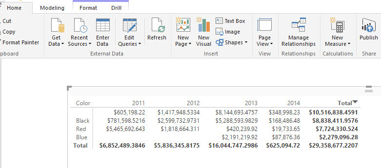
When dealing with raw numbers, often a table, grid (matrix) or cross tab is the perfect solution for conveying a set of numbers. However, the initial table or matrix displayed by Power BI Desktop, shown below, is actually quite boring…snooze….
So what is a table designer to do? Recent updates completed for Power BI come to the rescue. Preset Styling is now part of the Power BI formatting tool arsenal for styling both matrices and tables. To apply a table or matrix style, first select the appropriate visualization and then click on the roller paint brush, Format, button. Next, open the Table or Matrix Style property and select one of the pre-defined styles.

Of course just as you can adjust the various format properties after applying a style in Excel, Power BI allows you to fine tune the table format after applying a style. Note the format adjustments made after applying a table or matrix style do not become part of that style; the styles are more of a good starting point.

Finally, after applying a style, you can decide to go back to the default by simply clicking on the Revert to Default option under Style.


As a close cousin to the default styles, we can also use conditional formatting in Power BI Desktop. Any conditional formatting that you apply to your tables (currently does not work with matrix visualizations, but is on the “to do” list) will actually override any styles that have been posted to that particular table. The neat thing about conditional formatting is you can actually apply it to each column in your table. To apply conditional formatting you simply select the measure that you would like to apply the formatting. Once you select the measure and right mouse click, select conditional formatting and then select the rules that you would like to apply for the conditional formatting.

You can always reverse the conditional formatting by following the same process, but instead select Remove conditional formatting.
.jpg)

Finding the Right Chart Color in Power BI Desktop
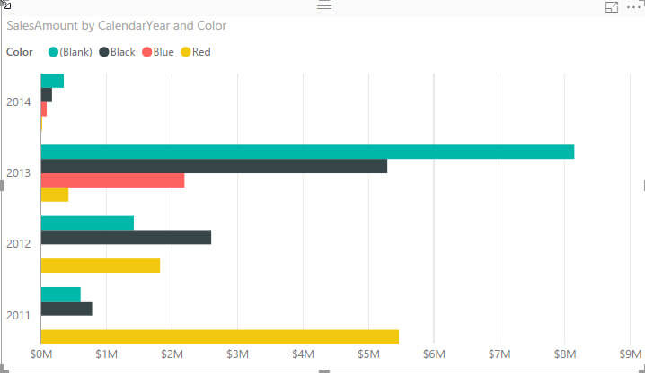
In a very similar fashion we can apply formatting and coloring to the chart visualizations. What if we had the following chart and we want to color code the bars to “match” the color in the legend?
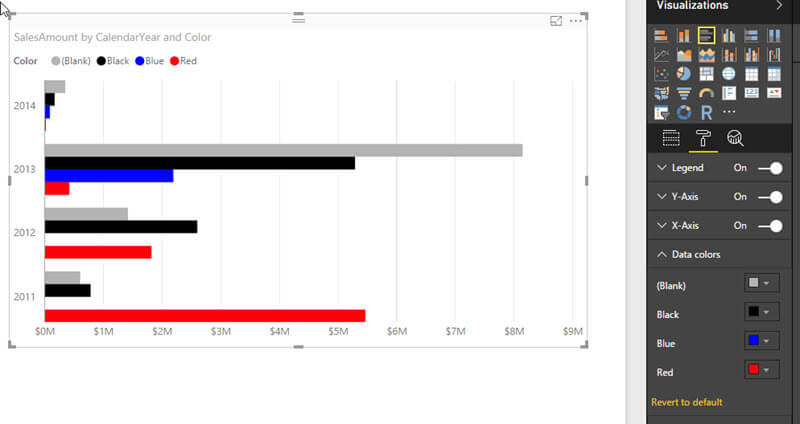
We can easily apply set colors to our bars by clicking on the chart, then clicking on the Format “paint roller” button and then opening the Data Color properties. Within the Data Colors property, we can assign a color to each item in our series. As shown below, we can match the color with the name!
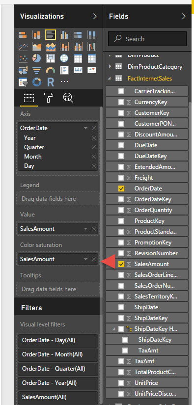
Of course, those colors are sort of “ugly”; as an alternative, we actually may want to apply a diverging or gradient colors. To apply a gradient color set, you use the color saturation property found under the Fields area. You drag the field to use as the basis for the color gradient from the fields list to the Color Saturation property.
As seen in the subsequent screen shot, the color for each bar in the graph is based on the sales amount value. You should note a couple of items about the color saturation property. First, it can only be implemented if you have a single series on your visualization. If you try to add a field to the Color Saturation when you have a series field in the legend, it will not allow you to drop the field into the Color Saturation box. Second, many charts, such as a pie chart, do not allow you to set a color saturation level.

Furthermore, we can control both the variation of the same color or the use of different colors, all based on a measure values. We accomplish these color changes by clicking on our visual, and then clicking on the Format paint roller button. Under Data colors, we can adjust the lower minimum and upper maximum bounds assigned to our selected colors. In the below example, the lower limit of 6,000,000 is assigned a reddish color and upper limit of 15,000,000 is set to yellow.

We can add a third “center” factor to the color scheme by switching the Diverging option to On. As illustrated next, we now flow the color scheme over 3 colors instead of 2. You should note that all these color options are also available when editing a report in Power BI online!

Often when displaying variations based on color, we may want to add a baseline reference line too. On many visualizations we can add a reference or constant line. This option appears under the Analytics button (magnifying glass). As shown next, we can add a constant line with a line name, a data point value / amount, and a line style and color. You can actually add multiple lines to your visualization.
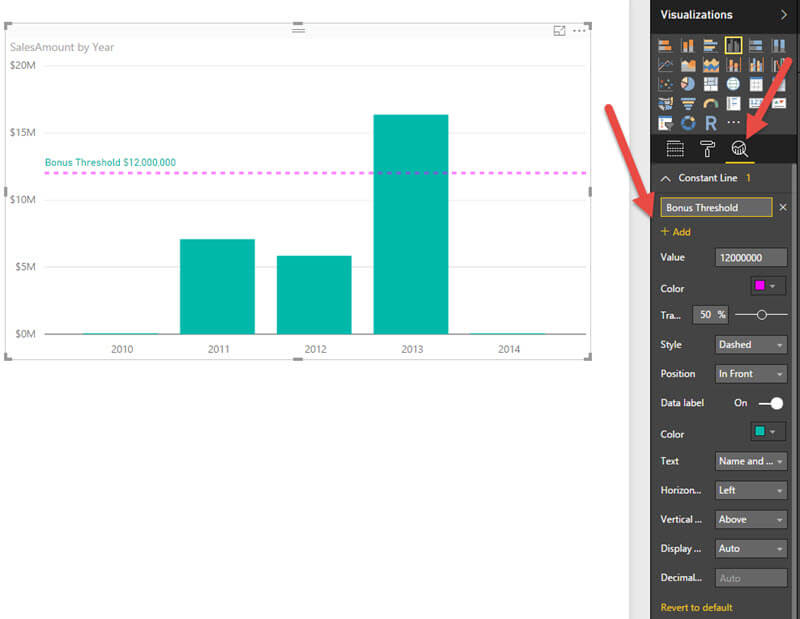
Folks often ask how to add a “calculated reference line; to complete that process Power BI includes a set of additional options to add the following reference line types: minimum, maximum, average, median, and percentile. In a similar fashion to the constant line, we can set the color, style and transparency for the reference line. We additionally get the option of selecting what measure serves as the basis for the calculation. Note, the measure must currently appear on the visualization to be used as a basis measure. Lastly, these calculated reference lines are only available on a limited number of visualizations including cluster bar, cluster column, line, and area charts.

Another formatting option that is often requested is to show fields which contain no data. The default setting for Power BI is to not show any categories that have no related measure data. However, you can actually reset that field to display items which are lacking any data. This option is available under the Fields panel. As illustrated next, you would right click on the field in question (Color in the below example) and then select the “Show items with no data” option.
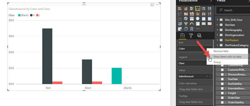
Now all colors are displayed even if no data exists for that field.

Conclusion
Throughout this tip, we covered several methods to control the display of data and charts by Power BI. Colors can be set for specific rows and columns in a table or matrix or even be applied through conditional formatting. These color properties can extend beyond the preset table and matrix styles which are available in Power BI Desktop. Likewise, we can color code data sections on a chart including setting the color for a single line, bar, column, or slice. Alternately we can use color saturation to apply a two or three tone gradient display of our chart graphics. Finally, we can also set a visualization to show items that contain no data. All these items add up to great ways to customize the look of your Power BI Reports and Dashboards.
Next Steps
- Review all the Power BI Tips on MSSQLTips

I have a passion for crafting Business Intelligence Solutions for my user groups. My experience includes almost 15 years of SQL Server involvement with the last 12 years focused specifically on Business Intelligence, SharePoint, OLAP, SSRS, and Decision Support solutions. Currently, I am a Business Intelligence Architect in the healthcare industry, and I also teach database and analytics classes for Kennesaw State University, Southern New Hampshire University, and Reinhardt University. My education includes an MBA and an undergraduate in Accounting (yes I am a reformed accountant!), both from Kennesaw State University. I enjoy every day by trying to grow my faith and spend precious time with my family. I have been happily married to my wife of over 20 years, and we have two teenagers one who we home school with the help of a University Model School, Cornerstone Prep in Acworth, GA (cornerstoneprep.org). Our other child is a Construction Management major at KSU’s Southern Poly / Marietta campus. We are a soccer and Cross Country (XC) family who play, coach, and referee soccer or run for fun most every day. For several years, our family has volunteered (and played with the dogs and cats) at Etowah Valley Humane Society in Cartersville, GA.
- MSSQLTips Awards: Champion (100+tips) – 2016 | Author of the Year – 2015 | Author Contender – 2014, 2016-2021