Problem
R is a popular data modeling, analysis and plotting framework that can be used to work with data from a variety of sources. In this tip, we will look at RStudio, an integrated development environment for R, and use it to connect, extract, transform, plot and analyse data from a SQL Server database. Unlike using R Services or executing R from within SQL Server, it is not necessary to have SQL Server 2016 – this method can be used with most versions and editions of SQL Server. We will also take a brief look at ggplot2, a powerful R package that can be used to generate complex data visualisations.
Solution
Configuring the Environment
Preparing AdventureWorks
AdventureWorks is one of the sample databases provided by Microsoft. For the example, we will be using SQL Server 2012 SP1 Developer Edition with the AdventureWorks 2012 database.
Download the file, then attach it to your local instance using the Attach… task in the context menu of the Databases subtree in SSMS Object Explorer, or T-SQL, whichever you prefer. Note: AdventureWorks does not come with a transaction log file so a new one will be created.
Once AdventureWorks is attached, you should see it listed in the Databases tree as below:

Note down the server name, instance name and AdventureWorks database name, and the port number (default: 1433) if this is non-standard. Make sure you are able to access the database. If you are using SQL authentication, make a note of your username/password. We will need these details for our connection string. In my example, server = localhost, instance = default instance, database = AdventureWorks2012, with Windows authentication.
Preparing RStudio
For the example we will be using the latest available stable versions of R and RStudio. Both R and RStudio are required for these examples. Download R by visiting: https://cran.rstudio.com/ and click on the ‘Download R for Windows’ link, then ‘install R for the first time’. Then click ‘Download R 3.4.0 for Windows’.
Open the downloaded file and install the application to your local machine.
Now visit https://www.rstudio.com/products/rstudio/download2/ and find the ‘Installers for Supported Platforms’ section below the product table. Click ‘RStudio 1.0.143 – Windows Vista 7/8/10‘ to download the file. Alternatively, a direct link to the download is here: https://download1.rstudio.org/RStudio-1.0.143.exe
Open the downloaded file and install the application to your local machine.
Finally, check R and RStudio are installed by opening RStudio from the Start Menu / Desktop. You should be presented with a screen similar to the following:

Data Access
Extracting the Data
Before we start working with data, we need to import some packages in R. Packages are synonymous with libraries; specific collections of functions which can be used for a common purpose. There are two steps required to use packages; we first import the package, then we load the package. For our examples we will need three packages: RODBC, which contains data connection functionality; dplyr, a set of data manipulation tools; and ggplot2, a graphics plotting package. Note that packages only need installing once, so you may prefer to comment out the install.packages lines, once installed, by prefacing with #. In the top-left RStudio window, use the following code to import and load these packages by copying/pasting into the Script window and clicking ‘Run’:
install.packages("RODBC")
install.packages("dplyr")
install.packages("ggplot2")
library("RODBC")
library("dplyr")
library("ggplot2")
The top-left and bottom-left windows in RStudio require some explanation. The top-left window is the script window where we create, open, save and close R files. These are script files containing R commands. The bottom-left window is the console window, where we can enter commands manually and execute them line-by-line. By using the script window instead of the console window to build our example, we can run parts or all of our code on demand without losing track of where we are.
Now, we need to define a new object to use to connect to SQL Server. This object will hold all details of the connection string, and we will subsequently pass this object into another method which will execute a query. First, use the connection string details you noted earlier to build a new connection called ‘conn’ in the manner below. Type/paste this into the Script window, highlight the line and click ‘Run’:
conn <- odbcDriverConnect('driver={SQL Server};server=localhost;database=AdventureWorks2012;trusted_connection=true')
odbcDriverConnect is a method in the RODBC package used to connect to data sources. It will accept connection strings in the standard format as shown above, or can be used to reference a local DSN, if you prefer. The latter method is useful if we want to manage our connections centrally. The RODBC manual is available here: https://cran.r-project.org/web/packages/RODBC/index.html. Note that you can get help on any R command by prefacing the command with ? You can search the R documentation on any command by prefacing the command with ??.
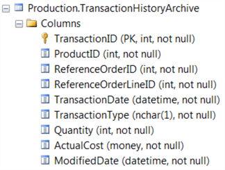
Now, we are going to interrogate the Production.TransactionHistoryArchive table in AdventureWorks. The table is constructed as follows:
Let’s first construct a simple SELECT * query in the Script window, then use the sqlQuery method in RODBC to execute it against SQL Server and return the results to a new object called ‘data’. We could use a more complex query, or call a stored procedure, or even load a pre-defined query from file, but for this example we’ll use straightforward inline SQL:
data <- sqlQuery(conn, "SELECT * FROM Production.TransactionHistoryArchive;")
Type this into the Script window then highlight the line and click ‘Run’. The output of this is a new object called ‘data’. We can see the ‘data’ object metadata in the top-right window of RStudio – this is the Environment window.
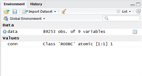
We can see there have been 89,253 rows returned and 9 variables (columns) in the table.
Now, we’re going to sub-select some of this data by using the ‘select’ method in the dplyr package. To do this, we will assign the output of a select statement against our ‘data’ object back to the object – in other words, overwrite our large data set with a subset of the data. We are interested in 2 of the 9 columns. Run the following line of code in the Script window. You will see in the Environment window that the description of ‘data’ has changed, from 9 variables to 2 variables.
data <- select(data, TransactionDate, ActualCost)
Transforming the Data
Now let’s transform the data by aggregating the ActualCost against each TransactionDate. In SQL Server, we can use GROUP BY to achieve this; similarly, in R, we can use group_by and summarize, two dplyr package methods to the same effect. Run the following lines of code:
data <- group_by(data, TransactionDate)
data <- summarize(data, sum(ActualCost))
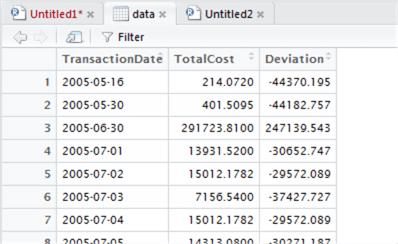
Now we can inspect our object by typing the object name into the console window and hitting Enter. Type ‘data’ (without quotes) into the console. You will be presented with a screen similar to the following:
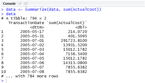
The dplyr terminology for a subset or projection of data is a ‘tibble’ – in this context, it means simply a subset of data. We can work with the object as a tibble, but we might find it better to convert it to a data frame, a widely-recognised type in R, so we can analyse it further. Let’s use dplyr’s ‘arrange’ (this is ORDER BY in SQL) , then pipe the output to a data frame by using as.data.frame. Piping is easy in R, and has the same principles as piping (|) in Unix-like systems – we use %>%. Run the following in the script window:
data <- arrange(data, TransactionDate) %>% as.data.frame
Check the Environment window. You can see the data object metadata has changed to 794 obs of 2 variables – this simply means 794 rows in two columns. We also have a small grid icon to the immediate right of this variable. Click this to open the data inspector – we can browse this data in a familiar tabular format:

Now depending on our data, we might wish to transform the data types themselves. In SQL we use CAST or CONVERT, and there’s nothing to stop us using this in R too, within the query. However, R gives us other options, and one of the most well-known is ‘mutate’. Something mutate gives us is the ability to add new columns based on a transformation of existing columns. We will use mutate in the example below to convert TransactionDate to a Date type, overwriting the existing column. Although this isn’t strictly necessary here, it’s useful to know how to do. Don’t forget that help is available by prefacing the command with ?, so to get help with mutate, execute ?mutate.
data <- mutate(data, TransactionDate = as.Date(TransactionDate) )
Now we have prepared our data, let’s visualise and analyse it.
Data Access
Visualising and Analysing the Data
Visualisation in R can be tremendously simple, and enormously complex. There are a vast number of visualization packages available plus some built-in functionality to R itself. We’ll start by visualizing the data for analysis in a simple generic X-Y plot. Use the ‘plot’ method to achieve this. The syntax of plot is straightforward – we specify the X axis (horizontal), a tilde ~, the Y-axis, and the type. Types can be ‘p’ for points, ‘l’ for lines, ‘h’ for histogram and so on. That’s it. Let’s give it a go:
plot(data$"sum(ActualCost)"~data$TransactionDate, type="h")
When we execute the above, a plot appears in the bottom-right window in the Plots tab:
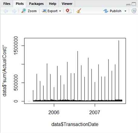
This is an easy visualization, and something immediately jumps out – we can see periodic high-cost transactions taking place regularly, with the majority of transactions being relatively low. The variation between these groups is a problem for analysis, since the data is combined. So, we now split this data – let’s create two further datasets to separate out the high values from the low ones. This is where R really starts to pull away from using raw T-SQL, because using our plot, we can visually estimate the value of the Y-axis where this separation occurs. We can also calculate it using mathematics, demonstrated below. But how do we decide what is high, and what is low?
Looking at the plot, we can visually estimate the low/high divide at approximately 200,000. But we can also do this another way, by using mutate to add a column to our data set calculating the deviation from the mean, then filter out two sets of data – one where the deviation is relatively high, and one where the deviation is relatively low.
First, we’ll rename the column called ‘(sum)ActualCost’ to ‘TotalCost’ to make the following scripts easier to understand and avoid confusion. You can check the name change took effect in the data inspector.
colnames(data)[2] <- "TotalCost"
Let’s calculate the mean of TotalCost like so and store it in new variable m:
m <- mean(data$TotalCost)
And let’s use m in the mutate function to add a column to this data frame calculating each deviation from the mean:
data <- mutate(data, Deviation = TotalCost - m )
Let’s now take a look at the plot of the deviations to see if we can find an easy differentiator between low and high values. This time we’ll set our own Y-axis range to ‘zoom in’ on the data, using ylim to set an experimental range from -100000 to 100000:
plot(data$Deviation~data$TransactionDate, type="h", ylim=c(-100000, 100000))
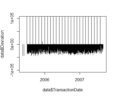
We can see the majority of the data, the ‘low’ data, has a deviation in the negative from the mean – likewise, ‘high’ data has a deviation significantly higher than the mean, with a few stray low positive values. Looking at this graph, let’s revise our estimate of 200,000 and set our threshold limit between high and low at 50,000, which correctly classifies 100% of the data.
threshold <- 50000
Now let’s create two new plots from our existing data set – one showing high data only, and one showing low data only. We can use the ‘filter’ method in dplyr to do this. Filter works much like T-SQL’s ‘WHERE’.
lowData <- filter(data, TotalCost <= threshold)
highData <- filter(data, TotalCost > threshold)
Now let’s plot the data using custom Y-axis limits so we can focus in on the trends for both ‘low’ and ‘high’ data. This time, we’ll automatically calculate our Y-axis limits based on the data minima and maxima:
plot(lowData$TotalCost~lowData$TransactionDate, type="h", ylim=c(min(lowData$TotalCost), max(lowData$TotalCost)))
plot(highData$TotalCost~highData$TransactionDate, type="h", ylim=c(min(highData$TotalCost), max(highData$TotalCost)))
We can browse the plots in the Plots tab. Both plots are shown below. By separating out the plots, we’ve revealed at least one useful insight – transaction values dipped significantly in the final quarter of 2006. This wasn’t visible in the combined plot.

Now, these graphs are pretty boring. Although data professionals are, by and large, perfectly happy to look at simple plots and endless tables of data – it comes with the territory – others prefer more exciting graphics. Plot can be extended to recolour, resize and set a vast array of graphics parameters, but the package ggplot2 is specifically designed for more advanced visualisations. However, it has a steep learning curve and it’s advised to spend some time with the documentation.
Let’s create a new plot using ggplot2 and assign it to a variable:
lowPlot <- ggplot(lowData, aes(TransactionDate, TotalCost, fill=TotalCost)) + geom_line(colour="Orange")
Type ‘lowPlot’ and hit Enter in the Console window to view the plot.
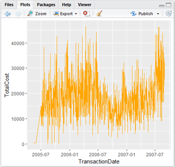
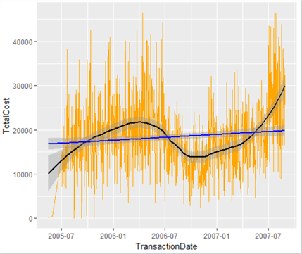
This is quite nice – it’s a lot more swish than the grey functional graphs produced by plot. Let’s now add a trendline – we can do this by using geom_smooth(). There are various types of line of best fit we can use – linear regression, generalized linear regression and local regression (the default). We want to capture the local variations rather than just drawing a line through the data, so let’s add a local regression line like so, and colour it black to stand out:
lowPlot <- lowPlot + geom_smooth(span = 0.5, colour="Black")
lowPlot

This is really useful – it shows the trend in low-level transaction value data. What we have also done is layer our plot object – we’ve added a line of best fit. Let’s add another line to the graph, showing the overall growth (or decline) of transaction values over time based on all data – a linear regression line. We could call this our overall growth line, and note where the local line of best fit exceeds or otherwise our expected line. We could then see fairly easily in which periods our transaction values were weak, and where they were strong.
Let’s replace our plot as described, and while we’re at it, remove the legend.
lowPlot <- ggplot(lowData, aes(TransactionDate, TotalCost, fill=TotalCost)) + geom_line(colour="Orange")
lowPlot <- lowPlot + geom_smooth(span = 0.5, colour="Black", show.legend=FALSE)
lowPlot <- lowPlot + geom_smooth(method=lm, colour="Blue", show.legend=FALSE)
lowPlot
There is much more than can be done in R, especially in the area of statistics analysis, and we have only touched the surface of what is capable in data visualization. Look out for the next instalment of this series where we will examine these topics in more detail.
Next Steps
- More tips on R and data visualization:
- SQL Server 2016 R Services: Executing R in SQL Server – https://www.mssqltips.com/sqlservertip/4126/sql-server-2016-r-services-executing-r-code-in-sql-server/
- Plotting SQL Server Data for Data Visualization [Python]: https://www.mssqltips.com/sqlservertip/2664/plotting-sql-server-data-for-data-visualization/
- SQL Server 2016 R Services: Display R plots in Reporting Services: https://www.mssqltips.com/sqlservertip/4127/sql-server-2016-r-services-display-r-plots-in-reporting-services/
- Find the CRAN documentation for R here:

Dr. Derek Colley is the lead technical consultant for Optimal Computing, a boutique data consultancy based in the UK NW helping clients troubleshoot, configure, plan and deploy their data platforms. He specializes in data integration and database performance optimization, and is a PhD candidate with Staffordshire University, looking into methods of integrating AL query selection algorithms with the cost-based query optimizer. In his spare time, he enjoys building robots, going outdoors, and spending time with his four children.
- MSSQLTips Awards: Trendsetter (25+ tips)