Problem
Data exploration is a routine exercise for data hosted in different repositories like OLTP databases, data warehouses and even data marts. Developing reports to explore data graphically is a time-intensive process. Database developers as well as analysts often encounter ad-hoc, urgent, last-minute requests to analyze and report data points of interests to the end user. In such cases, there is no time for developing stored procedures and reports. Mostly in such circumstances, developers execute a complex query and dump the data in a text or Excel file and share the data. This does not solve the purpose of rapid analysis and in cases of large dataset analysis in a tabular format does not help. The need is to develop quick graphic data snapshots which can be shared with end-users to present an initial level of analysis until well-crafted reports are designed, develop and deployed.
Solution
SQL Server 2016 and higher supports execution of R scripts from T-SQL code, which can be used to quickly create graphs with minimal effort for data analysis. In this tip, we will use NFL data to show how this can be done. We will look at three different types of charts that can be generated and then show the R code that can be used to generate the charts.
Analyzing NFL data with R
Let’s say we intend to explore a sample dataset and derive some analysis. You can use any dataset that you may have, but for the purpose of this demonstration I will use a NFL dataset which is available from this wiki page.
As our use case is that the data has to be analyzed from a data repository, you can just create a table in your database and copy and paste the data from the wiki page. Let’s call this table NFLTest and let’s say that our intention is to find records that are probable performance outliers in this dataset.
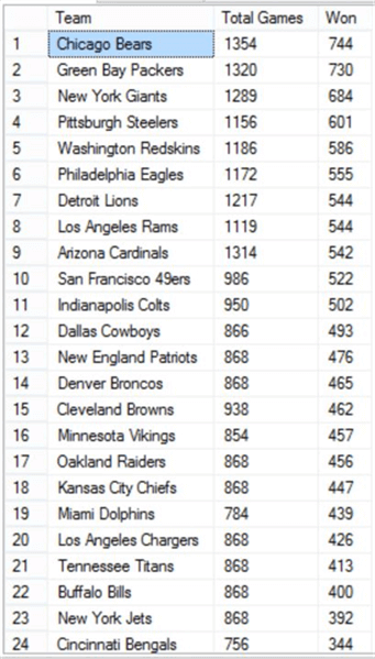
Here is a sub-set of what the data looks like.
SQL Server R Dot Chart
Let’s say you have thousands or millions of records in a table, in that case you may want to start the analysis by taking stock of how the distribution looks for a particular field of interest. In our case the number of matches won by a team is a performance parameter for us. If we create a dot chart of matches won by each team, the chart would look like below.

From the above chart you can see that there are a few teams that have won between 600 and 700 matches, and a few have won more than 700 matches. In a large dataset, you may have hundreds or thousands of points, so this dot chart might not be very helpful.
SQL Server R Histogram Chart
A histogram chart is an ideal way of analyzing the distribution, which would look like below.

This histogram chart clearly shows that there are two teams that have won between 600 – 700 and 700 – 800 matches. The majority of the teams have won between 400 – 500 matches. Different teams have different number of matches won, but they may also have played a different number of matches.
SQL Server R Scatterplot Chart
If two teams have played the same number of matches and still have lesser wins, then that can be a possible performance differentiator. This can be analyzed by a scatterplot chart as shown below.
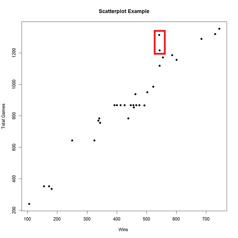
If you analyze the above chart, you will find that as the number of matches increases, the correspondingly number of wins increases. Of course, it’s not an exact linear relationship and there may still be other factors affecting this relationship.
If you analyze the points in the red box above, you will find that these teams have played a comparatively large number of matches, but the wins are quite less. Now if you take a look at the tabular view of the data as shown below, records 7 and 9 are the ones which have played more than 1200 matches, but still have wins in the range of 500-600. Compared to this, teams in records 1, 2, 3 and 4 have wins in the range of 600 – 700 for total games above 1200 – 1300. So records 7 and 9 can be considered a probable outlier as their wins are not proportionate to the number of matches and can be passed on to the data experts for further analysis.
Code to Generate Charts with R
So how can we generate these kind of graphs using T-SQL for quick analysis, without involving SSRS or dumping data in Excel? This can be solved by using R scripts in T-SQL from SSMS. The above graphs were generated by the below code.
DECLARE @sqlquery nvarchar(max) =  N'SELECT Won, Team, TotalGames FROM NFLTest'
EXECUTE sp_execute_external_script language = N'R',
@script = N'
   jpeg(filename="C:\\temp\\plots\\Win_Distribution.jpeg", width = 1080, height = 1080, units = "px", pointsize = 12, quality = 75,);
   dotchart(InputDataSet$Won,labels=InputDataSet$Team,cex=2,main="Team Wins", xlab="Wins")

   jpeg(filename="C:\\temp\\plots\\Wins_Histogram.jpeg", width = 1080, height = 1080, units = "px", pointsize = 12, quality = 75,);
   hist(InputDataSet$Won, col = ''lightgreen'', xlab=''Won'', ylab = ''Counts'', main = ''Histogram of Wins'');

   jpeg(filename="C:\\temp\\plots\\Wins_vs_TotalGames.jpeg", width = 1080, height = 1080, units = "px", pointsize = 20, quality = 75,);
   plot(InputDataSet$Won, InputDataSet$TotalGames, main="Scatterplot Example", xlab="Wins ", ylab="Total Games", pch=19)

   dev.off();
   ',
@input_data_1 = @sqlquery
Here we are using the jpeg function to specify the path of the file where we want the chart to be saved along with details of the resolution.
Then we are using functions like dotchart, hist and plot to create the different kinds of charts.
The dataset being used is passed by the @sqlquery parameter where we are just reading the fields from a table. To use this data inside the R script, we are using the default dataset name – InputDataSet and referring to the fields using the $ sign (i.e. InputDataSet$Won). Also, inside the charting functions we are providing charting related details like color, x-axis label, y-axis label, main, etc.
With this we create 3 graphs with just 6 lines of R script inside the T-SQL sp_execute_external_script stored procedure. When you execute this code, the jpeg function creates the graphic device to which the plotting functions render the output and three jpeg files with the respective charts are saved in the file path specified in the code.
This analysis may require further research on how other factors are affecting the relationship, but the intention of discovering interesting data points quickly is achieved. Such quick graphical analysis can be achieved with SSMS, T-SQL and a few lines of R script, allowing developers to have more insight into the data with lesser efforts and without the need of external reporting tools.
Next Steps
- Consider learning more about charting options in R to generate graphs from T-SQL as required.
- Consider applying this kind of analysis of a dataset having at least a few thousand records to make this analysis more interesting.

Siddharth has more than 14 years of experience in the IT Industry, with more than a decade of experience in Business Intelligence and Analytics, for clients banking, logistics, government, Media Entertainment, products, life sciences and other domains. He has been a lead architect for a portfolio of 40+ apps, containing apps in web, mobile, BI, Analytics, data warehousing, reporting, collaboration, CMS, NoSQL and other technologies. He has several certifications and is a published author for online and print-media publications, as well as the MSDN Library.
In his present role, he remains responsible for architecture design, technology stack selection, infrastructure design, 3rd party products evaluation and procurement, and performance engineering. These applications use technologies like Elasticsearch / Lucene, MongoDB, SharePoint 2013 and 2010, jQuery-based framework like Highcharts and GoJS, SQL Server and the Microsoft Business Intelligence stack (SSIS, SSAS, SSRS, MDX, PowerPivot, PowerView), jQueryMobile, Bootstrap, iOS xCode framework, and many others.
- MSSQLTips Awards: Champion (100+ tips) – 2018 | Author of the Year – 2017 | Author Contender – 2016, 2018-2019