By: Siddharth Mehta | Comments | Related: > SQL Server 2017
Problem
Data can be best summarized and analyzed using diverse types of charts and graphs. Numeric data can be aggregated using diverse mathematical functions and formulas. This aggregated data can then be plotted on charts and graphs, which can take up to 4 different dimensions like the values of X and Y axis, size of a graphic that represents the data point (for example bubble in a bubble chart) or color intensity of the graphic that represents the data point. But when it comes to categorical data, we cannot use graphical elements like size and color to add more attributes on the same graph.
For example, we can display weight vs. price of diamonds on a scatter plot, and each dot (or bubble) that represents a diamond can be sized based on the size attribute of a diamond and the shape of the dot (or bubble) can be categorized based on the cut of the diamond. Here not all attributes are numeric, but consider a dataset of Titanic Survival history, where we have attributes like Survived, Class, Sex, and Age which are all categorical and we intend to analyze all these on a common graph. In general, no single standard chart / graph (like bar or column chart) can display multiple categorical dimensions gracefully. So, the need is to have a single chart / graph that allows analysis of a variety of categorical attributes in a single chart / graph.
Solution
R can be used to generate a mosaic plot which is very effective and efficient in analyzing categorical data and representing the data on a single plot respectively.
We need some sample data which is highly categorical in nature, so that we can use it to generate a mosaic plot. Summarized data generally comes out of OLAP systems. OLTP systems can have millions to billions of records, which get summarized to thousands of records typically in OLAP systems as they are aggregated. To get started we will use a summarized dataset which contains the summary of Titanic Survival data in a CSV format. You can download the file from here. After downloading this file, follow the below steps.
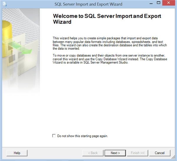
Assuming you have SQL Server 2016 or any higher version installed with SSMS, open it to import this file in SQL Server. Right click the database of your choice and select the Tasks menu, and from that select the Import Data sub-menu item. You will be presented with a Welcome dialog as shown below.
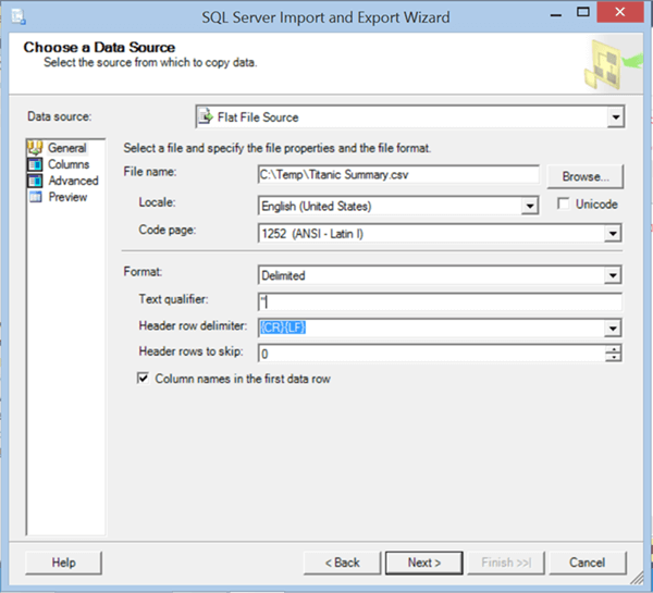
Click the Next button and you are be presented with the option to select the source file. Select the driver, file path (where you have stored the downloaded file), and text qualifier as shown below and click Next.
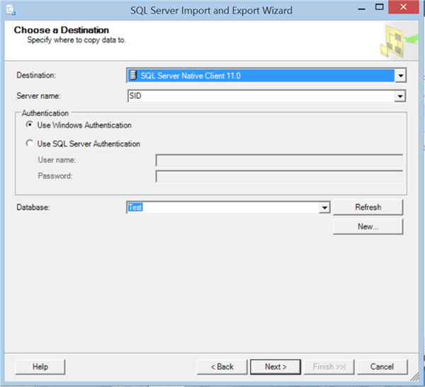
In this step, you need to specify the destination in SQL Server where you want to have the data stored in any SQL Server table. Select the options as shown below, provide a table name of your choice and click Next.
You can edit the mapping from the source file to destination table in this step. We need not necessarily edit it here as we are loading data in a new table. Click Next after you have validated the mappings.
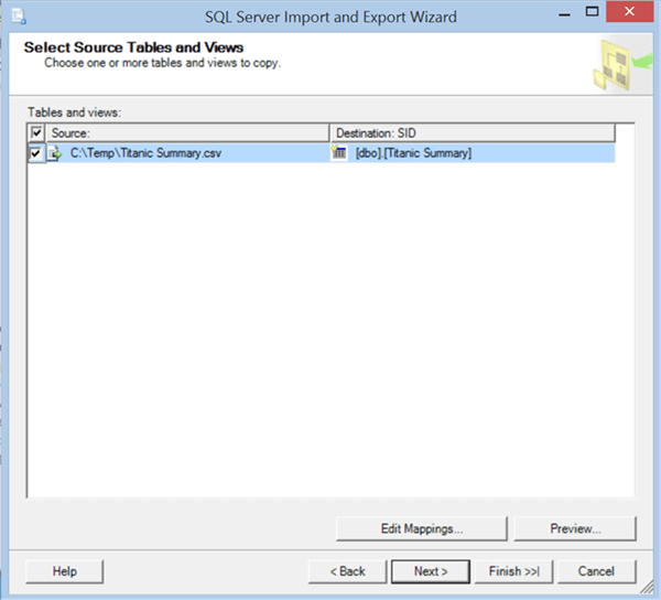
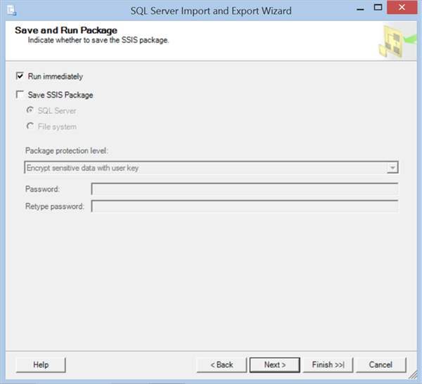
Now you just need to provide confirmation to execute the import process and load the data into the table. Click Finish and you should be able to import the data.
After the data import is complete, you can change the column names or table name as you find appropriate from the table design, though it is not mandatory. When you query the data, you should be able to find the data as shown below.
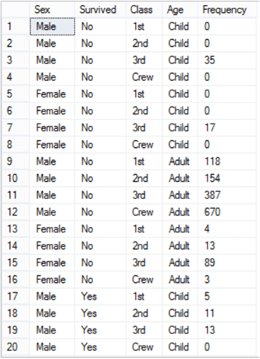
As you can see, there are four categorical attributes – Sex, Survived, Class and Age. Frequency is the summarized total number of passengers. The closest way to analyze this data on a chart is by using a pivot-chart which will include a few filters and drop-downs, or a multi-dimensional table which still does not provide us a visual picture of the data. SQL Server 2016 and higher versions support execution of R scripts. We will use an R script to analyze this data. To do so you may have to enable external script execution by executing a simple command as explained in this article.
Code the script as shown below and execute it.
execute sp_execute_external_script
@language = N'R',
@script = N'

TB <- xtabs(Frequency ~ Class + Sex + Age + Survived, data = InputDataSet)
print(TB)
'
,@input_data_1 = N'Select Sex, Survived, Class, Age, cast(Frequency as int) Frequency from TitanicSummary'
Let’s understand this code.
- Sp_execute_external_script is the store procedure which can execute external scripts in SQL Server.
- @language parameter signifies the script language being used, which is R in this case.
- @input_data_1 parameter signifies the data that will be read from SQL Server and will be passed to the R script in the @script parameter. The frequency field is supposed to be a numeric field. So, if you have kept the datatype of this field as numeric, you do not need to cast it in the query. Else you can cast the column to an int datatype as shown in the above script.
- @script parameter contains the actual R script which will be executed. In the script, the first line used the xtabs R function to create contingency tables in frequency-weighted format, and assigns the output to the variable TB. This allows us to numerically study the distribution of different categorical variables. The second line just prints the output. You can read more about xtabs function from here.
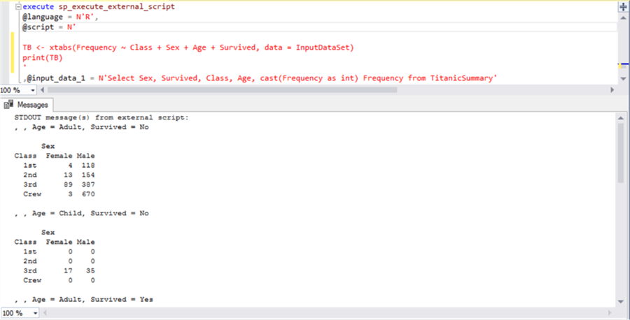
This data is still numerical and cannot be easily analyzed, although it enables you to analyze and summarize a large set of categorical data into a smaller number of views. This data can be fed to a chart called a mosaic plot. Code the below script and execute it.
execute sp_execute_external_script
@language = N'R',
@script = N'
library(vcd)

TB <- xtabs(Frequency ~ Class + Sex + Age + Survived, data = InputDataSet)
print(TB)
jpeg(filename="C:\\temp\\Mosaicplot-1.jpeg", width = 2200, height = 1080, units = "px", pointsize = 15, quality = 100);

mosaic(~ Sex + Age + Survived + Class, data = TB, highlighting="Survived", highlighting_fill=c("red", "skyblue"),
labeling_args=list(gp_labels=gpar(fontsize=20), gp_varnames=gpar(fontsize=24)),
legend_args=list(fontsize=16), margins=unit(4, "lines"), legend_width=unit(1, "lines"))
'
,@input_data_1 = N'Select Sex, Survived, Class, Age, cast(Frequency as int) Frequency from TitanicSummary'
Let’s understand this code.
- Using the library function, we have referenced an R library / package named “vcd” which hosts the mosaic function to create a mosaic plot. In case you do not have this library installed on your R server, you can install it. You can read more about installing additional R packages on SQL Server from here.
- Using the jpeg function, we are just specifying a file path where we want to save the output of the visualization that will be created using the mosaic function. As of the time of writing, SQL Server does not have any features to render visualizations from an R script in SSMS. So, the only option is the save the visualization to a table or file.
- Using the mosaic function, we are passing the contingency tables in the TB variable, and specifying additional parameters related to visual aesthetics of the plot. Let’s say our intention is to analyze the distribution of passengers who did not survive, so we are highlighting these with a red color by passing values in the highlighting and highlighting_fill parameters.
- After the script is executed, it will save the output to the file path mentioned in the jpeg function of the script.
Finally, the mosaic plot would get created as a jpeg file and show look as shown below.
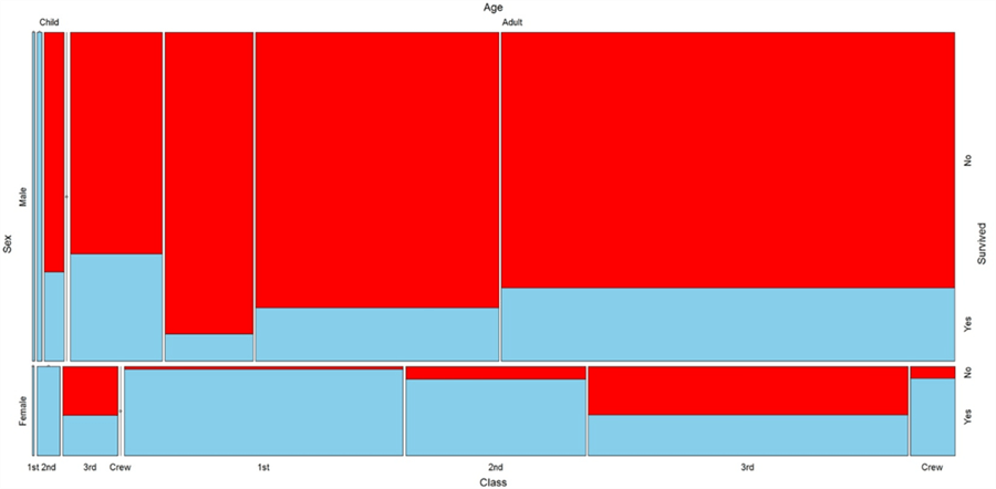
The following derivations can be easily made by just analyzing this visualization.
- This mosaic plot uses all four sides of the chart to represent four categorical dimensions, which can be identified by reading the field name and its corresponding values.
- The proportion of passengers that did not survive (indicated in Red) is significantly more than those that survived.
- Female passengers survived more compared to male passengers.
- Almost all children in the first and second class survived
- A substantial proportion of adult females in the first and second class survived.
- A substantial proportion of adult males in the Crew and 3rd class did not survive.
One point to keep in mind is that we are not interested in actual exact figures, but the intention is to analyze the distribution of categorical data against a numerical attribute like passenger count (Frequency) in this example. Mosaic plots are not available in any of the Microsoft BI Tools, but using R we can generate the plot and efficiently use it for analyzing vast categorical data, with just a few lines of code.
Next Steps
- Try using different out-of-box charts in SSRS / Excel / Power BI to understand how a Mosaic plot is different and effective with categorical data compared to other charts.
About the author
 Siddharth Mehta is an Associate Manager with Accenture in the Avanade Division focusing on Business Intelligence.
This author pledges the content of this article is based on professional experience and not AI generated.
View all my tips


