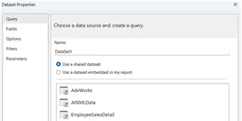
Problem
A slope chart is a variation of a line chart, in which two points in time are compared for different series. It allows you to easily compare the rate of change between the two periods in a glance. In the first part of this tip series, we created the basics for a slope chart in Reporting Services. Now we’re going to finish the chart with some advanced formatting.
Solution
The goal of this tip is to create the following slope chart using the built-in capabilities of SQL Server Reporting Services (SSRS):

It is advised to go over the first part of this tip, if you haven’t already. There we retrieve the sample data from the Wide World Importers data warehouse and create the first iteration of our slope chart with basic formatting. This is the result and the starting point of this part:

Positioning the Data Labels
The hardest part is the position the labels correctly. We want the labels for 2013 to appear left of the gridline and the labels for 2014 to appear right of the gridline. Unfortunately, we can only configure one setting: it is either left, right or any of the other available options:

The Outside option seems the perfect fit, however it results in an error. The graph becomes blank and the following message is displayed:

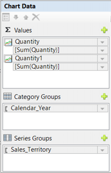
The solution to the problem is to create an additional series by adding the quantity measure twice. The second series will be hidden. From the first series, we’ll display only the labels for 2013 and position them left of the gridline. For the second – invisible – series, we’ll display only the data labels for 2014 and position them to the right of the gridline.
To duplicate the series, simply drag the Quantity field from the data set to the Values region:
We’re going to set two expressions on the data labels of the first series:
- One to hide the label if the year is not 2013
- One to concatenate the name of the sales territory to the value of quantity. By adding the name, we can delete the cluttered legend at the top.
Right-click the data label and go to properties. In the General pane, hit the fx button to go to the expression editor for the label data:

The Format function is used to show the value of Quantity as thousands, like we configured before. Close the properties window. While the labels are still selected, hit F4 to bring up the properties pane. For the Visible property, the following expression is set:

The Position property is set to Left. Now, we need to enforce SSRS to actually put the labels to the left. We can do this by using SmartLabels. Instead of selecting the data points, select the chart series itself. In the properties pane, we can find SmartLabels in the Labels section. Open the node and set AllowOutsidePlotArea to True.

With SmartLabels, we can also control the layout of the arrows that are sometimes displayed when a label is a bit too far from the actual series. In this example, the color is set to Gray in the CalloutLineColor property. In the NoMoveDirections node, we can configure all of the directions we want the labels to move to.
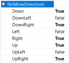
A value of True means the label cannot move in that direction. We’ll set everything to True, except the directions Left, DownLeft and UpLeft. When we render the graph, the labels have disappeared. What happened?

We configured the labels to go left and they can be positioned outside the plot area. However, there’s simply no room at the left to actually place the labels, so they have “fallen off” the chart. It’s also possible that in your case the labels are only partially displayed. The solution is to configure the CustomInnerPlotPosition of the chart area. This property determines the position of the plot area (the visualization except labels, axis, legends and titles) within the entire chart. Make the chart a bit wider and then select the chart area.

Give the Left a higher number so there’s enough room for the labels. Also, make the Width smaller so there’s room for the labels on the right. In the screenshot above you can see the values I used for the example. When rendering the report, the labels on the left are now displayed properly:

We can repeat the same steps for the right labels. The expression on the extra series to only show data labels for 2014:

Instead of hard-coding a value for the year, you could also determine the minimum and maximum values in your source query. An example using windows functions:

The NoMoveDirections are configured to only allow positioning to the right. Don’t forget to set AllowOutsidePlotArea to true and to change the color of the labels and the arrows to gray.

The chart now has the following layout:

Formatting Line Colors
At this point you can probably call it a day. However, when you have more series (here we have only 8), the slope chart can become a bit of a spaghetti mess. A good solution is to only highlight the lines with the highest and the lowest gradient. With some T-SQL window functions, we can determine those series in the source query:
WITH cte_basedata AS
(
SELECT
     c.[Sales Territory]
    ,d.[Calendar Year]
    ,Quantity = IIF([c].[Sales Territory]='Plains'AND [d].[Calendar Year]= 2014
                       ,SUM(f.[Quantity])* 0.75-- make sure at least one territy has declining numbers
                       ,SUM(f.[Quantity])
                   )
    ,MinYear  = IIF([d].[Calendar Year]=MIN(d.[Calendar Year])OVER(),1,0)
    ,MaxYear  = IIF([d].[Calendar Year]=MAX(d.[Calendar Year])OVER(),1,0)
FROM [Fact].[Order] f
JOIN [Dimension].[City] c ON [c].[City Key] = [f].[City Key]
JOIN [Dimension].[Date] d ON [d].[Date]     = [f].[Order Date Key]
WHERE [d].[Calendar Year] IN (2013,2014)
  AND [c].[Sales Territory] <> 'External'
GROUP BY [c].[Sales Territory]
        ,[d].[Calendar Year]
)
,   cte_CalculateDelta AS
(
SELECT
    [Sales Territory]
   ,[Calendar Year]
   ,[Quantity]
   ,[MinYear]
   ,[MaxYear]
   ,Delta     =   FIRST_VALUE([Quantity])OVER(PARTITIONBY [Sales Territory]ORDERBY [Calendar Year]DESC)
                - FIRST_VALUE([Quantity])OVER(PARTITIONBY [Sales Territory]ORDERBY [Calendar Year])
FROM [cte_basedata] c
)
SELECT
    [Sales Territory]
   ,[Calendar Year]
   ,[Quantity]
   ,[MinYear]
   ,[MaxYear]
   ,[Delta]
   ,Lowest            = IIF(Delta=MIN(Delta)OVER(),1,0)
   ,Highest           = IIF(Delta=MAX(Delta)OVER(),1,0)
FROM [cte_CalculateDelta] c
ORDER BY [Sales Territory], [Calendar Year];
The Delta column assumes there are only 2 time periods. It first fetches the most recent one by grabbing the first value when sorted descending. Then it fetches the oldest time period by fetching the first value when sorted ascending. In the outer query, the lowest and highest delta are determined by comparing the delta with the overall maximum and minimum. Keep in mind this code doesn’t take ties into account. If two series have exactly the same delta and it’s the highest, both will be flagged as having the highest gradient.
Now we can use this data to highlight only the important lines. First we hide all lines of the second series by setting its line color to No Color.

Next, we select the other lines and enter the following expression for the line color:

The slope chart now has the final layout we wanted to configure:

Next Steps
- Make sure you read part 1 to get the basics right of the slope chart.
- You can follow along with the instructions in this tip and part 1 to create your own slope graph. You can download the SSRS project with the report here. There are multiple charts in the report, where each chart corresponds with a major step of this tip.
- For more Reporting Services tips: Reporting Services Tips.

Koen Verbeeck is a seasoned business intelligence consultant with over a decade of experience with the Microsoft Data Platform. He holds several certifications, including Azure Data Engineer. He’s a prolific writer, with over 375 articles on technologies such as Microsoft Fabric, SSIS, ADF, SSAS, SSRS, MDS, Power BI, Snowflake and Azure services. He has spoken at various events such as PASS, SQLBits, dataMinds Connect and many others. He frequently delivers educational webinars on MSSQLTips.com. For his efforts, Koen has been awarded the Microsoft MVP data platform award for many years.
- MSSQLTips Awards:
- Leadership Award (200+ Tips) – 2021
- Author of the Year – 2014/2020/2022
- Author Contender – 2024/2025