Problem
I have data of the current and previous year. I would like to display it on a slope chart, but this chart type isn’t present in SQL Server Reporting Services (SSRS). I don’t want to purchase third party components. How can I create this visualization using Visual Studio or Report Builder?
Solution
A slope chart is a variation of the line chart, but typically it has only two points in time. This allows for an easy comparison of change between the different series. The slope chart was pioneered by Edward Tufte, a data visualization expert and guru, in his landmark book The Visual Display of Quantitative Information. In this tip, we’ll create the following slope chart:

The example is created using Visual Studio 2017, but the solution works in previous versions of SSRS as well. For more examples of the slope chart, see Slope Chart or for more complex example see the website of Tufte.
Creating the Slope Chart in SSRS
Test Data
As the source for the data the Wide World Importers data warehouse is used. It’s possible queries can return slightly different result sets on your system since the data is randomized. The following query returns the sample data we will use in the report:
SELECT
      c.[Sales Territory]
     ,d.[Calendar Year]
     ,Quantity = IIF([c].[Sales Territory] = 'Plains' AND [d].[Calendar Year] = 2014
        ,SUM(f.[Quantity]) * 0.75 -- make sure at least one territory has declining numbers
        ,SUM(f.[Quantity])
                    )
FROM [Fact].[Order]     f
JOIN [Dimension].[City] c ON [c].[City Key] = [f].[City Key]
JOIN [Dimension].[Date] d ON [d].[Date]     = [f].[Order Date Key]
WHERE [d].[Calendar Year] IN (2013,2014)
    AND [c].[Sales Territory] <> 'External'
GROUP BY [c].[Sales Territory]
        ,[d].[Calendar Year]
ORDER BY [Sales Territory], [Calendar Year];
The result set looks like this:

The “External” sales territory is dropped, as it has significant less data than the other sales territories and it would distort the scale of the axis. Also, the data for the “Plains” territory is modified for the year 2014 so that we would have at least one territory where the quantity of sales has dropped. Only the years 2013 and 2014 are kept, since we only need two points in time for a slope graph.
When plotted as a bar graph, we get the following result:

Most of the layout defaults are kept, but the X-axis has been configured to display units in the thousands. The configuration of the chart data is as follows:

Although you can compare all the territories within one year (for example the black bars for 2014) or you can compare the different years for a single territory, it requires some mental effort to digest the whole graph. It’s not as easy to spot which sales territory had the minimum or maximum incline. For this type of data, a slop chart will provide easier insights.
Initial Line Chart in SSRS
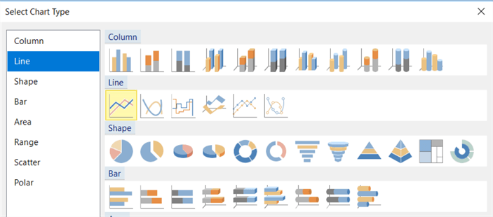
Let’s turn the bar chart into a line chart. You can do this by clicking on the arrow next to Quantity and selecting Change Chart Type…

In the dialog, choose the Line chart type.
We get the following line chart:

We have two series for the years and the sales territories on the X-axis. For a slope chart however, we want time on the X-axis and the territories on the Y-axis. So let’s switch them around in the data configuration of the chart:

Now we achieve the following result:

This is starting to look like the slope chart displayed at the start of this tip, but it obviously needs some formatting. By the way, it seems one series is missing, because there are only 7 lines displayed instead of 8, but this is caused by the Far West and the Great Lakes sales territories have nearly identical data points. Again, on your system the data can be slightly different when you have generated the data for the Wide World Importers data warehouse due to randomization.
Formatting the Slope Chart in SSRS
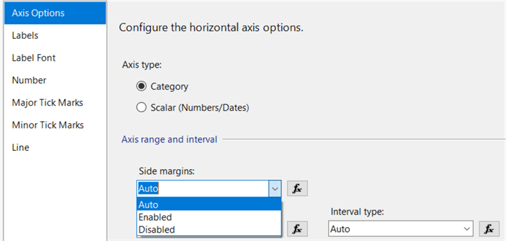
To get to the desired slope chart, formatting is most of the hard work. But let’s start with some basic formatting. First, we get rid of all the white space on the X-axis on the left and the right. Right-click on the horizontal axis and choose Horizontal Axis Properties…

In the properties dialog – at the Axis Options pane and in the Axis range and interval section – change the Side margins property from Auto to Disabled.
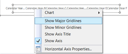
Next we’re going to get rid of the vertical axis and it’s gridlines. In a later step, we’ll replace the axis with the data labels with the series name concatenated to it. Select the vertical axis and right-click to get the context menu.

There we can simple deselect Show Major Gridlines and Show Axis. To get the slope chart look ‘n feel, we need to enable the horizontal gridlines. The process is the same: right-click the horizontal axis and select Show Major Gridlines.
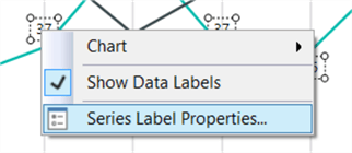
The last step of the initial formatting is to show the data labels. Right-click on a series line and enable Show Data Labels.

This gives us the following result:

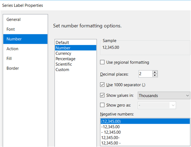
The black font of the data labels is a bit aggressive compared to the rest of the chart, so let’s change the font color. Right-click on a data label and click on Series Label Properties…
In the properties menu, go to the Font pane. There you can change the color to Gray.

Next, we’re also going to change the number formatting of the labels, so they display the units in thousands. Go to the Number pane. Change the category to Number, enable the 1000 separator and tick the checkbox to show the values in thousands.
The chart now has the following layout:

It already looks much better, but there’s some work left for the labels and the legend. In part 2 of this tip, we’ll tackle this formatting problems, which are a bit tougher.
Next Steps
- You can follow along with the instructions in this tip to create your own slope graph.
- More tips about creating charts in SSRS:
- For more Reporting Services tips: Reporting Services Tips.

Koen Verbeeck is a seasoned business intelligence consultant with over a decade of experience with the Microsoft Data Platform. He holds several certifications, including Azure Data Engineer. He’s a prolific writer, with over 375 articles on technologies such as Microsoft Fabric, SSIS, ADF, SSAS, SSRS, MDS, Power BI, Snowflake and Azure services. He has spoken at various events such as PASS, SQLBits, dataMinds Connect and many others. He frequently delivers educational webinars on MSSQLTips.com. For his efforts, Koen has been awarded the Microsoft MVP data platform award for many years.
- MSSQLTips Awards:
- Leadership Award (200+ Tips) – 2021
- Author of the Year – 2014/2020/2022
- Author Contender – 2024/2025