By: Rahul Mehta | Comments (2) | Related: > Reporting Services Charts
Problem
A dashboard is full of charts presenting various visual informative data. SQL Server Reporting Services (SSRS) provides many components to build interactive charts, but the challenge arises when one wants to filter the entire set of charts in the dashboard by selecting any one data point on a chart and reflect the selection in the rest of the charts. In a nutshell, cross chart filtering is a challenge to implement in SSRS reports, but in this tip we cover how this can be done.
Solution
Charts used in SSRS reports have an option to configure a Report Action. Using this option and some logic, we can configure the charts to select a data point as filter criteria which in turn can update multiple charts based on this selection.
Building a SSRS Cross Chart Example
To demonstrate SSRS cross chart filtering, we have a supplier products review table where each supplier’s product review is captured at certain intervals.
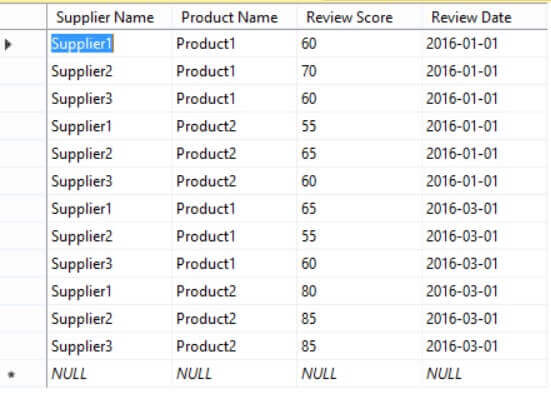
We have to perform the following steps to apply cross chart filtering:
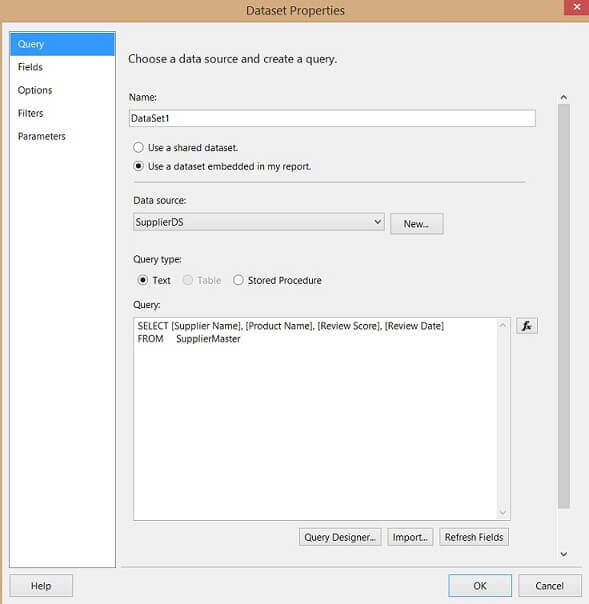
- First Step: Create a dataset in an SSRS report to fetch he data from the Supplier Table.
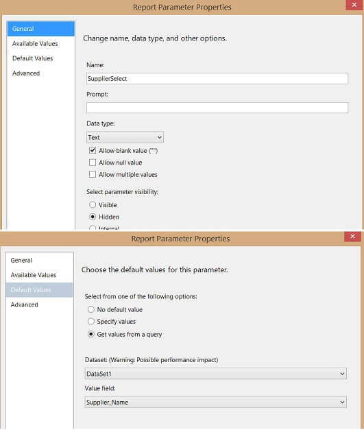
- Second Step: Create a parameter which will hold the selected value of the Supplier Name.
- Third Step: Create a few charts to show different data.
- Fourth Step: Configure the series "Action" of a chart to get Supplier Name (data point) from a parameter.
- Fifth Step: Highlight and filter the selected data point in the rest of the charts.
Step 1: SQL Server Reporting Services Dataset
Create a dataset to fetch data from the Supplier table as shown in the image below.
Step 2: Create an SSRS Parameter for the Supplier Name
Create a parameter named "SupplierSelect" as shown below. This parameter will store the selected supplier name on the charts.
Step 3: Build SSRS Charts
For this example, we will build three charts using the same dataset:
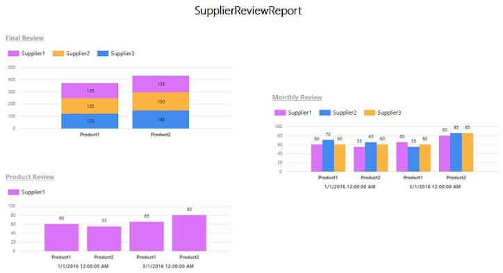
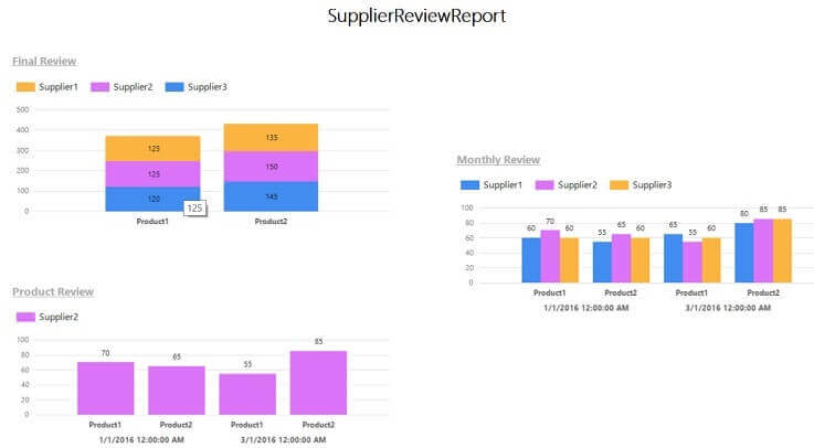
- First chart Final Review shows the supplier product review score in a stacked column chart type for each supplier and product.
- Second chart Monthly Review shows the scoring for each supplier based on product and review period.
- Third chart Product Review shows information about a single supplier for all products and review periods.
Here is an example output of the three charts:
Step 4: Configure an SSRS Series Chart
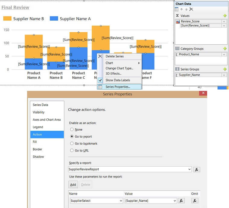
To configure a series in a chart, right click on the chart series and select "Series Properties" > "Action". Under "Enable as an action" select "Go to report". Select the report from the dropdown. Also select the parameter and field as "SupplierSelect" and "Supplier Name" just like shown in the image below. This needs to be done for the Final Review and the Monthly Review charts.
Step 5: Select the Data Point and Expression
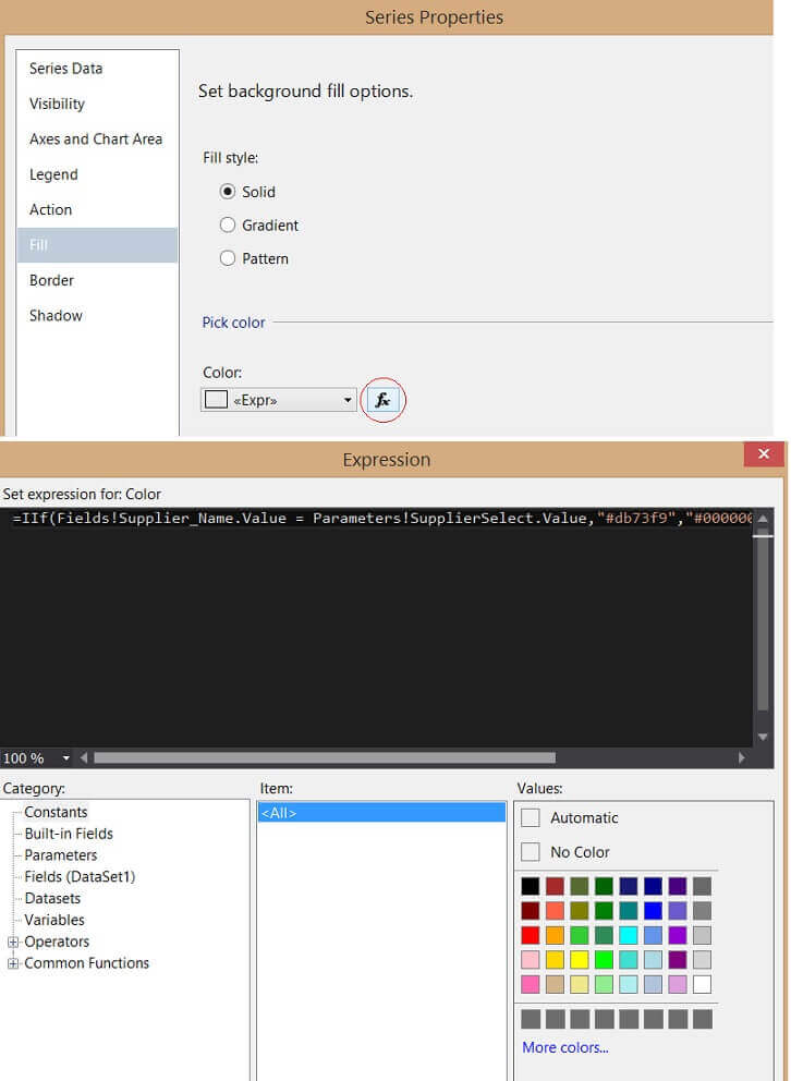
To highlight the selected data point ("Supplier Name"), right click on the chart series and select "Series Properties" > "Fill". Select "Fill Style" as "Solid" and in the color enter the below expression. This expression decides which supplier to highlight in this color. This needs to be done for all three charts.
=IIf(Fields!Supplier_Name.Value = Parameters!SupplierSelect.Value,"#db73f9","#00000000")
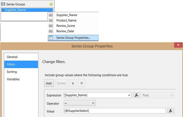
To filter with the selected data point ("Supplier Name"), click on chart "Series Groups" > "Supplier Name" and select "Series Group Properties". Select the "Filters" tab and add an expression to match the "Supplier Name" field with the "SupplierSelect" parameter as shown below. This will automatically filter the chart "Product Review" on a click of any data point in the chart.
Running the SSRS Report
If we click on Supplier3 in the Final Review chart you will see the other charts highlighted with the color we used in the above Expression. Also, the "Product Review" chart will filter based on the Supplier that was clicked on.
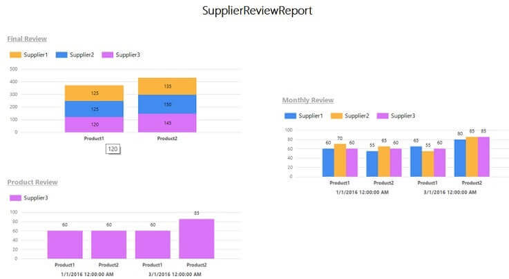
If we click on Supplier2 the charts will change accordingly.
Conclusion
In this way SSRS reports can have cross-chart filtering and highlighting based on what is clicked on in the report.
Next Steps
- Build the interactive Dashboards using SSRS.
- For more about SQL Server 2016, read these other SQL Server 2016 tips.
- Check out these other SSRS development tips.
About the author
 Rahul Mehta is a Project Architect/Lead working at Tata Consultancy Services focusing on ECM.
This author pledges the content of this article is based on professional experience and not AI generated.
View all my tips


